Rationale
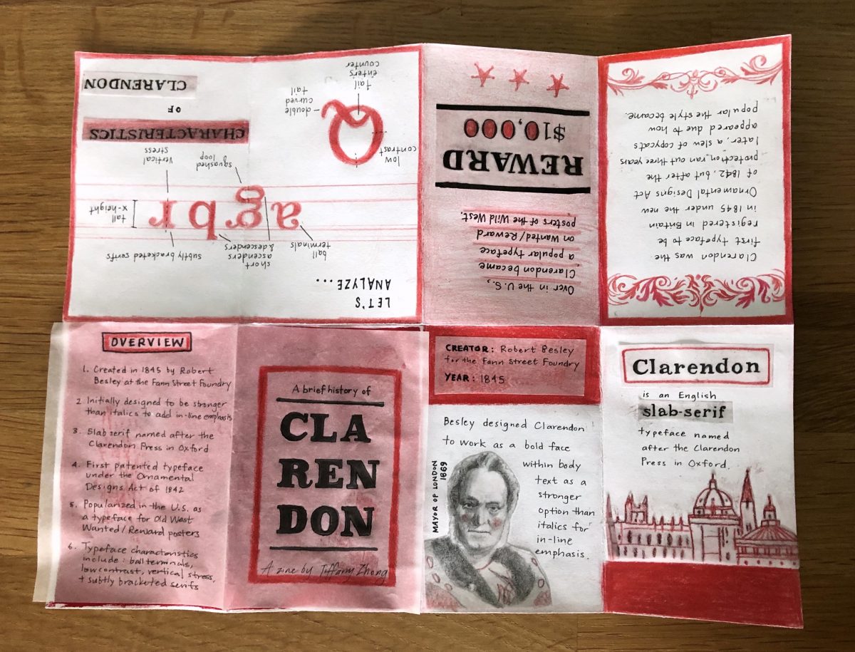
I chose to do a zine on Clarendon because I came across the fact that it was the first registered typeface in Britain in 1845 while we were learning about copyright in other classes which I found quite interesting.
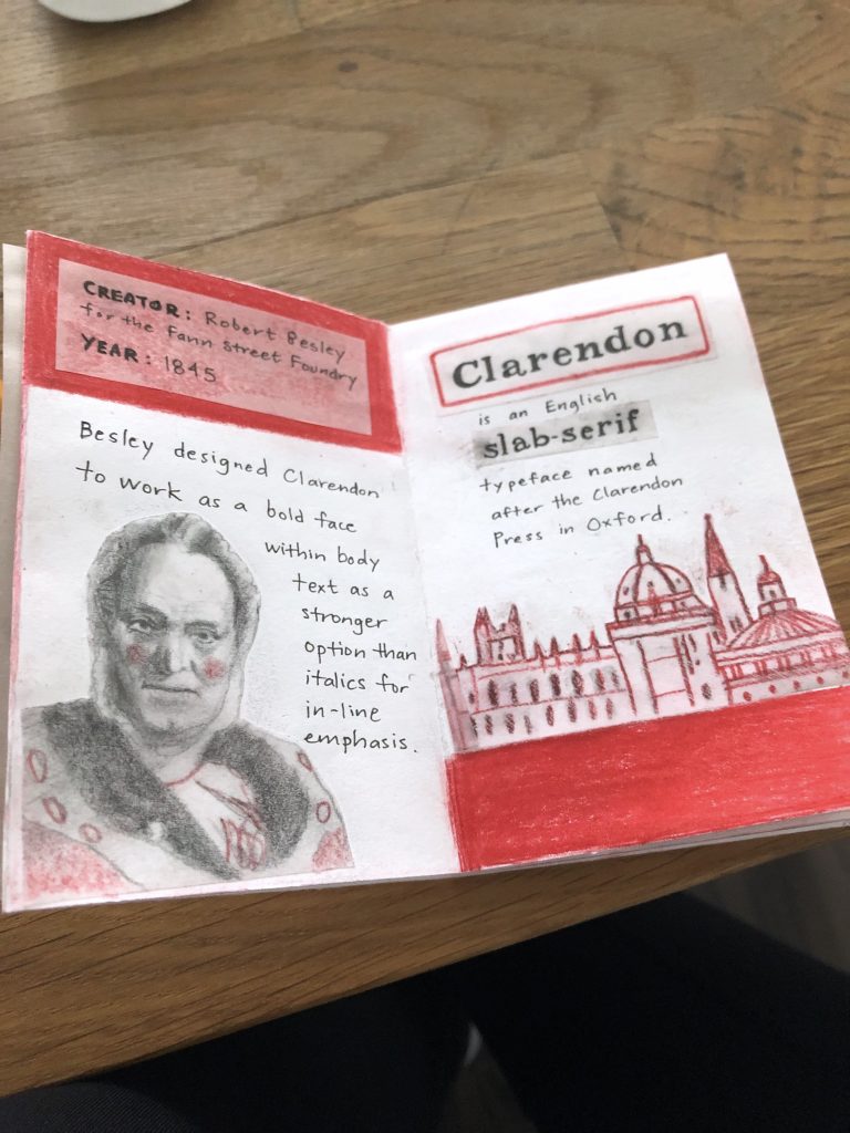
I chose a limited colour palette with just white, black, and red because it would keep the small format of the zine cohesive and simple. I added small illustrations and illustrative details to each page to bring life to the facts.
I also chose to use a variety of materials (gouache, ink, pencil crayons, tracing paper) to bring some textural elements to an otherwise white letter-sized sheet of paper. Also, because I worked in a limited palette, I was afforded the opportunity to incorporate a range of materials and still have it look like it all fits together.
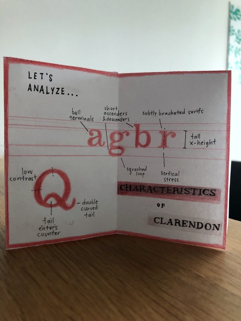
I took advantage of a 2-page spread to share some of Clarendon’s typographic characteristics which allowed me to demonstrate in a clear way how it’s constructed without just listing out a bunch of facts. It aims to educate readers in a ‘show, don’t just tell’ way.
Grade
8/10
I could have made the copy more interesting. Even though I planned and adjusted the wording several times, I never landed on anything too quippy, which I personally find the most engaging.
I almost never work with red, but I think it turned out quite striking! I had a great time working with gouache, pencil crayons, ink pens, and most of all, tracing paper for this zine. The tracing paper added a nice softness in texture to the otherwise bright white paper underneath. It started out as an experiment, but it ended up being a big element of the project in the end!
I’m quite happy with the end-result and this may be my favourite zine out of the four I’ve made in the last year. This is definitely getting mailed off to my old roommate in Toronto who got me into zines!


