Rationale
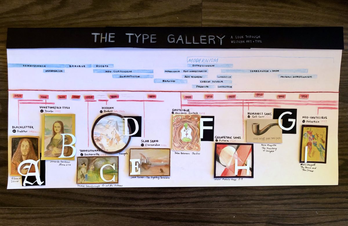
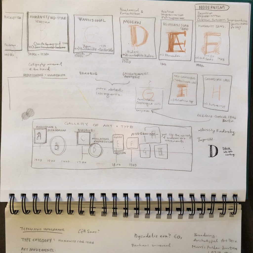
I decided to connect my typography infographic to the art movements we’ve been looking at in this class as well as Jeff’s class. My aim was to plot out the timing of the art movements to the typefaces that were created at the time to better understand where art and typography intersect.
The whole infographic aims to tell the story and connection between the two visually and without the support of too many words in a more general survey view. I decided focus on the visuals by making them the biggest and most colourful parts of the project. I recreated mini versions of famous artworks by artists who were popular at the same time as the typeface and then I overlaid a letter from the typeface mentioned, in its actual form. I tried my best to select artworks from the same country and year the type was created (only 2 are slightly off by country or date). I also chose artists that we’ve covered this term in our class so it would be familiar for all of us.
Grade
9/10
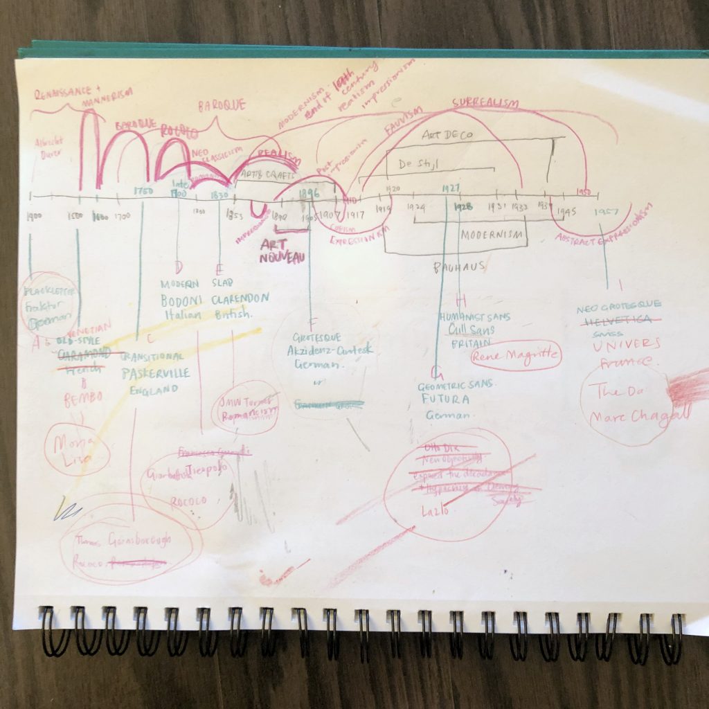
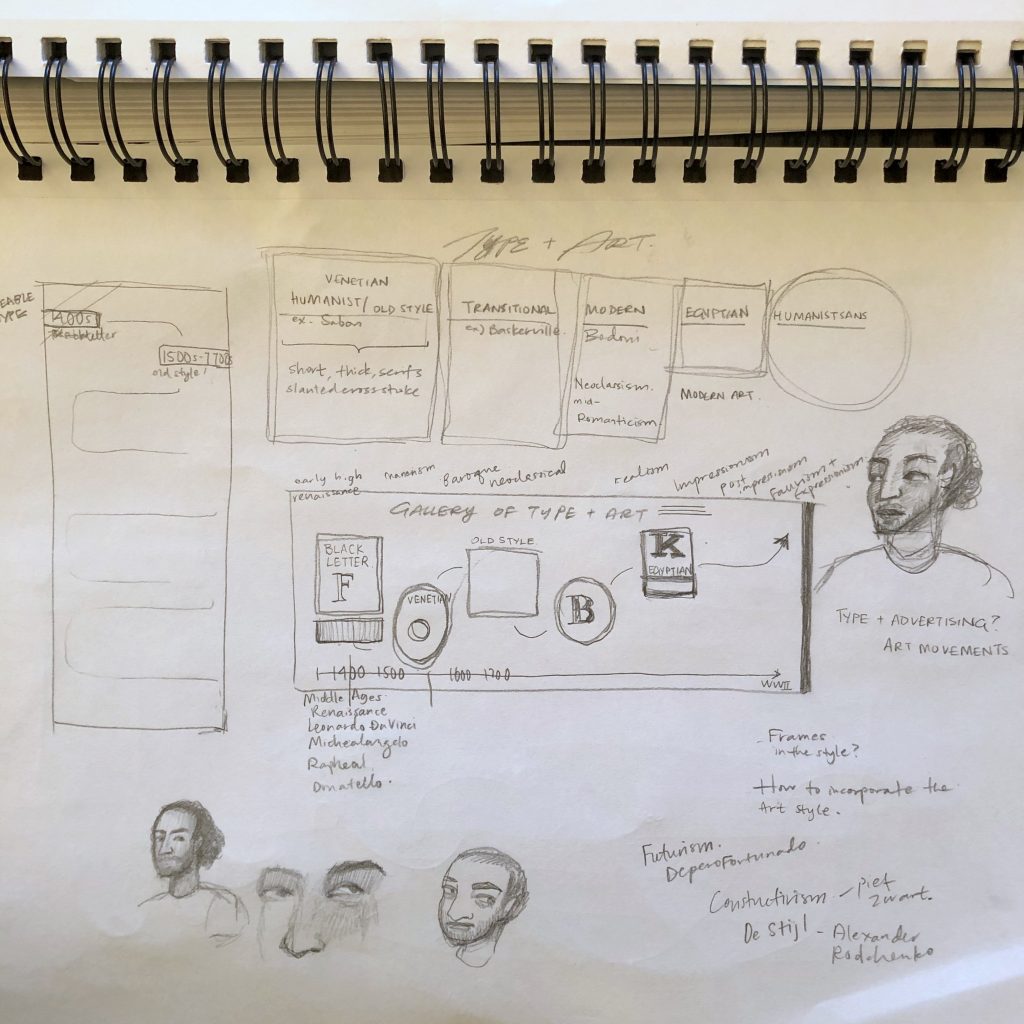
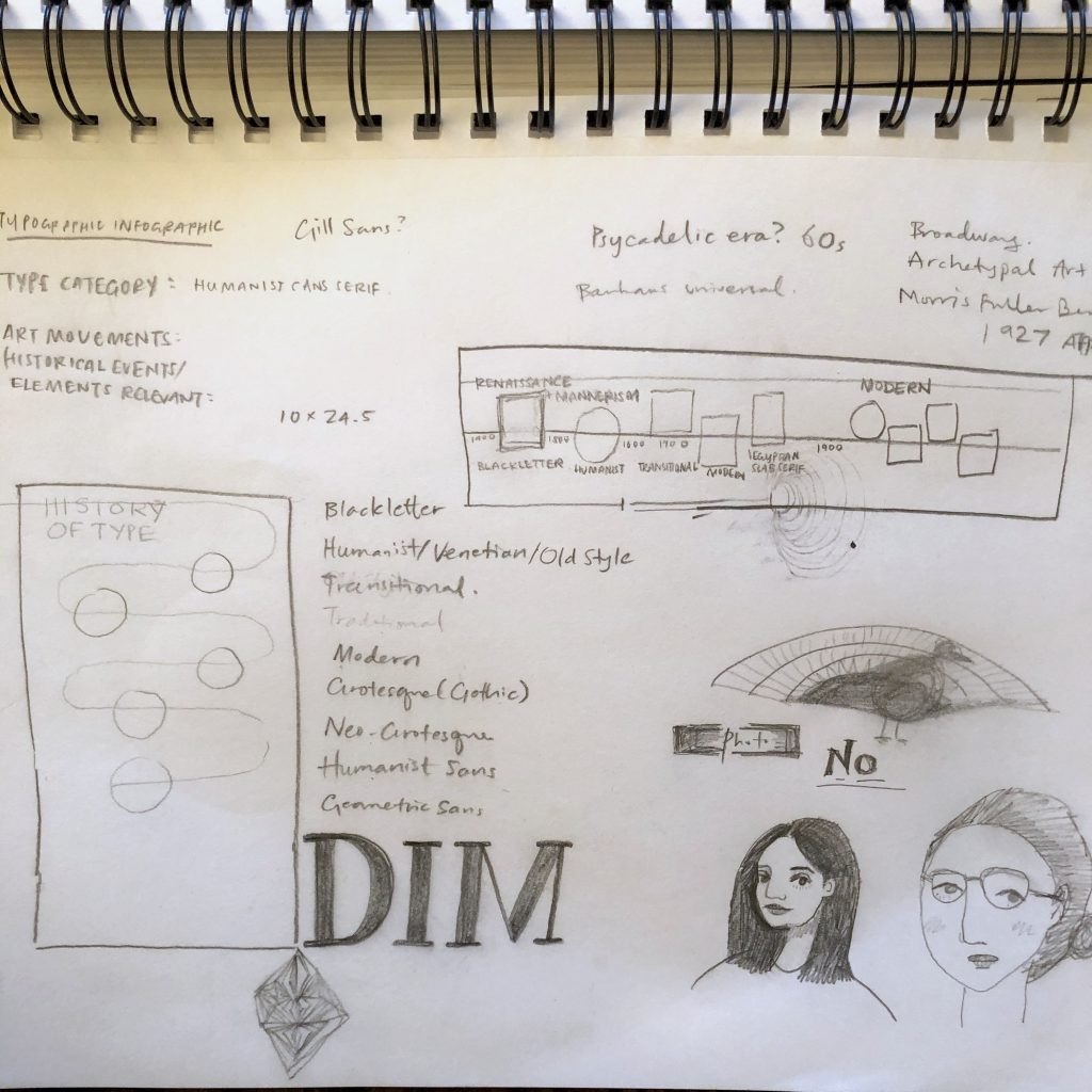
I did a lot of background research in an attempt to get the timeline right, but even between your class and Jeff’s, there are a few minor discrepancies in dates and the internet just makes it even more confusing. I did a lot of planning ahead of time to find artworks and artists who we’ve already heard of from the exact same time the type was invented. I also did several rounds of sketches so I could just execute once. I think the final result isn’t 100% what I imagined and planned, but it captures the spirit of what I was going for.
This was another multi-media project where I found myself using different kinds of papers, pens, and pencil crayons. I also dyed some string red for the main timeline as well as making use of extra black for contrast.
I’m quite proud of the fact that I completed this entire term’s projects without the use of a printer. It has made work a bit more tedious and time-consuming, but it was a fun challenge figuring out how to recreate things with good old fashioned methods.
