Gestalt Principle: Proximity
The shapes of the icon come together to form an abstract pound sign of sorts because they are placed close to each other.

Gestalt Principle: Proximity
The shapes of the icon come together to form an abstract pound sign of sorts because they are placed close to each other.

Gestalt Principle: Figure/Ground
This logo cleverly depicts a fountain pen nib as well as a spoon.


I really enjoyed how Sarah used scale to emphasize the relationship between the human figures and the devices. The illustration uses that device well to portray an abstract concept.

This poster uses the element of line to create the orbit rings around a planet. The angle and scale of the rings add drama to the poster while all other elements on the page are kept relatively small.

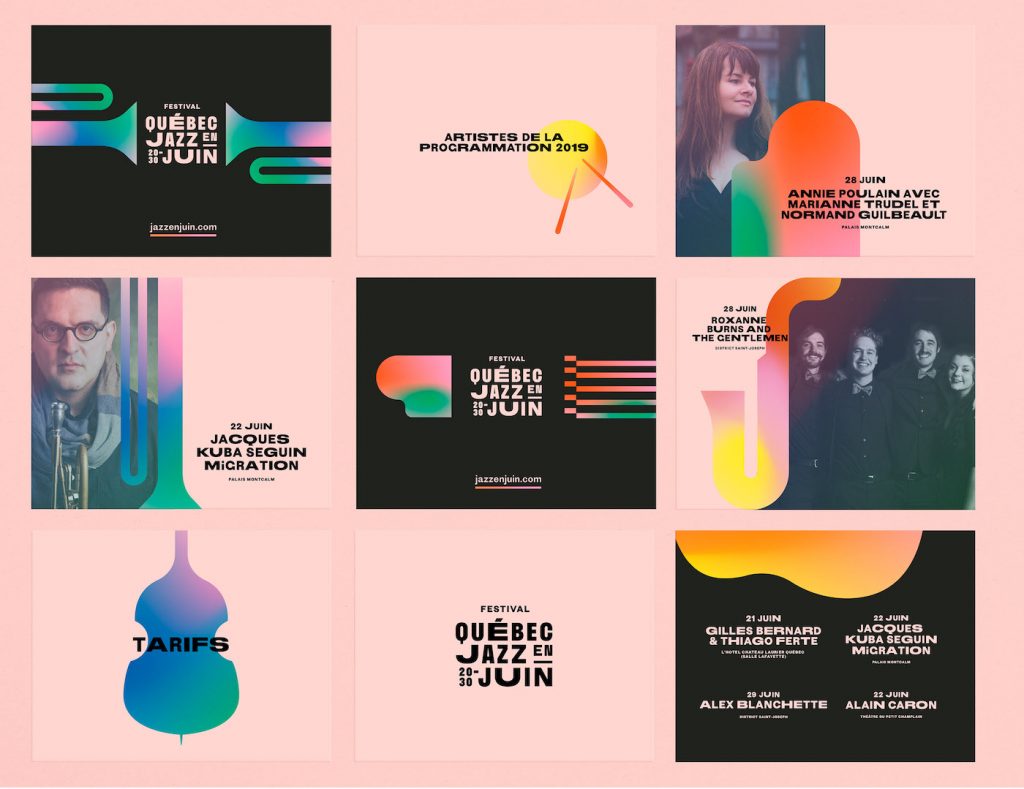
This jazz festival’s brand identity effectively uses space and colour to depict musical instruments in their simplest form. The textured gradients adds character within the forms when they’re placed against the solid coloured backgrounds.