My name is Aleks and I am currently attending the IDEA program at Capilano University. The IDEA program is a design program that focuses on graphic design, branding and web design. When I am not in school, I love to do photography and make videos. If someone ever wants to see my photography work, they can find it in the 3rd issues of the Capilano Courier as some of my photography work is featured in it. I also love to play sports. I have played soccer and football for over 5 years. I live in North Vancouver and have a dog named Luna. If there were 3 words to describe myself, I would say, funny, creative, and outgoing!
Revised Midterm Essay
Why human enhancement should be legal.
As time progresses, so does its technology. One of these new emerging technologies is human enhancement. As this is a new technology, some question its use and its side effects. However, this essay will discuss the several positive effects which should make human enhancement legal. Human enhancement should be legal because of its advancement of human evolution, its current positive use under a different name, and it’s more effective than natural selection.
A common concern about enhancement technologies is that their use might affect our humanity and transform us into something other than or even beyond human, thereby jeopardizing our species. However, these views are not rational and don’t look at the larger-scale impact of human enhancement. Sara Chan explains it perfectly in her article titled “Humanity 2.0?”, “In fact, the use of enhancements—genetic or otherwise—will not cause us to cease to be human or to lose the essential qualities of humanity indeed, enhancements and the desire to use them might be seen as an expression of our humanity. The advent of human genetic enhancement, then, signifies not the end of the human race, but rather, the next step in the continuing process of human evolution”.
Another reason why human enhancement should be legal is that elements of human enhancement are already in use and have a greatly positive impact. Sara Chan Gives a great example of this, “For example, many of us take dietary supplements to improve health and prevent disease, we supply prosthetic limbs to the disabled, participate in vaccination programs to enhance our natural immunity to infectious disease, use hearing aids or cochlear implants to treat deafness and use spectacles to correct defective vision, all of which represent enhancements”. here Sara list many positive medical treatments, all of which a widely accepted and appreciated. So if genetic human enhancement could to the same things, why would people be against it?
The last reason is the superiority over natural selection. As Sara Chan explains, we are still part of natural selection and natural is still part of human enhancement, “Even if we were to remove the influence of natural selection entirely, it would not necessarily mean the end of evolution—if by evolution we mean social change or cultural evolution—or the end of genetic change. In fact, although the collective human genome is not changing appreciably faster than it has in the past, the development of human society as a whole—that is, evolution in the cultural sense—is progressing faster than ever, and is constantly accelerating”.
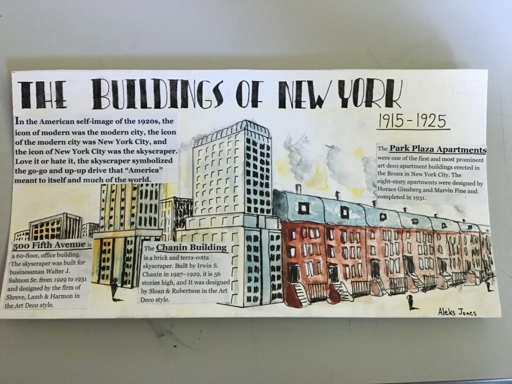
Architecture spread rationale
I believe I deserve a grade of 7.5/10. In this spread, their are several successful elements as well as several unsuccessful elements. Some of the successful elements include the right amount of information on each building as well as the general info. Another successful element is the title because of the Art Deco style which it portrays and helps connect with the time period. The illustrations are well done, however, it doesn’t really connect with New York and the Art Deco style such as the title does. One of the things I could have improved on was the overall concept and feeling of the spread; it may be nice to look at, however, it doesn’t scream New York architecture. The last thing I could have improved on is the integration of the text, as it is quite blocky and and out of place.
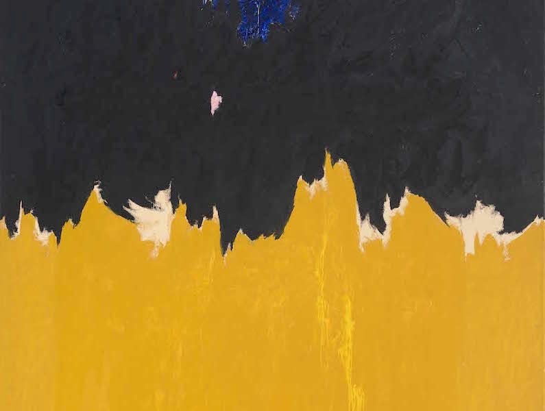
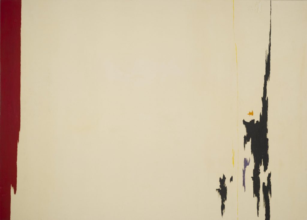
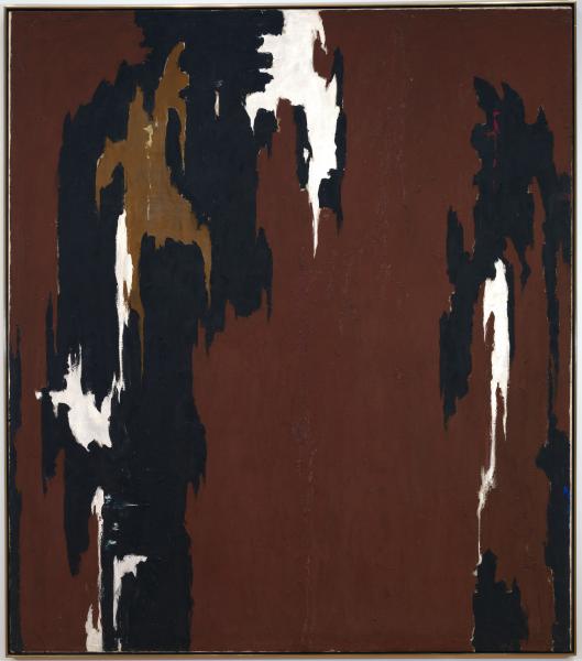
Clyfford Still
Abstract
Clyfford Still was an American painter associated with the Abstract Expressionist movement. He is best known for his paintings that resemble flame-like brush strokes or shapes. Inspired by the windswept landscape of the Canadian prairie, he developed a technique of applying thick layers of paint onto the canvas using a palette knife, creating jagged flares of dark tones against lighter areas of yellows, oranges, and reds.
Clyfford Still began to quickly see national recognition. His paintings were embraced by other artists and critics, who considered Still to be one of the most original artist of the time. Jackson pollock even said that “Still’s work makes the rest of us look academic”.
To me, many of the shapes and patterns seen in Clyfford Still’s work resembles the patterns found in nature, such as the pattern on a cows fur or the pattern and shapes of the markings on a koi fish. Although there might not be any meaning behind his paintings, I find them visually pleasing to look at, and I find it interesting that everyone will have a slightly different feeling from the paintings when viewing them.
References
ClyffordStillMuseum.org
https://collection.clyffordstillmuseum.org/object/ph-1139
https://americanart.si.edu/artwork/1946-h-indian-red-and-black-23063
http://www.artnet.com/artists/clyfford-still/
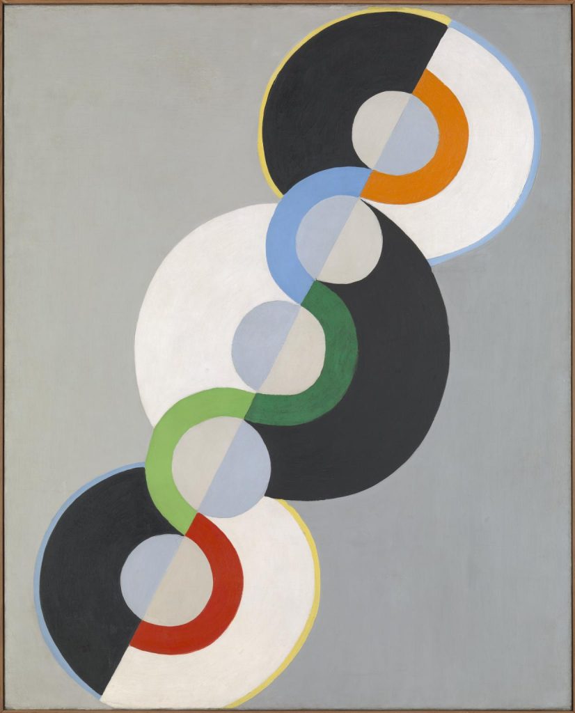
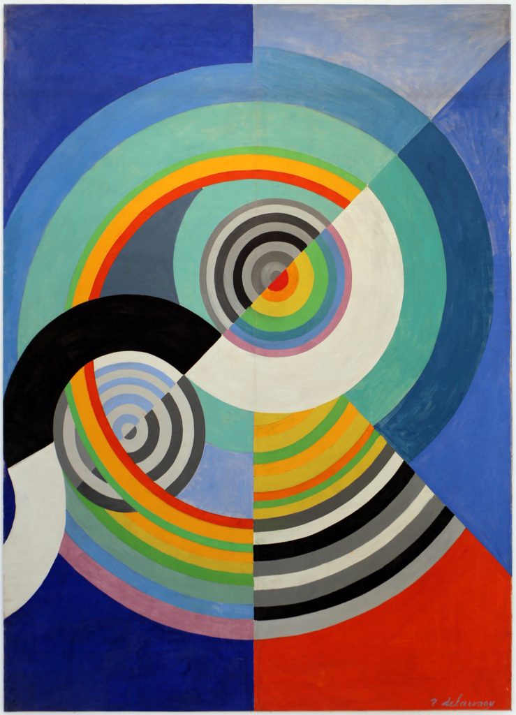
Robert Delaunay
Cubism/Orphism
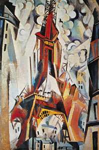
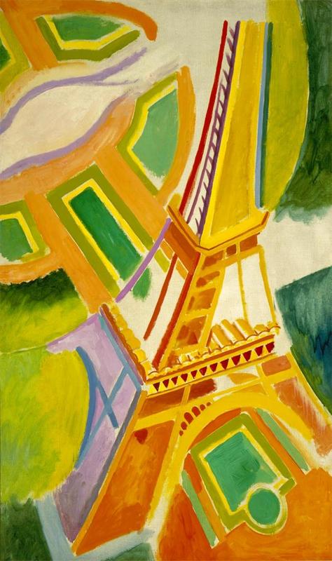
Robert Delaunay was a French painter who first introduced vibrant colour into Cubism and thereby originated the trend in Cubist painting known as Orphism. He was one of the earliest completely nonrepresentational painters, and his work affected the development of abstract art based on the compositional tensions created by opposite planes of colour.
Delaunay was at first a theatre designer and painted only part-time. But he soon came under the influence of the Neo-Impressionists’ use of colour. By 1910 he had made his own contribution to Cubism in two series of paintings, cathedrals and the “Eiffel Tower,” which combined bits of Cubist form with dynamic movement and vibrant colour.
I admire Robert’s work. His work looks very modern and is quite minima which is pleasant to look at. He uses color well to make his paintings more playful and lively.
References
https://www.britannica.com/biography/Robert-Delaunay
https://www.tate.org.uk/art/artists/robert-delaunay-992
https://www.theartstory.org/artist/delaunay-robert/
Artifact Rationale
Survey #5
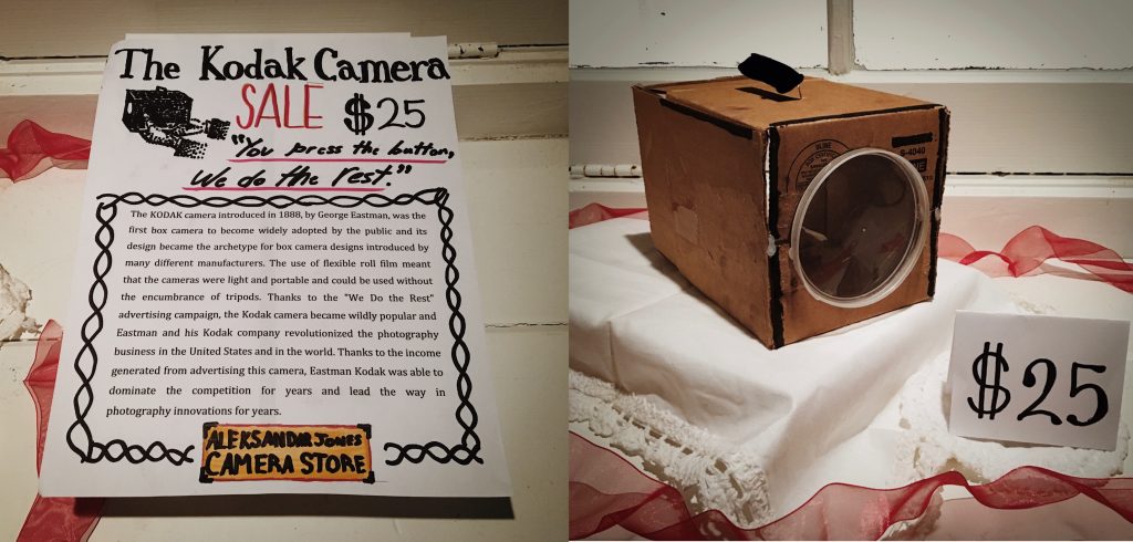
I am happy with my final result. I believe I have a strong concept for my artifact, as I displayed my artifact as if it was for sale in a store. My information about the camera on the first page is quite informative yet still is easy and fun to read. I think I resembled the build of the camera quite well, however, I made the lens of the camera too large. Another thing I could have done better was to integrate the writing with the artifact into one photo, instead of having two separate photos which makes it feel a little disconnected. Overall I think I did quite well and I’d give myself a 9/10.
Research:
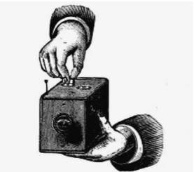
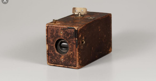
The Kodak Company was born in 1888 with the debut of the first Kodak camera. It came pre-loaded with enough film for 100 exposures and could easily be carried and handheld during its operation. “You press the button, we do the rest,” Eastman promised in the advertising slogan for his revolutionary invention.
After the film was exposed—meaning all 100 shots were taken—the whole camera was returned to the Kodak company in Rochester, New York, where the film was developed, prints were made, and a new roll of photographic film was inserted into the camera. The camera and prints were then returned to the customer, for the whole cycle to be repeated again.
George Eastman though long and hard about the perfect name for his company. “A trademark should be short, vigorous, incapable of being misspelled,” George Eastman said, explaining the process by which he’d come to name his company. “The letter ‘K’ had been a favorite of mine. It seems a strong, incisive sort of letter. It became a question of trying out a great number of combinations of letters that made words starting and ending with “K.”
References
Bellis, Mary. “The History of Kodak: How Rolled Film Made Everyone a Photographer.” ThoughtCo, ThoughtCo, 5 Oct. 2019, https://www.thoughtco.com/george-eastman-history-of-kodak-1991619.
“From the Camera Obscura to the Revolutionary Kodak.” George Eastman Museum, https://www.eastman.org/camera-obscura-revolutionary-kodak.
Andre Derain
Fauvism
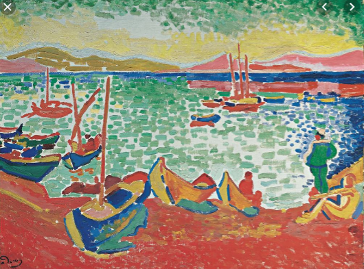
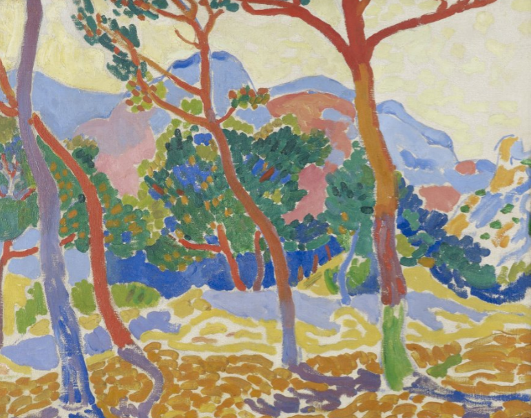
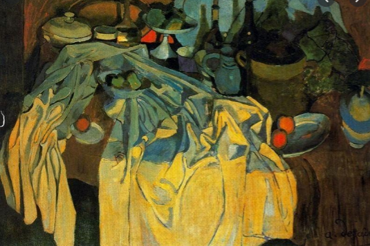
Derain studied painting in Paris at the Académie Carriere from 1898 to 1899. He developed his early style in association with Maurice de Vlaminck, who he met in 1900, and with Henri Matisse, who had been Derain’s fellow student at the Académie Carriere. Together with these two painters, Derain was one of the major painters of Fauvism from 1905 to 1908. Like the other artists who worked in this style, he painted landscapes and figure studies in brilliant, sometimes pure colors and used broken brushstrokes and impulsive lines to define his spontaneous compositions.
I personally do not like his artwork. I find his paintings are too saturated. Derain also uses too many colors, which makes a lot of his paintings look like messy, distorted rainbows.
Derain broke with Fauvism in 1908, when he was temporarily influenced by the works of the Post-Impressionist painter Paul Cézanne. Derain worked for a few years in a stylized form of Cubism, but by the 1920s his paintings of nudes, still lifes, and portraits had become increasingly Neoclassical. His art underwent virtually no change after the 1920s, though his more conservative style brought him financial success.
References
https://www.britannica.com/biography/Andre-Derai
https://www.albrightknox.org/artworks/k197126-les-arbres-trees
https://www.tate.org.uk/art/artists/andre-derain-998
https://www.guggenheim.org/artwork/artist/andre-derain
Survey #7
Vancouver Race Riots
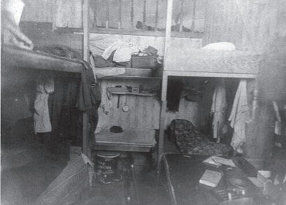
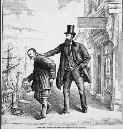
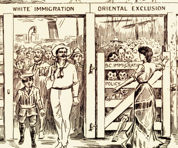
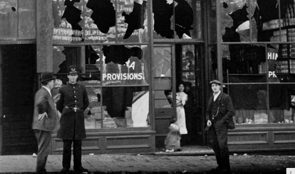
In 1907, an anti-immigration rally exploded into violence and vandalism in both Chinatown and Japantown in Vancouver. What began as riots in Bellingham as a movement to drive Punjabi Sikhs out of the lumber industry had eventually spread to white supremacist marches to Vancouver city with demands for a “White Canada.” In the riot, the property of Chinese and Japanese store owners was destroyed.
The riots were not only a landmark in the rise of racism in Canada, they signified the commencement of systematic federal intervention to prohibit Asian immigration to Canada through the imposition of quotas on Japanese emigration, continuous voyage regulations those from India, and the enforcement of laws against the Chinese.
The 1907 Riots were advertised in news reports, and by the time the parade arrived at the city hall, a huge crowd had gathered. Crowd estimates vary between four thousand and eight thousand people. As rioters attacked Chinatown, the angry mob eventually turned toward Japantown or Nihon Bachi, around the Powell Street grounds in what is now Oppenheimer Park.
Although news of the riot flashed reached different corners of the world, appearing on front pages in Ottawa, New York, and London, only three people were charged and only one person convicted of any offense. Not only had newspapers openly mocked the efforts of the court and police, few injuries were reported. All levels of government in Canada made vague apologies.
Reference
https://www.winnipegfreepress.com/special/goodnews/moment-of-clarity-in-my-canada-415358084.html
https://www.straight.com/blogra/869781/centre-unwelcome-dinner-commemorate-vancouvers-first-anti-chinese-riot-1887
https://en.wikipedia.org/wiki/Anti-Oriental_riots_(Vancouver)
https://www.vancourier.com/news/archives-anti-asian-mob-goes-on-rampage-1.1344739
https://www.library.ubc.ca/chineseinbc/riots.html
Survey #6
Edwardian fashion
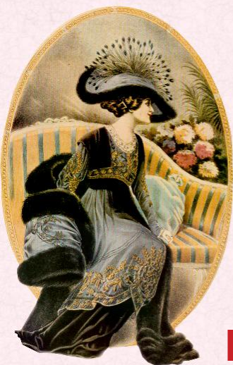
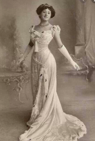
Edwardian fashion refers to the clothing that was in style between the late 1890s and 1914 or the beginning of the Great War (World War I). Also called La Belle Epoque, and the Gilded Age, this was a time when women’s fashions took on a new opulence and extravagance, inspired by the hedonistic lifestyle of Britain’s King Edward VII.
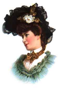
The popularity of the hourglass-shaped dress faded by the end of the Victorian age and the “S” curve became increasingly popular during the Edwardian Era. This new fashion style embraced a “healthier” corset that was far less constricting than the previous styles during the Victorian age and provided better support for the spine. Also at the beginning of the Edwardian Era (1901) ladies hats grew in size, but this trend only lasted until around 1911.
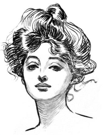
As the women’s suffrage movement continued through the Edwardian Era women began to mimic their style and attitude after the famous “Gibson Girl”. The “Gibson Girl” was a pen-and-ink drawing done by Charles Dana Gibson. She portrayed the modern women of the time, beautiful and independent. His drawings quickly became very popular and were displayed in all of the top magazines.
In 1910 fashion began to change once again. More women were working, playing sports and being more active in general and they needed clothing to reflect their new lifestyle. The “S” curve transformed into a pre-flapper style with more straight lines and less structure. This era of fashion is also said to be called “la Belle Epoque” (“The Beautiful Epoch”).
References
http://www.premierexhibitions.com/exhibitions/3/3/titanic-artifact-exhibition/blog/fashion-during-edwardian-era
https://bellatory.com/fashion-industry/FashionHistoryEdwardianFashionTrends1890s1914
http://www.victoriana.com/EdwardianHats/
http://victorian-era.org/edwardian-era-womens-clothing.html
Henri Rousseau
impressionism & post-impressionism
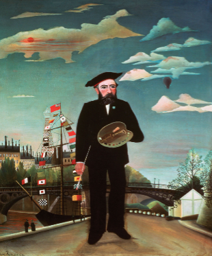
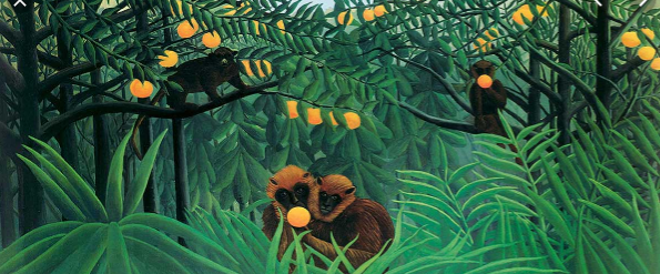
Henri Rousseau was a post-impressionist painter from Laval, France. His best-known paintings depict jungle scenes, even though he never left France or saw a jungle. His inspiration came from illustrated books and the botanical gardens in Paris, as well as tableaux of “taxidermied” wild animals. He had also met soldiers, during his term of service, who had survived the French expedition to Mexico and listened to their stories of the subtropical country they had encountered.
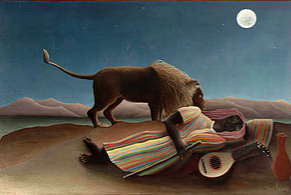
“The Sleeping Gypsy” is one of my all-time favorite paintings, which I was lucky enough to see at the MoMA in New York. This painting makes me feel so relaxed as if I am in a very pleasant dream. The colors are beautiful and soft and are quite light even though it is a nighttime scene. The colors also create such a perfect sense of temperature, the atmosphere of the painting doesn’t feel too cold, yet doenst feel too warm either.
References
https://www.icanvas.com/canvas-art-prints/artist/henri-rousseau?product=canvas&sort=popular
https://www.britannica.com/biography/Henri-Rousseau
http://www.henrirousseau.net/
http://www.henrirousseau.org/