Blog 1: Otto Storch

Otto Storch is a well-recognized photographer and Art Director who has received well over 300 awards for his work in the advertising industry. Otto helped bring a modern flavour to American editorials. He first stepped foot into the design industry as a photo retoucher for Dell publishing House and soon after became Art Director.

A McCall’s spread by Otto Storch from 1961. The text is warped to look like a mattress where the woman is laying on.

Otto had such a successful career because of his exploration in design. He craved excitement for new projects and liked having the freedom to push his creative limits. At Dell, Otto felt as if his work was being forced out of quantity rather than quality. This was where he went back to learning, first by taking classes taught by Harper Bazaar’s Art Director Alexey Brodovitch and then eventually studying at the New School. 17 years later, Otto joined McCall’s magazine where he began to feel his spark of creativity come back while discovering his new love for photography.

Another McCall’s spread done by Otto Storch. At first glance, this spread looks average as all text is aligned justified, but as you look closer, the text is adjusted according to the shape of the makeup brushes that come close.

Otto’s experimentation with typography and photography broke the barriers of design. For me, Otto helped make reading interesting by changing the way type was used. Type was no longer looked at as a way of communicating information, but a way of visually evoking feeling as an image. Although Otto is no longer with us today, I feel that his body of works will continue to live on and inspire many other artists to work outside of their comfort zone.

Sources:

Survey 9: Typography Spread

For my third spread, I was assigned a typography spread. I was really excited about this one because it was the same time period where design was shifting away from serif typeface and into san serif typeface. Automatically I knew I had to do a spread on the Futura typeface because it is one of my favourite fonts. 

Futura originated from Germany, created by a German type designer named Paul Renner. At this time, Adolf Hitler declared Fraktur font as the official German font, causing all modern typefaces to be looked down upon, especially The typeface Futura. Although it was not loved by Hitler, it was loved internationally for its readability. Futura was the first font to be made into a plaque to stamp during the landing of the moon. This stamp was to let aliens know that humans came in peace.

I am really happy with my third spread. I had a lot of fun creating this spread because I got to make a collage which happens to be one of my favourite types of art styles. It was a bonus that it was also very suitable during this time period. Third time around, I think I did a really good job planning my spread. I took extra caution when placing my type. In the past I put my text either too close to the gutter or not integrate my text well enough where people would be interested in reading what I had to say. Not only did I make the text look like the steam coming out of the landing Apollo 11 but I also made to imitate the popular diagonal text design that was going on around at the time.

I would rate this spread 9/10 because I feel like it is very organized and easy to read. Personally I think my spread would captivate the readers’ attention based on the contrast in red and black used in the background. If I could change one thing about the spread, it would be the image of the Bauhaus school on the bottom right corner. Although the Bauhaus did influence the design of the Futura font, it may not have been super important where I felt the need to incorporate into my spread.

Contemporary & Post Modernism

LISA YUSKAVAGE (1962-PRESENT)

Lisa Yuskavage is a female conventional painter who enjoys painting nude female figures. Her painting style is best described as a combination of both realism and abstract. Yuskavage was born in Philadelphia, Pennsylvania where she graduated from Temple University with a BFA. She then moved to New York City where she now exhibits her paintings. Yuskavage’s paintings provocative paintings take inspiration from a blend of soft porn magazines such as “Penthouse” and artworks by Baroque artist Peter Paul Rubens.  

Lisa Yuskavage’s paintings are really amazing in my opinion. She is very good at capturing the mood she wants to convey in her paintings. I think what helps her with that is how she is able to include artificial lighting in each painted scene to make it look realistic. What is interesting about this technique is that the hues Yuskavage uses in her paintings feel fanciful, almost as if it were straight out of an “Avatar” movie. My favourite painting by Yuskavage is her “Self Portrait” (2017). At first when I saw this painting I thought she drew herself with three legs, but as I looked closer, I realized there is a man standing behind her, almost ghost- like grabbing her by the waist. It is a very different approach to a self portrait like the ones I’ve seen from different art periods. I admire Yuskavage’s careless attitude as she is not afraid to paint herself in such a revealing manner. She does not dwell on the critics opinions as she continues to draw women in a strong yet erotic way. I am glad that not all art history was dominated by the male gender painting nude women. I like how I get to see the shift in female erotica, how Yuskavage’s paintings feel more genuine knowing that it was painted by a female herself.

”Self Portrait” (2017). Oil on linen.
https://www.yuskavage.com/artwork/4543
”Golden Couple” (2018) depicts the strong connection between man and woman. The evidence of drugs and alcohol and afro and moustache suggest that this painting was meant to take place in the time of the disco era.
https://www.yuskavage.com/artwork/4565
“Scissor Sisters” (2019) depict two strong female figures surviving out in the wilderness. The way the women are dressed in their undergarments remind me of the Disney movie “Tarzan” and how the two ladies are only wearing and holding the bare necessities for survival.
https://www.yuskavage.com/artwork/4598

Sources:

https://brooklynrail.org/2009/03/art/in-conversation-lisa-yuskavage-with-phong-bui

https://en.wikipedia.org/wiki/Lisa_Yuskavage

https://www.theartstory.org/artist/yuskavage-lisa/

https://www.yuskavage.com/artwork/4565

Abstract Expressionism & Pop Art

ROY LICHTENSTEIN (1923-1997)

American pop artist Roy Lichtenstein was best known for his comic style parodies. Lichtenstein’s early life consisted of him going to the Apollo Theatre in Harlem, where he would draw life drawings of musicians playing their music. Lichtenstein continued his art studies at the Ohio State University where he graduated and became an art instructor. Lichtenstein also taught at Rutgers University where he was first introduced to pop imagery by his colleague Allan Karpov. 

End of the Trail” (1951) is one of Lichtenstein’s earlier works. You can see that his style was very much like cubism and expressionism at the time.
https://brendandonnet.wordpress.com/2012/11/25/roy-lichtenstein-vs-walter-benjamin/

As a fan of comic books, I really enjoy Roy Lichtenstein’s work. I have been a fan of his work for some time as I dressed up as the “Crying Girl” for Halloween in grade nine. I think the reason why I wanted to dress up like one of Liechtenstein’s screen prints is for the way Lichtenstein is able to capture the beauty of women. Screenprints such as “Crying Girl” 1963 is a simple headshot of a girl crying. However, what I find so captivating about this piece is for the girl’s expression on her face. The girl is model like- similar to Marilyn Monroe and her red lipstick, yet she is expressing sadness. I think Lichtenstein was trying to convey a message of emotion, how even the most beautiful girls in the world can be sad too. Overall I enjoy his style of using flat colours with thick strokes. It helps exemplify the drama Lichtenstein likes to add to his work.

“Drowning Girl” (1963) depicts a girl in distress as she would “rather sink than call Brad for help”. I really enjoy the variety of strokes Lichtenstein uses in the water as well as her hair. The dark black stroke help make the subject matter pop out of the water.
https://brendandonnet.wordpress.com/2012/11/25/roy-lichtenstein-vs-walter-benjamin/
“In the Car” (1964) reminds me of Tamara de Lempicka’s “Tamara in the Green Bugatti”. However, in this image, it looks like the man next to her is controlling her life whereas Tamara looks like she is running her life according to how she wants to and does things her way.
https://brendandonnet.wordpress.com/2012/11/25/roy-lichtenstein-vs-walter-benjamin/
“Oh, Jeff… I Love You, Too… But…” (1964). This girl represents IDEA 23 at the end of the fall semester.
https://brendandonnet.wordpress.com/2012/11/25/roy-lichtenstein-vs-walter-benjamin/

Cubism, Dadaism, & Surrealism

YVES TANGUY (1900-1955)

Raymond Georges Yves Tanguy was highly recognized for his surrealist paintings. Tanguy’s subject matter for his paintings include dreams, childhood memory, hallucinations, and psychotic episodes. Yves Tanguy did not only have a unique style of painting, he was a unique individual who enjoyed eating living spiders. 

Tanguy was a self-taught painter whose precision and skill disguised his lack of training. His lack of experience for being quite a young painter did not seem to affect people’s judgment of him. It rather surprised many to see how such a young artist could have such a mature sense of style to his painting. Tanguy was one of the first surrealist painters who was capable of capturing his unconscious thoughts into an atmosphere.

Early on in his career, Tanguy met Andre Breton. This was his lead way into meeting the group of surrealists at the time, including Pablo Picasso, Max Ernst, and Andre Masson. In 1928, Tanguy joined this group of painters to exhibited his work at Paris’ “Galerie au Sacre du Printemps”. Tanguy soon after would exhibit his pieces across the world, he had exhibits in New York, Brussels, Paris, and London.

“Storm” (Black Landscape, 1926). This painting reminds me of the ocean floor. The white strokes look like water waves but also look like clouds (the strokes up at the top). The brown rock on the left looks like a hermit crab shell but also looks like a bird’s head with the eye on the side.
https://www.wikiart.org/en/yves-tanguy/storm-black-landscape-1926

Looking at the work of Yves Tanguy, I can see that his paintings are a self-reflection of himself. As a person and painter, Tanguy has a strange personality that is somewhat admirable. I admire how he does not shy away from the unusual however I do not see myself gravitating towards his art. For me, I like to be able to recognize the subject matter of a painting. When I look at Yves Tanguy, I do not know what I’m looking at. The only thing I know is that this French painter was very good at conveying the depth of field and turning shapes into objects. His paintings almost look sculpture-like. 

“Tomorrow” (1938) is an oil on canvas piece that looks almost desert-like. The green twigs in the background look like cacti, while the shapes in the foreground look like animals and people trying to migrate to a new home.
https://www.wikiart.org/en/yves-tanguy/tomorrow-1938
“Through Birds Through Fire But Not Through Glass” (1943). A lot of Tanguy’s pieces are not supposed to represent anything other than his unconscious mind, however this piece, I am reminded of a circus scene, where the big object in the front looks like an elephant with its trunk out and the red and white balls in the background are the circus balls that the animals play with.
https://www.wikiart.org/en/yves-tanguy/through-birds-through-fire-but-not-through-glass-1943
“I Came Like I Promised” (1926) sounds like a piece that was inspired by World War 1. The diagonal lines that lead my eyes towards the smoke in the foreground and background remind me of some sort of bombing that is occurring. The woman in the background looks like she is standing still. She looks like she is in shock of what is happening before her eyes.
https://www.wikiart.org/en/yves-tanguy/i-came-like-i-promised-1926
“The Hand in the Clouds”(1927). This piece is refreshing to see from Tanguy because it looks like he used the anatomy of a human hand as the main subject of his painting rather than shapes. He also included scattered letters and numbers arising from the smoke which makes me feel like it was a calculated attack on someone.
https://www.wikiart.org/en/yves-tanguy/the-hand-in-the-clouds-1927

Sources:

https://en.wikipedia.org/wiki/Yves_Tanguy

https://www.guggenheim.org/artwork/artist/yves-tanguy

https://www.theartstory.org/artist/tanguy-yves/

Survey 6: Suffragette Sash Artifact

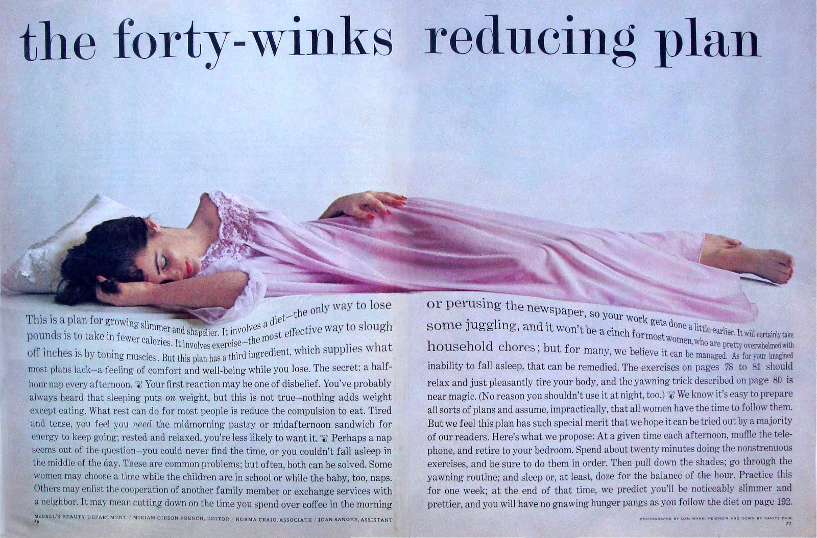
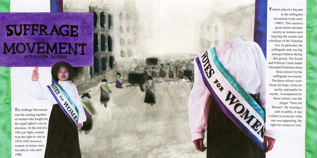
Fashion played a big part in the Suffragette Movement in the early 1900’s. This caused a great notion amongst society as women were rejecting the corsets and crinolines of the Victorian Era. Like men, women were seen wearing trousers and pantsuits, in preachment of the comfortable clothing movement. Unlike any other protest, the Suffragette Movement did not shy away from the public eye. Many women who supported the movement wore the colours green, purple, and white in solidarity of women having equal rights to men. These three colours were chosen by Christabel Pankhurt, who was the co-founder and leader of the Social and Political Union. The colour green represents hope, purple for royalty, and white for purity. The Suffragette Movement not only change the right for women to vote, but it made fashion for females more progressive and more diverse decades after. 

Women supporting the Suffragette Movement were expected to dress in either all white, or in the three colours, white, green, and purple. This is an example of one of the many types of suffragette sashes worn during this time.
https://blog.fitnyc.edu/volumesandissues/2017/01/20/textiles-speak/

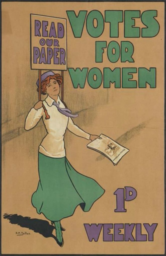
Though controversial, fashion houses such as Peter Robinson, best known as Topshop today had well supported the Suffragette Movement.  Storefronts helped promote pieces of clothing such as scarves in the iconic green, purple, and white colours. With the whole dress according to the occasion movement, “Vote for Women”, a newspaper house argued to be conscious when buying white dresses for the movement and to only buy from companies who supported the Suffragettes. This comes to show how intense this protest was that no matter what one does, there will always be an afterthought of doing the right thing for women.

Example of a suffragette poster used to advertise the movement in 1910.
https://mymodernmet.com/womens-suffrage-poster-cambridge-university-library/

What I have learned from this time period was that in order to do justice to the Suffragette era, I would need to include the iconic colour trio into my fashion artifact. These colours back in the day were the main determinants to show whether you were a supporter of this cause or not.

My idea for this artifact is to recreate the sash that was worn by women during the Suffragette Movement. This was an important piece of clothing as it was a wearable piece of promotion for the Suffragette Movement. 

Sources:

https://americanhistory.si.edu/collections/search/object/nmah_509474

https://en.wikipedia.org/wiki/Black_suffrage

https://www.stylist.co.uk/fashion/suffragette-movement-fashion-clothes-what-did-the-suffragettes-wear/188043

https://www.womenshistory.org/resources/general/woman-suffrage-movement

Knowing I was being given a fashion artifact for Survey 6, I felt extremely excited and enthusiastic about the project ahead. I decided to dedicate this spread towards the Suffragette Movement because I had learned a bit about this topic in high school, yet I wanted to further my knowledge of an important event that improved lives for millions of women. When researching, I found the Suffragette sash to be one of the most well-recognized clothing pieces of this time. I like how the sash was a piece of clothing that signified unity amongst women. For this reason, I felt the need to shine light on this event and try to educate others on my learning.

I am much happier and satisfied with the turnout of my second spread compared with my first because I felt like the process ran much smoother, which allowed me to really comprehend how I was applying my knowledge into this project. I would give myself an 8.5/10 for this artifact because I was able to go out of my comfort zone and try something new, yet not allow this new thing to affect the execution of the final product like how it did for my first spread. My experience with sewing is very slim. I have not played around with sewing a lot, so I believe the turnout of my satin Suffragette sash was very successful. What I think I could have improved on with this project was photographing the sash. Initially, I wanted to iron on my text to the back of my sash using iron-on fabric paper, however, because I used satin, I was unsure if the material would work the same as if it were cotton fabric. That lead me to photograph the sash vertically so that later on I could paste the text on with glue. I wish I would have done a better job at incorporating my text because I felt like it was a bit lacklustre. Aside from the text, I was very happy with the background illustration because I felt like it was able to set a good mood for my time period yet not take away too much from the actual artifact itself. 

Expressionism, Fauvism, & Early 20th Century

RAOUL DUFY (1877-1953)

Raoul Dufy was a late 18th century french painter who explored different mediums such as woodcuts, ceramics, and tapestries. In 1912, Dufy became the founder of a textile company, where he made textiles out of cotton and silk. What motivated Dufy to pursue art was for his first job working as a junior clerk at a coffee importing firm. This was where Dufy witnessed many boats that he felt ignited to enroll himself at Le Havre’s Ecole des Beaux-Arts shortly after. Dufy’s work is defined as fauvism because Dufy tended to use plenty of bright colours in his paintings. Dufy’s subject matter of choice were horse races, regattas, parades, and concerts. 

“The Hunt” (1919) was one of the fabric patterns Dufy designed. This pattern reminds me of Hawaiian prints because of the rounded petals on the flowers and the variety of strokes on the diverse selection of plants.
https://www.wikiart.org/en/raoul-dufy/the-hunt-design-for-fabric

Dufy is an artist whose work I can picture on the cover of a magazine or poster. When I look at Dufy’s work, I gain a sense that Dufy was not afraid of taking risks. Not only does Dufy use a wide range of colour in majority of his pieces, the detail on Dufy’s work is quite minimal, yet has enough information that I can gain a sense of what the image is suppose to resemble. My first impression when I saw Dufy’s work was that Dufy was an artist not to be taken seriously. His works such as “The Kessler Family on Horseback” feel playful and lively. This might be because of the painting scenes of his choosing.

“The Kessler Family on Horseback” (1931) is a very minimal yet chaotic piece because Dufy uses many colours and has many subjects in a cluster, yet has the bare minimum of strokes for the people and horses on scene.
https://www.tate.org.uk/art/artworks/dufy-the-kessler-family-on-horseback-t03566
“La Réception à l’Amirauté” (1936) is one of my favourite pieces by Dufy because it reminds me of a collage due to the mismatch in colours each person is drawn in. The perspective of the painting is very interesting because the people in the foreground are almost equally as small as the people in the midground.
https://www.artsy.net/artwork/raoul-dufy-la-reception-a-lamiraute-reception-at-the-admiralty
“Open Window, Nice” (1926), oil on canvas.
https://www.artic.edu/artworks/23639/open-window-nice

Sources:

https://www.britannica.com/biography/Raoul-Dufy

https://en.wikipedia.org/wiki/Raoul_Dufy

Impressionism & Post Impressionism

CAMILLE PISSARRO (1830-1903)

Camille Pissarro was one of the few contributing artists who shaped the impressionist movement. Because Camille Pissarro was a french artist of Portuguese descent, he was often looked at as an outsider. In addition to his disliked origins, Pissarro’s art style was not idealized by the Paris salon. Like Monet and Cezanne, Pissarro’s approach to landscape paintings was much more experimental and modern at the time of realism, pre-impressionism, and pre-raphaelites. By not being able to showcase his artworks like his peers, Pissarro and other artists such as Cezanne, Edgar Degas, Edouard Manet, Pierre-Auguste Renoir began to create what was known as their own art exhibition. In 1873, Pissarro showcased five of his paintings, some including The Old Road to Ennery, Bourgeois House at L’Hermitage, Pontoise, and his own self-portrait.

The man in “The Old Road to Ennery” (1873) is shown to be doing his everyday tasks in the countryside.
https://commons.wikimedia.org/wiki/File:Camille_Pissarro_-_Gel%C3%A9e_blanche,_ancienne_route_d%C2%B4Ennery,_Pontoise_-_1873.jpg
“Bourgeois House at L’Hermitage, Pontoise” (1873)
http://www.camillepissarro.org/bourgeois-house-in-at-hermitage-pontoise.jsp
Camille Pissarro’s self-portrait (1873)
https://www.wikiart.org/en/camille-pissarro/self-portrait-1873

When I look at Camille Pissarro’s pieces, I see myself enjoying his earlier works such as Paisaje tropical con casas rurales y palmeras much more compared to his more recent pieces. What I like about Paisaje tropical con casas rurales y palmeras is Pissarro’s choice of a warmer colour palette. Even though it is clear that Pissarro is not painting in a realistic manner, his figures in this piece are well recognizable, which I find it a little more challenging when I look at his later pieces. For instance, Haymaking, Éragny is a painting that I dislike because I find it hard to concentrate on what the main subject is. There appears to be no real subject manner. The painting’s delivery lacks depth and the colours are not my ideal compared to when I look at Paisaje tropical con casas rurales y palmeras.

“Paisaje tropical con casas rurales y palmeras” (1867) was a piece Camille Pissarro worked on early in his career when he moved to Venezuela.
https://theculturetrip.com/europe/france/articles/10-artworks-by-pissarro-you-should-know/
“Two Women Chatting by the Sea, St.Thomas” (1856) is a painting that well displays Pissarro’s ability in capturing outdoor lighting with oil paint.
http://www.camillepissarro.org/camille-pissarro-painting-gallery6.jsp

Sources:

https://www.biography.com/artist/camille-pissarro

http://www.camille-pissarro.org/

https://www.theartstory.org/artist/pissarro-camille/

Survey 3: Design Infographic Rationale

My experience with having to do my first history spread on the Rococo period started off rocky. When I was assigned design for my infographic, I assumed I was given the broad topic of design and did not realize design meant graphic design. This lead me to believe that I had the freedom to do anything that was considered design. I had sketches of designs based on my admiration for interior design during this period. Thinking about furniture and interior decoration, I thought it would be really fun to recreate and do my interpretation on an “Ikea” catalogue. After realizing my mistake, I decided to not let this idea go to complete waste. I decided to base my spread on different types of typography developed during this period that was influenced by interior design at the time.

I would rate my spread an 8/10 because I thought my idea was really good but I was not satisfied with the completion of it. I ran into a bunch of artistic problems such as the type of medium to use. At the start, I used pencil crayon to colour in the hands and background. However, it did not look very vibrant as I wanted it to so I resorted to using acrylic paint. At the same time, I had planned to use gold leaf because the Rococo had a lot of gold as the interior. I found it to be a mistake because I had never had the proper experience using gold leaf that it left me with great difficulty placing the gold leaf onto my spread evenly. Other then the type of medium, I would have made the text of my spread look more interesting. Whether I incorporated the appropriate text for each blurb or added little statistics and diagrams, I wish I had made my infographic look more so like an infographic.

Survey 5: Queen Victoria and Her Influence on Fashion

The Victorian era was well known for its extravagance and decorative touches. England at the time was ruled under Queen Victoria who played a big part in Victorian fashion and art. During her ruling, England’s technological advances from the Industrial Revolution helped fashion spread across the country. As big advocates of the arts, Prince Albert and Queen Victoria created the Great Exhibition, an international art exhibition that stretched eight miles. It was at the exhibition where textile designers were able to showcase their designs to the world. This created a major shift in fashion. Fashion no longer belonged exclusively to the upper class. Due to the great technology at the time, the mass production of fabrics allowed the middle class to become big consumers of these decorated fabrics. The list of fabrics highly consumed by the middle class included patterned cottons and woven silks.

The Great Exhibition in 1851. Fabric designers were able to display their works in booths for thousands of visitors to see. This was an example of the exhibit of Tunisian textiles.
http://www.vam.ac.uk/content/articles/t/tunisian-textiles-at-the-great-exhibition/

The Great Exhibition in 1851 led to fashion’s role distinguishing people of certain social classes. The dress, for example, was an essential piece found in every woman’s wardrobe, despite their social class.

This was the dress Queen Victoria wore during the grand opening of the Great Exhibition.
The dress has the same characteristics you would find in a dress worn by an upper class female. The neckline is wide yet conservative and the colours are soft.
http://www.gogmsite.net/early_victorian_-_1837_-_18/queen_victoria/1851_dress_worn_by_queen_vi.html

There were certain types of dresses dedicated for occasions and certain classes. For example, women of the upper class were expected to wear more conservative dresses compared to women of the middle class. These dresses were stiff as “dropped shoulder lines and corsets” were restrictive. Women in the middle class wore petticoats, corsets, or chemises under their gowns and dresses.

The dresses we associate with the Victorian era were actually skirts with a bodice. The skirt itself was what made the Victorian fashion so remarkable. Skirts at this time were shifting away from the traditional dome shape frame to a more flared silhouette. Flared skirts began to overpower the women’s fashion industry because it accentuated the woman’s waist size, creating an hourglass illusion. This illusion was so idealized by fashion designers that crinoline, a thick type of fabric made of horsehair, was used to help add the needed volume for this skirt. Although elegant looking, the “multi layered petticoat” skirt was not the most comfortable piece of clothing to wear. It no longer made sense to create an article of clothing that was not comfortable to wear for long periods of time.  In the 1850’s “hoop skirts” made designers rethink the construction of the skirt. The hoop skirt provided a nice shape without the weight, unlike the crinoline. The hoop skirt consisted of steel rings of various sizes that was held together by fabric tape. This new innovation enabled skirts to eliminate the amounts of fabric that was used before.

The basic framework of a hoop skirt.
http://www.kristinholt.com/archives/6877

Sources:

https://bellatory.com/fashion-industry/Fashion-History-Victorian-Costume-and-Design-Trends-1837-1900-With-Pictures

http://www.gogmsite.net/early_victorian_-_1837_-_18/queen_victoria/1851_dress_worn_by_queen_vi.html

https://www.metmuseum.org/toah/hd/txtn/hd_txtn.htm

https://en.wikipedia.org/wiki/Victorian_fashion

https://www.royal.uk/queen-victoria

https://sites.google.com/site/thevictorianmiddleclass/clothing-and-fashion