Realism, Pre-Impressionism, & Pre-Raphaelities

WINSLOW HOMER (1836-1910)

Winslow Homer is an artist I believe first year Idea Program students can resonate with. Homer was an all-american landscape painter and printmaker who started off as a commercial illustrator at the age of 19, as he apprenticed for J. H. Bufford. Afterwards Homer began to specialize in making sheet music covers during his first two years of his career, then eventually he branched into bigger jobs such as working for Harper’s Weekly. Before starting his career, Homer and his family were well off, his uncle had a mansion in Belmont that inspired Homer’s first few works. Attending school at the National Academy of Design in New York, Homer was sent by Harper’s to sketch and draw the Amercian Civil War in 1861-1865. This opportunity transitioned Homer’s illustrated style into the more traditional art form. It was after getting back from the war was when Homer explored more with paints. 

Homer’s “Great Russian Ball” for Harper’s Weekly (1863).
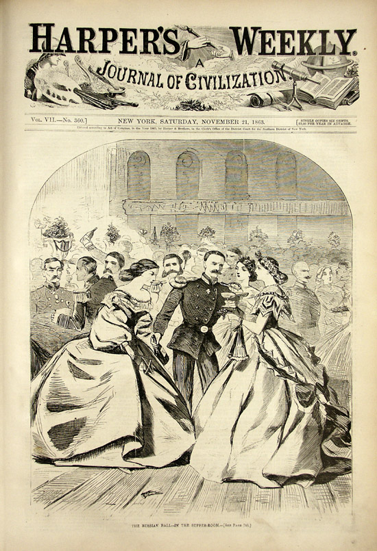
http://www.sonofthesouth.net/Winslow_Homer_Civil_War_1863.htm
“The Return, Tynemouth (recto) Study (verso)” (1881) was a watercolour painting painted during the American Civil War.
https://www.artic.edu/artworks/113064/the-return-tynemouth-recto-study-verso

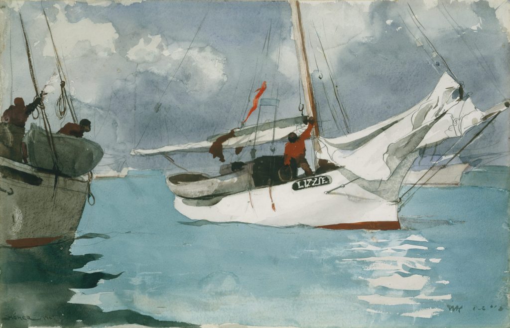
Winslow Homer’s career is a career I aspire to have. It did not seem like it was a struggle for Homer to start his career as an artist due to his apprenticeship with J. H. Bufford. Even so, Homer’s family was well off and had the money to send Homer to study abroad if Harper’s did not send him off to war instead. As for Homer’s paintings, it makes sense as to why Homer was a well renowned landscape artist of his time. As one who has experience with watercolour, it takes a great deal of confidence to use. I say that because unlike oil paint, it is very hard to layer and fix mistakes. However, if used right, watercolour can create an illusion of airiness and movement, which is why I think watercolour suits Homer. What I can depict from Homer’s art style is that it is very free handed, his strokes are painted with assurance. For example, “Fishing Boats, Key West” is a painting of three men fishing on their fishing boats. Homer does not focus on making his painting look life like. Instead Homer focuses on giving off the illusion that the atmosphere is moving.

“Fishing Boats, Key West” (1903)
https://www.metmuseum.org/toah/works-of-art/10.228.1/
“After the Hurricane, Bahamas” (1899) is a piece that explores the idea of weather patterns and the dangers that it brings.
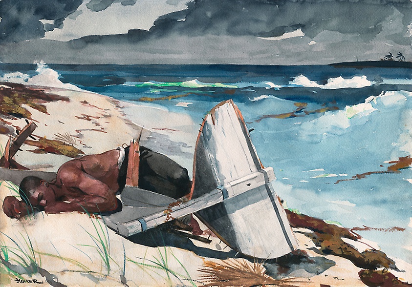
https://www.artic.edu/artworks/16776/after-the-hurricane-bahamas
“Prout’s Neck, Breakers” (1883). Homer focuses solely on the ocean and how with each wave contains the power to make it to shore.
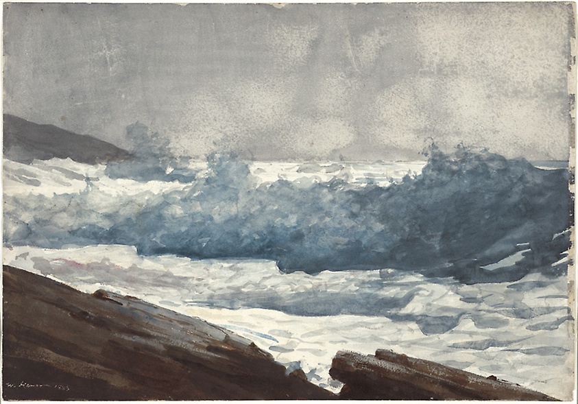
https://www.artic.edu/artworks/16815/prout-s-neck-breakers

Sources:

https://www.artic.edu/artists/34988/winslow-homer

https://www.metmuseum.org/toah/hd/homr/hd_homr.htm

https://en.wikipedia.org/wiki/Winslow_Homer

Neoclassicism, Romanticism, & Rococo

JEAN-BAPTISTE CHARDIN (1699-1779)

Jean Baptiste Chardin, master of life drawings, was special as he did not fit into the period of paint style of his time. He did not fit in the category of the Rococo period because he did not use soft colours that displayed scenes of love and entertainment in his paintings. Rather he was a genre painter who painted everyday life. In spite of the fact that Chardin had produced 200 paintings during his 50 year career, Chardin was well admired for his activity amongst the Academy. Chardin had the role of treasurer, to manage finances in the Academy. Chardin by 1770 became ‘Premier peintre du roi’ and took the lead as the highest paid member in the Academy. 

Jean Baptiste Chardin’s “Self Portrait” (1771)
http://spokenvision.com/jean-chardin-the-great-18th-century-still-life-painter/

I respect Jean Baptiste Chardin as an artist because he did not feel the need to follow trends during his time period. He stuck with what he was good at and that was life drawings. Chardin reminds me of Baroque artist Jan Steen because one of Chardin’s pieces called Soap Bubbles looks like it was painted in the exact same setting as Steen’s “Rhetoricians at a Window”. Both paintings contain a subject leaned up against the edge of a windowsill. In the top left corners of Chardin and Steen’s paintings includes a vine of leaves of a similar sort. Other than the subject matter, the only difference between the two paintings is for Chardin’s use of muted dark colours, creating a soft hue, whereas Steen’s painting uses tiny pops of colour to emphasize his depicted object, producing the illusion of a more crisp and refined painting.

Jean Baptiste Chardin’s “Soap Bubbles” (1733-1734). Chardin possibly used Jan Steen’s “Rhetoricians at a Window” (below) as inspiration.
https://www.britannica.com/biography/Jean-Baptiste-Simeon-Chardin
Jan Steen’s “Rhetoricians at a Window” (1658-1665)
https://en.wikipedia.org/wiki/Jan_Steen

 Although life drawings are not meant to give off emotion, I find Chardin’s pieces to feel intimate and humble. His brush strokes are soft and somewhat abstract, which creates a nice glow to his pieces. I am not alone in giving my opinion. According to Britannica.com, after Chardin died in 1779, Charles-Nicolas Cochin wrote a letter to Haillet de Couronne about his interaction with Chardin. Cochin asked Chardin “But who told you that one paints with colours?” Chardin’s response was “One uses colours, but one paints with feeling”.

“Pears, Walnuts and Glass of Wine” (1768). Oil on canvas.
http://spokenvision.com/jean-chardin-the-great-18th-century-still-life-painter/
“The Ray” (1728) was the piece that gave Chardin a spot in the Academy. Out of all the life drawings created by Chardin, I understand why this one was one of his most famous pieces. The subject matter of the ray is an unusual choice for a painting and because it is somewhat graphic with the cat crawling on the dead fish around it, makes it shocking for its viewers.
https://en.wikipedia.org/wiki/The_Ray_(painting)

Sources:

https://www.britannica.com/biography/Jean-Baptiste-Simeon-Chardin

https://en.wikipedia.org/wiki/Jean-Baptiste-Sim%C3%A9on_Chardin

Survey 4: The Industrial Revolution

Though harshly criticized for being one of the main causes of climate change today, it is no doubt that the Industrial Revolution was the peak of technological advancement, but more specifically fashion. Even with the era gap of over three hundred years, the Industrial Revolution still has a major influence on fashion in the twenty first century. This period in time was what enabled the possibilities of fast fashion. Before this time, clothing was seen as nothing but an expensive necessity. In the 1600’s, Britain’s fashion was seen to be very stiff and conservative. By having the tools such as the “Spinning Jenny” which was a multi-spindle spinning frame, people were able to wear looser and breathable clothing made of cotton. Thinner fabric was achievable through cast iron technology, a highly malleable iron with a low melting point used in a lot of factory machines today. The power in machinery had the capabilities to weave and knit breathable fabrics such as cotton. 

the “Spinning Jenny”, a multi-spindle spinning frame created by James Hargreaves in 1764.
https://interestingengineering.com/james-hargreaves-the-inventor-of-the-spinning-jenny

Fashion played a big role in distinguishing the social classes in this time. Unlike the periods before, the clothing made during the Industrial Revolution was a form of self expression and identity.  Anything from colours to patterns, to accessories helped people break free from previous periods of tense and traditional wear. Women started to reject the idea of wearing a tight, structured corset and began to wear a corset that was made of a more flexible material. Some women even freed from the concept of wearing a corset and instead chose to embrace their curved bodies through the lightness of their clothing. Women at the time were beginning to branch away from tradition and explore new ideas with fashion.

Portrait painting of Henriette de Verninac (1799) who is wearing a loose dress with no corset. Dress seems to be made out of a light cotton which explains for the lack of structure in the dress.
https://en.wikipedia.org/wiki/Henriette_de_Verninac#/media/File:Jacques-Louis_David_Henriette_de_Verninac_1799.jpg
By Jacques-Louis David, Public Domain, https://commons.wikimedia.org/w/index.php?curid=30998291

In similarity, men’s fashion started to evolve from the influences of the French Revolution in 1789, where Napoleon and Beau Brummell were idolized for their fine tailored suits. Despite the lack of fashion knowledge that these two men had, Napoleon and Beau Brummell were two men who knew how to make an appearance. Napoleon, known as the man who led the French Revolution influenced men’s fashion by dressing him and his army in uniforms that showed nationalistic pride. As for Beau Brummell, he was a dandy who loved wearing tailored suits, linen, and trousers. He did not work directly in the fashion industry but maintained a sharp appearance which changed fashion for most men during the Industrial Revolution. 

It is interesting to see that lots of trends seen in stores today were actually trends that had originated during the Industrial Revolution period. In my personal opinion, I think the Industrial Revolution was one of the best periods in time. Not only were people exploring with ideas of science and technology, people were also exploring new ways of self expression. For me, clothing is a piece of my identity. I dress accordingly to how I feel and it makes me feel confident in knowing that I can show others my personality through another medium other than speech.

Sources:

https://www.blankstyle.com/articles/clothing-and-textiles-industrial-revolution

https://en.wikipedia.org/wiki/1795%E2%80%931820_in_Western_fashion

http://www.ooshirts.com/guides/The-Clothing-and-Textile-Revolution.html

Baroque

JAN STEEN (1626-1679)

Jan Steen was a man who lived an unusual life in comparison to his colleagues. He grew up in Leiden, Holland in 1626, where his father was a brewer who owned a tavern named “The Red Halbert”. Steen was taught by german painter Nicolaes Knupfer who was well known for his “historical and figurative scenes in Utrecht”. As an observer, I can pinpoint characteristics such as composition and use of colour where Steen took influence from Knupfer’s teachings. Unlike other artists who only had one occupation- art, Jan Steen relied on his brewery background as a source of second income where in 1654 he ran a tavern named “De Slang” and opened another after the “Year of Disaster” in 1672. Jan Steen was not rich for most of his lifetime, thus had to compensate through his art, which Steen was able to produce approximately 800 paintings in his career.

“Feast of the Chamber of Rhetoricians near a Town-Gate”. As you can see, Steen’s brewery background influenced a lot of his paintings.
https://www.tripimprover.com/blog/rhetoricians-at-the-window-by-jan-steen

By looking at Steen’s work, I can very much tell that he was an artist during the Baroque period. Steen’s works are very good at showing movement, as each of his paintings were mainly influenced by the chaos of social gatherings like in “The Dancing Couple” where a group of people look to be having intoxicated fun at a local bar. “Rhetoricians at a Window” is one of my personal favourites because it shows a strong sense of Steen’s humorous style. It may be because of the man in the back poking his cheek and grinning, or the contrast between the man proudly reading out a story and the man to his right looking in complete boredom, but this painting radiates a fun and playful attitude. Despite the fact that Steen likes to paint more chaotic and fun settings, he has painted a couple serious paintings in his lifetime such as “The Lovesick Maiden”.

“Rhetoricians at a Window” (1658-1665)
https://en.wikipedia.org/wiki/Jan_Steen
“The Lovesick Maiden” (1660). Steen paints subtle hints that the woman is lovesick by adding Cupid in the doorway and an open bed to her right.
https://www.metmuseum.org/art/collection/search/437748
“The Dancing Couple” (1663). Oil on canvas.
https://www.britannica.com/biography/Jan-Havickszoon-Steen

Sources:

https://www.britannica.com/biography/Jan-Havickszoon-Steen

https://www.tripimprover.com/blog/rhetoricians-at-the-window-by-jan-steen

https://en.wikipedia.org/wiki/Jan_Steen

High Renaissance & Mannerism

RAPHAEL (1483-1520)

Though lived a short life, dying at the age of 37, Raphael was well recognized for his works as an italian painter and architect during the high renaissance. In the early years of Raphael’s career, it is said that he apprenticed for Perugino. The similarities between Raphael’s early pieces such as “The Marriage of the Virgin” to Perugino’s piece “Giving of the Keys to St. Peter” show that Perugino had a heavy influence on Raphael at the time. Small things such as the way the two painters painted their hands on their figures are almost identical. However the similarities started to wear off once Raphael furthered into his career. People were beginning to distinguish Raphael for his strong sense of form and composition he used in his pieces such as the “Vision of a Knight”, “Three Graces”, and “St. Michael”. It is undeniable that Raphael was talented. This high renaissance artist had great knowledge when it came to using composition and perspective in his paintings. I might be bias because the High Renaissance is one of my favourite eras in art history, but I have a great respect for Raphael. It is evident that Raphael’s paintings are much simpler than other artists during this period of time, however I think the simplicity works well for him because he is able to incorporate composition in all of his pieces, which gives his viewers a clear sense of focus. The simplicity in Raphael’s painted figures help give off a feeling of sweetness and innocence, which I find charming because it helps soften a topic. This can help if I am looking at one of Raphael’s more gruesome pieces.

Raphael’s “Marriage of the Virgin” (1504). Similarities such as the central building in the background was said to be inspired by Pietro Perugino’s “Delivery of the Keys”.
https://en.wikipedia.org/wiki/The_Marriage_of_the_Virgin_(Raphael)
Pietro Perugino’s “Delivery of the Keys” (1481-1482)
https://en.wikipedia.org/wiki/Delivery_of_the_Keys_(Perugino)
Raphael’s “Vision of the Knight” (1504-1505); egg tempera painting on poplar.
https://en.wikipedia.org/wiki/Vision_of_a_Knight_(Raphael)
Raphael’s “Three Graces” (1504-1505). This pieces represents the stages of a developing woman.
https://en.wikipedia.org/wiki/Three_Graces_(Raphael)
Raphael’s “St. Michael” (1504-1505). This oil painting shows St. Michael battling the “demons of Hell”.
https://en.wikipedia.org/wiki/St._Michael_(Raphael)

Sources:

https://www.britannica.com/biography/Raphael-Italian-painter-and-architect

https://en.m.wikipedia.org/wiki/Raphael

https://www.google.ca/amp/s/www.theartstory.org/amp/artist/raphael/

Late Gothic & Early Renaissance

Hugo Van Der Goes (1440-1482)

Considering that Hugo Van Der Goes is known to be one of the most influential artists in northern Belgium, most of his life remains unknown due to his short life span of 42 years. Yet, Goes’ career is still well established through pieces such as the “Adoration of the Kings” and “Portinari Altarpiece”.

“The Adoration of the Kings” (1470)
“Portinari Altarpiece” (1475)

Goes uses proportion to bring focus to Virgin looking down on baby Jesus, who is highlighted in a golden hue.

Hugo Van Der Goes is an early renaissance painter who specializes in flemish paintings. All of Goes’ pieces share one common theme of Christianity, as most of his pieces were commissioned by the Roman Catholic “City of Ghent”. What makes Goes’ style authentic is his limited colour choice in his paintings. In the transition between late gothic to early renaissance, viewers can see that most of Goes’ paintings are dark in colour. That is because Goes uses certain colours to highlight his symbolism. Blue would be used to show purity, red to show holy spirit and white to represent goodness. Goes does a good job at storytelling, allowing his viewers to gain a better understanding of the meaning of his paintings through hidden messages. 

“Portrait of a Man” (1475)

From his paintings, I can tell that Hugo Van Der Goes was a well educated artist with a good understanding of the Christian religion. Goes knew how to tell a story through his art. What made his style particularly interesting was although Goes was known to take a certain realistic approach to his figures, Goes also experimented with his work by diverting away from reality and seeking the immortal. In most of his well recognized pieces such as “The Fall” and “The death of the Virgin”, he includes drawings of angels, and animocaputs. 

“The Fall of Man and The Lamentation” (1479)
“The Death of the Virgin” (1470)

In the centre is a bed where the Virgin lies, dressed in pure colours. Surrounding her are twelve chief disciples, whose faces express sadness and despair. Yet, above the virgin is a yellow circle, representing light, and in the circle are Christ and angels waiting for Virgin’s soul to follow them up in heaven.

Sources:

https://www.wikiart.org/en/hugo-van-der-goes/the-adoration-of-the-kings-monforte-altar

https://www.italian-renaissance-art.com/Van-der-Goes.html

http://www.visual-arts-cork.com/old-masters/hugo-van-der-goes.htm

https://en.wikipedia.org/wiki/Hugo_van_der_Goes