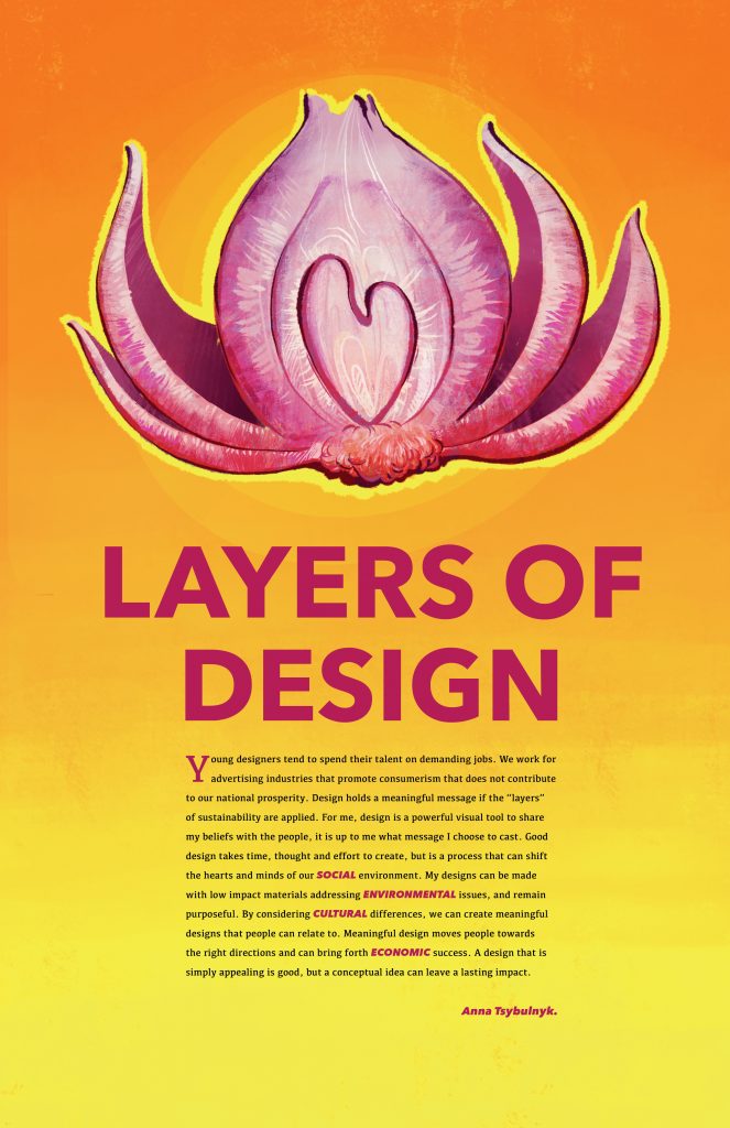
This poster has been created to reflect my design personality and explain my sustainability practices. I chose the onion imagery because “onion” was my nickname back at my home country due to my last name. Onion is also a layered vegetable which makes it the perfect image for layers of the design idea. The objective was to invite the audience to practice sustainability on their own. A drop cap has been added to lure the viewer into reading. The paragraph has been made as small as possible to make it look approachable. Also, the four words representing sustainability pillars have been bolded and coloured a purplish shade to relate them back to the onion (the layers of design) and make them stand out to the reader. I have chosen a colourful approach to represent my drawing style, however, a more simple and stylistic style could have a bigger impact. I have attempted to make this poster personal and unique but there are always possibilities for improvement. Based on my rationale, my self-evaluation rating would be 8/10 for this project.
Here are some links to the manifestos I took inspiration from:
Leave a Reply