• Contact
  • Find
  • Terms of Use
ePortfolios
  • Home
  • Getting Started
    • Who can use CapU ePortfolios?
    • Curating Content
    • Building Your ePortfolio
    • Sharing Your ePortfolio
  • FAQs
Select Page

#19– Add Alt Text to your Images

by Trula Fountaine | Jul 12, 2017 | Blog, User Experience

Use alternative (alt) text for your images. Alt text is essential for people with accessibility screen readers, which helps them understand the content on the page. If your image ends up breaking (broken link), the alt text takes it’s place.
← #20– Display File Sizes → ← #18– Optimize your Images →

#20– Display File Sizes

by Trula Fountaine | Jul 12, 2017 | Blog, User Experience

Be conscious of people accessing and looking at files on their mobile devices. When you’re linking to files on your website, indicate how large the file is so they can decide if they want download it using their data plans.  
← #21–Serving Different File Types → ← #19– Add Alt Text to your Images →

#21–Serving Different File Types

by Trula Fountaine | Jul 12, 2017 | Blog, User Experience

When linking to .docx, .pdf, .xlsx, etc., make sure to add these extensions to links so that people know what to expect. Avoid generic ‘click here’ links. Instead use the title of your file as the link and work it into a sentence. Example: Download and complete Paragraph Assignment 1 (.pdf) before Thursday, May 11.
← #22– Clean Formatting → ← #20– Display File Sizes →

#22– Clean Formatting

by Trula Fountaine | Jul 12, 2017 | Blog, User Experience

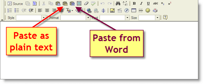
If you’re copying and pasting text from Word, use the WYSIWYG Paste from Word, Paste as Plain Text or Sweeper tool option. This helps clean up the appearance of the text and removes unnecessary code from the back end.
← #23– Two Font Styles Max → ← #21–Serving Different File Types →

#23– Two Font Styles Max

by Trula Fountaine | Jul 12, 2017 | Blog, User Experience

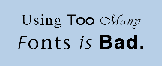
Avoid using more than 2 fonts for your website. Too many fonts can make people wonder why the fonts are different and what the emphasis is intending. One serif and sans-serif font is recommended. Don’t forget that you can also italicize or bold your fonts, giving you more flexibility and options.  
← #24– Avoid Centering Text → ← #22– Clean Formatting →
« Older Entries
Next Entries »
  • Home
  • Getting Started
  • FAQs