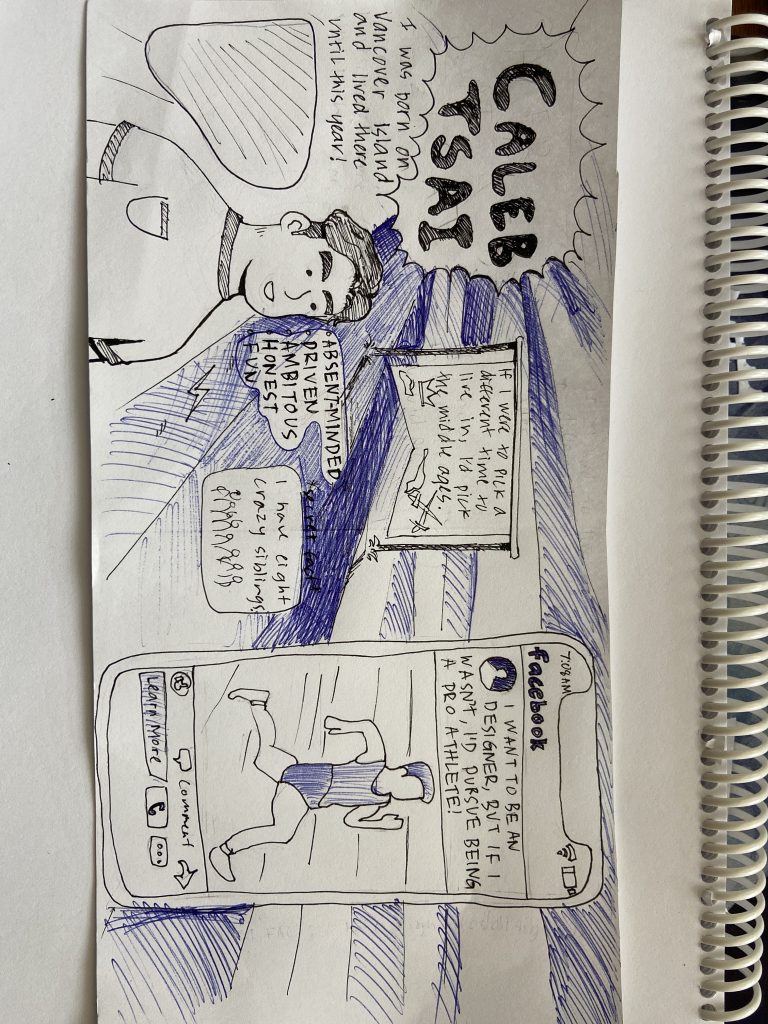
To start the year, I was tasked with creating a yearbook spread that showed the world more about myself. After a while of contemplating how I would approach the design, I finally decided I wanted to use ball pens to create a spread that represented my fast paced life.
I decided to have a portrait of myself in the left corner of the spread and to the right would be a mobile phone with a photo of what I would pursue if I wasn’t going into design. I tried to draw it similar to a Facebook ad because I am also into marketing and social media. I put the time at 7:08 am because I am an early bird and sleep in rarely. I sketched the design with a pencil first, then went over it with a black pen. I was pretty happy with how it looked. Then I went over with my blue pen and I immediately got sad because it didn’t go the way I wanted. I tried to add more blue to block out some of the noise it was causing but it just got a bit worse. In the end it didn’t go as planned but isn’t the worst piece I’ve done. At least it still followed the point of the project and told the world a bit more about myself.

Leave a Reply