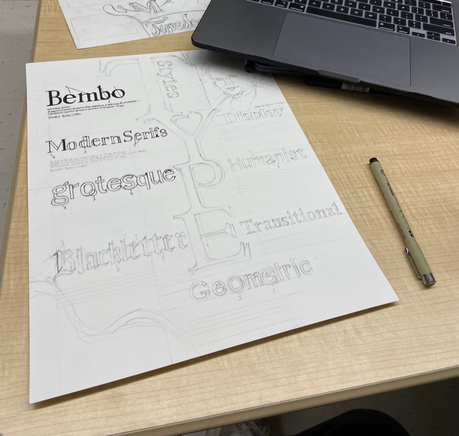
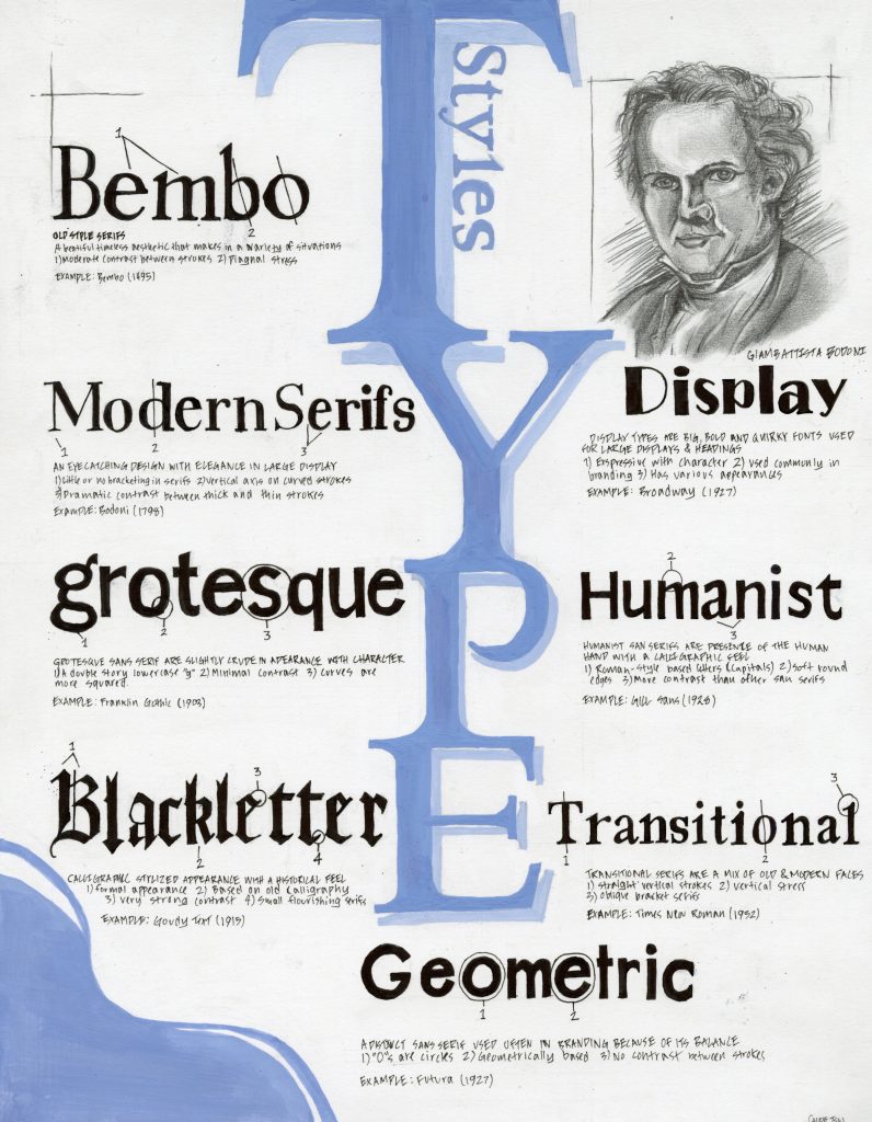
This poster was a long process with a satisfying end result. From doing multiple concept sketches to designing from scratch online, I am happy to be finished with it. I originally took a very dimensional and abstract approach to the design with overlapping letters. However, I changed from this because it looked too busy with all the types of information and traits on the poster. Because I desired a clean outcome, I designed the whole poster from scratch online before sketching the final draft. I also took into consideration what types of challenges I might face with the mediums I would use. Since I was using gouache and ink, that meant that in the design, the colors could not overlap the text. After hours of revision, I decided on a design that is focused on the type styles with a soft blue title that complements the black inked fonts. I added a small rendered portrait of Bodoni to have an extra element for the viewer’s eyes to rest on because it added a touch of emotion to the poster. Since the title was soft blue, it did not stand out from the black fonts so I added a shadow to make stand out more by “Popping” ou from the paper. I ended up spending one hour on concept sketches, eight hours on designing online, six hours on the final sketch, and three hours on inking and penning. The total hours I spent on this project were eighteen hours. I believe I deserve a 9/10 for this project because of the well-revised design and layout of the final execution. I believe It is not 10/10 because, in my online design, the black fonts were at a smaller scale. In my finished poster, I drew the fonts too large so that they look a bit too bold and stole the viewer’s eyes from seeing the whole design in a cohesive way. If I redid this poster, I would trace the fonts so that they would fit the scale of the poster better.
Leave a Reply