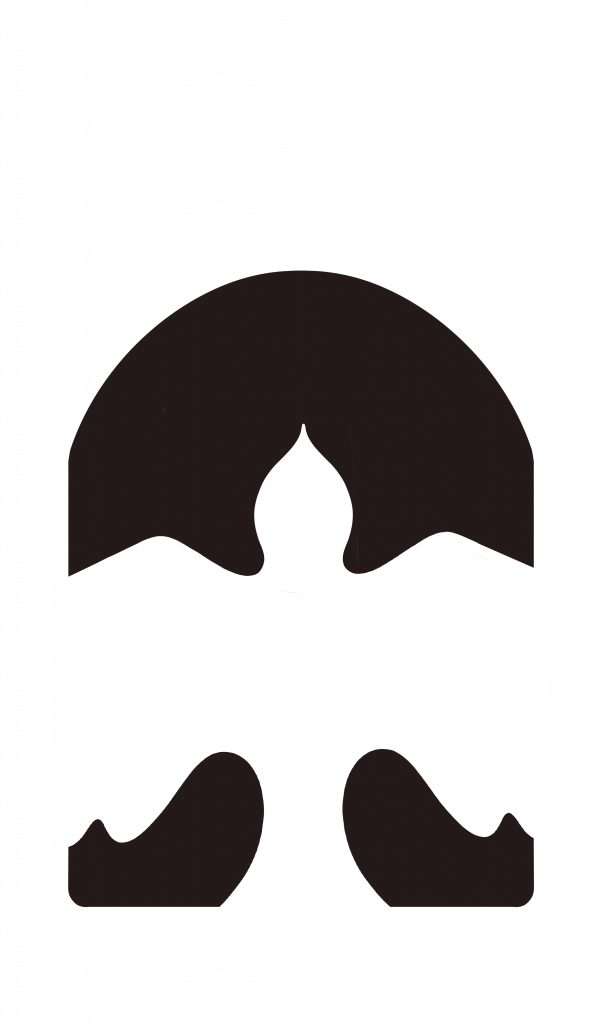
For my final logo, I ended up revisiting my third concept from the earlier round (which I felt was working the best). The problems that we identified in the critique were that it needed to tie more strongly to the idea of a pigeon coop. While I think the aerial view of a field is a lovely visual and does tie in with the story, it ultimately gets lost without an explanation. And even there, it does perhaps take too many leaps
My main reason for continuing with the third concept was that I liked the balance it struck. I think (with a lot of work, don’t get me wrong), it has the potential to be a beautiful mark, while at the same time being very utilitarian. I can see it working as a watermark with my illustration quite well, which is an important quality that was absent in the other concepts.
I’m proud of my progress through this logo because logos are still something I struggle a lot with, it’s not resolved yet. I’m much happier with the shape of the pigeon, but I feel like there is still some award negative tension in the logo I’ve arrived that I need to fix. Another worry, I have is that because it’s a dove, it might feel too soft against some of my illustrations. Additionally, I feel like it could be misinterpreted as a charity or humanitarian group logo, just because of the dove imagery. Perhaps adding some more angles into the bird’s wing could help that issue. In all, I would probably give myself a 7.5/10, I don’t think it’s a failure, but it would still really benefit from some polishing up.