My partner Tina and I were assigned to create a cover for the Idea 22 History book we’ve been making spreads for this term. We first struggled a lot with the design, and our initial sketches very much dependent on literally depicting the events, people, and inventions from different time periods. Unfortunately, these thumbnails would be rather weak cover designs, or at least would blend in with the hundreds of other history books. So, Tina and I switched gears and turned towards a more conceptual approach. Namely, we wanted to depict our major takeaways from the course, namely: the cyclical nature of history and the connections between the different events. From this ensued many thumbnails, including one with a map. I did some more thumbnails with the map, and while I could plot the main events and important ideas down, I found it difficult to connect them. Especially in a way illustrated timing well. I ended doing some more digging and came to look at some subway maps, which ended up as our final design plan. We felt that the subway idea was particularly well suited to illustrate the idea of connections, as different art movements and events could be connected through subway lines. Additionally, we feel as though the railway lines also create a very linear movement, which also acts as a timeline to place points upon. This would solve the problem which the earlier map idea problem created, where I couldn’t show multiple events happening in conjunction with each other. To add more authenticity to my design I referenced various subways systems around the world, especially Paris’s one. Paris subway system, in particular, was particularly interesting because it follows Paris’s radial city plan. I borrowed the radial design, and make it the epicentre of my “city”, where I placed the text which reads “IDEA” twenty-one. Additionally, epicentre also could represent our current day, as all past events and design and fine art movements feed into. We decided to extend this design into both the cover and the back, as we felt splitting it would greatly weaken the design.
Overall, I feel that our spread was fairly effective and I would give us an 8/10. I think that we had a very strong concept, but there were aspects that could have been perfected. This was especially evident in the way which the text was added. Additionally, the execution could have been a little cleaner in some areas. Perhaps markers would be a better medium compared to the paint.
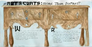
I was the designer of for survey 5, for which I had to create an object spread which occurred during the time period. I decided on focusing on the furniture and jewelry produced by the arts and crafts movement.
Through the research I realized that arts and crafts furniture is very easily recognized through their very unique and streamlined silhouette. I really quickly latched onto this idea and wanted to use the silhouette as the main focus of my spread, and thus use the negative space of the silhouette to slot in the text. However I found that when I zoomed up so much, the image was no longer as recognizable as furniture. For this reason, I chose to zoom out a little, so that the entire piece of furniture was featured in the piece. Additionally, I added in a piece of jewelry hanging out from one for the drawers, to include that part of my group’s research. The typeface used was also an arts and crafts movement font.
Overall, I’m not happy with this spread at all. Out of ten, I would give myself a 6 or 7. In all, I feel as though I had a rather weak composition. Now that I see the final result I’m not sure if zooming out was the right way to go. I feel as though it almost flattens the image, and gets rid of a lot of the interest. . I think the font choice was good, but the black is perhaps a little too overpowering. The only thing that I’m happy with is was the wood on the furniture, and even then it could have been darker in some areas. Additionally, the jewelry should have been incorporated better, and been painted more cleanly. In short, there is room for much improvement, and I hope to take these lessons to my next spread.
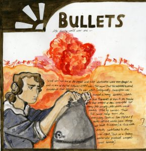
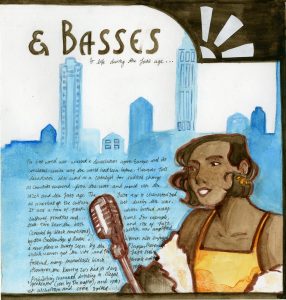
For the third spread, I was in charge of creating a comparison spread for survey 8. As this period of time encompassed both world war 1 and the the jazz age, which I thought would make for a very interesting contrast as you could see the direct aftermath of the war.
I halved the page into two, one for each era. On the outside of each page, I placed a figure to represent the life of women during these time periods as it was a distinction which was marked compared to the times previous. To further reinforce the idea of constrast, the figure for world war 1 was done in cool colours, while the jazz age figure was done in warm colours. I wanted to amplify the dreariness and hardship that permeated the time period, even back at home. The jazz age figure was done in warm colours to show the rebound of the economy and culture that occurred after the first world war. Behind them I placed a background. For the background for the world war 1 side, I put the silhouette of the trenches with an explosion. To contrast against the figure I did it entirely in warm colours to represent the constant danger of life in the trenches. I felt like this was a good contrast, as it represents the hardships for the soldiers fighting on the front lines. For the jazz age page, I created a city, as they were the cultural centre of the time. The city is also done in cool colours to create a colder impression of the city to represent the flaws of the time (namely how the iconic speakeasies were almost all controlled by gangs). I brought the image together by creating a border, and I added in two white motifs in the art deco style to each corner to add more interest. Out of ten, I would give myself an 8 on this spread. I think that in all, the spread is alright, but the composition could have been a little more interesting. I think the contrast between warm and cool colours did work well though. I think I should have put the background lower down on the page, as makes the figure disappear into the background, which is the opposite effect I wanted to create. Additionally the art deco motifs I added in the corner only really serves the jazz age page, as it was a style which was created in the jazz age.
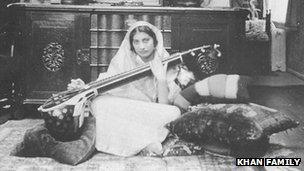
Noor Inayat Khan , Britain’s only muslim spy during world war two was one of the most amazing spies of world war two that you’ve never heard of. She was an incredible woman and a war hero who wore many hats, an Indian princess, a devout muslim, a member of the Stufi Order, a musician, a writer, a spy and a hero. And yet she succeeded in a field which required her to go against every aspect of herself.
The story begins on 1914’s New Year’s Day in Moscow where Khan was born to an Indian father, Hazrat Inayat Khan, and an American mother. At age six, her family moved to Paris France, and remained there until its occupation by Nazis in 1940. She and her brother, Vilayat hightailed it out of there and moved to London where Khan enrolled in women’s Auxiliary Air Force and was later recruited into the SOE, and Vilayat signed up to the Navy.
Noor was perhaps not what the British considered the “ideal” spy
However, that is not to say that it was all smooth sailing. Enlistment was not easy for Khan, as her recruiters had their own reservations about her. Firstly, to put it kindly, Khan was perhaps not the most suited candidate for the job. The life she lived was not one which was suited for very physical active. She had no background in any areas which could be easily applied to Prior to her time in the war, she was a poet, a children’s book author, a musician. Not exactly the spitting image of your everyday spy. Even worse than her background, was her nature. Afterall she was the daughter of Hazrat Inayat Khan, the founder of the Sufi Order of the West which preached religious tolerance and nonviolence. Khan held these principles dear to her heart and was a pacifist. And on top of that, who refused to lie (which one would think would disqualify her for the job), which also caused her to voice her less thoughts on Britain and their occupation of Indian. Namely, that it was her full intent to see Britain removed from India. Her efforts in the war were not motivated by any love for England, instead a fierce opposition to fascism and colonialism (another agent who trained with Khan) claims that she “couldn’t bear to see an occupied country”. This appears to be a value which ran in her family, as she was the great-great-great-grandfather of Tipu Sultan, the 18th Century Muslim ruler of Mysore. Most famously, he died in 1799 in battle with against the British, fighting until his last breath to defend his country against Britain. However she was accepted and she trained and trained to achieve her goal. Thankfully, her immense dedication paid off, as she accepted After eventually be accepted to be an agent of the The Special Operations Executive(more commonly abbreviated to SOE) in 1942. She was sent to France as a radio operative under the code name “ Madeline” and joined up with the resistance network named “Prosper” to “set Europe ablaze” as Churchill himself stated (he was in charge of the network. To everyone’s disbelief she succeeded where no one thought she could. The mission was incredibly dangerous, and operatives only had an expected life expectancy of six weeks. However, the six weeks went by, and Khan remained. And so she remained for close to 4 months, doubling her expected lifespan. She even remained when rumours went around saying that a Nazi spy had infiltrated the resistance network. However it all came to an end when she was betrayed by a double agent and arrested by the Gestapo. She was transferred and held in the Pforzheim prison in Germany where she was kept in solitary confinement. There she resisted beatings, torture and starvation for 10 months, giving no information away. She was no longer the timid woman who struggled so greatly in this part of her training. During this time she made two daring escape attempts both of which were unsuccessful. However, they were enough for her pacifist self to be labelled as “highly dangerous” by her Nazi captors.
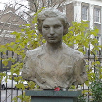
Noor Inayat Khan’s Bust in London
Eventually, Noor and three other SOE female agents were transported to Dachau were they were all shot by the SS, but not before Noor spoke her finals words : “Liberté” After her death she was awarded the Croix de Guerre and the George Cross, only three women were awarded the George cross (Violette Szabo and Odette Hallowes). Additionally,On 8 November 2012, a memorial memorial celebrating her bravery and sacrifice was erected. Fitting enough the memorial was 4 Taviton Street, the neighbour where Kahan grew up in 1914 and where she returned during her training. It is the first memorial in the UK celebrating an Asian women and one of the few to celebrate a Muslim women in the entire world. In times which seem to only forecast stormy skies ahead it is important to remember the mistakes we have made. As well as honour the those who sacrificed so much to correct them. And I can think of no greater honour to Noor, and others like her, to prevent the necessity for use to repeat these same words about another person like her.
Lecture Summary This week we covered a very tumultuous period of history, with the crash of 29 and a the beginnings of the world war 2. Interestingly enough, the conditions appear to have made the progression of design almost impossible, however the opposite proved to be true. Governments were intent on bolstering the economy and created many job opportunities for designers. For example during the Great Depression, photographers like Dorothea Lange documented the devastation of the dust bowl effect on rural communities, employed by the Farm Security Administration. Likewise,The Work Projects Administration commissioned many poster designs from artists to hang on government buildings. As their purpose was merely decorative the main concern was on was not on the design itself. As a result, artist had enormous creative leeway and created many ingenious posters, which remain relevant to this day. Fine art in Europe didn’t so much as disappear but migrate out of Germany where what Nazi’s called “degenerate” art and artists were in immense danger.