Monthly Archives: September 2018

Sir Anthony Van Dyck – Blogpost Week 4

Sir Anthony Van Dyck

Sir Anthony Van Dyck (variant spellings include) was a well known portrait artist (often for European aristocracy), as well as a draftsman and an etcher. He was born to a wealthy family of silk merchants on March 22nd in 1599 in Spanish Netherlands (which is now modern day Belgium).

Van Dyck began his career in art at the early age of ten when he was apprenticed to the artist Hendrick van Balen. Later on he was greatly influenced by Rubens, who at the time was considered one of the greatest masters of art in Antwerp. His first surviving work, “Portrait of a Man” from 1613 is an excellent example of Rubens influence on Van Dyck. Van Dyck mimicked Ruben’s iconic dramatic composition, however he added his own twist. Unlike Ruben’s work’s (and baroque artists in general) the brushstrokes are clearly visible and add an almost coarse texture to the painting. This theme continued to be relevant in almost all of his paintings. 

“An Apostle” painted in 1618  and “Apostle Jude” painted between the years of 1619 and 1621 are  great example of this.

Additionally, the figures he drew were proportionally less idealized and more angular than other artists of his time. The expression of his figures in his religious and mythological paintings were also exaggerated such as in “Drunken Silenus Supported by Satyrs”.

 also implemented warmer hues in his tones.  

I think that Van Dyke was an excellent painter, and I particularly enjoy his portraits. I am especially fond of the ones where he uses a dark background, and the face is partially cast in shadow. The warm hues he implements in the face are beautiful and add such an interesting atmosphere to the paintings. Additionally, the visible brushstrokes make it almost possible to imagine how Van Dyke worked on the painting.

Sources
Held, Julius S. “Anthony Van Dyck.” Britannica, www.britannica.com/biography/

    Anthony-Van-Dyck.
All pictures are taken from Held, Julius S. “Anthony Van Dyck.” Britannica, www.britannica.com/biography/

    Anthony-Van-Dyck.

Survey 4 & Research

Lecture Summary

his week’s summaries we looked at the time period between o BCE and 1450 AC and focused in on (books, printing, writing and how they were affected by various factors. These factors include the paper they used and they used and why they chose it and to their purpose, mostly commissions of religious texts. Examples of these texts include the 1st printed text The Diamond Sutra, The Codex of Gigas, and The Book of Kells. The overwhelming majority of these works are religious in nature, and we saw the influence that religion had on the stylistic choices of these texts.For example, we looked at illuminated Manuscripts of the Quran which were devoid of any representations of humans. Christian and other religious illuminated texts often featured humans as the main subjects of illustrations which made an interesting contrast. This was because in Islam the representation of the human form is not allowed in any shape or form as it is considered a form of idolatry. From this, my group which focused on architecture began to began to think about how religion affected architectural styles, which prompted many questions.

Research

Flamboyant style is an ornate form of Gothic architecture which evolved from the Rayonnant style, and flourished in French between 1350 and 15,00. The west facade of the Cathedral of Rouen built in 1370 is considered the birth of the style, the high point of Flamboyant architecture is the church of Saint Maclou at Rouen (as shown below). 

Image result for cathedral church of Saint Maclou at Rouen.
The Rayonnant style of architecture was bold, eye catching famously flamboyant. However, as time went on and the demand for flamboyance only increased, the Rayonnant style wasn’t considered quite enough; and thus the Flamboyant style was born. Cathedrals such as Notre-Dame d’Épine and Palais de Justice at Rouen, France exemplify the new flamboyant style, which outdid the Rayonnant style in every way possible.

France is the homeplace of the style however it was adopted by Spain and Portugal in the 15th century. La Capilla del Condestable in Burgos, and the Cathedral of Segovia in Spain serve as prime examples of the Spanish form of the Flamboyant style.

 In essence, it was a purely decorative style which added embellishments onto the foundation of Gothic architecture(such as flying buttresses and valued ceilings) but no structural Advances.   

The most common descriptors attributed to the style are “flowery” and “lacy” which are both apt adjectives for it. Every surface was taken advantage of and used for decorative purposes. Facades in particular were the jewel of the style. They were painstakingly carved, and created  

These elements compounded created an almost delicate appearance which was only accentuated by some of the structural choices integral to the style. The foundations of the buildings in flamboyant style are noted to be proportionally very thin, allowing for  little space in between windows, roof lines and flying buttresses.


However perhaps the most recognizable aspect of the Flamboyant style are the stone window traceries ( the stone work which provided reinforcement between glass segments). Unlike many other variants of Gothic architecture, Flamboyant traceries are recognized by their distinct “s” shape compared to the more common round traceries of other Gothic styles. The traceries are often compared to flames or tongues.

image of flame traceryRelated image


Niches which featured figures were also common in Flamboyant architecture although it was common spread thoroughly all Gothic architecture.

Sources

  • “Flamboyant Style.” Britannica, www.britannica.com/art/Flamboyant-style. Accessed 27 Sept. 2018.

  • “flamboyant style.” The Columbia Encyclopedia, 6th ed.. . Encyclopedia.com. 26 Sep. 2018 <http://www.encyclopedia.com>.

  • Muscato, Christopher. “Rayonnant VS Flamboyant.” Study, study.com/academy/lesson/rayonnant-vs-flamboyant-style-gothic-architecture.html. Accessed 27 Sept. 2018.

  • Przybylek, Stephanie. “Flamboyant Gothic Architecture.” Study,
    study.com/academy/lesson/flamboyant-gothic-architecture.html. Accessed 27 Sept. 2018.

    Pictures from (in order)

  • https://frenchmoments.eu/saint-maclou-church-rouen/
  • https://study.com/academy/lesson/flamboyant-gothic-architecture.html
    2nd picture

  • https://www.researchgate.net/figure/A-French-Flamboyant-Window-by-T-Rickman-in-Four-letters-on-the-Ecclesiastical_fig1_261721076

Hieronymus Bosch-High Renaissance & Mannerism Blogspot Week 2


Jheronimus van Aken, more commonly known as Hieronymus Bosch was a Dutch/Netherlandish artist and draughtsman originally from Brabant. Aside from this, much of his person life remains unknown. No letters or diaries have been able to have been attributed to him.


Bosch is perhaps most remembered for his outlandish Throughout his life span he painted a grand total of triptychs, his most famous one being The Garden of Earthly Delights (c. 1495–1505). This painting is emblematic of the majority of his work; fanatical and macabre with religious themes. This painting in particularly was part of one of his transitional pieces, from his middle period to his late period. Interestingly enough, much of his work can be distinguished from the traditional Flemish painting style which employs glazes to hide brushwork. Bosch’s work is characteristically rough and textured.

“Garden of Earthly Delights”

A close up of the hell panel of the “Garden of Earthly Delights”


“The Crucifixion of St. Julia” is another example of Bosch’s work with religious scenes.

Even now, I’m not sure if I like his work, but it definitely catches your eye. I personally saw this piece in the Museo del Prado in Madrid, and it certainly draws the eye. It is ever easy to spend a very long time observing its immaculate details. I certainly did,I spent a long time looking at it. However, I’m not sure that I enjoyed it. Regardless, his work certainly makes a statement, even if I am unsure how I feel about said statement.

Andrea Mantegna-Late Gothic & Early Renaissance (Blogpost Week 1)

Andrea Mantegna was an Italian artist of the early renaissance with a background in Roman archaeology. He not only had a successful painting career but also had a notable career as a engraver (although he never dated any of these works).

His background in sculpture is clearly reflected in his paintings, especially his later works.
His artwork is noted to be on the stiffer,more rigid side, as he preferred he works of ancient artists to nature. The approach he maintained towards sculptor. Mantegna’s works often featured a barren dull landscape, and stiff, relatively with a bony, stiff figure.

Image result for andrea mantegna 
His paintings “St. Sebastian” from 1480 and “Christ and the Suffering Redeemer” are a good example of this.

As per the time, Mantegna Experimented with the new discover of perspective. He especially seemed to favour the then new trend of lowering the horizon. This created a very subtle worms eye view which created a greater sense of awe. .

In general, the art of the late Gothic period and the early renaissance is not one which I find particularly appealing. While I recognise the immense skill of renaissance painters  and the of its time, it is not artwork which I generally enjoy. The majority of the Mantegna’s paintings are rather dull, however there are a few exceptions. Unfortunately, I don’t think the colours are particularly well handled, although this may be a result of the available materials at the time.


For example, his “Judith and Holofernes” is certainly more colourful than his other works, but I personally dislike the use of colour in this piece. (It should be noted that it is disputed whether Mantengna painted this or Giulio Campagnola did).

All information and pictures are from his Wikipedia page (https://en.wikipedia.org/wiki/Andrea_Mantegna)

Week 3- Lecture Summary & Research

Lecture Summary

This week’ lecture focused on the evolution of art and typeface, and the circumstances affected their creation.However we did stray a little from the initial subject of art and typeface, delving into more historical aspects of these subjects, such as the circumstances which allowed for them to arise. This sort of discussion turned out to be very helpful for my group and myself who are in the geo-political group. In many cases, language was advanced not only be trade, but by direct commands from the government. Examples of this include the Chinese folktale which states that the yellow Emperor ordered Kanji, to create a writing system and the Korean king Sejong ordered the creation of the Hangul alphabet.  From this we began to think about how leaders can be on of the driving force in the development of concepts such as writing. Both examples mentioned are still the current writing systems of their respective countries. Our plan for our spread was to look at the Ancient Egyptian concept of kingship, as well as the influential rulers and their effect of Egypt as a whole, and this lecture helped us brainstorm more

Research (300-500)

Egyptian Concept of Kingship
The pharaoh was the political and religious ruler of Egypt, and often acted as a representative of the gods. The word pharaoh is a great variant of the Egyptian “pero” or “per-a-a”, which can be translated as “Great House. While Egypt was divided into sections called Nomes and ruled by Nomarchs, in the end, the Pharaoh has power over all. Similar to every other aspect of egyptian theology, the concept of duality is integral to the Egyptian concept of kinship. The pharaoh was both a political symbol and a theological concept. For example, in texts Pharaohs are often referred to by the gods as “my living image on earth” and are depicted with many similarities to Re, Aton, Amon and especially Horus. The pharaoh is even referred to as Aton, Horus, and Re. However, it is important to note that the pharaoh himself is not a god. Even though divinity is intertwined with the role of the Pharaoh, the pharaoh is not divine himself. The king can still physically die, but his soul is immortal. Simply put, the Pharaoh can be thought of a version of Horus, not the Horus. The pharaoh’s divine role was often represented in art. In ancient Egypt, the relative sizes of people and deities was indicative of their status, and pharaohs were always depicted as least as large as other humans. Additionally, humans were often shown bowing in reverence to pharaohs.

A pharaoh’s goal was not only to to be religious and political leader of egypt but also to uphold Ma’at. Ma’at refers the Egyptian ideas of justice, balance and harmony, as well as its divine personification the goddess Ma’at.The pharaoh was meant to follow the wishes of Ma’at and to follow through with them.


The first reference to an Egyptian pharaoh is the legend of Menes, who was said to be the uniter of Lower and Upper Egypt. This feat was accomplished through conquest, and thus the first dynasty of Egypt was founded and of the city Memphis. Unfortunately, archaeologist’s search for evidence of his evidence has largely turned out to be fruitless. Many Egyptologist, such as Flinders Petrie believe that Menes was a reference to a title instead of a name (meaning “he who endures”). However much evidence has been found to corroborate that Narmer (c.3150 BCE) was most likely the first pharaoh.


Perhaps the most promising evidence is the Narmer Palette,  which depicts Narmer symbolically unifying Egypt. Narmer is always depicted wearing a combination of the two crowns of Egypt. The red crown is representative of lower Egypt, while the white crown of Upper Egypt. Thus, the combined version visually depicts the coalescence of Egypt. Many Egyptian documents after the unification of Egypt portray pharaohs wearing this crown. However, interestingly enough archeologist have been unable to find any physical proof of these crowns.


Narmer Palette


Deshret.svgHedjet.svgDouble crown.svg

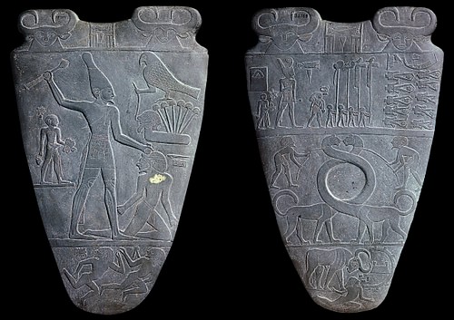
There is a pretty large disconnect between the mythical figure of Menes and more evidence based story of Narmer.For example, the legend of Menes states that Lower and Upper Egypt were unified through conquest. However, Narmer’s story states that unification of Egypt was bloodless. Unlike Menes, Narmer supposedly accomplished this feat by marrying a princes, consolidating power and through forging strong connections with neighbouring factions.


Notable Pharaohs

Pepi II or otherwise known by his Pharoah name Neferkare (meaning “Beautiful is the spirit of Ra”), was the 5th Pharaoh of the 6th Dynasty (2325-c.2150 BCE), and is credited for having the longest reign of any pharaoh. Sources say that he ascended to the throne at age six and records Credit him with a reign of 94 years. However it should be noted that while Pepi II enjoyed the longest reign of them all, it was not a prosperous time. On the contrary it was a characterized by the internal and external strige which Egypt faced.  Pepi II’s reign was characterized by the decline of the Old Kingdom, in large part due to changing dynamics of powers. Internally, Nomarches (nobles who ruled over the the divided sections of Egypt called Nomes” were enjoying an increase of power from the previous ruler, Pepi I. Consequently, small civil wars broke out as a result from their struggles for power. Additionally, Egypt suffered low flooding from the Nile, which had disastrous consequences. Pepi’s solution of taxing the poor in order to make up for the costs had the opposite intended effect, only hurting his already diminishing reign. In the end, Pepi’s death marked the end of of the 6th dynasty of Egypt and the splendor of the Old Kingdom.


Ramses II, more commonly known as Ramses the Great or by his pharaoh name  Userma’atre’setepenre (“keeper of Harmony, Strong in Right, Elect of Ra”) is remembered as one of the most successful pharaohs. He was the 3rd pharaoh of the 19th dynasty (1292-1186 bCE). His most notable accomplish was the victory at Kadesh against Hittite invasion , where he established a reputation as a warrior. He boasted a long and prosperous reign in which he gained trading partners, secured borders, augmented the country’s wealth, and built a truly astonishing about of monuments and temples and statues of himself (more than any other pharaoh). He was considered so successful and loved that his legacy was a string of Pharaohs named in his honour.


Sources

Mark, Joshua J. “Ramesses II.” Ancient History Encyclopedia. Ancient History Encyclopedia, 02 Sep 2009. Web. 21 Sep 2018.

Mark, Joshua J. “Pharaoh.” Ancient History Encyclopedia. Ancient History Encyclopedia, 02 Sep 2009. Web. 21 Sep 2018.

Mark, Joshua J. “Menes.” Ancient History Encyclopedia. Ancient History Encyclopedia, 29 Jan 2016. Web. 21 Sep 2018.

“Pepi II King of Egypt.” Britannica, www.britannica.com/biography/Pepi-II.
Accessed 21 Sept. 2018.


Photos
Narmer Palette- https://www.ancient.eu/Menes/
All pictures of the crowns -https://en.wikipedia.org/wiki/Crowns_of_Egypt

Yearbook Spread Rationale

When designing my yearbook spread I wanted to create a dreamy and optimistic air to reflect my character. In order to create this look, I emphasized simplicity. I  chose a simple colour palette and clean layout which stressed forward movement. However I specifically chose a composition that avoids straight lines, to mimic how how the learning process is irregular and never a straight line. Additionally, I added lines to illustrate the path of the airplane and to show a reflective aspect of myself, how I think about the paths I’ll take. The forward facing composition was meant to reflect a positive outlook, looking forward and not dwelling in the past. Additionally, most of the colours I used are pastels which invoke a sense of the light heartedness I hope to maintain. In the end, I found that these decisions compounded and created created a style almost reminiscent of children’s books, which is rather fitting as that is a career that I am interested in.  


I think I would give myself a 7/10 on this piece. While I think I created an interesting composition with the trail from the paper airplane, I do think it looks a little empty. I’m sure if this could be solved by adding something in the background or more paper planes. Another problem I have with this piece is that I could have been more inventive with the way I placed the information. The method of placing the information in the loops from the train place ended up having a pasted on effect. Next time I would like to try and more fluid approach that engages more with storytelling. Additionally, the end result wasn’t as crisp as I would have liked. There are areas where the watercolour and pencil crayon are a little messy.