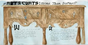
Spread #2
![]()
I was the designer of for survey 5, for which I had to create an object spread which occurred during the time period. I decided on focusing on the furniture and jewelry produced by the arts and crafts movement.
Through the research I realized that arts and crafts furniture is very easily recognized through their very unique and streamlined silhouette. I really quickly latched onto this idea and wanted to use the silhouette as the main focus of my spread, and thus use the negative space of the silhouette to slot in the text. However I found that when I zoomed up so much, the image was no longer as recognizable as furniture. For this reason, I chose to zoom out a little, so that the entire piece of furniture was featured in the piece. Additionally, I added in a piece of jewelry hanging out from one for the drawers, to include that part of my group’s research. The typeface used was also an arts and crafts movement font.
Overall, I’m not happy with this spread at all. Out of ten, I would give myself a 6 or 7. In all, I feel as though I had a rather weak composition. Now that I see the final result I’m not sure if zooming out was the right way to go. I feel as though it almost flattens the image, and gets rid of a lot of the interest. . I think the font choice was good, but the black is perhaps a little too overpowering. The only thing that I’m happy with is was the wood on the furniture, and even then it could have been darker in some areas. Additionally, the jewelry should have been incorporated better, and been painted more cleanly. In short, there is room for much improvement, and I hope to take these lessons to my next spread.