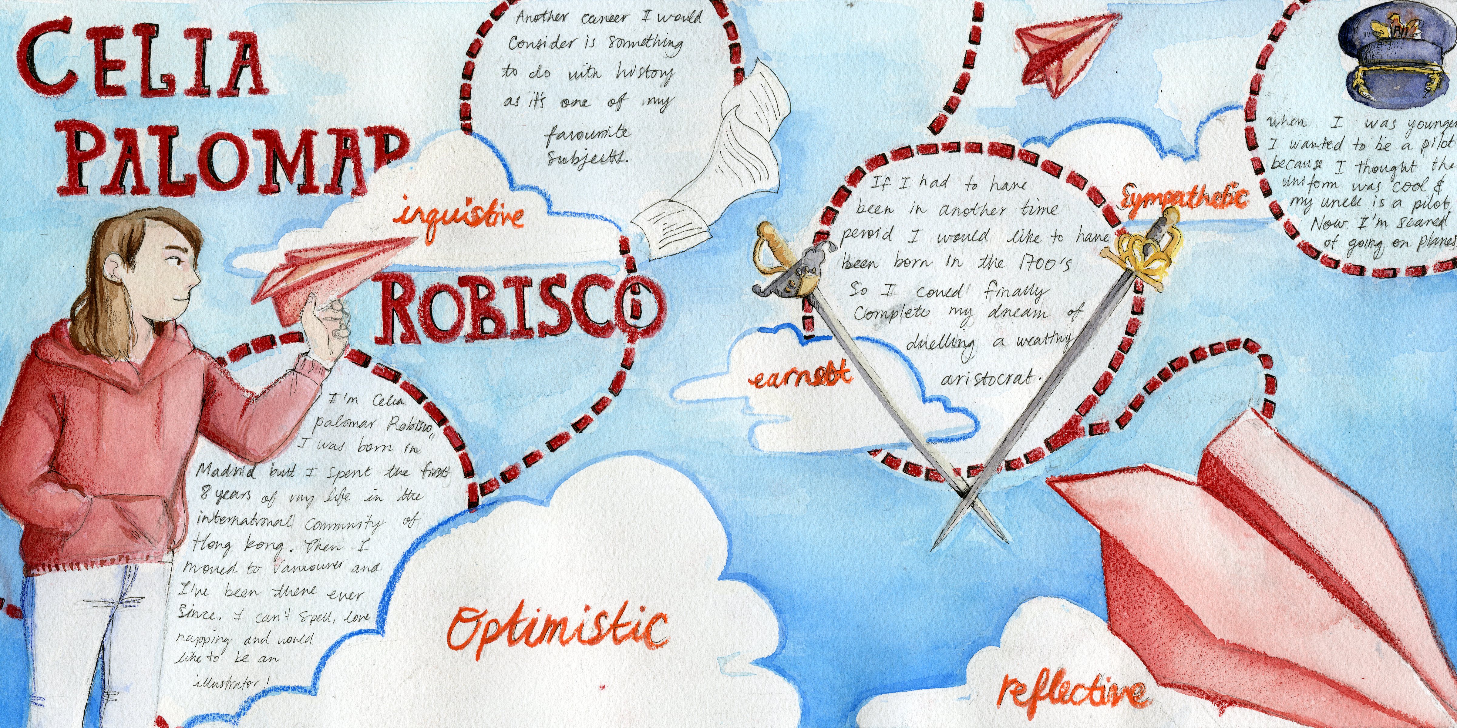
 When designing my yearbook spread I wanted to create a dreamy and optimistic air to reflect my character. In order to create this look, I emphasized simplicity. I chose a simple colour palette and clean layout which stressed forward movement. However I specifically chose a composition that avoids straight lines, to mimic how how the learning process is irregular and never a straight line. Additionally, I added lines to illustrate the path of the airplane and to show a reflective aspect of myself, how I think about the paths I’ll take. The forward facing composition was meant to reflect a positive outlook, looking forward and not dwelling in the past. Additionally, most of the colours I used are pastels which invoke a sense of the light heartedness I hope to maintain. In the end, I found that these decisions compounded and created created a style almost reminiscent of children’s books, which is rather fitting as that is a career that I am interested in.
I think I would give myself a 7/10 on this piece. While I think I created an interesting composition with the trail from the paper airplane, I do think it looks a little empty. I’m sure if this could be solved by adding something in the background or more paper planes. Another problem I have with this piece is that I could have been more inventive with the way I placed the information. The method of placing the information in the loops from the train place ended up having a pasted on effect. Next time I would like to try and more fluid approach that engages more with storytelling. Additionally, the end result wasn’t as crisp as I would have liked. There are areas where the watercolour and pencil crayon are a little messy.