Spread #3
For the third spread, I was in charge of creating a comparison spread for survey 8. As this period of time encompassed both world war 1 and the the jazz age, which I thought would make for a very interesting contrast as you could see the direct aftermath of the war.
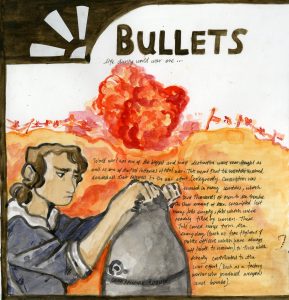
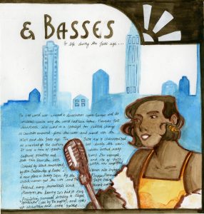
I halved the page into two, one for each era. On the outside of each page, I placed a figure to represent the life of women during these time periods as it was a distinction which was marked compared to the times previous. To further reinforce the idea of constrast, the figure for world war 1 was done in cool colours, while the jazz age figure was done in warm colours. I wanted to amplify the dreariness and hardship that permeated the time period, even back at home. The jazz age figure was done in warm colours to show the rebound of the economy and culture that occurred after the first world war. Behind them I placed a background. For the background for the world war 1 side, I put the silhouette of the trenches with an explosion. To contrast against the figure I did it entirely in warm colours to represent the constant danger of life in the trenches. I felt like this was a good contrast, as it represents the hardships for the soldiers fighting on the front lines. For the jazz age page, I created a city, as they were the cultural centre of the time. The city is also done in cool colours to create a colder impression of the city to represent the flaws of the time (namely how the iconic speakeasies were almost all controlled by gangs).
I brought the image together by creating a border, and I added in two white motifs in the art deco style to each corner to add more interest.
Out of ten, I would give myself an 8 on this spread. I think that in all, the spread is alright, but the composition could have been a little more interesting. I think the contrast between warm and cool colours did work well though. I think I should have put the background lower down on the page, as makes the figure disappear into the background, which is the opposite effect I wanted to create. Additionally the art deco motifs I added in the corner only really serves the jazz age page, as it was a style which was created in the jazz age.