My partner Tina and I were assigned to create a cover for the Idea 22 History book we’ve been making spreads for this term. We first struggled a lot with the design, and our initial sketches very much dependent on literally depicting the events, people, and inventions from different time periods. Unfortunately, these thumbnails would be rather weak cover designs, or at least would blend in with the hundreds of other history books.
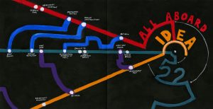
So, Tina and I switched gears and turned towards a more conceptual approach. Namely, we wanted to depict our major takeaways from the course, namely: the cyclical nature of history and the connections between the different events. From this ensued many thumbnails, including one with a map. I did some more thumbnails with the map, and while I could plot the main events and important ideas down, I found it difficult to connect them. Especially in a way illustrated timing well. I ended doing some more digging and came to look at some subway maps, which ended up as our final design plan.
We felt that the subway idea was particularly well suited to illustrate the idea of connections, as different art movements and events could be connected through subway lines. Additionally, we feel as though the railway lines also create a very linear movement, which also acts as a timeline to place points upon. This would solve the problem which the earlier map idea problem created, where I couldn’t show multiple events happening in conjunction with each other. To add more authenticity to my design I referenced various subways systems around the world, especially Paris’s one. Paris subway system, in particular, was particularly interesting because it follows Paris’s radial city plan. I borrowed the radial design, and make it the epicentre of my “city”, where I placed the text which reads “IDEA” twenty-one. Additionally, epicentre also could represent our current day, as all past events and design and fine art movements feed into.
We decided to extend this design into both the cover and the back, as we felt splitting it would greatly weaken the design.
Overall, I feel that our spread was fairly effective and I would give us an 8/10. I think that we had a very strong concept, but there were aspects that could have been perfected. This was especially evident in the way which the text was added. Additionally, the execution could have been a little cleaner in some areas. Perhaps markers would be a better medium compared to the paint.