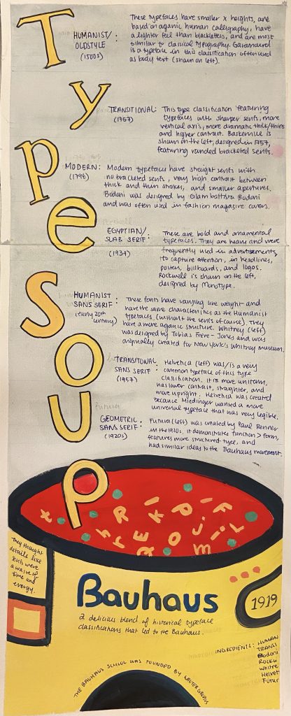
For this historical typography infographic, I played with the concept of alphabet soup to make it more engaging for the viewers, who are relatively young design students interested in typography. I think my infographic is easy to follow, flows well from top to bottom, and is organized by dates. I also think my use of colour helps convey my main focus, which happens to be the Bauhaus movement, the Bauhaus school, and Bauhaus typography. The can at the bottom really ties my concept together, especially with the alphabet soup illustration and the forms/shapes often associated with the Bauhaus movement.
My research is well integrated and is detailed. I have researched the characteristics of the type classifications and demonstrated a sample letter of a font belonging to the classifications. I also made it so that these letters spell out the title of my infographic “Type Soup.”
I chose to use watercolour and gouache because I think they can create an effective contrast. I used gouache for the soup can because I wanted it to be the focal point with the bright primary Bauhaus colours. Watercolour was used in the background, as it is subtle and won’t clash with the solid colours of gouache.
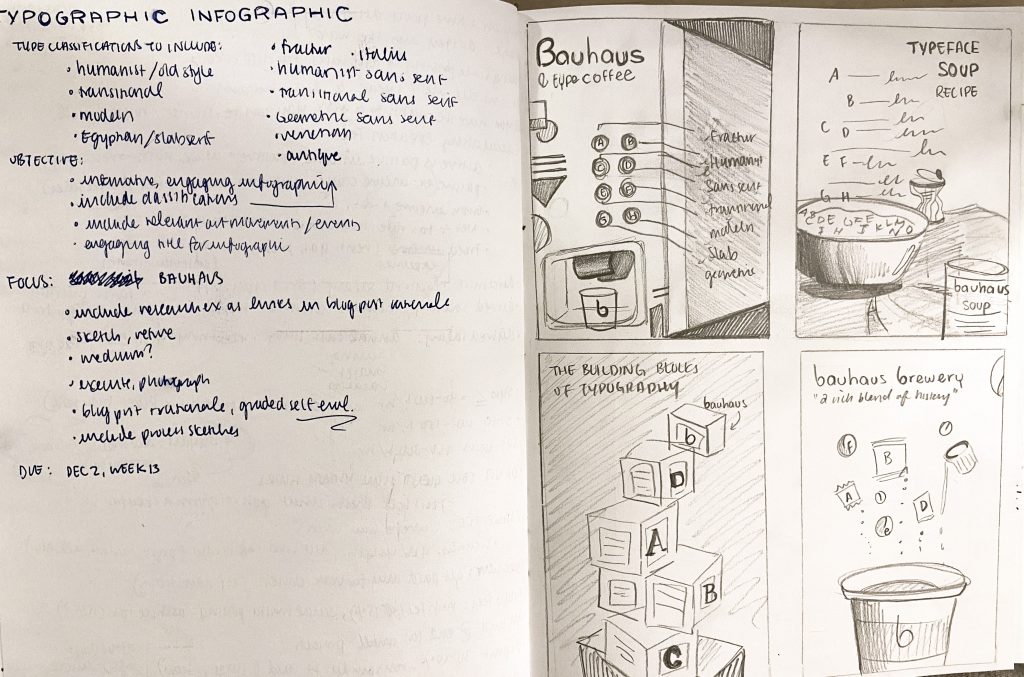
Overall, I think I deserve a 12/13 because I explored different ideas (as shown in my sketchbook pages) and chose one that I think would best suit the project brief. I also think it is engaging due to the connection made to alphabet soup. It also contrasts well and has visual hierarchy. However, I realize that the information could be more legible. I realize that information is an important element of infographics and, in mine, you kind of have to take a closer look or squint to see the information.
Sources:
http://www.designishistory.com/1450/type-classification/
https://study.com/academy/lesson/bauhaus-movement-art-typography.html
https://www.freepik.com/blog/history-garamond-typeface/
https://medium.com/@jevans67/typeface-history-bodoni-f2ef2d285cfe
http://www.meaningfultype.com/rockwell.html