Reconciliation Project | Case Study

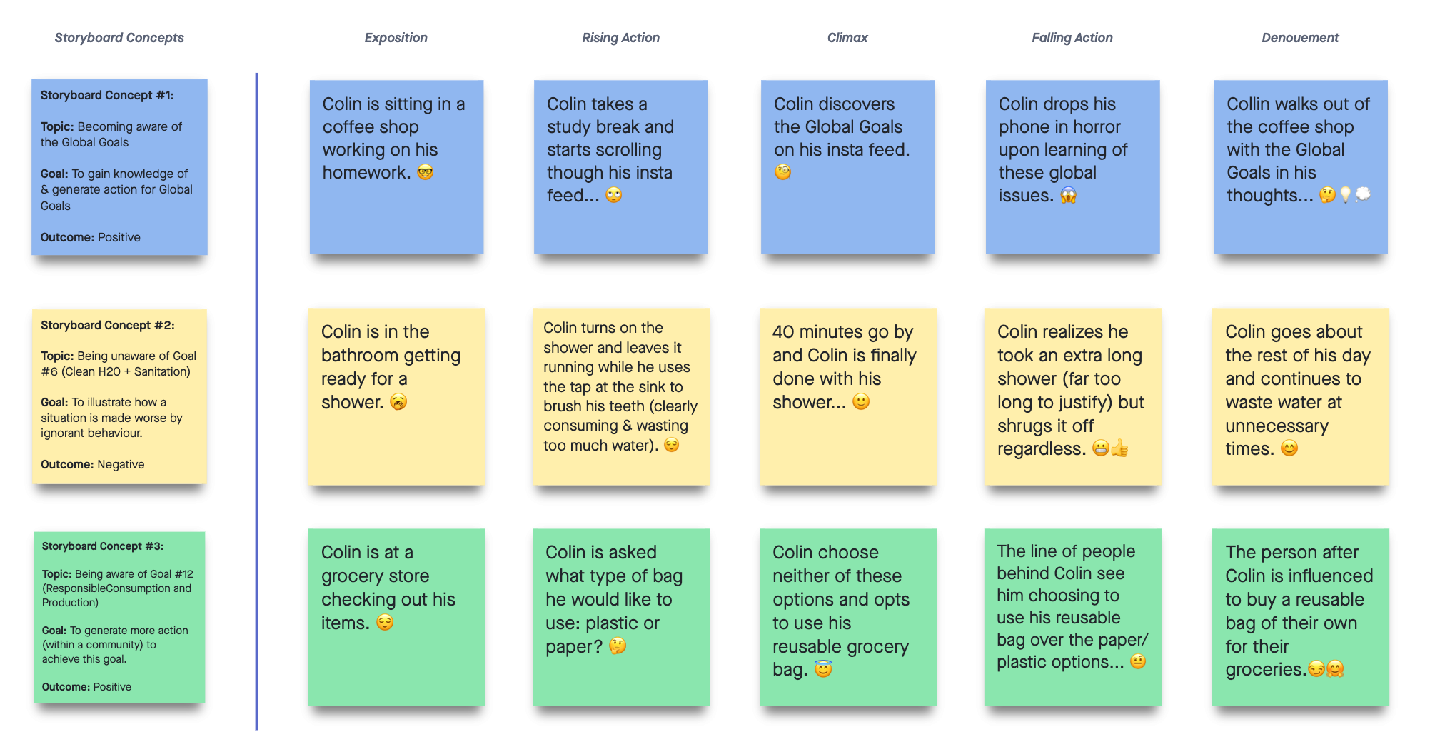
Children of the Tree | A Game of Voices and Languages

Communication is key in our everyday lives, as such it is essential that we can convey our thoughts with a language.

Our first project is focused on the topic of languages, specifically in relation to Calls to Action #13 to #16 as reported by the Truth and Reconciliation Commission of Canada. These calls to action ask the government to address Aboriginal language rights, its protection as well as its revitalization and the creation of educational language programs.

Serving as a foundation for the project, we then proceeded to research about various Aboriginal language groups and the history revolving around them. Our findings indicated that many language groups have and are still facing endangerment or extinction as a result of the residential school system. Many languages were lost but those that still exist are being revitalized through many efforts.

We also researched these various language groups in the process.

With this research in hand, we proceeded to develop a strategy to share a message with the public. We eventually came up with the idea to create a concept for a game to inform players about Aboriginal languages. We aimed to give the incentive to support revitalization efforts with this strategy.

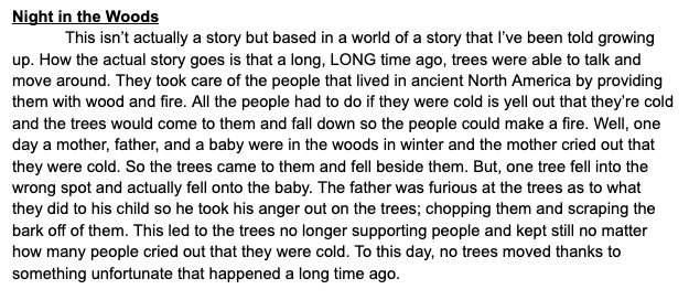
Initially we wanted to develop a fully functional game using Scratch, however we decided to scrap the idea due to technical difficulties and stick with a concept instead. Regardless, we knew that Indigenous languages had to be incorporated into the final result from the start. We then began ideations for the game’s narrative inspired by stories from First Nations cultures, such as the example below:

We then decided to use excerpts from each idea as part of a larger narrative, where we kept our goal of educating players on Aboriginal languages, their history and revitalization efforts.

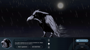
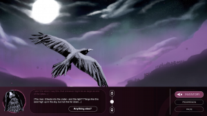
The main plot revolves around a fisherman, who- with a Raven’s help- sets out to look for their family who recently disappeared:

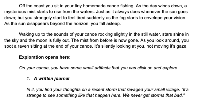
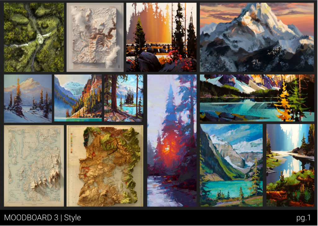
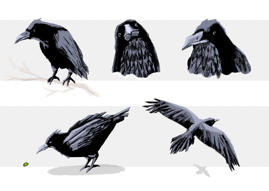
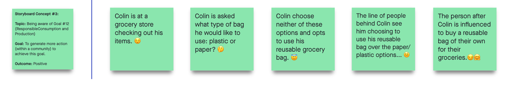
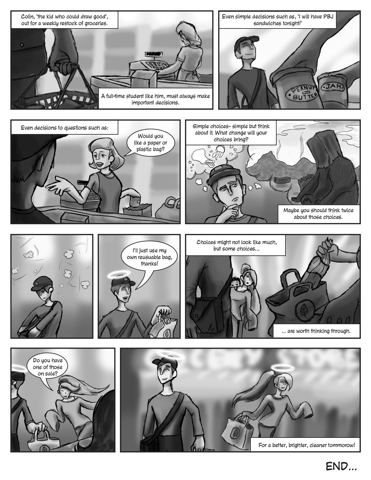
After tackling the narrative, we then went ahead with developing the gameplay (which we summarized as a “point and click exploratory visual novel”. We also thought of visual, aesthetic choices in terms of characters, user interfaces and environments. Sounds were also considered at this stage. Concept pieces were also developed to help us get a general idea of the visuals along with various moodboards:
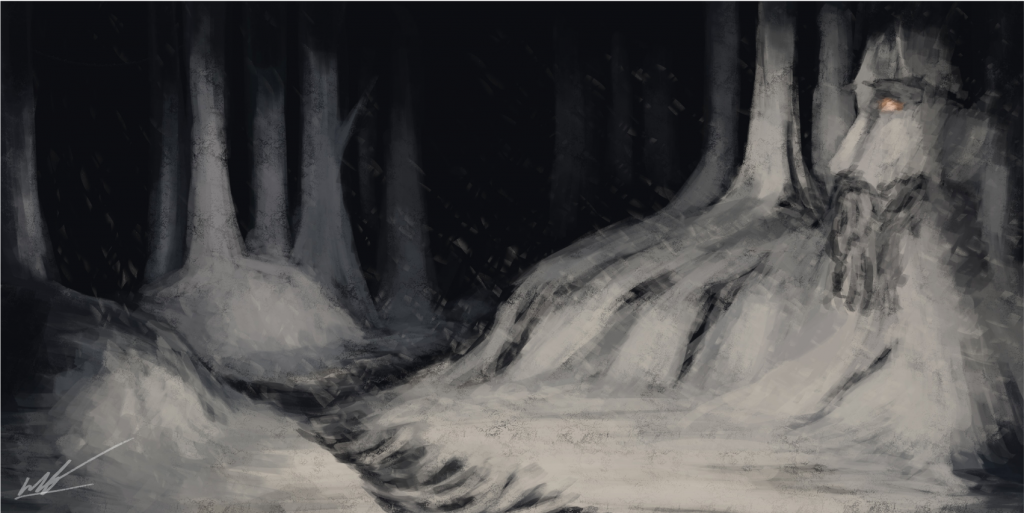
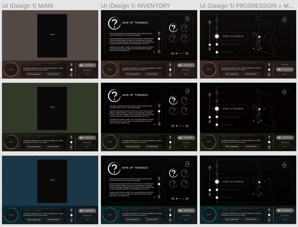
These were later incorporated into a refined concept, with game screenshots such as the ones below:

A video was also produced to assist in conveying the ambience of the environments:

https://capilanou1-my.sharepoint.com/:v:/g/personal/davidbautista2_my_capilanou_ca/EfTI8gnoknJJutthE2yL7kYBi0g60NVkYtZqMtBocTFICQ?e=npWm5a

My contributions to the final concept were to the game’s UI and characters– while Harlen handled environment concepts, as well as assembling the video and game screenshots. The end result is the video itself, as well as a presentation to summarize the entire process.

In short, it was quite the experience to conceptualize a game to this level of finish, and I personally believe that we pulled it off greatly.

A job well done!

Digital Media II – UX Storyboard

Last week, the class of IDEA 23 was assigned to develop a storyboard by utilizing a 4-step process depicting an assigned user story/persona and how they would utilize one of the global goals (https://www.globalgoals.org/) in their daily lives.

The Concepts


The class was split into groups of 4, each group collaborated to come up with three text + arrow method storyboard concepts. Below is my group’s storyboard freehand board which we worked on via Invision:

Our three stories have varying focuses: the first one is a positive concept involving all global goals. Second is a negative concept involving an unawareness of goals. The third concept is a positive, but more specific one compared to the first story concept.

We utilized the pyramid narrative structure (Exposition, Rising Action, etc.) to provide a clear, straightforward story for each of the three concepts. The emojis implemented onto each concept are a visual aid, allowing us to plan what emotions we want to depict at that certain point in the story concept.

Following this, we later reviewed the three stories. After a brief discussion, our group recieved approval (by our instructor) for the third option in this board. The third option depicts our user persona, Colin Jones, a design student, in a situation involving Global Goal #12 : Responsible Consumption and Production.

Our group’s final, approved choice!

The Storyboard


Once we had chosen our story, it was up to each of us to create an individual storyboard to accompany the story concept. Choice of medium was dependent on personal choice, thus I decided to create my storyboard through a digital medium. This includes Adobe Indesign and Photoshop to assemble the final product below:

Comic-style storyboard by David Bautista (me)

The comic layout was chosen as it follows a left-right reading order due to its common usage in western media. A narrative caption structure was used to lead the viewer thorughout the panels with the goal of maintaining the reader’s interest in mind.

Blog 5 – Canadian Design Today

Hulse and Durrell

Illustration design for the Vancouver 2010 Olympics, with design contributions by Hulse and Durrell.

I wasn’t exposed to mainstream graphic design as a kid, but once I migrated to Canada I was greeted by the beautiful designs of the 2010 Winter Olympics throughout Vancouver. Since then I always admired its art direction- made possible by multiple designers including the likes of ‘Hulse and Durrell’.

Redesign of Swimming Canada Logo by Hulse and Durrell (far right “2015”)

This design studio consists of Ben Hulse and Greg Durrell, who share interests in sports and design. They believe that opportunity is brought by complexity and their aim is to develop impactful design solutions for their clients. The studio has worked with sports brands such as the redesigned Canadian Olympic Team.

Moscow 1980 Mug designed for the Olympic Heritage Collection by Hulse and Durrell

Hulse and Durrell began working together in 2007 remotely in cafes, all while collaborating with clients worldwide. They later worked with the design team of the Vancouver 2010 Olympic & Paralympic Games. This eventually resulted in the graphically-striking identity of the games.

Photo documentary of the torch relay by Greg Durrell

Hulse and Durrell’s favourite moments while working on the project revolved around the torch relay and the Olympic torch. Greg Durrell proudly remembers being allowed to be a torchbearer after following the torch relay in late 2009 as a documentary photographer, while Ben Hulse favoured their contributions to the design of the torch used in those relays.

Vancouver 2010 Olympic Torch Post-relay

WORKS CITED

  • Halse and Durrell Design Ltd. “Info.” Hulse & Durrell, Halse and Durrell Design Ltd., 2020, hulsedurrell.com/Info.
  • Clarke, Ian. “Ben Hulse & Greg Durrell.” HeyThere, Ianclarke.ca, 2020, heythere.ca/interview/hulse-durrell/.
  • “Filmmakers.” Design Canada, designcanada.com/filmmakers.

Images obtained from

  • https://www.underconsideration.com/brandnew/archives/new_logo_and_identity_for_swimming_canada_by_hulse_durrell.php
  • http://heythere.ca/20interview/hulse-durrell/
  • https://natedsanders.com/blog/2019/09/2010-olympics-torch-vancouver/

Blog 4 – Postmodernism in Europe

Reudi Baur (b.1956)

Reudi Baur

French-Swiss designer, Reudi Baur was born on March 5, 1956, near the beginning of the late 20th-century Postmodernism movement. Spending his early years in the city of Paris, Baur later moved to Zurich, Switzerland to study graphic design, studying under Michael Baviera with Lars Müller as a classmate.

Type signage for Pompidou Center, Paris (Centre Pompidou) (c.2001)

Baur eventually graduated in 1979, returning to France to begin his design career, partaking in cultural projects by developing concepts for museums, including the curation of design exhibitions for clients such as the Project Gallery. He later expanded his reach to Parisian art institutions such as the Pompidou Center, where he designed its facility navigation system.

Directional signage for Pompidou Center, Paris (Centre Pompidou) (c.2001)

Baur’s work is heavily focused on architecture and urban development, whereas his body of work involving brand identity merged the two disciplines together to form a new branch of design. Personally, Reudi prefers developing a recognizable and appealing visual language for his clients’ audiences.

Nelson Mandela Day 2015 Project involving painted houses (c.2015)

Reudi later formed the Intégral design firm alongside Pippi Lionni and Philippe Delis in 1989, with present-day branches in Paris, Zurich and Berlin. It was also after the creation of these studios where Baur noticed a change in attitude in his clients, who became more analytical and meticulous towards proposed design solutions.

The New School Arnold Hall, New York (designed alongside Chantal Grossen, Alexandra Bauch, David Thoumazeau and Matthieu Thonnard)

WORKS CITED

  • Baur, Ruedi. “SHORT BIOGRAPHY.” Ruedi Et Vera Baur, Ruedi Et Vera Baur, ruedi-baur.eu/en/biography/short-biography.html.
  • Butler, Andy. “Interview with Graphic Designer Ruedi Baur.” Designboom, 25 Mar. 2014, www.designboom.com/design/interview-ruedi-baur-03-24-2014/.

Images obtained from

Blog 3 – Supergraphics Innovator

Paula Scher (b.1948)

Paula Scher

Born in Virginia on October 6th, 1948, Scher lived her childhood years in Philadelphia and Washington DC, later attending the Tyler School of Art in Pennsylvania. She eventually graduated with a Bachelor of Fine Arts in 1970 and soon moved to New York City to jump-start her career in design as a layout artist.

U.S.A. Median Home Prices (c.2016)

Often, Paula’s design solutions draw influences from the Art deco movement and Russian constructivism, mainly evident in her implementation of typographic elements. Scher has also designed environmental supergraphics, perceiving and transforming the urban scene into dynamic design works.

Planned Parenthood New York HQ Mural by Paula Scher and team

Paula Scher is often referred to as a “master conjurer of the instantly familiar,” agreeably a valid notion, as she has worked in the design industry for roughly 50 years. Since then, she has designed for companies such as Microsoft, Coca-Cola and CBS Records.

Bob James album cover by Scher (CBS Records, c.1980)

Scher has taught at Yale University, Tyler School of Art, Cooper Union, and at the School of Visual Arts in New York for at least 37 years, where she bore witness to the evolution of technology and its growing involvement in graphic design.

Europe (c.2008)

Although she acknowledges its convenience, she believes that it is not the technology that makes good design, but the designer.

WORKS CITED

  • FamousGraphicDesigners.org. “Paula Scher: Biography, Designs and Facts.” Famous Graphic Designers, FamousGraphicDesigners.org, 2020, www.famousgraphicdesigners.org/paula-scher.
  • Long, Molly. “Paula Scher: ‘It Took Me 20 Years to Realise I Was Good at My Job.’” Design Week, Centaur Media Plc, 27 Nov. 2019, www.designweek.co.uk/issues/25-november-1-december-2019/paula-scher-profile/.
  • Pentagram. “Paula Scher.” Pentagram, Pentagram, www.pentagram.com/about/paula-scher.

Images obtained from

Blog 2 – Psychedelic Design Hero

Stanley Mouse (b.1940)


Stanley Mouse

The son of an animator, born in Fresno, California, Stanley Mouse is renowned for his illustrative posters, fusing Art Nouveau, Pop-art and Psychedelic techniques and motifs.

Built To Last (c.1987)

Mouse grew up in Detroit, known for drawing muscle cars driven by monstrous figures and working as a spray-painter for cars, which made a name for him during his thirteenth year of age.

Grateful Dead poster (c.????)

Dropping out of art school, he began producing art posters for rock bands in San Francisco alongside Alton Kelley and influenced a permanent change to advertising art.

Zig-Zag poster (c.????)

During the 15-year collaboration, Mouse and Kelley produced notable works including a poster starring the ZigZag cigarette man, and a poster incorporating death and roses for the rock band “The Grateful Dead”.

Moonalice poster (c.2009)

Stanley would then return to Detroit in 1970, where he held a large-scale solo art show at the Detroit Institute of Art and resulted in his body of work to become noticed in various art institutions worldwide. This including the Louvre in Paris, and the Rock and Roll Hall of Fame in Cleveland.

Moonalice poster (c.2016)

Mouse later moved to San Francisco permanently, where he produced works for the late Jimi Hendrix, Jefferson Airplane, Moonalice and even Journey.


WORKS CITED

“Biography.” MouseStudios, MouseStudios, www.mousestudios.com/section/biography. Accessed 17 Feb. 2020

artnet. “Stanley Mouse.” Artnet, www.artnet.com/artists/stanley-mouse/. Accessed 17 Feb. 2020

IMAGES OBTAINED FROM

https//moonaliceposters.com/artists/stanley-mouse/

http://voices.washingtonpost.com/postrock/2009/04/stanley_mouse.html

https://www.pressdemocrat.com/lifestyle/3864479-181/stanley-mouse-man-who-designed?sba=AAS&artslide=1

Blog I – Advertising Art Director

Alex Steinweiss (b.1917, d.2011)


Image of Alex Steinweiss (1947)

Beginning his design career with Columbia Records (1939), Alexander Steinweiss was mostly known for his album cover designs. Born in Brooklyn, New York, and receiving education from Abraham Lincoln High and Parsons School of Design, Alex was Columbia Records’ first art director.

La Conga (c.1940)

Recently after landing a job position with Columbia Records, a job opening was published by CBS, whose advertising manager was looking for a designer. Steinweiss disregarded this offer, continuing to work for Columbia Records.

Smash Song Hits by Rodgers & Hart by The Imperial Orchestra Under Richard Rodgers (Album Cover) – Steinweiss (c.1939)

Alex established his position in design history with the first-ever album cover, produced alongside a photographer to make a cover out of the New York Imperial Theatre’s marquee sign. Steinweiss’ motivation was the awful, plain sleeve covers, record disks were packaged in before his breakthrough.

Columbia Presents Gershwin’s Rhapsody In Blue (Album Cover) – (c.1941)

Steinweiss experimented with layout, colour, type and illustration cohesively in a modernist style. Involving elegant type, and vibrant, and eye-catching geometric patterns and symbolic folk art.

Roumanian Rhapsody No.1, Chicago Symphony Orchestra with Frederick Stock, (c.1942)

By 1937, Steinweiss had created over two thousand covers, mostly by hand.

Cover for Beethoven’s Piano Concerto No.5 In E-Flat, Emperor, conducted by New York Philharmonic Orchestra, Columbia Masterworks (c.1942)

Steinweiss’ body of work displayed prominence during the 1940s, where music enthusiasts quickly grew fond of music records now packaged in art album covers. A now, a common staple in the music industry, through the unwavering innovation of Alex Steinweiss.


WORKS CITED

AIGA. “Alex Steinweiss.” AIGA, 5 Sept. 2004, www.aiga.org/medalist-alexsteinweiss. Accessed 17 Feb. 2020

Kennedy, Philip. “Alex Steinweiss and the World’s First Record Cover.” Illustration Chronicles, Illustration Chronicles, June 2016, illustrationchronicles.com/Alex-Steinweiss-and-the-World-s-First-Record-Cover. Accessed 17 Feb. 2020

IMAGES OBTAINED FROM

https://en.wikipedia.org/wiki/Alex_Steinweiss

illustrationchronicles.com/Alex-Steinweiss-and-the-World-s-First-Record-Cover

https://thevinylfactory.com/features/alex-steinweiss-the-story-of-the-worlds-first-record-sleeve-artist/

Contemporary & Post-Modernism

Diego Rivera (1886-1957)

Rivera’s The Flower Seller (c.1941)

Diego Rivera was a fresco painting marvel born in Guanajuato, Mexico on December 8th, 1886. He is well-known for his large fresco murals, as well as being the promiscuous husband of artist Frida Kahlo.

Rivera’s Nude with Calla Lilies (c.1944)

After studying art in the Academy of San Carlos, Mexico City, Rivera travelled to Spain and later moved to Paris, where he befriended modern artists such as Picasso. As a result, Diego was influenced and adopted the Cubist style until 1917, where his artistic style transitioned into a Post-Impressionist style similar to Cézanne.

Rivera’s Dream of a Sunday Afternoon in Alameda Park (c.1946-1947)

Early on in his career, Diego painted murals depicting Mexican themes and subjects. Later murals created by Rivera included flat human figures, bright colours and wider subject matter such as peasants and factory workers while covering thousands of square feet on building walls. He was also a Communist, which reflected onto his murals and sparked controversy during his time.

Rivera’s Man at the Crossroads (c.1933)

Rivera’s attitude towards art revolved around his art coming first before other aspects of his life. The phrase that accompanied this attitude was ‘Mi arte, mi vida’ meaning my art, my life in Spanish. This phrase became the title of his autobiography, solidifying his legacy for future generations.

Rivera’s Crossing the Barranca (c.1930)

WORKS CITED

  • Bartra, Eli. “Rivera, Diego.” Encyclopedia of Mexico: History, Society & Culture, edited by Michael S. Werner, Routledge, 1st edition, 1998. Credo Reference, https://search-credoreference-com.ezproxy.capilanou.ca/content/entry/routmex/rivera_diego/0. Accessed 9 Dec. 2019.
  • The Editors of Encyclopaedia Britannica. “Diego Rivera.” Biographies, 04 Dec. 2019. Encyclopædia Britannica, inc., https://www.britannica.com/biography/Diego-Rivera/images-videos. Accessed 09 Dec. 2019.

IMAGES OBTAINED FROM

  • https://www.diegorivera.org/flowerseller.jsp
  • https://www.diegorivera.org/nudecalla.jsp
  • https://www.diegorivera.org/dream-of-a-sunday-afternoon-in-alameda-park.jsp
  • https://www.diegorivera.org/man-at-the-crossroads.jsp
  • https://www.diegorivera.org/crossing-the-barranca.jsp

Abstract Expressionism & Pop Art

Roy Lichtenstein (1923-1997)

Born in New York City in 1923, Roy Lichtenstein is known for his contributions to Pop Art, hence being considered a founder of the art movement. His works are reminiscent of comic strips, and his style takes influences from van Gogh, Matisse and Picasso.

Roy Lichtenstein’s Woman with a Flowered Hat (c.1963)

Early on in his career, Roy’s work took the form of Western-style pieces from 1951 to around 1957, depicting cowboys and Indians. He later began incorporating pop culture figures such as Mickey Mouse and Donald Duck

Roy Lichtenstein’s Look Mickey! (c.1961)

Lichtenstein eventually began to paint, advertisement illustrations, variants of other artists’ works and adaptations of paintings by older artists such as Piet Mondrian around 1961. He also began painting his famous comic style pieces the same year.

Roy’s cartoon pieces involved themes such as romance and war, while also depicting sound effects, portraying onomatopoeia in large and bold letters.

Roy Lichtenstein’s Whaam! (c.1963)

Lichenstein eventually hosted his first show in his hometown during 1962, which achieved outstanding success and global attention. Roy was also the first artist in the U.S. to exhibit their work in the London Tate Gallery in 1966.

Roy Lichtenstein’s Drowning Girl (c.1963)

Today, Roy’s work achieves a unique identity, with his easily-distinguished comic style pieces and relatively recent work, depicting furnished interiors.

Roy Lichtenstein’s Modern Room (c.1991)

WORKS CITED

  • “Lichtenstein, Roy.” Gale Biographies: Popular People, edited by Gale Cengage Learning, 1st edition, 2018. Credo Reference, https://search.credoreference.com/content/entry/galegbpp/lichtenstein_roy/0. Accessed 02 Dec. 2019.
  • The Editors of Encyclopaedia Britannica. “Roy Lichtenstein.” Biographies, 23 Oct. 2019. Encyclopædia Britannica, inc., https://www.britannica.com/biography/Roy-Lichtenstein. Accessed 02 Dec. 2019.
  • “Lichtenstein, Roy (1912).” The Bloomsbury Guide to Art, edited by Shearer West, Bloomsbury, 1st edition, 1996. Credo Reference, https://search.credoreference.com/content/entry/bga/lichtenstein_roy_1912/0. Accessed 02 Dec. 2019.
  • Kolva, Jeanne. “Lichtenstein, Roy (b. Oct. 27, 1923; d. Sept. 30, 1997).” Encyclopedia of New Jersey, edited by Maxine N. Lurie, and Marc Mappen, Rutgers University Press, 1st edition, 2004. Credo Reference, https://search.credoreference.com/content/entry/rutgersnj/lichtenstein_roy_b_oct_27_1923_d_sept_30_1997/0. Accessed 02 Dec. 2019

IMAGES OBTAINED FROM

  • https://www.britannica.com/biography/Roy-Lichtenstein
  • https://en.wikipedia.org/wiki/Look_Mickey
  • https://en.wikipedia.org/wiki/Drowning_Girl
  • https://whitecubediaries.wordpress.com/2013/07/25/todays-muse-roy-lichtensteins-interiors/

Cubism, Dadaism, & Surrealism

Joan Miró

Early on in his life, Joan Miró dreamt of being a painter and began to pursue his passion in Tarragona, Spain. Born on April 20,1893 in Barcelona, Miró drew influences from the likes of Paul Cezanne and the Fauvist movement, resulting in a figurative style of painting. He was also adept at lithography, and crafting sculptures or ceramics.

Mont-Roig Landscape (c.1914)

He later encountered works from the Surrealist movement in Catalonia and Paris, and Miró began to combine abstract art and surrealism in his work.

The Farm (c.1921-2)

Joan’s painted certain elements from life, such as farm animals and household items. Miró explored the painting of landscapes, discarding realism for a more abstract or suggestive focus.

The Reaper, photograph (c.1937; destroyed 1938)

It was after WWII when he began receiving public attention, from there he worked on commissions and his work was exhibited globally. In 1930, Miró was awarded a Gold Medal of Fine Arts in Spain, while having a plaza named in his honour in Madrid. He would later die from cardiovascular disease on December 25, 1983.

Constellations (1941)

Combining elements from abstraction and life, Miró and his work are known today for their allusions to surrealist, fancy and poetic fantasies.

Blue II (1961)

WORKS CITED

  • “Miró, Joan (1893 – 1983).” The Bloomsbury Guide to Art, edited by Shearer West, Bloomsbury, 1st edition, 1996. Credo Reference, https://ezproxy.capilanou.ca/login?url=https://search.credoreference.com/content/entry/bga/mir%C3%B3_joan_1893_1983/0?institutionId=6884. Accessed 24 Nov. 2019.
  • Erben, Walter. “Joan Miró.” Biographies, 5 Sep. 2019. Encyclopædia Britannica, inc., https://www.britannica.com/biography/Joan-Miro. Accessed 24 Nov. 2019.

IMAGES OBTAINED FROM

  • https://www.masmiro.com/en/ruta
  • https://www.wikiart.org/en/joan-miro/the-farm-1922
  • http://coshamie.com/art-revolutionaries-at-mayoral-london/.
  • https://www.joan-miro.net/constellations.jsp
  • https://www.joan-miro.net/blue.jsp