Survey 7 Spread Rationale + Research

Artefact Spread Rationale

I was assigned to design a fashion artefact spread for Week 7, as such I wanted to cover fashion designer Paul Poiret, whose avant-garde designs inspired me to draw some of his apparent sketches in his style.

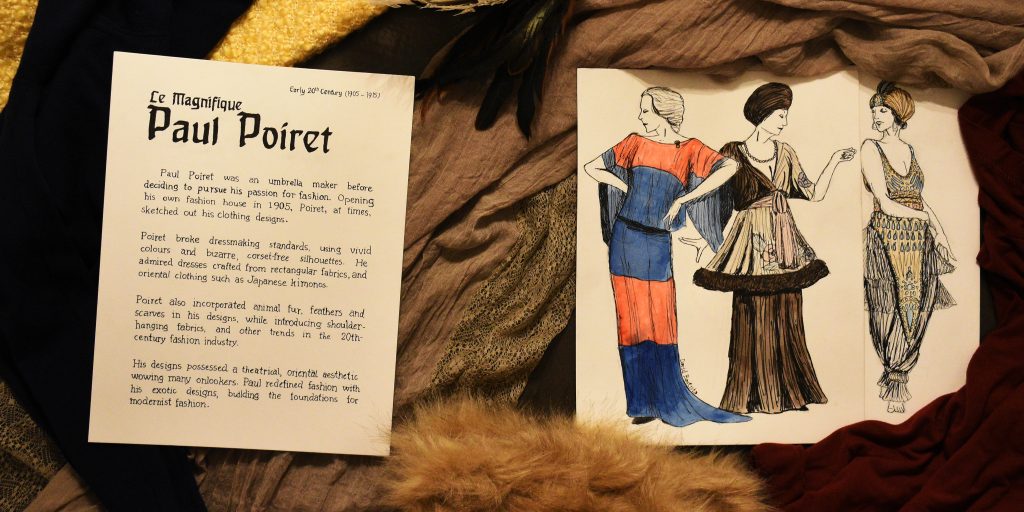
Many decisions were made, of course, before creating the final spread. For one, a wash of watercolour was added to the sketches, despite Poiret’s sketches not being coloured, to depict some of the vibrant colours that Poiret used in his clothing designs.

The typefaces replicated on the left side of the spread are supposed to Behrens-Schrift and Souvenir, these typefaces were chosen because they originated from the 20th century and thus matching the time period.

For the surrounding ‘objects’, the clump of feathers and fur were placed onto the spread as Poiret simply used feathers and fur trims in some of his designs. The fabrics in the back were carefully chosen depending on their likeliness to fabrics Paul himself would’ve used.

As for the orientation of the papers, the spine of the upcoming history book was considered, hence the slightly upright positioning. They were tilted slightly to make the spread more dynamic and less stiff.

Originally, 20th-century sewing objects were to be included in the spread, however finding or crafting a pin cushion, tape measure and fabric scissors was and would have been difficult for me. It would have also caused the spread to become a bit too busy. Thus it was decided to scrap the idea of including those objects.

Considering the end result, I am satisfied. However, I do recall committing some minor mistakes with the text and sketches. The execution of the body text could have been done more carefully. As such, I give myself an 8.5/10.


Total hours spent: 19h:22m

  • Research = 7:09
  • Ideation = 1:58
  • Execution = 8:55
  • Reflection = 2:00

Research – Survey 7

Le Magnifique Paul Poiret

For Week 7, we covered Cubism and Corporate Identity within the period of 1905 to 1915. It was interesting to learn about Peter Behrens and his contributions to visual identity, typography and architectural design. I was also assigned to create an artefact related to fashion during the week, and I eventually decided to research about the French fashion designer, Paul Poiret.

Photograph of Paul Poiret

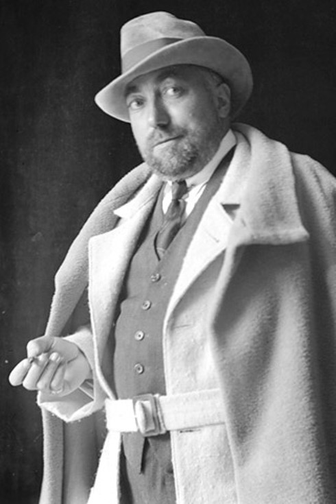
Born on April 20, 1879, in Paris France, Paul Poiret was the son of a cloth maker and, as a teen, became an apprentice umbrella maker. However, Poiret’s interests lay in fashion and thus he began to work for fashion designers including Jaques Doucet.

In 1905, Paul established his own ‘maison de couture’, or fashion house in English, and was assisted by Jaques Doucet who managed to contact famous French actress Gabrielle Rejane to model for Poiret.

A sketch by Paul Poiret from Staatliche Museen zu Berlin Preußischer Kulturbesitz, distributed with Creative Commons BY-NC-SA

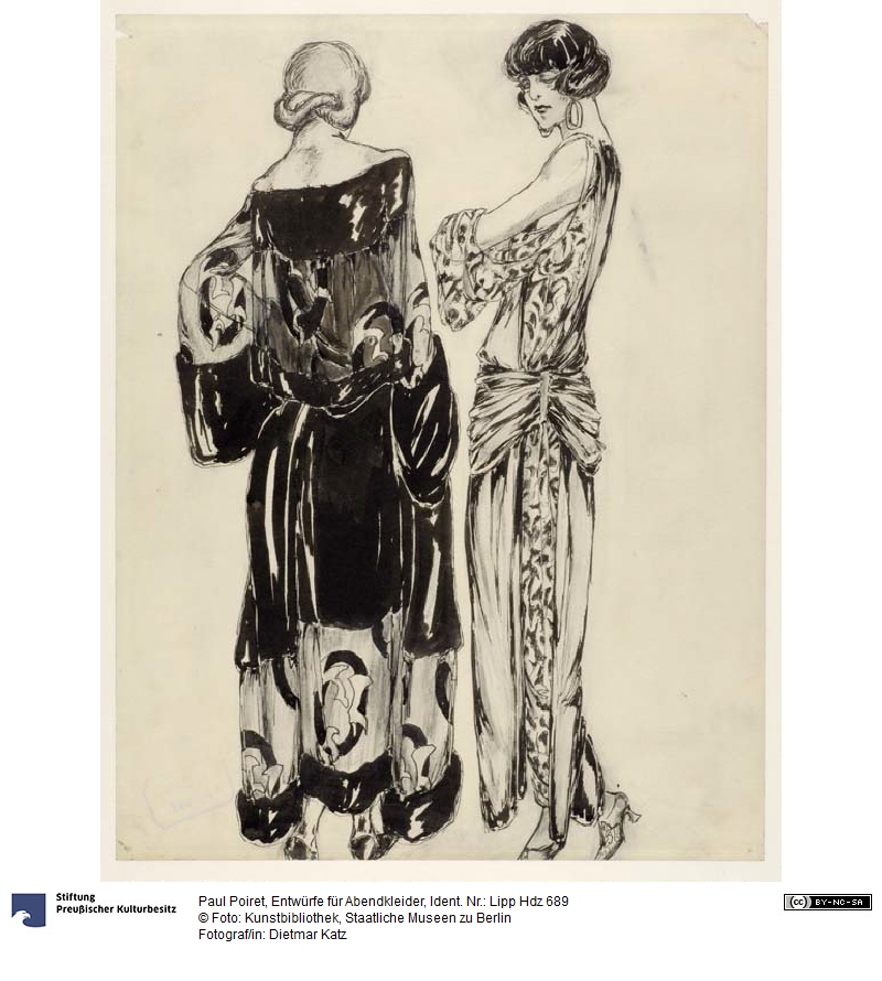
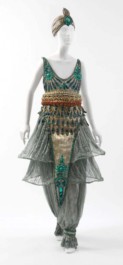
Paul was free to create his own fashion designs, influenced by oriental, eastern fashion, he introduced the Kimono shape to Europe and also made use of turbans and harem pants. Poiret’s designs took a theatrical aesthetic with fringed, draped fabrics, feathers in vibrant colours and fur trims.

He would eventually tour Europe in 1912 with a group of models, showcasing his rather avant-garde designs, and later toured the US in 1913.

One of Paul Poiret’s fashion designs, incorporating harem pants.

The following year, he joined the war efforts in WWI as a military tailor, and was forced to close his fashion business and, afterwards, couldn’t regain his position in the fashion industry, as postwar fashions were more modernist than his exotic fashions. Poiret lost his fame and later died in poverty on April 30, 1944.

However, were it not for Paul Poiret and his bizarre fashions, modern-era fashion wouldn’t have destroyed his career, for his tendency to go above and beyond built the foundations for modernist fashion.

WORKS CITED

  • “Poiret, Paul.” Britannica Concise Encyclopedia, Encyclopaedia Britannica, Britannica Digital Learning, 2017. Credo Reference, https://search-credoreference-com.ezproxy.capilanou.ca/content/entry/ebconcise/poiret_paul/0. Accessed 04 Nov. 2019.
  • “Poiret, Paul.” World of Art: The Thames & Hudson Dictionary of Fashion and Fashion Designers, Georgina O’Hara Callan, Thames & Hudson, 2nd edition, 2008. Credo Reference, https://search-credoreference-com.ezproxy.capilanou.ca/content/entry/thfashion/poiret_paul/0. Accessed 04 Nov. 2019.
  • Koda, Harold, and Andrew Bolton. “Paul Poiret (1879–1944).” In Heilbrunn Timeline of Art History. New York: The Metropolitan Museum of Art, 2000–. https://www.metmuseum.org/toah/hd/poir/hd_poir.htm (September 2008)
  • Koda, Harold, and Andrew Bolton. “Paul Poiret (1879-1944).” Metmuseum.org, The Metropolitan Museum of Art, Sept. 2008, www.metmuseum.org/toah/hd/poir/hd_poir.htm.

IMAGES OBTAINED FROM

  • https://agnautacouture.com/2014/04/06/paul-poiret-le-magnifique-part-2/
  • http://www.smb-digital.de/eMuseumPlus?service=direct/1/ResultLightboxView/result.t1.collection_lightbox.$TspTitleImageLink.link&sp=10&sp=Scollection&sp=SfieldValue&sp=0&sp=0&sp=3&sp=Slightbox_3x4&sp=12&sp=Sdetail&sp=0&sp=F&sp=T&sp=19
  • https://www.metmuseum.org/toah/works-of-art/1983.8a,b/

Survey 8

The Emperor Who Fell – Kaiser Wilhelm II

This week we were introduced to Survey 8, covering the period of 1915-1925. What piqued my interest was that Kazimir Malevich took inspiration from the Greek philosopher Plato, who believed geometry was the best kind of beauty. Not exactly sure what Plato meant, but if it was just simple geometry- I have to disagree, for nature is more complex and beautiful than a simple square.

World War II was also mentioned today, and as a researcher assigned to cover a topic relating to geopolitics, I decided to cover one of the war’s significant figures: Kaiser Wilhelm II.

A photograph portrait of Kaiser Wilhelm II

Born in Potsdam, Germany on January 27,1859, Friedrich Wilhelm Victor Albert had a rather tough upbringing, with his left arm permanently damaged by a complicated birth. Wilhelm also had dysfunctional relationships with his parents.

Wilhelm was intelligent and extremely interested in science and technology. However, he also had a quick-tempered, impulsive, high-strung personality.

His childhood was influenced by the forming of the German Empire under Wilhelm’s father’s rule in 1871. Wilhelm was filled with enthusiasm at the time, being twelve years of age, and was determined to win a future “place in the sun” for Germany. He would later succeed his father as kaiser, or emperor of Germany on June 15, 1888.

A photograph of Wilhelm with his first wife, Augusta, and son, William.

Wilhelm immediately appointed civil servant chancellors instead of statesmen. Even discharging chancellor Otto von Bismarck beforehand, who believed Wilhelm would cause Germany to collapse.

While in power, Wilhelm damaged his own political position. Meddling with foreign policies in response to his emotions, offending nations such as Britain, and being accused of having illegitimate offspring. Wilhelm was psychologically broken by the criticism following his past actions, which mostly influenced his future actions in World War I.

Wilhelm committed to creating a powerful navy to rival Great Britain’s, which he was envious of back then, but also caused financial issues for the German government. He also signed a military order due to pressure from his generals, leading to a declaration of war against Russia and France in August 1914.

He did little to manage the military, only acting as a public-relations figure by giving medals and touring German front lines. Often, he encouraged the strategies of the generals and politicians that subdued chances of a peaceful resolution to the war.

An Oil Painting of Kaiser Wilhelm II by Paul Beckert (c.1890)

Eventually, national and naval unrest in late 1918 convinced political leaders that Wilhelm should abdicate the throne. His abdication was announced long before he gave consent, but nonetheless, he agreed to step down. Moving away to the Netherlands, where he spent the rest of his life away from the troubles of war.

Living in the Netherlands prevented Wilhelm from maintaining his position in Germany, thus he lived quietly in the countryside until he died on June 4, 1941.

Wilhelm was perceived as a warlord by the British back then, however, this view has changed, viewing him more as one involved from the sidelines- criticized for encouraging the actions of German officials without regarding the consequences.

WORKS CITED

  • History.com Editors. “Kaiser Wilhelm II.” World War I, 14 Apr. 2010. A&E Television Networks, https://www.history.com/topics/world-war-i/kaiser-wilhelm-ii. Accessed 6 Nov. 2019.
  • Balfour, Michael Graham. “William II.” Biographies, 31 May, 2019. Encyclopædia Britannica, inc., https://www.britannica.com/biography/Hermann-von-Helmholtz. Accessed 6 Nov. 2019.

IMAGES OBTAINED FROM

  • https://www.britannica.com/biography/William-II-emperor-of-Germany

Survey 7 (Plan)

Artefact – Fashion

Before today’s lecture on Survey 7, I was assigned as a designer to cover fashion between the years 1905 and 1915, which is the period of Cubism and Corporate Identity.

I am supposed to create an artefact relating to this general topic. As such, I have decided to research the fashion designer known as Paul Poiret. Having a brief glimpse of Poiret’s work, I find him to be quite avant-garde.

I will be creating multiple fashion ‘sketches’ of his designs on separate sheets of paper. For the final ‘spread’, I intend to photograph the ‘sketches’ on a flat surface and place objects that relate to fashion in that time period for aesthetic (on one page).

Another page will have a document, written in first-person, by ‘Paul himself’, writing about his life and his own thoughts on general fashion and his own design process.

Looking forward to creating this artefact, in the meantime, I will be getting my research done!

Survey 6

Father of Grotesque Type – Akzidenz-Grotesk

The years 1895-1905 were covered during Week 8 of Survey Design, highlighting the art nouveau movement, which interestingly took influences such as the Renaissance and Rococo eras and Japanese ukiyo-e.

I was assigned, yet again, to another group as a researcher, for typography which I covered following our first lecture. This time, I will be briefly covering the typeface company known as the “Berthold Foundry” and its founder, whilst mainly elaborating on an extremely influential font family that shaped the sans serif typeface library.

An image of Hermann Berthold, founder of the “Berthold Foundry”

In the year of 1858, a company called “Berthold Foundry” was founded in Berlin to manufacture measuring gauges. The founder, Hermann Berthold, was born in 1831 and was the head of the company for fifty-seven years until 1888.

During his time as the head, the company was asked to develop a system for measuring type in 1878, by the wish of the German typefounding industry.

With the help of a professor, a basic measurement was established for typography, where every two thousand six hundred sixty typographic points can be converted into one metre.

This eventually built the foundations of the type measurement system known as the “Didot System”, and was one of Berthold Foundry’s significant achievements.

However, a more well-known achievement of the foundry was the development of the sans-serif typeface family known as Akzidenz-Grotesk, sometime around 1898 near the end of the 19th century. It was the first sans serif font to become widely popular and is considered as the parent of Grotesque design typefaces.

Modern example of the Akzidenz-Grotesk font

This font family was made to be functional over stylistic, this is mostly due to the font being produced in response to marketing activities other than through the regular type design process. The x-height of this typeface was considerably higher, and it had shorter ascenders and descenders to save space.

Though sans serif fonts were utilized commonly as display types, the structure of Akzidenz-Grotesk made it legible enough to be used for body text. This was enough to influence the potential ways sans serif fonts were used.

Between 1893 to 1926, the “Berthold Foundry” purchased other foundries that manufactured similar typefaces to acquire them. Many of the acquired typefaces were categorized as if they originated from the Akzidenz-Grotesk family. The inclusion of more san serif fonts into Berthold Foundry’s typeface collection contributed to the success of the Akzidenz-Grotesk font.

This success opened a market for sans serif types but was partially problematic as more competing sans serif typefaces were created such as the “Venus” typeface by the “Bauer Foundry”.

The result was a drop in Akzidenz-Grotesk’s popularity, however, this was revitalized when Swiss-style typography demanded the simple, structured design of Berthold’s typeface.

Modern example of Helvetica, developed initially from Akzidenz-Grotesk

This typeface can still be obtained today, due to its enlargement and refinement in the 1950s- making it usable in a digital format. Were it not for this revitalization of popularity, this typeface would have not allowed for the development of certain sans serif designs such as Univers, and even the well-known Helvetica.

WORKS CITED

  • “1800-.” The Visual History of Type, by Paul McNeil, Laurence King Publishing Ltd, 2017, pp. 152–153.
  • “Hermann Berthold.” MyFonts, MyFonts Inc., www.myfonts.com/person/Hermann_Berthold/.
  • “Berthold (f. 1858).” The Thames & Hudson Dictionary of Design Since 1900, Guy Julier, Thames & Hudson, 2nd edition, 2004. Credo Reference, https://search-credoreference-com.ezproxy.capilanou.ca/content/entry/thdesign/berthold_f_1858/0. Accessed 29 Oct. 2019.

IMAGES OBTAINED FROM

  • https://alchetron.com/Hermann-Berthold#hermann-berthold-4d047c2b-0ece-4988-b633-3c174120ed3-resize-750.jpg
  • https://en.wikipedia.org/wiki/Akzidenz-Grotesk#/media/File:AkzidenzGroteskspecAIB1.svg
  • https://commons.wikimedia.org/wiki/File:HelveticaSpecimenCH.png

Survey 5

Vision with Herman von Helmholtz

For Week 7 of Survey Design, we went over the years 1850 – 1895, while also covering The Great Exhibition. As this event happened in Vancouver in 1986, I do hope it returns in the future so I can experience it and travel the world without wandering too far from home.

I was also assigned to a group as a researcher, and in a general agreement, decided to cover optics during the 19th century, specifically anything related to vision. It was a bit difficult to research this topic during this period, but luckily I did find something interesting to cover for this post.

An actual photo of Herman von Helmholtz.

As such, I would like to introduce to you, the man responsible for boosting the development of visual optics: Hermann von Helmholtz, or Hermann Ludwig Ferdinand Helmholtz, who contributed to the study of optics, and also invented some tools that optometrists use today, with the most significant being the ophthalmoscope.

Ophthalmoscopes are used today to examine blood cells in the retina and can indicate signs of medical issues in the eye and even in the circulatory system. It also allows for the accurate prescription of eyeglasses.

Helmholtz invented the first proper ophthalmoscope in the 19th century, in the year 1851. An English inventor named Charles Babbage made a similar instrument to the ophthalmoscope earlier in 1847, but it failed to be of any use to eye doctors at the time.

Helmholtz was greatly successful due to his studies while conducting research on the eye, he found out that a clear image of eye tissue can be produced if a light is focused onto the tissue.

A front and back image of a 19th century ophthalmoscope.

Helmholtz also wrote the ‘Treatise of Physiological Optics’ (c.a. 1856), where he reports on his research regarding the behaviour and characteristics of the eye, with a dose of philosophy.

The text demonstrated the eyes’ perception of distance and developed the theory of space, while also elaborating on colour vision, in response to a theory made by Thomas Young (1802).

According to Young, three primary-colour receptors worked in unison to produce the colour range an average human witnesses.

Helmholtz expands on this, stating that three types of light receptors in the eye were colour-sensitive, reacting to blue-violet, green or red light.

Within these receptors are various chemicals with different sensitivities and reactions to light, stimulating neurons and sending signals to the brain.

Helmholtz applied this expanded theory to topics such as afterimages and blindness.

A modern, translated version of Helmholtz’s ‘Treatise of Physiological Optics’ , edited by James P.C. Southall.

Helmholtz also delves into deep thinking with the following question: if eyes do react in a form of optical phenomena, can we be sure and trust our general senses to relay information of the outside world to our brain? This was a question that Helmholtz explored and often failed to answer.

Thanks to the efforts and materialized research of Hermann von Helmholtz, humans managed to develop the understanding of eye vision that we know and follow today.

Our optometrists may have been unable to care for the conditions of our eyes, were it not for Helmholtz’s invention.

WORKS CITED

  • Williams, L. Pearce. “Hermann von Helmholtz.” Biographies, 4 Sept. 2019. Encyclopædia Britannica, inc., https://www.britannica.com/biography/Hermann-von-Helmholtz. Accessed 22 Oct. 2019.
  • Street, Warren R, and Philip Tolin. “Helmholtz, Hermann von.” Encyclopedia of Cognitive Science, L. Nadel, Wiley, 1st edition, 2005. Credo Reference, https://search-credoreference-com.ezproxy.capilanou.ca/content/entry/wileycs/helmholtz_hermann_von/0. Accessed 22 Oct. 2019.
  • “Helmholtz, Hermann (Ludwig Ferdinand) von (1821 – 1894).” The Cambridge Dictionary of Scientists, edited by David Millar, Cambridge University Press, 2nd edition, 2002. Credo Reference, https://search-credoreference-com.ezproxy.capilanou.ca/content/entry/dicscientist/helmholtz_hermann_ludwig_ferdinand_von_1821_1894/0. Accessed 23 Oct. 2019.

IMAGES OBTAINED FROM

  • https://www.britannica.com/biography/Hermann-von-Helmholtz
  • http://www.mrcophth.com/Historyofophthalmology/ophthalmoscope.html
  • https://www.amazon.com/gp/product/B0006AJDBQ/?tag=prabook0b-20

Survey 4

Sound the Steam Whistles (Impacts of the Steam Engine)

Week 6 of our Survey Design class covered the years 1750-1850, as well as in-depth coverage of printmaking in Japan. In all honesty, it was a nice break from the origins of design and typography in Europe.

There was also the mention of steam power during the lecture. Having been assigned as a designer this week- I decided to cover this topic. As such, allow me to explain to you the impacts of the steam engine during the Industrial Revolution:

A photograph of a recovered Newcomen steam engine.

The invention of a steam engine through the contributions of Thomas Newcomen and James Watt signified a major turning point for life in Britain.

Thomas Newcomen invented the first known model of the steam engine in 1712, intending to improve the exploitation of coal. The resource was easier to find because of the Newcomen’s model, with the mining industry having the newfound ability to dig deeper pits to reach previously untouched coal reserves.

This method is the discharge of water from mines, now more efficient compared to slower processes existing before the steam engine. Unfortunately, this did not improve the way coal was extracted, it only reduced the time required to access the coal.

This revelation did influence the location of industrial zones, with new factories established closer to coalfields which gave access to cheaper sources of fuel.

Factories too were affected by the introduction of the steam engine. However, these engines were rather inefficient since steam would tend to escape- otherwise, more steam was being consumed to produce steam power. Cue the arrival of James Watt, who improved Newcomen’s model of the steam engine.

An illustration of a water-powered factory. Factories powered by water flow were common before the emergence of the steam engine.

Before the implementation of the steam engines, early factories had to be located on hills which contained streams of fast-running water that powered these factories. With the steam engine, factories need no longer the hillsides but a single, large steam engine reworked by Mr. Watts.

This engine was used to drive a shaft and power belt which primarily delivered power to all machines in the factory, thus reducing the required amount of manual labour.

The increased productivity also attracted bundles of settlers seeking to live in industrial zones, forced to live closer to work as many towns transformed into cities.

The use of iron was significantly improved, with the steam engine- developments in utilizing iron skyrocketed, with iron-made factories and the more accurate manufacturing of existing machines and steam engines.

The steam engine also reduced the cost of transporting goods, improving transport via land and sea, more specifically through watercraft and railroads.

A man named Robert Fulton, utilized the steam engine to invent the first steamboat, allowing more goods to be shipped through canals and waterways in 1807.

An illustration of an early steam train invented by George Stephenson.

George Stephenson invented the first steam-powered train in 1814, which transported human populations and of course goods, through long-distance spans. This opened a system of importing and exporting goods as well as raw materials.

When all these breakthroughs are considered in thought, it was no doubt that the steam engine was a major game-changer during its time.

WORKS CITED

  • “Steam Engine.” Bloomsbury Guide to Human Thought, edited by Kenneth McLeish, Bloomsbury, 1st edition, 1993. Credo Reference, https://search-credoreference-com.ezproxy.capilanou.ca/content/entry/bght/steam_engine/0. Accessed 16 Oct. 2019.
  • “Industrial Revolution.” The Hutchinson Unabridged Encyclopedia with Atlas and Weather Guide, edited by Helicon, 2018. Credo Reference, https://search-credoreference-com.ezproxy.capilanou.ca/content/entry/heliconhe/industrial_revolution/0. Accessed 16 Oct. 2019.
  • History Crunch Writers. “Invention of the Steam Engine.” History Crunch – History Articles, Summaries, Biographies, Resources and More, History Crunch, 22 Jan. 2016, www.historycrunch.com/invention-of-the-steam-engine.html#/.

IMAGES OBTAINED FROM

  • https://ethw.org/Thomas_Newcomen_and_the_Steam_Engine
  • https://www.locallocalhistory.co.uk/brit-land/power/page06.htm
  • https://diyhomeschooler.com/the-steam-locomotive-a-mini-unit/

Survey 3

A Brighter Day with Pastels

Week 3 of Survey Design involved a small case of entertaining, historical drama. What stuck out to me was the backstabbing of Johannes Gutenberg by Johann Fust. The thought of stealing a person’s work without acknowledging them to gain a full benefit- to me, is unfair and sickening.

Despite this interesting ordeal, we also covered the arrival of the printed press and of the Baroque and Rococo periods. Through research, I found that both eras seem to mention differences in using colour.

More is known of colour usage during the Baroque period, but that’s not what I want to discuss with you today. In short, we’re going to talk about the colours of its biological child, the Rococo period.

These chairs are an example of Rococo furniture, with white lacquer and light yellow cushions.

The Rococo period began when art conveying youthful vibes were requested by Louis XIV in 1699. The term ‘rococo’ originates from the French word ‘rocaille’, meaning ‘rockery’ or ‘shell incrustation’ in English.

The term is associated with a French art movement that resulted in a transition from the deep colours of the Baroque period. This change was seen in interior architecture and art.

Other than the vibrant exteriors, Rococo interiors were muted, and softer in colour compared to Baroque interiors. The wooden components of furniture were coated with white lacquer or gold, while cushioned parts were usually coloured light green or yellow.

On a side note, matching the colour of women’s clothing with Rococo furniture was a preferred practice as well.

Art had an appealing change from expressing dramatic moments in the Baroque era, to positive and happier events. To indicate this more positive vibe, artists also resorted to utilizing light pastel colours alongside Rococo interiors.

‘The Swing’ (c.1767) is considered one of the best paintings to originate from the Rococo period.

Jean-Honoré Fragonard makes use of pastels in the famous ‘The Swing’, in which a young woman sports a light pink dress as she swings to and fro. The use of pastel pink assists in depicting a moment of joy.

François Boucher’s Blond Odalisque also includes pastel colours which contrast with the golden or yellowish surroundings. Pastel blue and again- pink, were used, combined with a naked female figure to give off a more intimate vibe compared to Fragonard’s joyful piece.

An image of the ‘Blond Odelesque’ (c.1752) painting.

The artistic trend that existed in this era was a more light hearted and intimate approach to art, with artists in this period veering towards a playful manner in their works.

Pastel colours in the Rococo period were a huge leap in aesthetic value; escaping the dramatic, deep colours that once shrouded the Baroque period for the lighter spectrum of pastels.

WORKS CITED

  • Charles, Victoria, and Klaus H. Carl. Rococo. Parkstone International, 2010. EBSCOhost, search.ebscohost.com/login.aspx?direct=true&db=nlebk&AN=436229&site=eds-live&scope=site.
  • “Rococo style.” Britannica Concise Encyclopedia, Encyclopaedia Britannica, Britannica Digital Learning, 2017. Credo Reference, https://search-credoreference-com.ezproxy.capilanou.ca/content/entry/ebconcise/rococo_style/0?institutionId=6884. Accessed 09 Oct. 2019.
  • “Rococo.” The Bloomsbury Guide to Art, edited by Shearer West, Bloomsbury, 1st edition, 1996. Credo Reference, https://search-credoreference-com.ezproxy.capilanou.ca/content/entry/bga/rococo/0?institutionId=6884. Accessed 10 Oct. 2019.
  • “Rococo.” The Thames & Hudson Dictionary of British Art, edited by David Bindman, and Nigel J. Morgan, Thames & Hudson, 1st edition, 1988. Credo Reference, https://search-credoreference-com.ezproxy.capilanou.ca/content/entry/thba/rococo/0. Accessed 10 Oct. 2019.
  • Richman-Abdou, Kelly. “Celebrate the Elegance and Exuberance of French Rococo Art.” My Modern Met, 27 Apr. 2018, mymodernmet.com/rococo-art/.
  • All That’s Interesting. “The Rococo Art Movement That Dominated The Seventeenth & Eighteenth Century.” All That’s Interesting, All That’s Interesting, 7 Aug. 2019, allthatsinteresting.com/rococo-art-movement.
    Krén, Emil, and Daniel Marx. “Blond Odalisque (L’Odalisque Blonde).” Blond Odalisque (L’Odalisque Blonde) by BOUCHER, Franois, Web Gallery of Art, www.wga.hu/html_m/b/boucher/2/o_murph.html.

IMAGES OBTAINED FROM

  • https://allthatsinteresting.com/rococo-art-movement
  • https://www.britannica.com/art/Rococo

Survey 2

The Barbaric Squalls of the North

Following the collapse of the Roman Empire, Britain was faced with oppression from barbaric tribes. Among these tribes were the Scots and Picts, but the wild cards of this ordeal were the Vikings and the Anglo-Saxons.

A drawn depiction of Anglo-Saxon warriors.
Obtained from http://epicworldhistory.blogspot.com/2013/10/anglo-saxon-culture.html

Anglo-Saxon history dates back to the 3rd century AD, where Saxon raiders sailed across the North Sea to raid settlements on the southeast coast. Defences were strengthened to prevent raids only to fail in 367 AD during the ‘Barbarian Conspiracy’- involving a united raid of Picts, Scots, and Saxon groups. This united force temporarily shook the foundations and shattered the British army.

Early Anglo-Saxons groups to set foot in Britain soil weren’t entirely Anglo-Saxon as tribal affiliation for Germanic tribes were not too strict. Thus, groups would involve people from other Germanic groups. Some even had names influenced by Celtic origins.

The Germanic Anglo-Saxons favoured great skill and courage in combat. They originally followed pagan beliefs, with concepts such as unavoidable destiny (or fatalism) and the human ability to manipulate the supernatural. Eventually, they would be forced to convert into Christian faith, specifically because of the British Christians who looked down upon paganism.

A Viking longship, notice the shallow draft or bottom of the ship.
Obtained from https://www.khm.uio.no/english/visit-us/viking-ship-museum/

Anglo-Saxons would thrive until the rise of the Vikings, who sought the opportunity of the wealth gained by the germanic group while beginning to bring British land under their control.

Originating from Scandinavia, the Vikings (from ‘vikingr’ , Norse term for sea-rover or pirate) sailed onwards to the upper region of the British Isles. Their advances weren’t easily hindered, due to the Vikings’ use of oar-powered longships as the draft of the vessels was shallow- allowing them to land on flat beaches. This also enabled them to initiate raids without being noticed beforehand.

It is a presumption that the Vikings were motivated by sudden population blooms in Scandinavia and the fall of the Frisians, thus they were pressured and they resorted to the art of raiding. Utilizing hit-and-run tactics, they were quick on their feet and pillaged settlements before defences can retaliate.

A depiction of a Viking raid on a monastery.
Obtained from https://vikinghistorytales.blogspot.com/2013/10/802-vikings-sacked-and-burned-iona.html

Initially, they set their eye on locations along the coast, and on one instance- they raided the coastal monastery of Lindisfarne in 793AD as well as Iona in 795AD. Churches and monasteries were common targets due to the absence of defences and an abundance of loot.

The Vikings continued to raid in 840AD, but now alongside a mutual interest for settling onto Britain soil and in larger groups. Eventually settling on the isles of Scotland, the northern, eastern regions of England (as a result of the non-cooperative nature between the British and Irish nations), and as aforementioned, land occupied by the Anglo-Saxons.

WORKS CITED

  • “The Saxon Shore.” The Hutchinson Unabridged Encyclopedia with Atlas and Weather Guide, edited by Helicon, 2018. Credo Reference, https://ezproxy.capilanou.ca/login?url=https://search.credoreference.com/content/entry/heliconhe/the_saxon_shore/0?institutionId=6884. Accessed 25 Sep. 2019.
  • “Vikings.” Encyclopedia of Warrior Peoples & Fighting Groups, edited by Paul K. Davis, and Allen Lee Hamilton, Grey House Publishing, 3rd edition, 2016. Credo Reference, https://ezproxy.capilanou.ca/login?url=https://search.credoreference.com/content/entry/greywarrior/vikings/0?institutionId=6884. Accessed 25 Sep. 2019.
  • Anglo Saxon. (2018). In Helicon (Ed.), The Hutchinson unabridged encyclopedia with atlas and weather guide. Abington, UK: Helicon. Retrieved from https://ezproxy.capilanou.ca/login?url=https://search.credoreference.com/content/entry/heliconhe/anglo_saxon/0?institutionId=6884
  • Burns, William E. “Anglo-Saxons.” World History: A Comprehensive Reference Set, edited by Facts on File, Facts On File, 1st edition, 2016. Credo Reference, https://ezproxy.capilanou.ca/login?url=https://search.credoreference.com/content/entry/fofworld/anglo_saxons/0?institutionId=6884. Accessed 25 Sep. 2019.
  • “The Scourge of the North: The Vikings in Britain.” The Hutchinson Unabridged Encyclopedia with Atlas and Weather Guide, edited by Helicon, 2018. Credo Reference, https://ezproxy.capilanou.ca/login?url=https://search.credoreference.com/content/entry/heliconhe/the_scourge_of_the_north_the_vikings_in_britain/0?institutionId=6884. Accessed 25 Sep. 2019.

Survey 1

The Evolution of The Chinese Writing System

Today in our Survey Design class, we covered the history of handprints and handwriting. We briefly discussed the history of handwriting in Asia, and it was interesting to learn that inscriptions were found on bones. This drove me to further research about these inscriptions, and the history of the Chinese writing system.

Chinese writing consists of symbols or characters ,and the earliest confirmed iteration of these characters took place sometime between the Neolithic period and half of the Shang Dynasty (around 1200 to 1050 B.C.E.). First manifesting during the reign of King Wu Ding around 1200 B.C.E., they came in the form of oracle bone inscriptions. 

Oracle Bones were sold as dragon bones in the late 19th century until scholars started retrieving them in the 1920s.
Obtained from https://www.chinasage.info/oracle-bones.htm

The inscriptions on these bones are known as chiaku-wen, or bone-and-shell script, and were commonly used in divination and were inscribed on animal shoulder blades and turtle shells. They usually depicted questions from diviners regarding subjects such as weather and luck. They were then heated, and the cracks produced by the heating determined a yes or no answer from gods or ancestors. 

Samples of these oracle bones show that the characters were written in columns. The symbols themselves were more like pictograms compared to their modern-day counterparts. These are the earliest evidence of ideograms, a term referring to picture symbols often associated with the Chinese writing system.

Chiaku-wen would eventually evolve into chin-wen (or bronze script). This involved the embedding of inscriptions onto various cast-bronze objects. Similar to the writings on oracle bones, bronze inscriptions depicted messages from gods and ancestors. However, these inscriptions were permanent, making bronze script ideal for treaties, contracts and other important documents.

Bronze script was embedded onto cast-bronze objects such as weapons, and even food.
Obtained from https://alchetron.com/Chinese-bronze-inscriptions#-

Chin-wen would eventually evolve into an art form known as calligraphy. Starting sometime during the 4th century B.C.E, the practice, involving ink and brush, had very strict rules in terms of its execution. These included how much ink was used and the composition of written characters.

Individual brush strokes in ideograms are known as radicals, allowing each character to be classified. All the characters fit into an imaginary, rectangular box and are known as logograms, which are symbols representing individual words. Eventually, this formed a vast library of written characters that needed to be learnt, and those who managed to learn them were considered to be wise.

Initially, different styles of calligraphy were utilized throughout China, until the reign of Emperor Shih Huang Ti (around 259 to 210 B.C.E.), who unified all of the existing writing styles. This style remained until Li Ssu, a prime minister from 280 to 208 B.C.E., developed a new style of calligraphy called hsiao chuan or “small-seal”. The result was a more abstract and graceful style, also neatly balanced in terms of form.

A visualization of Emperor Shih Huang Ti.
Obtained from https://www.chinasage.info/qin-dynasty.htm

I will not be covering anything that occurred during the common era, since the post would be lengthened. Thus, I will be taking my leave.

Thanks, and until then!

WORKS CITED

  • “Chinese.” The Columbia Encyclopedia, Paul Lagasse, and Columbia University, Columbia University Press, 8th edition, 2018. Credo Reference, https://ezproxy.capilanou.ca/login?url=https://search.credoreference.com/content/entry/columency/chinese/0?institutionId=6884. Accessed 16 Sep. 2019.
  • Chinese writing system. (2017). In Encyclopaedia Britannica, Britannica concise encyclopedia. Chicago, IL: Britannica Digital Learning. Retrieved from https://ezproxy.capilanou.ca/login?url=https://search.credoreference.com/content/entry/ebconcise/chinese_writing_system/0?institutionId=6884
  • SAUSSY, H. “Ideogram.” The Princeton Encyclopedia of Poetry and Poetics, edited by Roland Green, et al., Princeton University Press, 4th edition, 2012. Credo Reference, https://ezproxy.capilanou.ca/login?url=https://search.credoreference.com/content/entry/prpoetry/ideogram/0?institutionId=6884. Accessed 16 Sep. 2019.
  • “calligraphy.” The Hutchinson Unabridged Encyclopedia with Atlas and Weather Guide, edited by Helicon, 2018. Credo Reference, https://ezproxy.capilanou.ca/login?url=https://search.credoreference.com/content/entry/heliconhe/calligraphy/0?institutionId=6884. Accessed 16 Sep. 2019.
  • “oracle bones.” The Columbia Encyclopedia, Paul Lagasse, and Columbia University, Columbia University Press, 8th edition, 2018. Credo Reference, https://ezproxy.capilanou.ca/login?url=https://search.credoreference.com/content/entry/columency/oracle_bones/0?institutionId=6884. Accessed 16 Sep. 2019.
  • Writing and Literacy in Early China : Studies from the Columbia Early China Seminar, edited by Feng Li, and David Prager Branner, University of Washington Press, 2011. ProQuest Ebook Central, https://ebookcentral-proquest-com.ezproxy.capilanou.ca/lib/capilano-ebooks/detail.action?docID=3444463.
  • “typography.” The Columbia Encyclopedia, Paul Lagasse, and Columbia University, Columbia University Press, 8th edition, 2018. Credo Reference, https://ezproxy.capilanou.ca/login?url=https://search.credoreference.com/content/topic/typography?institutionId=6884. Accessed 16 Sep. 2019.
  • Yee, Chiang. “Chinese Calligraphy.” Encyclopædia Britannica, Encyclopædia Britannica, Inc., 17 Jan. 2019, www.britannica.com/art/Chinese-calligraphy.
  • Asia for Educators. “Timeline of Chinese History and Dynasties: Asia for Educators: Columbia University.” Timeline of Chinese History and Dynasties | Asia for Educators | Columbia University, Columbia University, 2009, afe.easia.columbia.edu/timelines/china_timeline.htm.
  • “Chapter 3: The Asian Contribution.” Meggs’ History of Graphic Design, by Philip B. Meggs and Alston W. Purvis, 5th ed., John Wiley & Sons, 2012, pp. 34–36.