Father of Grotesque Type – Akzidenz-Grotesk
The years 1895-1905 were covered during Week 8 of Survey Design, highlighting the art nouveau movement, which interestingly took influences such as the Renaissance and Rococo eras and Japanese ukiyo-e.
I was assigned, yet again, to another group as a researcher, for typography which I covered following our first lecture. This time, I will be briefly covering the typeface company known as the “Berthold Foundry” and its founder, whilst mainly elaborating on an extremely influential font family that shaped the sans serif typeface library.
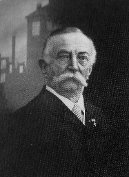
In the year of 1858, a company called “Berthold Foundry” was founded in Berlin to manufacture measuring gauges. The founder, Hermann Berthold, was born in 1831 and was the head of the company for fifty-seven years until 1888.
During his time as the head, the company was asked to develop a system for measuring type in 1878, by the wish of the German typefounding industry.
With the help of a professor, a basic measurement was established for typography, where every two thousand six hundred sixty typographic points can be converted into one metre.
This eventually built the foundations of the type measurement system known as the “Didot System”, and was one of Berthold Foundry’s significant achievements.
However, a more well-known achievement of the foundry was the development of the sans-serif typeface family known as Akzidenz-Grotesk, sometime around 1898 near the end of the 19th century. It was the first sans serif font to become widely popular and is considered as the parent of Grotesque design typefaces.
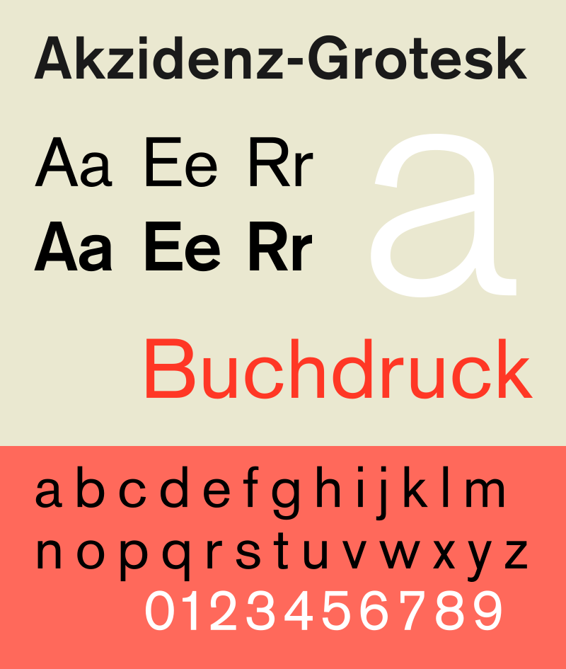
This font family was made to be functional over stylistic, this is mostly due to the font being produced in response to marketing activities other than through the regular type design process. The x-height of this typeface was considerably higher, and it had shorter ascenders and descenders to save space.
Though sans serif fonts were utilized commonly as display types, the structure of Akzidenz-Grotesk made it legible enough to be used for body text. This was enough to influence the potential ways sans serif fonts were used.
Between 1893 to 1926, the “Berthold Foundry” purchased other foundries that manufactured similar typefaces to acquire them. Many of the acquired typefaces were categorized as if they originated from the Akzidenz-Grotesk family. The inclusion of more san serif fonts into Berthold Foundry’s typeface collection contributed to the success of the Akzidenz-Grotesk font.
This success opened a market for sans serif types but was partially problematic as more competing sans serif typefaces were created such as the “Venus” typeface by the “Bauer Foundry”.
The result was a drop in Akzidenz-Grotesk’s popularity, however, this was revitalized when Swiss-style typography demanded the simple, structured design of Berthold’s typeface.
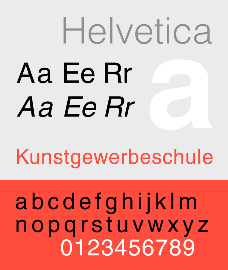
This typeface can still be obtained today, due to its enlargement and refinement in the 1950s- making it usable in a digital format. Were it not for this revitalization of popularity, this typeface would have not allowed for the development of certain sans serif designs such as Univers, and even the well-known Helvetica.
WORKS CITED
- “1800-.” The Visual History of Type, by Paul McNeil, Laurence King Publishing Ltd, 2017, pp. 152–153.
- “Hermann Berthold.” MyFonts, MyFonts Inc., www.myfonts.com/person/Hermann_Berthold/.
- “Berthold (f. 1858).” The Thames & Hudson Dictionary of Design Since 1900, Guy Julier, Thames & Hudson, 2nd edition, 2004. Credo Reference, https://search-credoreference-com.ezproxy.capilanou.ca/content/entry/thdesign/berthold_f_1858/0. Accessed 29 Oct. 2019.
IMAGES OBTAINED FROM
- https://alchetron.com/Hermann-Berthold#hermann-berthold-4d047c2b-0ece-4988-b633-3c174120ed3-resize-750.jpg
- https://en.wikipedia.org/wiki/Akzidenz-Grotesk#/media/File:AkzidenzGroteskspecAIB1.svg
- https://commons.wikimedia.org/wiki/File:HelveticaSpecimenCH.png