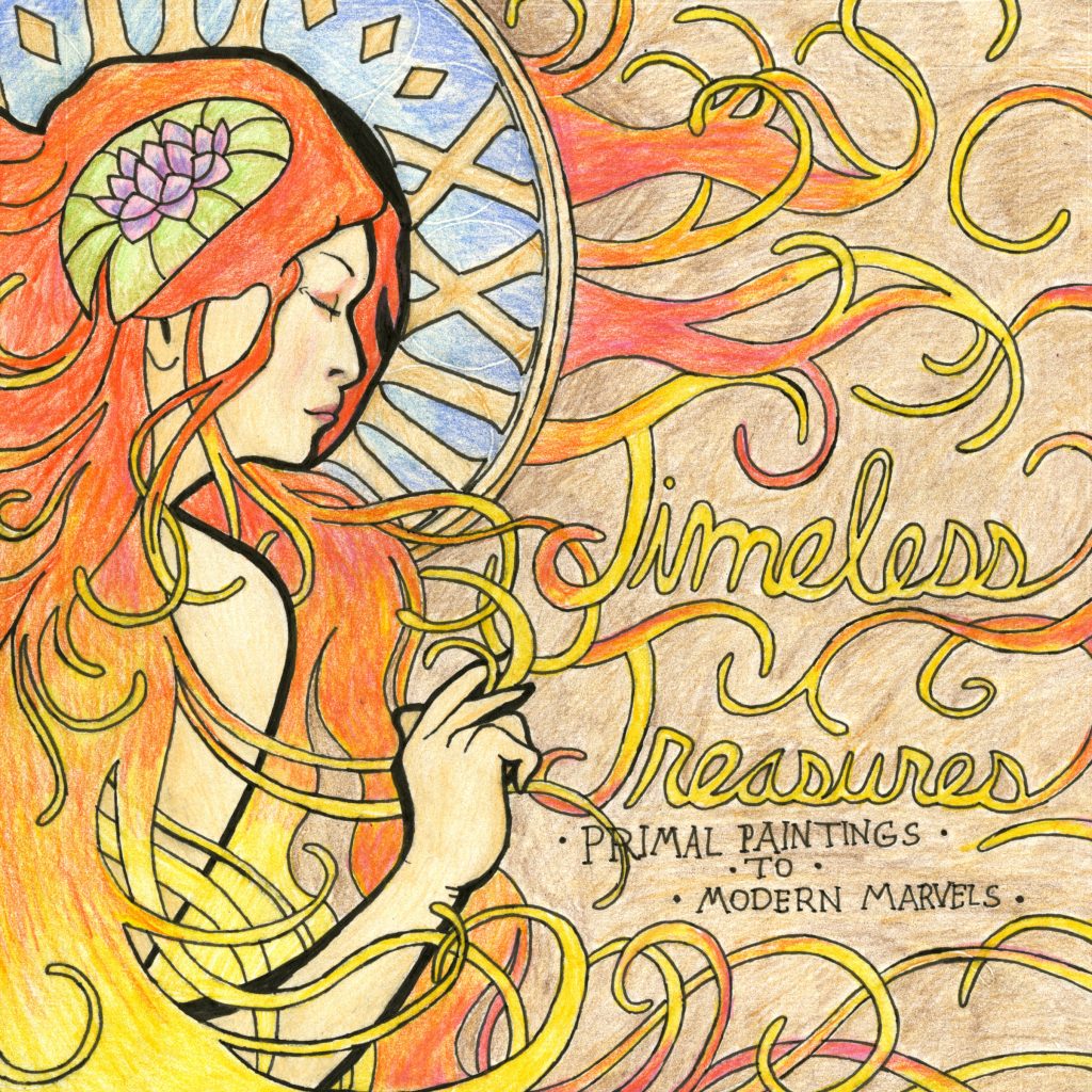
My final submission for IDES 141 is a potential front cover design. The ideated theme for the design was a risky move, as it only covers a specific period in history.
The main inspiration/motif for the cover was the Art Nouveau, and the artist Alphonse Mucha. This particular art period was chosen personally because of the style’s visual appeal, and its amount of detail and simplicity.
There is also a set of Roman numerals to the right of the ‘lily woman’, XXIII stands for 23 and was implemented into the cover design to hint at our class, IDEA’23.
Apart from that, I began develop a few concerns with my design after completing it. For one, it can be almost unavoidable to get lost within the design due to the distribution of whiplash curves and warm-coloured hair.
There is also a minor issue regarding the neatness of the design’s execution. The final drawing was created on a different paper medium, and was transferred via tracing paper. This required my pen to press down on the tracing paper to transfer the image. Erasing the embedded graphite lines from the transfer resulted in impressions that leave white marks on the design when coloured over.
Considering what I covered in this rationale, I would give myself an 8/10. I am pretty much alright with the result, however there are minor elements which I could have been a bit more careful about.
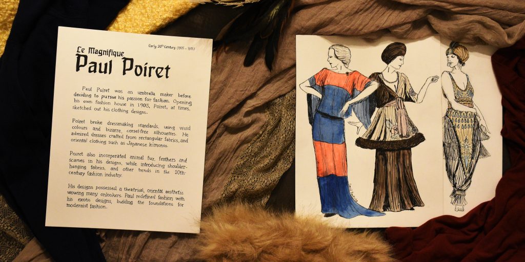
I was assigned to design a fashion artefact spread for Week 7, as such I wanted to cover fashion designer Paul Poiret, whose avant-garde designs inspired me to draw some of his apparent sketches in his style.
Many decisions were made, of course, before creating the final spread. For one, a wash of watercolour was added to the sketches, despite Poiret’s sketches not being coloured, to depict some of the vibrant colours that Poiret used in his clothing designs.
The typefaces replicated on the left side of the spread are supposed to Behrens-Schrift and Souvenir, these typefaces were chosen because they originated from the 20th century and thus matching the time period.
For the surrounding ‘objects’, the clump of feathers and fur were placed onto the spread as Poiret simply used feathers and fur trims in some of his designs. The fabrics in the back were carefully chosen depending on their likeliness to fabrics Paul himself would’ve used.
As for the orientation of the papers, the spine of the upcoming history book was considered, hence the slightly upright positioning. They were tilted slightly to make the spread more dynamic and less stiff.
Originally, 20th-century sewing objects were to be included in the spread, however finding or crafting a pin cushion, tape measure and fabric scissors was and would have been difficult for me. It would have also caused the spread to become a bit too busy. Thus it was decided to scrap the idea of including those objects.
Considering the end result, I am satisfied. However, I do recall committing some minor mistakes with the text and sketches. The execution of the body text could have been done more carefully. As such, I give myself an 8.5/10.
Total hours spent: 19h:22m
Research = 7:09
Ideation = 1:58
Execution = 8:55
Reflection = 2:00
Research – Survey 7
Le Magnifique Paul Poiret
For Week 7, we covered Cubism and Corporate Identity within the period of 1905 to 1915. It was interesting to learn about Peter Behrens and his contributions to visual identity, typography and architectural design. I was also assigned to create an artefact related to fashion during the week, and I eventually decided to research about the French fashion designer, Paul Poiret.
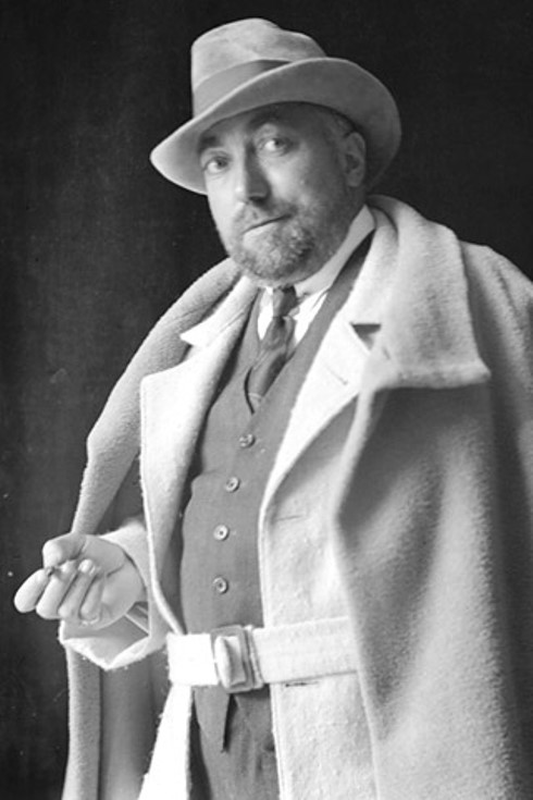
Photograph of Paul Poiret
Born on April 20, 1879, in Paris France, Paul Poiret was the son of a cloth maker and, as a teen, became an apprentice umbrella maker. However, Poiret’s interests lay in fashion and thus he began to work for fashion designers including Jaques Doucet.
In 1905, Paul established his own ‘maison de couture’, or fashion house in English, and was assisted by Jaques Doucet who managed to contact famous French actress Gabrielle Rejane to model for Poiret.
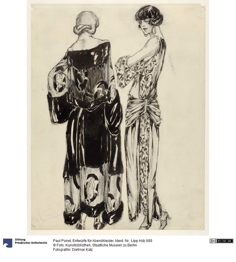
A sketch by Paul Poiret from Staatliche Museen zu Berlin Preußischer Kulturbesitz, distributed with Creative Commons BY-NC-SA
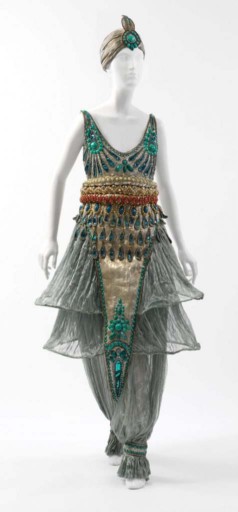
Paul was free to create his own fashion designs, influenced by oriental, eastern fashion, he introduced the Kimono shape to Europe and also made use of turbans and harem pants. Poiret’s designs took a theatrical aesthetic with fringed, draped fabrics, feathers in vibrant colours and fur trims.
He would eventually tour Europe in 1912 with a group of models, showcasing his rather avant-garde designs, and later toured the US in 1913.
One of Paul Poiret’s fashion designs, incorporating harem pants.
The following year, he joined the war efforts in WWI as a military tailor, and was forced to close his fashion business and, afterwards, couldn’t regain his position in the fashion industry, as postwar fashions were more modernist than his exotic fashions. Poiret lost his fame and later died in poverty on April 30, 1944.
However, were it not for Paul Poiret and his bizarre fashions, modern-era fashion wouldn’t have destroyed his career, for his tendency to go above and beyond built the foundations for modernist fashion.
WORKS CITED
“Poiret, Paul.” Britannica Concise Encyclopedia, Encyclopaedia Britannica, Britannica Digital Learning, 2017. Credo Reference, https://search-credoreference-com.ezproxy.capilanou.ca/content/entry/ebconcise/poiret_paul/0. Accessed 04 Nov. 2019.
“Poiret, Paul.” World of Art: The Thames & Hudson Dictionary of Fashion and Fashion Designers, Georgina O’Hara Callan, Thames & Hudson, 2nd edition, 2008. Credo Reference, https://search-credoreference-com.ezproxy.capilanou.ca/content/entry/thfashion/poiret_paul/0. Accessed 04 Nov. 2019.
Koda, Harold, and Andrew Bolton. “Paul Poiret (1879–1944).” In Heilbrunn Timeline of Art History. New York: The Metropolitan Museum of Art, 2000–. https://www.metmuseum.org/toah/hd/poir/hd_poir.htm (September 2008)
Koda, Harold, and Andrew Bolton. “Paul Poiret (1879-1944).” Metmuseum.org, The Metropolitan Museum of Art, Sept. 2008, www.metmuseum.org/toah/hd/poir/hd_poir.htm.
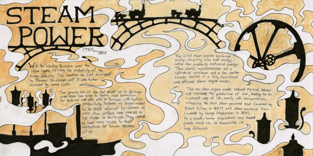
Me and my research team were given approval to dive deep into steam power through the years 1750 to 1850. Immediately, I knew that steam had to dominate my spread in some way, which is accomplished with the ‘trails’ of steam present on the spread.
Objects related to steam are depicted as black silhouettes, with the iron bridges, steam engine wheel, the steam whistles and the steam boat. They were placed in regards to the body text, to ensure there was enough space for the text. The decision to depict these objects as silhouettes was also to prevent too much attention being drawn away from the text.
Although it does look generally appealing in my opinion, I do not think very highly about this spread. I’ve come across many challenges regarding the design and execution of the final result.
A spread is supposed to reflect the style of the period, and it is a bit difficult (for me) to see any resemblances. The heading on the top left, does reflect it to a degree, being a serif font, but I’m not entirely confident that it is appropriate for the time period.
The body text prioritized placement and space, somehow I did not think of writing the body text in a typeface relevant to the time period. Looking back at the spread now, utilizing relevant typeface might make the spread more eye-catching.
The execution could have been better, the black silhouettes were blocked in using ‘Micron’ brush pens, some inked parts were smudged since the ‘Copic’ markers used to colour the background only dried seconds after being applied.
Though it was not a problem in my yearbook spread, some pencil lines were extremely hard to erase in this spread, thus one could notice some ghost lines after their first glance.
Considering what I’ve covered in this rationale, I feel that I should give myself a 7/10. Though it is appealing in my opinion, I believe I could have improved a bit with the design of the spread, as well as being more careful with some aspects of its execution.
The original layout for the zine to allow proper folding.
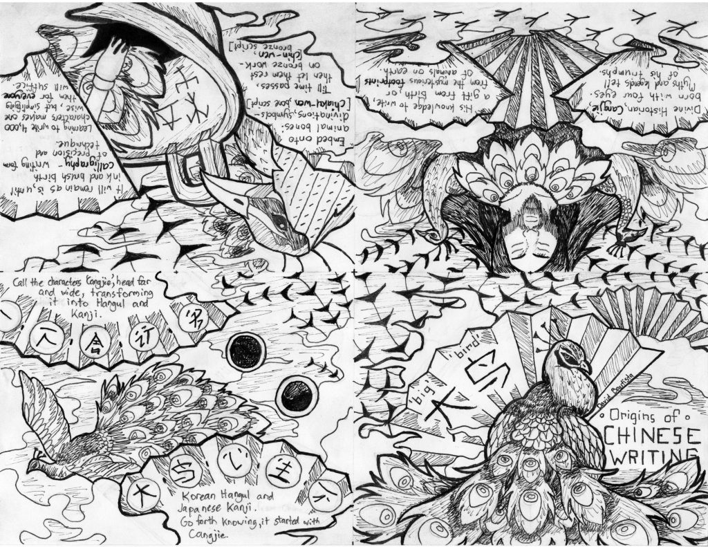
For week 1, I was assigned to a group to research and design a zine for typography in the 35,000BCE-0CE. We chose to narrow down the topic to cover the origins of Chinese writing.
The zine covers in order: the mythological beginnings, the evolution of writing mediums (i.e. bone writing), until ending with the global distribution of Chinese Cangjie.
For this design, I decided to draw out 4 black and white images that span 2 pages each. I believe in doing so, compositions became more appealing. It was a bit challenging to find the right balance between images and text.
The general motif of the zine were peafowls and fans, mostly with aesthetic in mind. This also encouraged me to format the zine’s text as if it were a story, the ‘odd’ grammar is an attempt to convey information poetically.
Looking at the result, I would say I am generally satisfied- but I am certain that I can improve.
On the plus-side the use of line weight to distinguish elements such as the peafowls, is something I am proud of. I find the design to be cohesive, and the details seem to make this work.
However, I believe I could have been a bit more careful with the execution. For example, the ‘global distribution’ panel(s) has two dark circles on the right which were meant to show the red sun in Japan’s flag and the yin-yang symbol in South Korea’s flag.
It is difficult to recognize these symbols as they are quite dark in shade and it drags attention away from the rest of the drawing.
In regards to the ups and downs of the result, I would give myself a mark of 9/10. I believe I did put in the effort, and despite some minor mistakes, the overall quality seems good to me.
The first assignment in the Survey Design class was to create a personal yearbook spread. I currently enjoy illustrating as a past time, which is why I decided to illustrate a composition from scratch.
The central theme of my yearbook spread is marine biology and of course, me. I wanted to stick to a colour scheme of blues (mostly) to reflect a watery atmosphere, and also because Azure is my favourite colour. Whale Sharks are also present since they are (currently) my favourite animals. Some parts of the illustration pop out to convey movement and energy, such as the bubbles, splashes of water, and the drawing of myself. The illustration is not meant to be realistic, but rather stylized to resemble vector graphics.
I arranged the text with the layout of a magazine page in mind. I was mostly going for a modern, ‘National Geographic’ feel to the composition, which is why the text is in the third person, and brighter than the black background behind it. The symbols beside some lines of text are Nautilus shells, to replace the bullet points commonly used in word documents. After finishing the panels of the text, it reminded me of the chalkboard signs some businesses use on their storefronts.
If I’m going to give myself a mark out of 10, it would be 9/10 mostly because of the text. Although I included all of the required information indicated in the assignment brief, the right panel feels a bit cramped. Some errors also occurred while adding the text with a white gel pen, so I covered the mistakes in black ink. Other than that, I’m happy with how the illustration turned out. The intricacy with the Whale Shark patterns and the texture of the coral was rather daunting, but I believe it turned out nicely.
I’m satisfied with the result, even if the process involved some trial and error. Not to mention, I’ll be mounting this spread on my deskspace as soon as I get the chance!