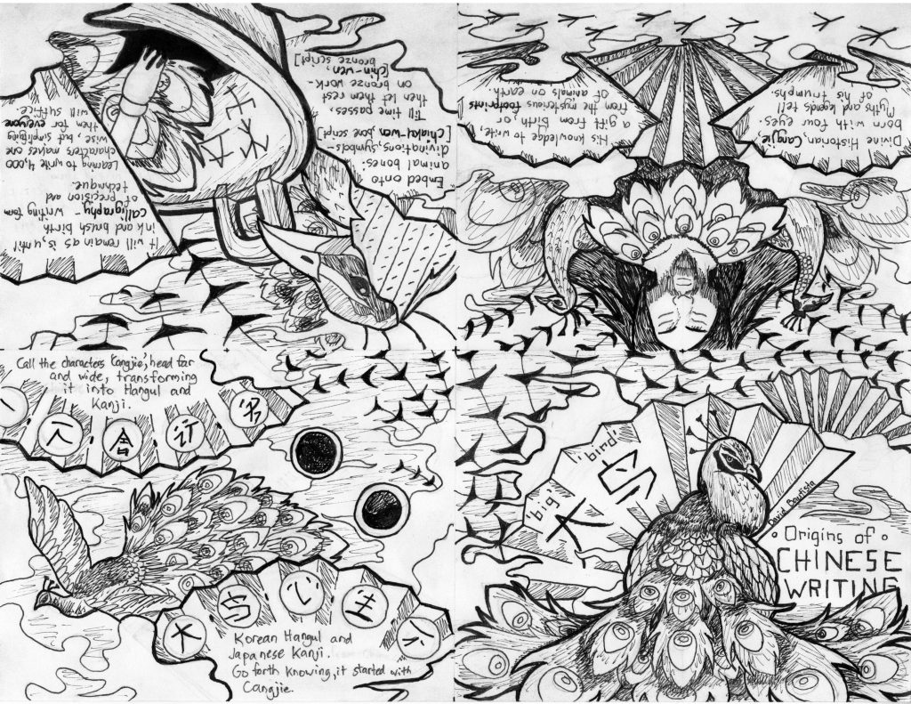
For week 1, I was assigned to a group to research and design a zine for typography in the 35,000BCE-0CE. We chose to narrow down the topic to cover the origins of Chinese writing.
The zine covers in order: the mythological beginnings, the evolution of writing mediums (i.e. bone writing), until ending with the global distribution of Chinese Cangjie.
For this design, I decided to draw out 4 black and white images that span 2 pages each. I believe in doing so, compositions became more appealing. It was a bit challenging to find the right balance between images and text.
The general motif of the zine were peafowls and fans, mostly with aesthetic in mind. This also encouraged me to format the zine’s text as if it were a story, the ‘odd’ grammar is an attempt to convey information poetically.
Looking at the result, I would say I am generally satisfied- but I am certain that I can improve.
On the plus-side the use of line weight to distinguish elements such as the peafowls, is something I am proud of. I find the design to be cohesive, and the details seem to make this work.
However, I believe I could have been a bit more careful with the execution. For example, the ‘global distribution’ panel(s) has two dark circles on the right which were meant to show the red sun in Japan’s flag and the yin-yang symbol in South Korea’s flag.
It is difficult to recognize these symbols as they are quite dark in shade and it drags attention away from the rest of the drawing.
In regards to the ups and downs of the result, I would give myself a mark of 9/10. I believe I did put in the effort, and despite some minor mistakes, the overall quality seems good to me.