The first assignment in the Survey Design class was to create a personal yearbook spread. I currently enjoy illustrating as a past time, which is why I decided to illustrate a composition from scratch.
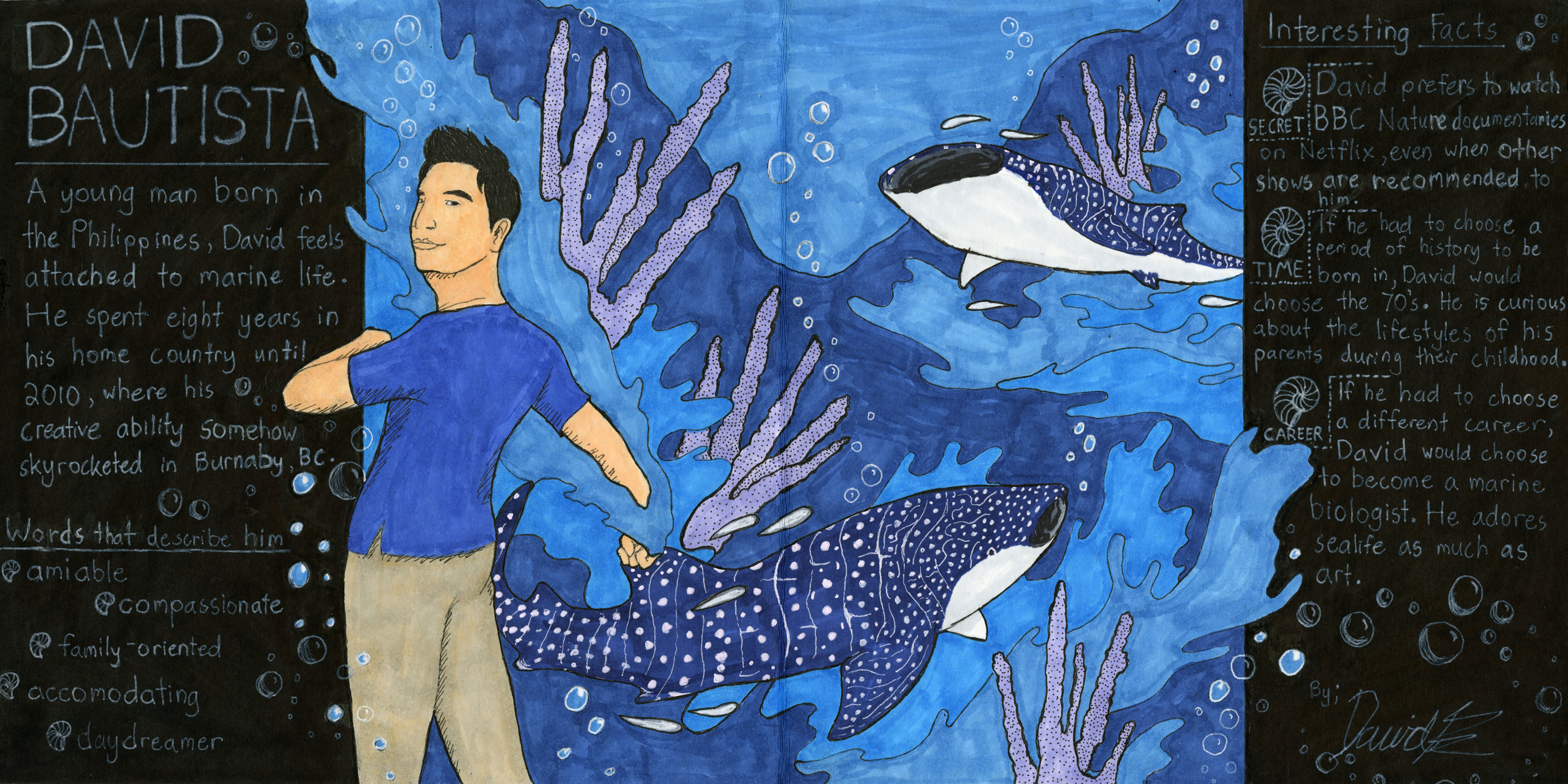
The central theme of my yearbook spread is marine biology and of course, me. I wanted to stick to a colour scheme of blues (mostly) to reflect a watery atmosphere, and also because Azure is my favourite colour. Whale Sharks are also present since they are (currently) my favourite animals. Some parts of the illustration pop out to convey movement and energy, such as the bubbles, splashes of water, and the drawing of myself. The illustration is not meant to be realistic, but rather stylized to resemble vector graphics.
I arranged the text with the layout of a magazine page in mind. I was mostly going for a modern, ‘National Geographic’ feel to the composition, which is why the text is in the third person, and brighter than the black background behind it. The symbols beside some lines of text are Nautilus shells, to replace the bullet points commonly used in word documents. After finishing the panels of the text, it reminded me of the chalkboard signs some businesses use on their storefronts.
If I’m going to give myself a mark out of 10, it would be 9/10 mostly because of the text. Although I included all of the required information indicated in the assignment brief, the right panel feels a bit cramped. Some errors also occurred while adding the text with a white gel pen, so I covered the mistakes in black ink. Other than that, I’m happy with how the illustration turned out. The intricacy with the Whale Shark patterns and the texture of the coral was rather daunting, but I believe it turned out nicely.
I’m satisfied with the result, even if the process involved some trial and error. Not to mention, I’ll be mounting this spread on my deskspace as soon as I get the chance!