Overall, I found this mentorship super awesome! There was a lot of work and challenges to overcome (of course) but the payoff was definitely worth it and I am very proud of my project. I’m especially grateful to my mentor who thankfully responded back to my email very quickly and was a superb person and guidance all around. She consistently provided me with amazing insight not just from herself, but also from other working designers on her team. In addition, she was able to patiently and expertly answer any of the questions I had for her, whether it’d be about how she likes to work and what processes she uses to design to how her workplace operates.
Continue reading “Mentorship Phase 5”Mentorship Phase 4
For this phase, I mocked up the rest of the product design and was able to get feedback from my mentor. She made a lot of comments which I really appreciated and was even able to show my mid-fi wireframes to other people in the agency, including a developer. As such, I was able to implement her feedback as well as start thinking about the perspective from a developer and how to make elements more consistent so that it’s easier to build.
Continue reading “Mentorship Phase 4”Mentorship Phase 3
This week, I took my digital mid-fi wireframes and began designing the UI elements of the app. I took my mentor’s advice of creating moodboards for different parts of the UI elements, such as the button styles, menu style, and card styles. This process helped me out a lot as I usually have trouble deciding colours and dictating which elements should have colour and what they should look like while also keeping up with the UI trends.
Continue reading “Mentorship Phase 3”Mentorship Phase 2
During this second phase of the mentorship, my work mostly consisted of using the research to actually build the product. I started off by analyzing the interviews and listing requirements and features that would be needed for the function of the app. I created a user persona for my product to help me streamline the function/usability of the product but I made the mistake of diving right into designing lo-fi wireframes. When I met with my mentor, I realized that I lacked a direction for the app, an issue that would arise later in my development. As my mentor reminded me consistently, I had did not have that big of a time frame to create my project. By utilizing a user flow, I would be able to focus my time and energy into designing a high-quality prototype instead of random sets of screens that weren’t able to be touched on that much.
Continue reading “Mentorship Phase 2”Mentorship Phase 1
For this phase of the mentorship, I focussed on familiarizing myself with my mentor and creating a strong foundation for my project to rest on. Initially, I had a hard time choosing a project idea/concept to pursue. I didn’t really have any preference in mind, only that I wanted to create a digital product that could help people (versus a commercial motivation). One of my stronger ideas in the very first week involved helping people in quarantine with learning how to restructure and rearrange their homes so that they could have a better space to exercise in, as I know that space can be limited for many people. However, the idea was lofty and complicated and lacked a direction. Nor did I have a vision for what the solution would be. When I brought up these concerns with my mentor, she suggested talking to my classmates and peers about what challenges they face during the lockdown and start from there.
Continue reading “Mentorship Phase 1”Final Brand

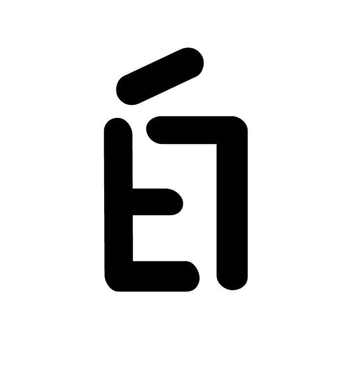
The brand I chose shows a professional and functional part of me, both qualities that I feel exemplify not only the style of my design but also how I approach problem-solving. Using angular lines while also applying a soft rounded look to the edges, it is a logo that well represents my simple yet functional approach to design. In addition, it has a very geometric shape that is reminiscent of my style that I am known for in my illustrations and designs. I am pretty satisfied by how cohesive it looks together as well as the cleverness that is hidden in the icon that not everyone will see at first glance. It is simple and mysterious and an icon I think well represents my values as a designer.
Continue reading “Final Brand”Logo Concepts and Reflection
3 Logo Concepts
The logo concepts I’ve chosen to polish all represent different parts of myself that I feel have well emanated my person. With the first logo, it takes my initials to create an icon that is reminiscent of a character of my Chinese name, showcasing the collaboration I have between my nationality and ethnicity. It gives a soothing look through neat hand-drawn lines which I feel well represents my design. The second concept uses a version of my initial, ELIN, as the base. Since the letters are made of straight lines, it already refers to the usual geometric style that I enjoy playing with. This concept has been split into two versions, one with a box that emphasizes the geometric-ness while the other relies more on the overall shape of the letters to create a “box”. The third concept then uses an abstract shape loosely using my initials to display the quirky fun-loving side of my personality, able to be used as a pattern that is versatile and interesting.
Continue reading “Logo Concepts and Reflection”Personal Ad

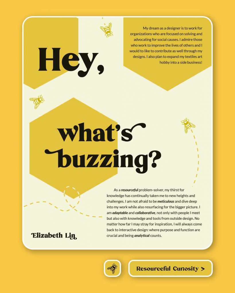
My personal ad really forced me to think about what I like in terms of design and how I approach this field. I wanted to show an aspect of me that highlighted my attributes (resourceful, meticulous, adaptable, collaborative, and analytical) while also inserting a part of my personality unrelated to design. Many options were considered but in the end, I chose bees and puns to be the highlight of my ad – obsessions that I’ve been nurturing throughout the years.
Continue reading “Personal Ad”


