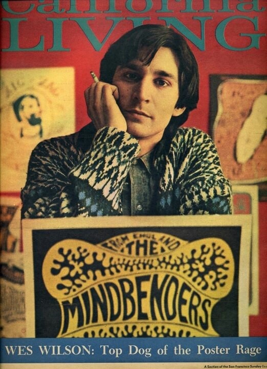
And the Psychedelic Poster was Born

Wes Wilson:

Wes Wilson is generally accepted as the “father of the 1960s rock concert poster” and he considers himself as the first psychedelic poster artist. In addition, he invented the style that is now synonymous with the peace movement and the psychedelic era.

Wilson’s posters were intended for a certain audience- one that was tuned in to the psychedelic experience- and to do so, he translated the sights and sounds of counterculture society into psychedelic iconography. His work quickly moved from psychedelic subculture into the mainstream culture by taking what he understood about promotional art and turning it upside down.

Continue reading “And the Psychedelic Poster was Born”

The Golden Age Part 2: Bill Mauldin (1921-2003)

Bill Mauldin

Bill Mauldin was an American cartoonist who is one of the best known and best-loved newspaper cartoonists in America. He is remembered for his depiction of life in the trenches during World War 2- which initially gained him fame- and then later became known for his editorial cartoons that dealt with a wide range of social and political issues. During his time in the military where he was assigned in Europe, he produced numerous cartoons that essentially captured the experiences and emotions of an entire generation of soldiers, usually through his characters Willie and Joe, two infantrymen. He chose to draw pictures for and about soldiers because he knew what it was like and wanted to make something out of the humorous situations that came up even when the soldiers thought that life could not get any more miserable. In addition to his cartoons about fighting in the war, he also created cartoons that boldly displayed social and political commentary. For example, some of the cartoons attacked the issues of racism, the Ku Klux Klan (KKK), and McCartyism.

Continue reading “The Golden Age Part 2: Bill Mauldin (1921-2003)”

The Golden Age Part 1: Hergé (1907-1938)

Hergé:

Hergé (Georges Prosper Remi) was a Belgian cartoonist who was best known as the creator of the comic series, Adventures of Tintin. One of the most influential comic creators in history, he single handily launched the Belgian comics industry with Adventures of Tintin. He was a master at crafting suspenseful page-turners where humour was never far away and had the latest political, cultural, and scientific inventions of the time mirrored in his work.

Through his comics, he developed his own graphic style, “Ligne Claire” (Clear Line). This style had thin, bright, and clean lines and avoided the use of hatches, shadow effects, or excessive details. This gave his work the clarity of readability. Decades later, when he started adding colours, they were applied in his open outlined areas and were flat and plain. Hergé insisted that his drawings’ line quality formed the true structure of his work, which is why he used a light pastel palette to help his lines stand out and allow more complex images to be easily read.

Continue reading “The Golden Age Part 1: Hergé (1907-1938)”

“The only quality I really have an appreciation for is newness.” – Helmut Krone

Helmut Krone (1925-1996):

Helmut Krone was an American advertising art director who was considered a pioneer of modern advertising. Born in Yorkville, Manhattan, he started his design career at 29 at Doyle Dane Bernbach where he would continue to work (except for a short time in the early ’70s) for the next 30 years and practically his entire career.

Before the term “branding” had even come to exist, Krone already understood how graphic design could define an institution’s personality. He was always after a product’s individual personality and this “total way of speaking”. He believed that the ad that reflects the company is the company itself.

Continue reading ““The only quality I really have an appreciation for is newness.” – Helmut Krone”

Illustration’s Early Masters: Coles Phillips (1880-1927)

Coles Phillips:

Coles Phillips was an American illustrator that was the first to introduce the Art Deco styles into advertising design. He created illustrations of magazine covers of very modern and seductively designed women by using radical techniques. This became his signature trademark, the “Fadeaway Girl”, which became a hallmark throughout his career. While other illustrators created more elegant images, Phillips used a certain cerebral approach and design device to create his “Fadeaway Girl” technique. He cleverly linked the background colour surrounding the model’s dress to its colour so that she would give the impression of being close and far away at the same time. To do so he subtly combined the foreground and background by using the same colour to add to his other uses of unique compositions and themes, and pastels.

I thoroughly enjoy Coles Phillips’ illustrations. Especially, his “Fadeaway Girl”, the technique that he was famously known for. The contrast between the flatly coloured dress and the model’s exposed flesh is well used and if I were to live during his time, I would’ve definitely been enamoured in the ads he illustrated for. I also appreciate the “simplicity” he has managed to display in his illustrations as I know that to successfully pull it off, extensive planning must’ve been used.

Continue reading “Illustration’s Early Masters: Coles Phillips (1880-1927)”

Beginnings to the Golden Age: Thomas Crane (1843-1915)

Thomas Crane:

Thomas Crane was an English illustrator known for his ornamental designs and embellishments. He became the Director of Design at the London office of Marcus Ward and Co. where he supervised the design and sale of Christmas cards, a product popular in the 1880s. In addition, he frequently worked on illustrations for both the company’s Christmas cards and children’s books. Marcus Ward and Co.’s Christmas cards were known for their quality and were popular with art collectors. His designs of the Christmas cards have been praised by art critics, especially on the appropraite and most refined ornamentation on the borders and backs. Aside from his time at Marcus Ward and Co., Crane had also produced a series of celebrated books with other contemporary illustrators.

Thomas Crane is also known for his designs of needlework patterns. He was chosen as one of several artists to create needlework patterns for the Royal School of Needlework. His designs had helped the revival of artistic needlework and ornamental embroidery.

Continue reading “Beginnings to the Golden Age: Thomas Crane (1843-1915)”

Women in Art: Lee Krasner (1908-1984)

Lee Krasner:

Lee Krasner was an American Abstract Expressionist known for her unique contribution to the advent of Abstract Expressionism. She was a key transitional figure within abstraction and did this by connecting early twentieth-century art with new ideas of postwar America. As a significant postwar American painter, she had great artistic versatility and advanced skill with intensive training in art theory. She helped devise the “all-over” technique which influenced her husband’s, Jackson Pollock, “drip paintings”. Another technique/strategy she used was to take “breaks” in order to revise her aesthetic, allowing her to improvise her art style. For example, her paintings/collages show her exploration of colours and graceful rhythmic forms.

Krasner developed her own style of geometric abstraction that was grounded in floral motifs and rhythmic gestures. She was unique in terms of her commitment to using hard-edged figurative elements and a certain amount of cerebral control. This is contrastive to the less-controlled automatism that was practiced by her contemporaries.

Continue reading “Women in Art: Lee Krasner (1908-1984)”

Contemporary and Post Modernism: Cy Twombly (1928-2011)

Cy Twombly:

Cy Twombly was an American painter whose character painting style comprised of expressive drips and active, scribbled, and scratched lines on solid fields of mostly neutral colours (grey, tan, or off-white). A sophisticated and emotional painter, his art situates itself in the context of the history of Western civilization and the process-orientated aspects of Abstract Expressionism. He balanced the static history of the past with his own sensual and emotional responses to it, focussing on his immediate surroundings and combining aspects of both traditional European sources and new American painting. Examples of these inspirations included French neoclassicism, contemporary graffiti on ancient local walls, and Greek and Roman mythology, history, and places.

A major conceptual foundation of his abstract art was writing and language; he was focussed on the written word and the process of writing. These qualities took on forms of identifiable doodles and splotches or words directly on the canvas or line-based compositions that were usually inspired by handwriting. These creations suggested subtle narratives that lied beneath the surfaces of his paintings and coincided with his interest in layering time and history, painting and drawing, and various meanings and associations.

Continue reading “Contemporary and Post Modernism: Cy Twombly (1928-2011)”

Survey 10: Less Than Satisfactory

Fortune and the Führer (1930-1945)

Summary:

In this week’s lecture, we learned about the Great Depression, the Second World War, and European designers in America. During the Great Depression in America, many jobs were created by the US Works Progress Administration in an attempt to stimulate the economy. These included the Farm Security Administration (an organization that tried to improve the lifestyle of American farmers during the depression) and commissioning artists to create posters for public services/events. In 1933, the Nazi party was elected in Germany and they used extensive propaganda to spread their racist goals and ideals. Artists, such as Helmut Franz Josef Herzfield aka John Heartfield, were named Degenerate artists as Hitler believed that modern art was bad.

Several European designers including Herbert Bayer and Jan Tschichold fled to America when World War 2 broke out. Edward McKnight Kauffer, as well as many other artists, were involved in creating posters for World War 2. Walter Paepcke, the son of a German immigrant, founded the Container Corporation of America (CCA) and hired many European designers to design his posters. Such as A.M. Cassandre, Jean Carlu, and Herbert Bayer. Fortunato Depero was another designer who moved to the US.

Continue reading “Survey 10: Less Than Satisfactory”

Abstract Expressionism and Pop Art: Ad Reinhardt (1913-1967)

Ad Reinhardt:

Ad Reinhardt was an American abstract artist who was a major influence on conceptual art, minimal art, and monochrome painting. He was a member of the American Abstract Artists and The Club, a meeting place for the New York School’s abstract expressionist artists during the 1940s to the 1950s. Although Reinhardt was associated with Abstract Expressionists, his works had origins in geometric abstraction. In his exploration of geometric abstraction, he sought to purify his paintings of everything he saw as extraneous to art. He believed that the ultimate in abstract paintings were concerned with art alone and bore no reference to anything outside the paintings themselves. Thus, he sought to remove all references from the external world from his pictures- even the hints of soul and angst typically found in Abstract Expressionists pictures. He maintained an interest in various types of mysticism, as shown in his barely delineated forms in his Black Paintings that viewers struggled to understand.

Continue reading “Abstract Expressionism and Pop Art: Ad Reinhardt (1913-1967)”