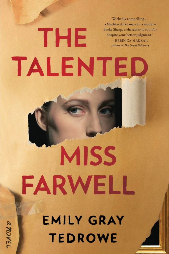
1. TEXTURE
In this Novel cover “The Talented Miss Farwell” written by Emily Gray Tedrowe, we can instantly see the use of texture by the designer. This has been carefully placed to create the illusion of there being paper texture through a 2D surface.
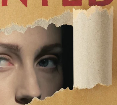
This screen of the cover is my favourite. It has the illusion that the front page of the novel has been ripped purely to show the woman hiding in the book underneath. It shows a lot of depth and gives a sense of mystery about the novel, before even reading it!
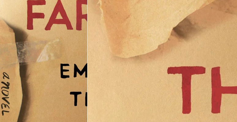
These aspects of the novel cover might not seem like much, but they are in fact crucial elements to the bigger page together. They add to the effect that the page isn’t just a flat 2D page, and that it’s stuck together with tape, and layered underneath other papers.
2. VALUE
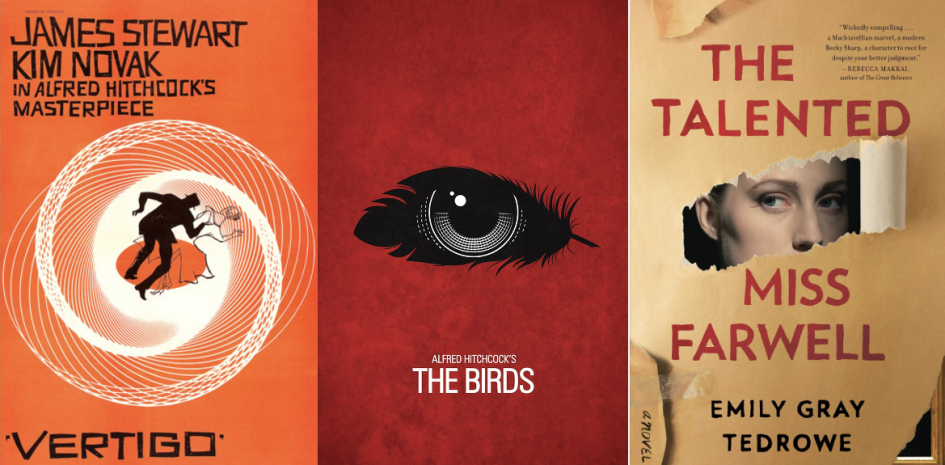
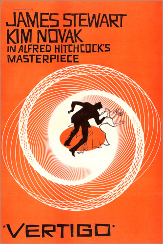
This is the poster for the movie “Vertigo” produced by Alfred Hitchcock. Using the design element of value, Saul Bass produced this amazing eye-catching poster for when the film made its appearance in 1958. His work is. Predominantly created using simple shapes that hold bold and powerful messages and pop out of his (normally) 1-2 colour scheme.
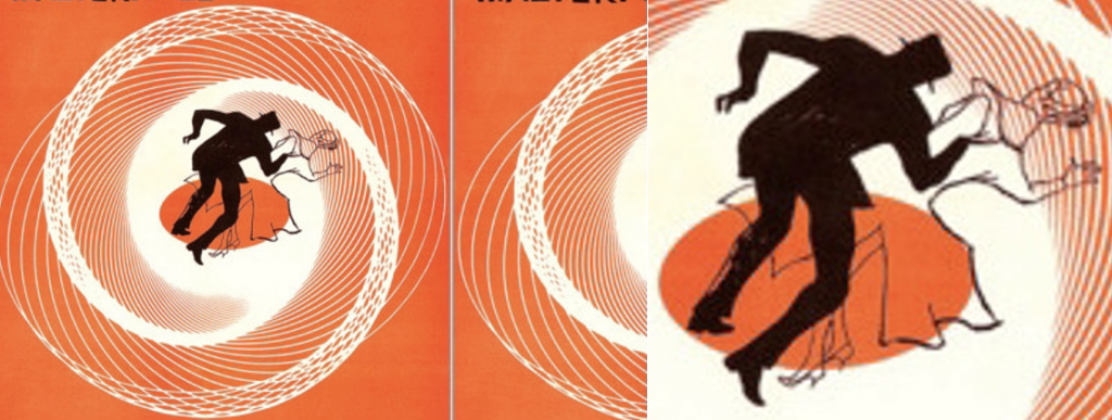
Obviously for most people seeing this poster for the first time, the first thing your eyes dart towards is this section. Using the contrast of black and white colours from their bright orange background, the silhouettes in the middle are the focal point of the poster. However, the main aspect that truly grabs your attention are the spirals leading your eyes directly towards the centre of the poster. Using the gradual white values on the spirals give the perception of ‘depth’ which is an instant attention grabber on such a neutral background. After staring at it for so long, it’s hard to look away and focus on a separate aspect of the poster.
3. SPACE
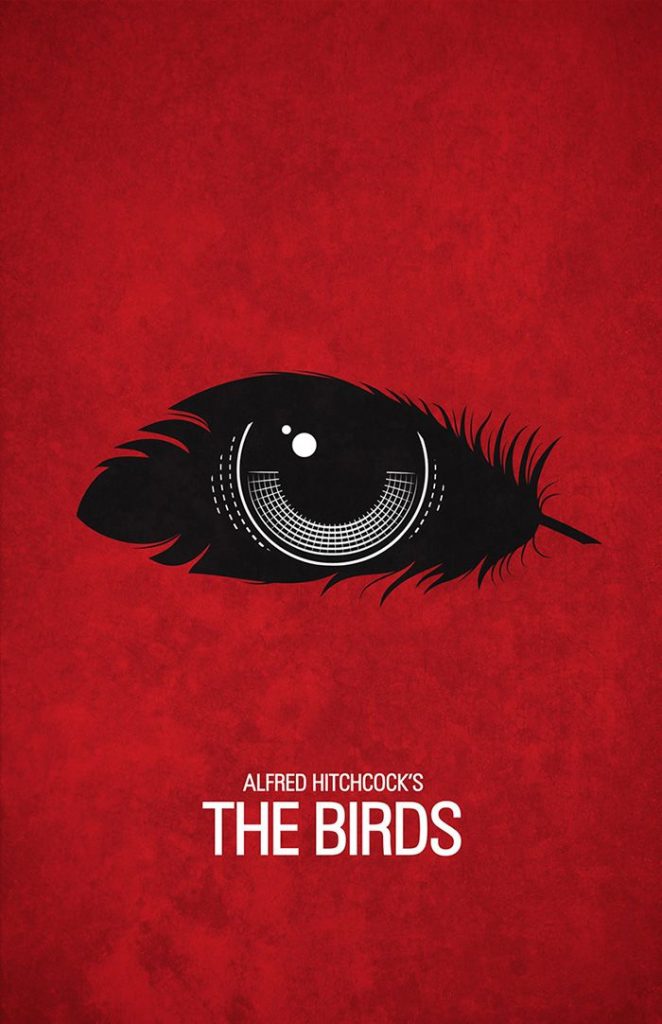
For my last poster I chose to analyze “The Birds” produced by Alfred Hitchcock. I sadly cannot find the original maker of this poster, but I was instantly attracted to their strong use of bold silhouettes on top of a minimal use of colour. I’ve actually watched this movie years ago with my grandad, so I think this poster goes a lot more in depth about the symbolism involved in this movie.
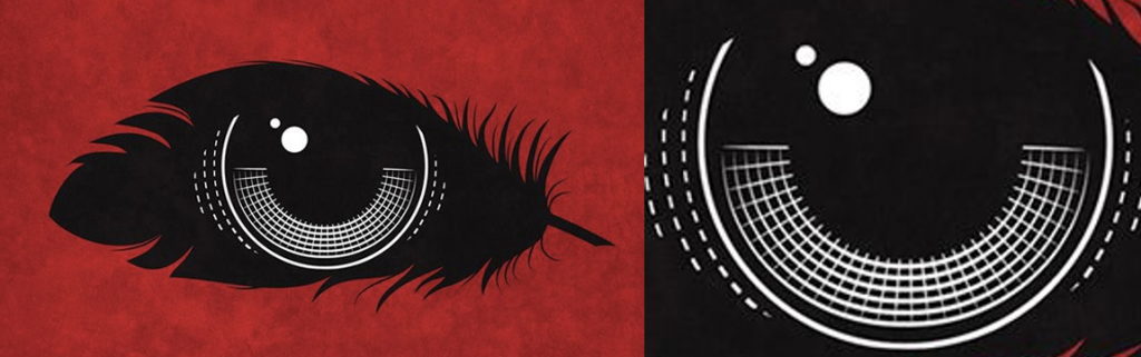
Having so much space around the main component of the poster allows the designer to create an eye-catching design while defining the importance in the strong but simple message located in the middle. In my opinion, having the eye looks like a distorted camera lens by adding white lines and shapes to the centre of the feather creates so much more attraction because there’s so much un-used space within the poster, but however the addition of such small details still conveys and attracts attention to it.
Leave a Reply