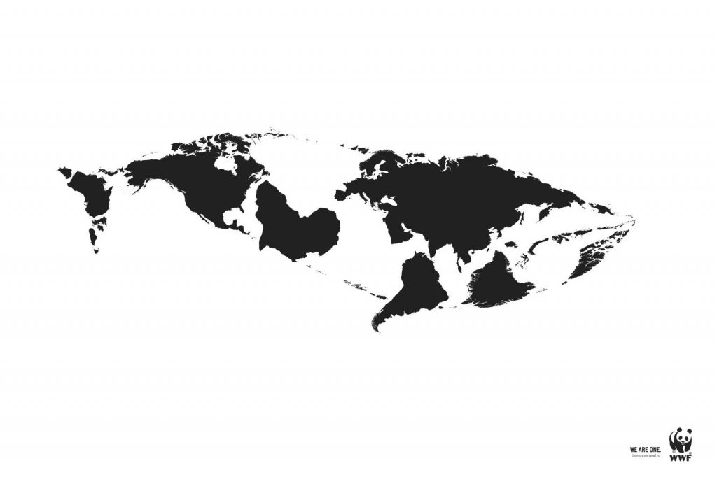
- CLOSURE
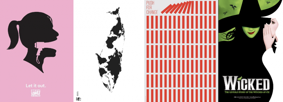
The first poster I discovered shows the Gestalt principal ‘Closure’. It was illustrated by Kentaro Nagai for the “We Are One” campaign to help bring awareness to the extinction of Arctic animals. Using the gestalt principal, we as viewers can view this poster and easily make out the shape of a whale made of the world’s continents. It is strategically illustrated to create an informative poster that allows the viewers to make their own perception, without allowing them to stray too far from the actual campaigns message.

I personally think this is a very strong design, utilizing closure with the many breaks between the black and white areas helps to create an easily recognizable silhouette of a whale. The placement and usage of the world map is also a very strong component in this design because of the role it plays in their campaign, along with the contrasting colour factor allowing a more defined silhouette to pop off the page.
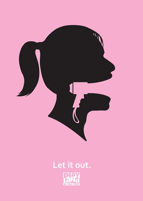
2. FIGURE/GROUND
For my last Gestalt principal image, I chose to do it on ‘Figure/Ground’. This poster is created by Playland PNE for their 2010 ad campaign. Every year they create a new set of posters to promote themselves, and I found a lot of attraction to this one. Using bright and solid colours that contrasts the black, but then flows your eyes down to the white print created my initial gaze. After one look, it’s visible that there’s a play with composition revolving around the figures head and the speaker seen in the middle.

Highlighting this portion of the design, this poster has a good sense of multistability. There are two clear images as the focal point and using a play on foreground creates an illusion of one being more focal than the other while the other fades behind if you focus on it enough.
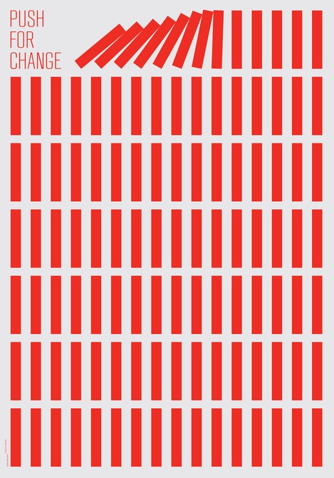
3. REPETITION
This poster designed by Kevin Finn is a great example of the Visual Design principal ‘repetition’. It is a political poster urging the “Push for change” campaign. Focusing on the repetition aspect of the poster, it creates a sense of unity amongst the design, giving a much stronger poster. Using a bold sharp colour to contrast with the white background creates clean cut lines and definite even repeating shapes throughout the poster.
In my opinion the ‘break’ of repetition in this area makes the viewers eyes dart towards it, which is also strategically placed right next to the title of the poster. In my opinion, when I first look at this poster, the first thing I see are the red lines ‘falling over’ and then I see the “push for change” title next, which insinuates that the red columns have been ‘pushed’ over.
4. CONTRAST
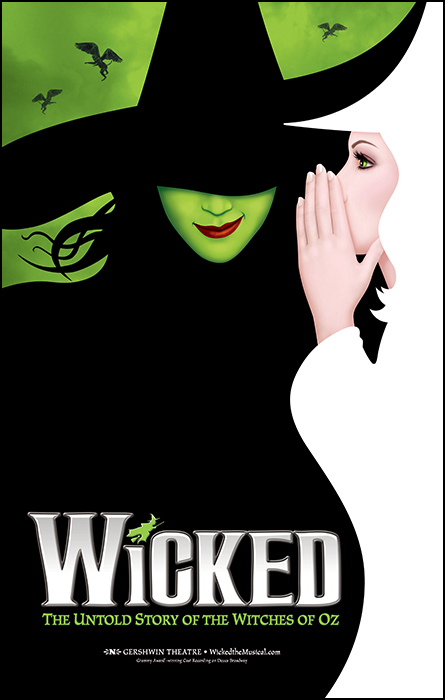
My last visual design principal I decided to focus on is ‘contrast’. To do this I chose a poster created for the musical Wicked. Immediately the first thing that catches the viewers eyes are the contrasting white/neutral and black/green colours displayed by the two main characters silhouettes. Another aspect to the poster is the difference in sizing of both silhouettes. The character portrayed in black, and green is the focal character in the musical, hence why she gets a larger portion of the poster.
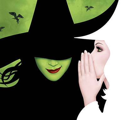
I have seen this musical online, and a more in-depth aspect that corresponds to the contrast principal, is how differently the characters behave and are viewed. Each of the characters opposes each other with a contrast in behaviour, and the designer manages to recreate that with the use of colour. White feels like a kind, clean and innocent colour, whereas black/green feels more sinister, threatening or even evil.
Leave a Reply