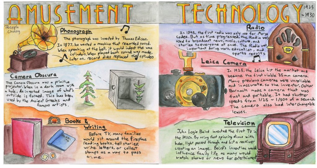
For this spread, I was chosen to create a comparison spread about science and technology from 1925 to 1930. Since some of the major innovations during this time period were the inventions of entertainment technology such as the TV, Radio, and Leica camera, each of us did research on each item. For the comparison, we felt that it was a good idea to compare what life was like or what people did before the TV, the radio, and the Leica camera was invented so that we can get a good comparison between before and after. For the left page, I decided to have the technology before the inventions(Which was the phonograph, camera obscura, and books) and for the right page, we have the new inventions that were made in the 1920s. I felt that this was a good layout because people read from left to right, the viewer can see the transition from old to new. We chose the phonograph because it was the main way for people to listen to music until the radio was invented, the camera obscura because it was a way for artists to easily capture reality, and books because that’s what families did before TV. Each page was divided into 3 slanted rectangular shapes so in total there are 6 sections for each item with their own description. Each section will have a drawing of an item with a different coloured background to make each section look different, and a brief simple description of what it was and what people did with it. I felt that having a slanted shape would make the spread a bit more dynamic instead of having boring rectangles. On the top, I have the title “Amusement Technology” and I chose it because it had the right number of words to fit in the small space and I wrote the title in a very 1930s font to create a proper 1920s/30s mood. I filled it with yellow and orange alcohol markers to create a more golden look. I first divided the spread into sections and once that was done, I sketched out the items with help from references and outlined them with an ink pen. After that, I coloured each item with watercolour coloured pencils and tried to do my best to make it look good and accurate to the references. Because I’m not really good at watercolour, I use watercolour pencils because they have a lot more control. I then filled the background with different colours and I wanted to make sure that there was an equal amount of cool and warm coloured backgrounds on both pages to create a sense of balance. After the colouring, I wrote down the descriptions of the items with the help of my classmate’s research. And with that, the spread was done.
I was overall satisfied with the spread and for my first time using watercolour pencils, the results were satisfying. The watercolour pencils really gave me a lot more control as opposed to using traditional paint, so I was able to a lot more highlights and shadows easily and the look for the items looked nice. The background looked nice but I felt that I could do better to make the background less streaky. My handwriting isn’t the best and I felt that I could do a lot better in making the text look more clean and appealing. Overall, it’s not my best but I enjoyed the process. I’d give it an 8/10
Leave a Reply