

Some people don’t hate sports, they just don’t understand the hype or care about them. That’s me with this.
I don’t like abstract art.
I said it, it’s not a controversial opinion and I’m okay with that.
I was worried I was going to have a pretty rough time writing on this era of art for that reason. Abstract expressionism is one of those movements I just have a deep ambivalence towards, verging on a slightly disdainful apathy. I’m aware of how harshly people bag on it, extol that it takes no skill to make (obviously untrue), and I’m okay with coming to terms that I just prefer art that has representational elements to it. Sometimes postmodernism’s fixation on being ironic, pseudo-philosophical and hyper conceptual just comes off as being obnoxiously self-indulgent and self-congratulatory over how clever we all are for subverting art.
All personal saltiness aside, if you can mix a bit of abstraction into things without treading into the black morass of high falutin’ bellybutton gazing, I can get down with that.
So without further ado, I was pleasantly surprised to find James Rosenquist in the midst of my research.
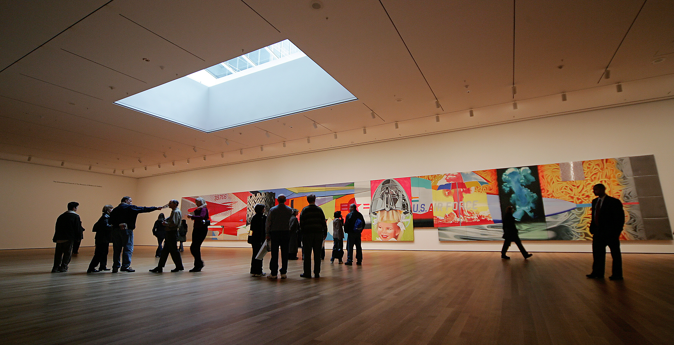
F-111 (1964) displayed at the MoMa in New York.
He started out wanting to get into sign painting, but more specifically wanting to go to mural painting school. He moved into billboard painting before getting into fine art, and ironically, never considered himself a pop artist, apparently the tag stuck thanks to labeling from art critics since he had recognizable elements in his work.

Zone (1961) This looks like a contemporary piece, almost. He has a way of marrying abstraction with representational elements that I quite like, and feels like it was very outside of its time.
It’s interesting that he caught on quite early and managed to keep that momentum and relevance going all the way up until his death in 2017. I think it would have been easy to lose relevancy if he didn’t adapt and change tack at some point, but he turned and started exploring the intersections between science, technology and aesthetics in the 80s and started producing very different work from his early era.
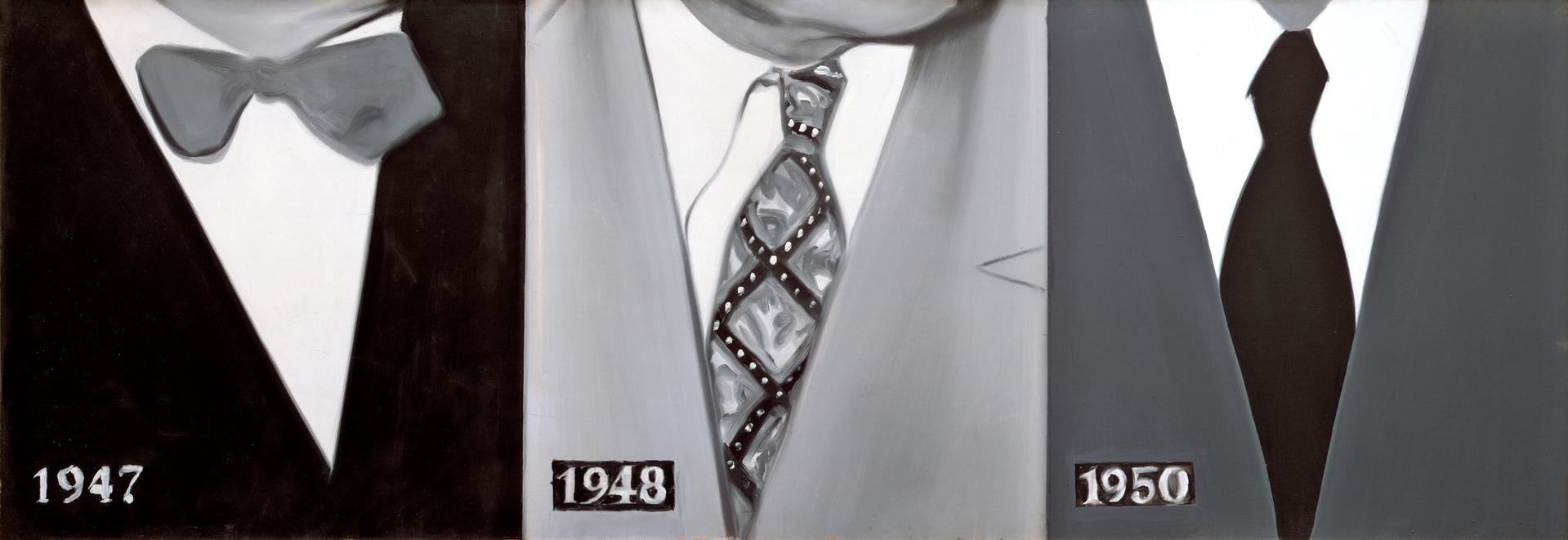
1914-1948-1950 (1960).
Some of his more contemporary work, below:
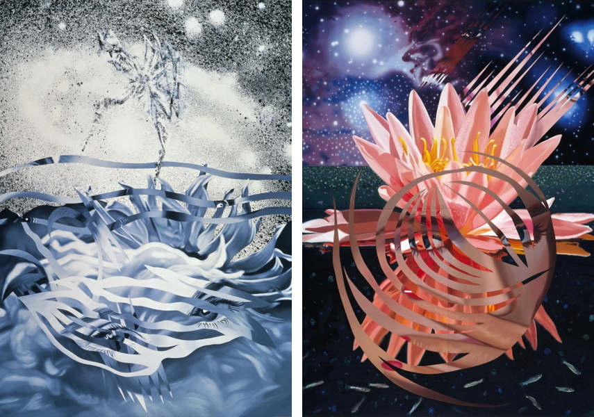
The Bird of Paradise Approaches the Hot Water Planet, (1989) (Left) / Welcome to the Water Planet, (1987) (Right)
This painting below in particular is incredibly impressive to me from a technical painting standpoint. To render the distortion, coloured light and reflections takes extreme observational chops, and I think a piece like this would have driven a less skilled painter to outright madness.
The Serenade for the Doll after Claude Debussy, Gift Wrapped Doll #16 (1992)
I was quite happy finding his work, I thought it provided a nice bridge between the two movements for me while also moving forward and innovating after the respective art movements began to peter out. That, and I felt like at least a third of the class was going to write on Roy Lichtenstein, so I’m glad to have found Rosenquists’ work!
Sourcing:
http://www.jamesrosenquiststudio.com/artwork/6101-zone
http://www.achievement.org/achiever/james-rosenquist/
Images:
http://counter-melody.com/wp-content/uploads/2015/02/mark-rothko-untitled-seagram-mural.jpg
http://www.jamesrosenquiststudio.com/artworks/paintings-sculpture
December 6, 2018 at 1:26 pm
John,
Lastly you hit a homer with Rosenquist. Again you delved deeply into the artist you posted on and thought hard and long about what their work meant to you and the public at large. I appreciate your wrestling with ambivalence when it comes to a period like Abstract Expressionism and Pop Art. I’ve had the same struggles with non representational appreciation myself and have (hopefully) come out the other side. I’m not saying you should be more open minded because you have not dismissed the art out of hand, you’ve looked hard at it, tried to make sense of it before forming your own thoughts.
Keep up the good work moving forward. I also gave you a 10/10 for your PK on Dore… great presentation.
Jeff
December 15, 2018 at 1:56 pm
John,
Great to have you in the classroom this term. Very much appreciated your commitment and engagement… a model student!
So your mark on the final quiz was 39.5/50 which is not bad but could have been better. Something to strive for next term.
Marks and comments on Assignment 5: Expressionist Portrait- 8/10, Cubist Portrait- 8.5/10. Both these are similar but the Cubist portrait jumps out. There are some issues with it but all in all a bold experiment that works on a number of levels. The Expressionist portrait also has some issues but the painterly quality in her face is working very well. Just the background black looks blocked in and after the fact. Should consider the whole composition and the figure’s placement in it.
Anyhow hope you have a great Christmas Break and see you in the NY.
Jeff