
Ooh boy! This was a tricky one.
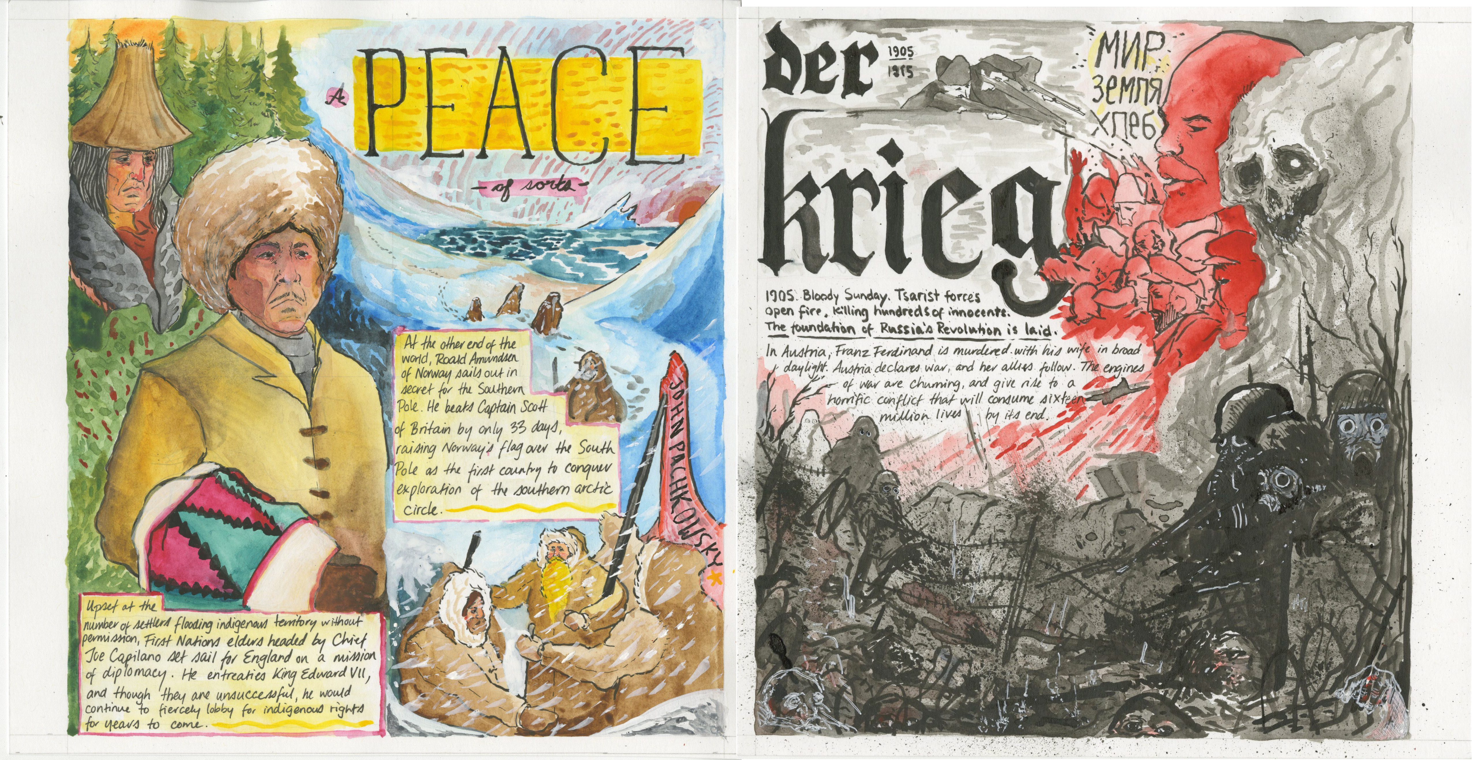
For this, I wanted to go for a slightly different tone than the previous spread, which was more fun and playful. The left side is a little more painterly and realistic, and on the right I wanted to bring in something more stylized and raw, giving a nod towards Otto Dix’s series of works during WW1.
All in all, I’m pretty happy with how most aspects of this one turned out. I wanted to keep forcing myself to continue using mediums I don’t typically work with, so I was terrified I was going to screw this up from start to finish, and that definitely comes out with some of the watercolor parts in particular (I think some of the coat and face was left a little muddy by pigment bleed) but I’m okay with that for how much I ended up learning through using them to complete the illustration. I was super pleased with how the hand lettering turned out on the right, but I do think I need to practice my serif fonts a little more to get the same level of crispness on the other side. I trapped myself again with leaving the text until last (dummy!) but it fits a little better than it did on the last spread, so maybe I’m slowwwly learning. I would have liked to tweak some of the elements of the lower right side on the right panel, but it was challenging to keep the silhouettes I wanted while bringing in the detail, and I backed myself in a corner on it.
Additionally, this was swapped around, with War on the left and Peace on the right, but Judy suggested switching sides and it made the composition much stronger than before, which I never thought of. Awfully glad of that though!
Self grade:
I hate self grading if I’m being honest. Does 9/10 sound okay?
Leave a Reply