
The last one!
I had a pretty strong idea of where I wanted to go with this one at the beginning.
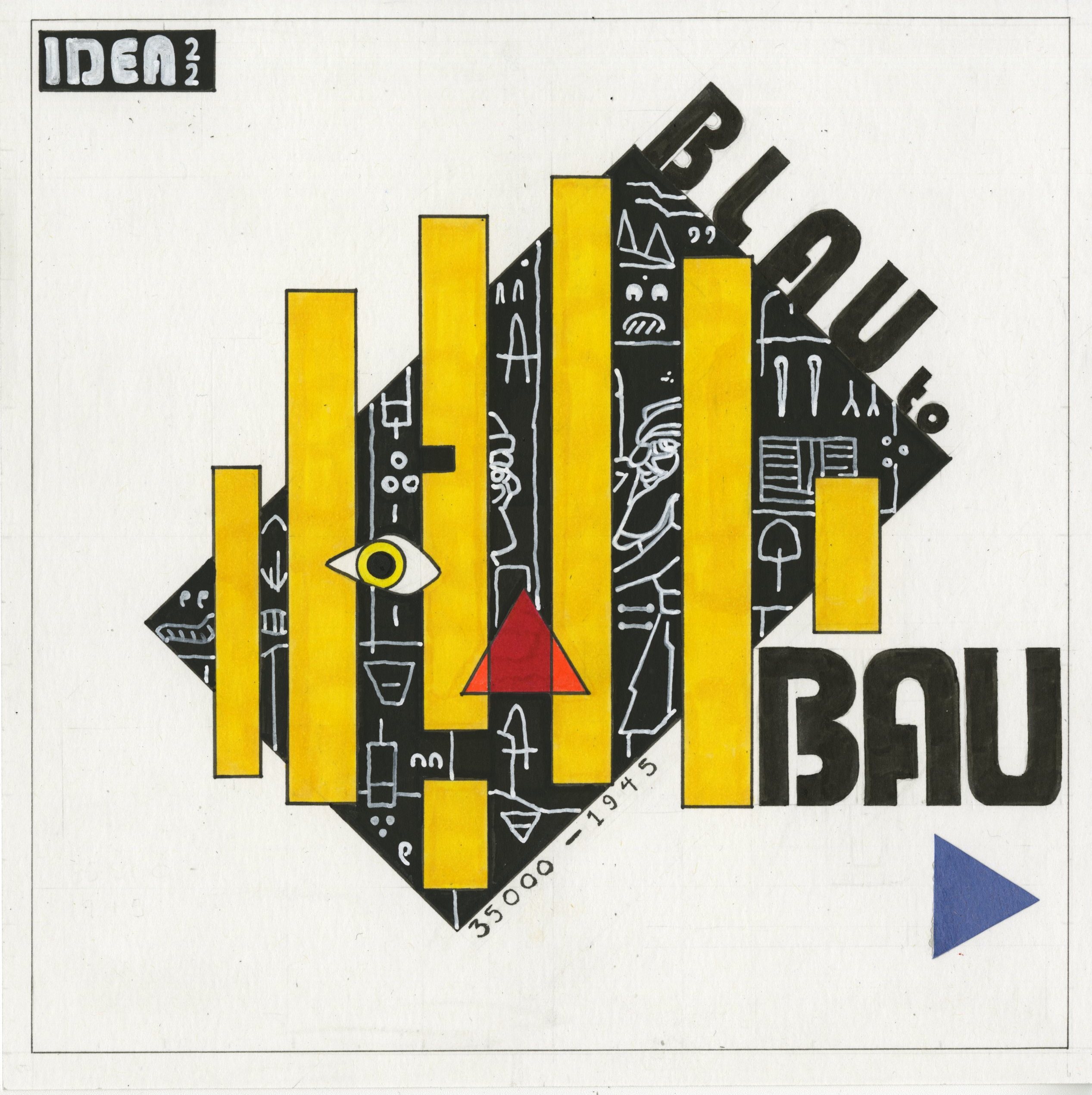
I think the first idea most of us had was to try and fit a little of everything from every era into our spread or cover, but (and no disrespect intended here) it felt like it would be a little cliche, and it wasn’t something that was really compelling for me to design or draw.
I wanted to approach this from the perspective of how would this cover look if it was done with the design aesthetics of some of the 20th century movements we learned about? I started to draw on a lot of material from Constructivist, Bauhaus and avant-garde poster work of the era, and I liked the idea that it might be something loosely related and functioned more to catch your eye and draw you in than just give you the most literal interpretation of what was inside the book.
To give some weight to the composition, the black rectangle anchors it in the middle while having the inscriptions from the Blau monument overlayed, giving it a bit of visual interest. These were hard to translate into drawing without making them look kind of sloppy, and I’m not sure if I’m 100% happy with them but they’re as close as I could feasibly get.
The face is there to give a recognizable human element and context to the contents of the book, and also references the common shapes and color palettes seen in much of the periods design movements. I think they came out a little too saturated, which I’m not super happy with, but at the same time it helps give some snap to the cover so it’s not all bad I suppose.
The hand lettering was really difficult to get consistent, and that’s maybe the one element I’m most unhappy with (the BAU is kind of uneven in comparison to what’s up top), but I learned a couple of things with it and wanted to push myself to do something I was really uncomfortable with (design) in comparison to illustration so even though there’s big flaws, I’m very happy with the risks I took and what I learned.
It was kind of a bummer I couldn’t design a back cover in time, that could have been quite cool and saved us having the awkward split on the final vote, but I was stretched too thin at that point which I regret. Still quite happy with how it turned out, and was glad to present something unusual for the last submission.
Self grade:
Still hate these, 9/10!
Leave a Reply