
Frank Frazetta has been one of those illustrators I’ve been wanting to write on for quite some time now. Over my adolescence I was a very quiet kid who spent hours in the realm of books, burning through new titles every few days. Over this period, I was always captivated by the realm of mythology, fantasy and science fiction; though I loved novels and other works of fiction grounded in reality, there was something about the potential and the impossible possibility presented in those aforementioned genres that would ignite my imagination like wildfire, sending me running for my sketchbook to furiously scribble my own ideas down before they managed to drift away. This would be a constant catalyst for me (and still is), thus, I remain incorrigible.
Because he painted in such a niche genre, many people are not familiar with him by name but it’s impossible not to have run into his artwork or the characters he brought to life at some point. Titans of pulp fiction like Robert E. Howard’s Conan the Barbarian owe an enormous debt to Frazetta’s vision, and his influence in pop culture and fantasy art has propelled him into status as an icon of the genre, often poorly imitated.
Frazetta is one of those artists who remained an influence on me as I stepped into painting this year and began practicing anatomy. I became part of an art collective with other friends who were active in Vancouver’s metal scene, and we would meet every few weeks to show what’s we’d be working on, plow through studies and practice together and the books that were always on the table at those meetings were Andrew Loomis, Burne Hogarth and Frank Frazetta. Nobody else in fantasy art did poses brimming with so much tension and dynamism, and we all wanted to be able to render images like that as we grew and found our voices.
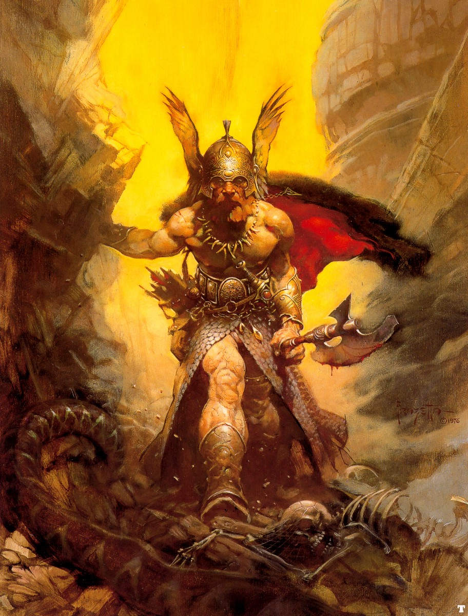
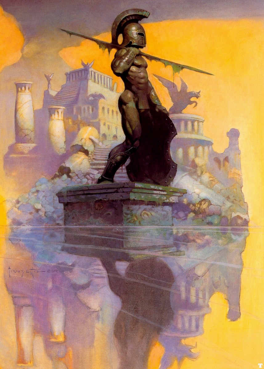
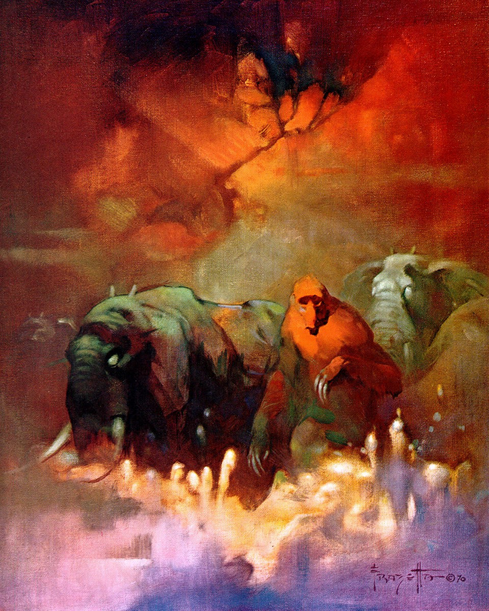
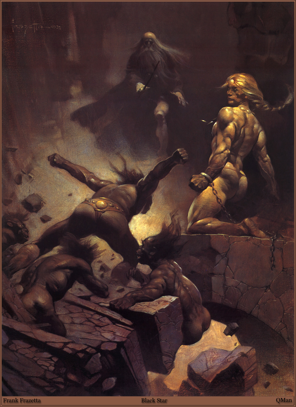
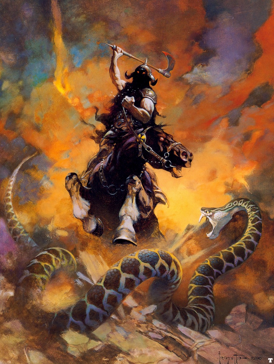
Though I’ve sung praises for his work, Frank is also someone who’s body of work I have a complicated relationship with. He, perhaps moreso that any other fantasy illustrator embodies a very particular aesthetic within the genre. He is quite literally the father of Sword and Sorcery, the realm of low fantasy. The struggles are mortal and the adversaries are not gods and gilded wonders of high magic but gnarled and grotesque hulks, savage apes and writhing serpents. They are very much a product of their time, something that had some grounding before fantasy became bloated with the tropes that have become so familiar today.
That being said, for all I appreciate about those aspects of his work, there are others that can bother me sometimes. Though I’ll talk about them, I would simultaneously like to start with the caveat that I appreciate these as a product of their time, made in an era and a social climate that was very different than the one we live in today.
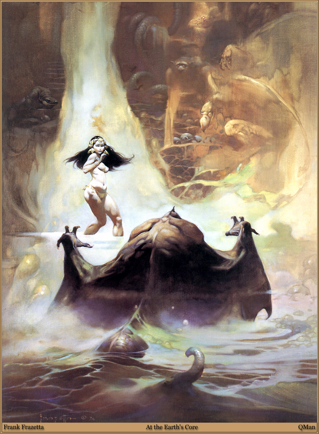
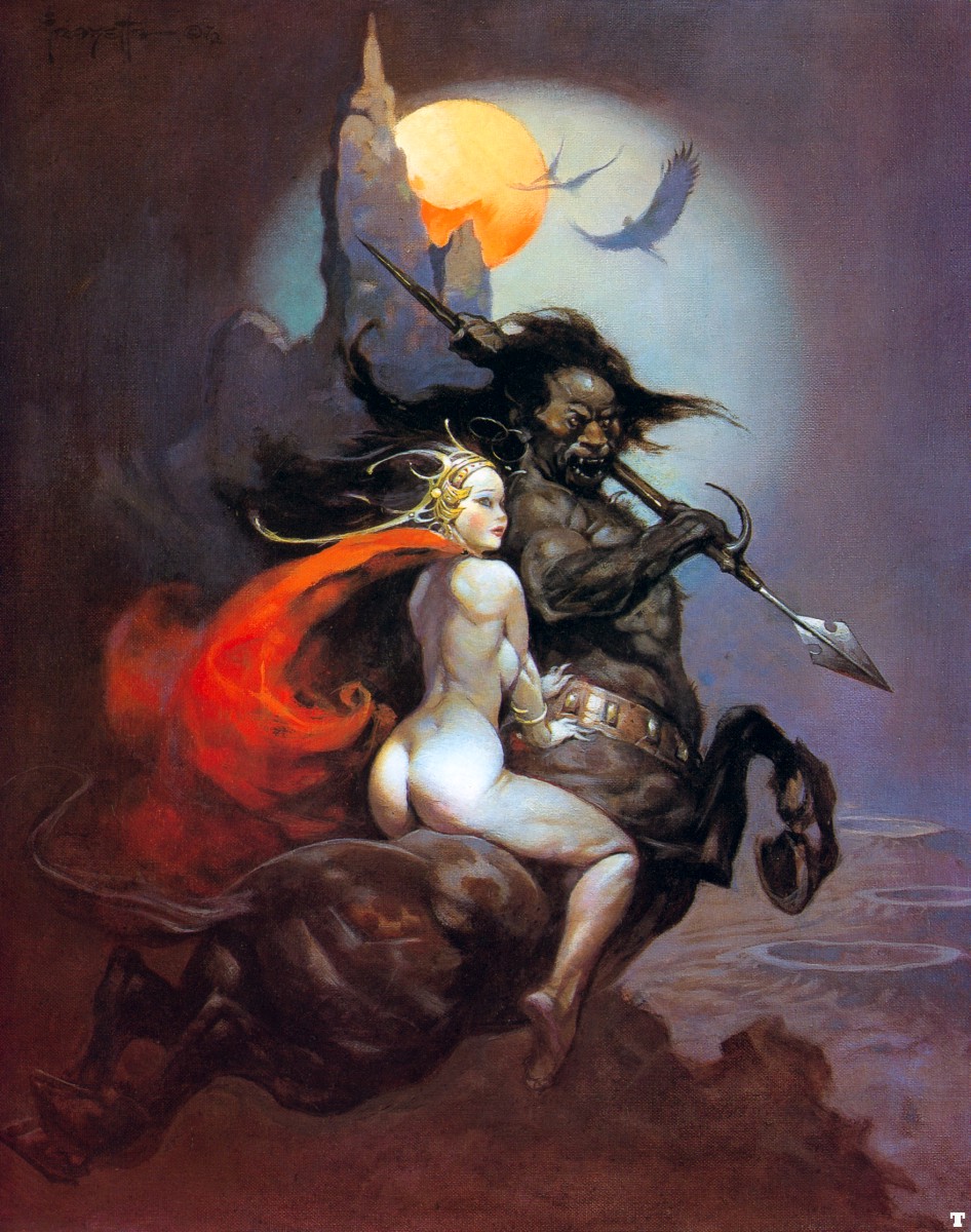
Expanding somewhat on the criticism I’ve levied in the above image, there’s an uncomfortable streak of veiled racism that comes up in much of the fantasy work from the 20th century. The adversaries too often look like caricatures of “savages”, portraying anyone who isn’t the buxom blonde haired blue eyed females and rippling caucasian warriors as idiot brutes with features that play too close to the mocking caricatures of black men and women that were so prevalent in the decades before.
Something that often bothers me is his portrayals of women are frequently hypersexualized, with them being little more than titillating eye-candy with no agency, no character. This is unfortunate as the works age, because it takes paintings that are technically brilliant and makes them feel puerile and juvenile in comparison to other works of illustration and fine art.
The world of fantasy is one that has long been the realm of teenage boys, and these depictions don’t help its reputation in gaining credibility as a voice in art and storytelling that is worth hearing. Even today, it can be a genre that alienates women with sexist tropes and portrayals that fail to make them feel included, like they can also get lost in these worlds the way their brothers, fathers and partners can. If the only role available to you in this world was is a passive sex object, there’s nothing welcoming about that. Nobody wants to be a constant conquest of a male character’s power fantasy, but this was the reality of a genre that catered solely to masculinity for decades.
These points being made, there remains a compelling body of work left behind in the legacy of Frazetta. He was a man with flaws, and as imperfect as any of us, and though themes of his works may not have aged as well as one would have hoped, he leaves an indelible mark on the world of fantasy. It remains a world that owes much to the his visions of subterranean horrors, stygian warlocks and the heroes who would test their mettle against them. Raise your sword against the twisted hands of the sorcerer, and lose yourself in a realm of clanging steel and clandestine magic!
“Good or bad, the one thing I can say about my art is, if I can quote Sinatra, I did it my way.” – Frank Frazetta.
Images and Sourcing:
http://www.arthistoryarchive.com/arthistory/fantasy/Frank-Frazetta.html
Leave a Reply