
For this week I wanted to cover an artist I’ve greatly admired over the years, but also gained a deeper appreciation for as I returned to drawing on my own terms.
I’ve been an avid lover of graphic novels since my early twenties, and combined with my fondness for book collections the two combined have put me in the hole just about every time I’ve moved in the last seven years. As much as I love the medium though, I was never that taken with superhero stories, arguably the bread and butter of the genre. They’re fun in a popcorn movie kind of way, but after the seventh cycle of retconned character deaths and and convoluted multiverse plot lines my enthusiasm was circling the drain.
:no_upscale()/cdn.vox-cdn.com/uploads/chorus_asset/file/15978137/HBY25YC_HBYICM_FC_FNL.jpg)
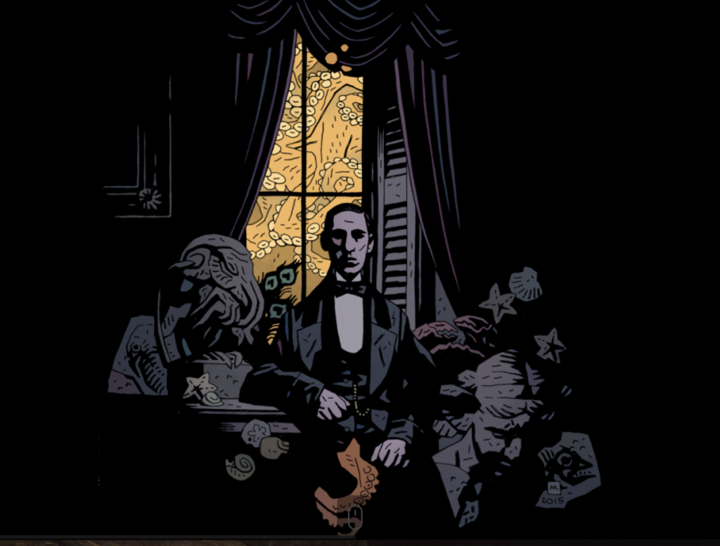
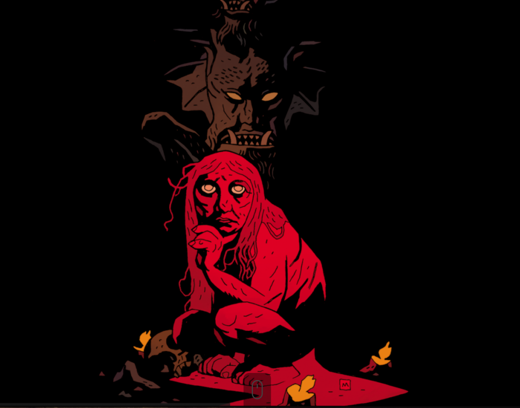
It’s refreshing to find work from artists like Mike Mignola when you dig a little past the Marvel and DC fare many of us associate graphics novels and comics with. He’s best known for creating the universe that contains the worlds of Hellboy, B.P.R.D, Witchfinder and Lobster Johnson, film works like Bram Stoker’s Dracula and various short story anthologies for Dark Horse, a great publisher that puts out a lot of fun series that may be considered too niche or off-beat for the bigger publishing houses. 1994 was when he started to really gain recognition, moving from junior inking positions at Marvel to doing covers for Rocket Raccoon, The Incredible Hulk and releasing his own IP in the form of Hellboy.

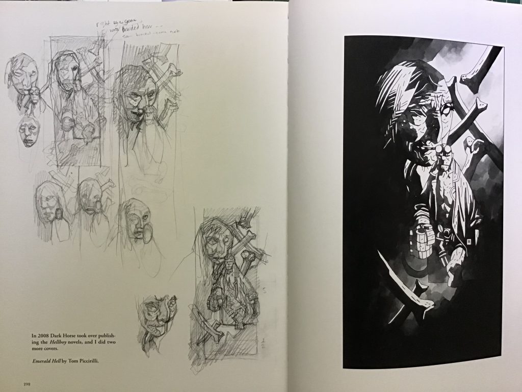
His work for his proprietary settings is so much fun to pore through, and I was lucky enough to find large format library editions of some of the Hellboy books that contains sketches, failed ideation and character concepts with commentary. Getting to see how established artists work behind the scenes is super exciting for me as someone working out their own process, and he packs a lot of notes that show a thoughtful methodology behind his approach. He weaves tons of symbolism and folklore into his storytelling that makes the imagery so much more rich once you can contextualize it with the behind-the-scenes work peppered throughout.
In the comics industry he’s super well respected as a graphic novelist and has a great reputation as an “artist’s artist”, particularly with how he bends lighting to give characters weight, their proportions sometimes stretched, twisted and warped in conjunction, telling you more about them without having to rely on supporting dialogue. He’s a master of showing over telling, and it makes his work great fun to take in, especially as someone sharpening their own composition skills.
He’s similar to Frazetta in these respects, citing him as a direct influence, particularly in this interview from the magazinePolygon.
Bill Mantlo, the writer I worked with on all my early comics at Marvel, once told me that I needed to put more character into my people — more naturalistic acting — and not “try so hard to make every panel look like a Frazetta painting.” And I guess that’s it right there. I think like a poster or book cover artist. That’s the stuff that influenced me more than comics. Eventually I figured out a way to make comic storytelling work for me, but my stuff is still more graphic, more focused on overall page design, than on the naturalistic acting of the characters in the panels. I could go on and on about that but I’d need to draw diagrams. And I’m here to talk about covers.
Polygon: Mike Mignola shares an exclusive preview of Hellboy: 25 Years of Cover
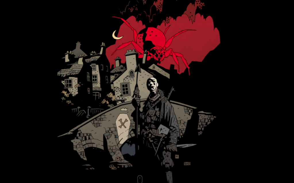
I like this quality about his work, to be honest it’s probably the same pull I feel with Bob Peak and Frazetta’s work as well. Mike has something a little different though, and where Peak had incredible colour and versatility and Frazetta anatomy, camp and technique, Mignola has this wonderful imaginative quality that’s backed up with a style that’s super unique and very much his. There’s a sense of an almost elevated crudeness or primitive portrayal in the way he draws that reminds me a bit of German Expressionism, but it’s backed up with a deft hand in how he brings light and composition in to make things work with the unconventional, sometimes even crude and exaggerated shapes. He’s a big influence on me, and an artist I’ve looked up to for quite some time and I hope I’ll put out work that can speak with that much confidence and craft one day.
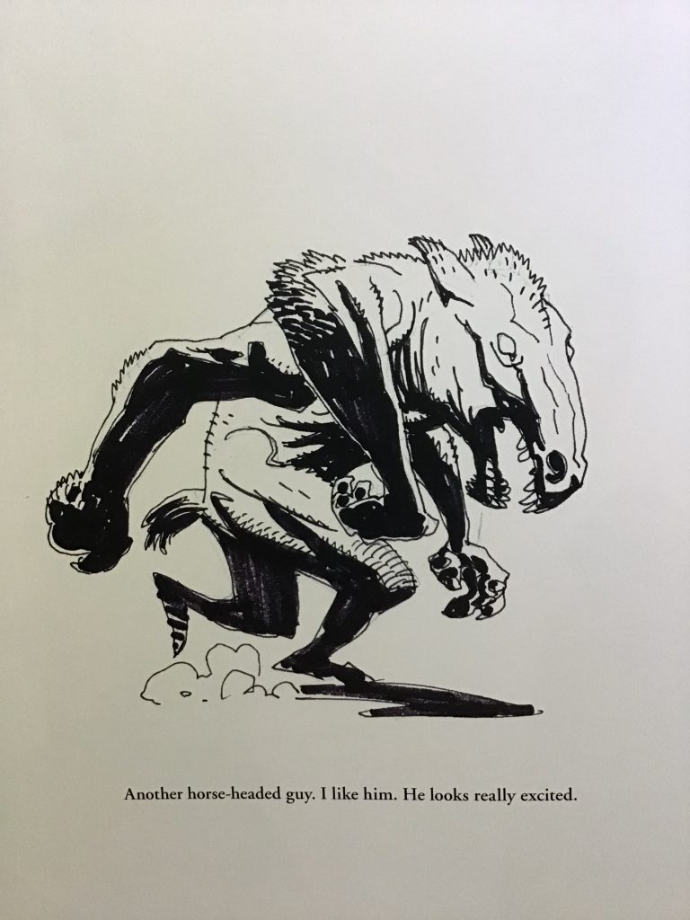
And on a closing note, this was a fun page I found when I was taking photos from the sketchbooks earlier. As heavy as the imagery in much of his work is, he doesn’t take himself very seriously (and as someone who is a big goober, I love this):
Sources and Images:
https://www.polygon.com/comics/2019/3/22/18276211/hellboy-covers-mike-mignola-foreword-anniversary
Leave a Reply