Categories
121

Visual Research II

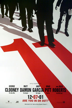
Neville Brody put together this high-contrast poster for the movie Oceans Eleven. The large number Eleven positioned diagonally on the image draws the viewer’s eyes in first. It is bright red and the only color in an otherwise monochrome poster. The number eleven then moves your focus to the black silhouettes at the top. These figures are set apart from the completely white background. The use of contrast in color, tone, and even size allows the poster to pop giving it clear readability.
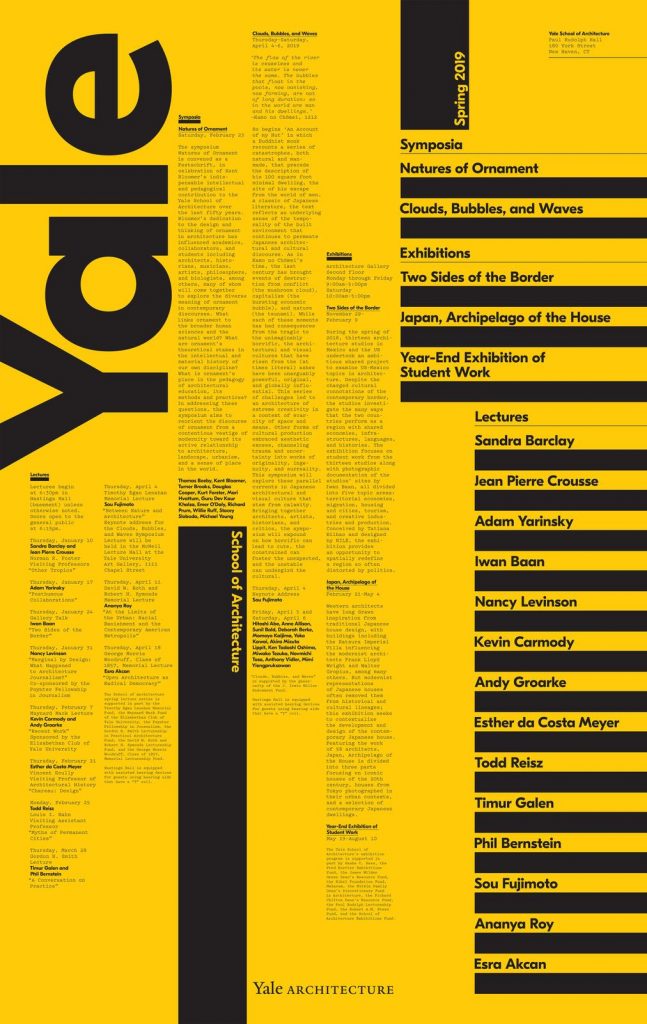
This 2019 Yale Architecture poster heavily uses the visual design principal alignment. The poster has many columns of texts all seemingly aligned by invisible grids. This creates vertical rectangles from the words making the overall poster quite structured, which is fitting for an architecture program.
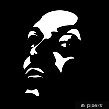
This image was created by a user and seller on Pixers by the name of sarplaninac. They created a very high contrast image of a face using only two tones of black and white. The Gestalt principle of Closure is what allows the viewer to distinguish forms from the white highlighted shapes and fill in the mental blanks of the image from the negative space or black background.
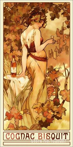
The ad ‘Cognac Bisquit’ by Alphonse Mucha is an example of Gestalt’s Principal of Figure/Ground. The lady looking over her shoulder holding the cognac is the figure. She is the focus of the illustration, while the trees and underbrush surrounding her are the background elements. Even though the foliage isn’t the focus of the poster it adds movement, drawing the viewer’s eye around the image in an ‘S’ shape balancing out the composition. This is a great example of figure and ground as even though the figure is the focus of the advertisement to sell the cognac, the ground element is of almost equal importance to make a visually appealing and successful advertisement.

Categories
121

Visual Research I

This poster was created by Illustrator and Graphic Designer Josh Hayes. The poster displays the use of geometric shapes that are differentiated by value and tone. Shape is the strongest element as it adds structure and intrigue to the poster.
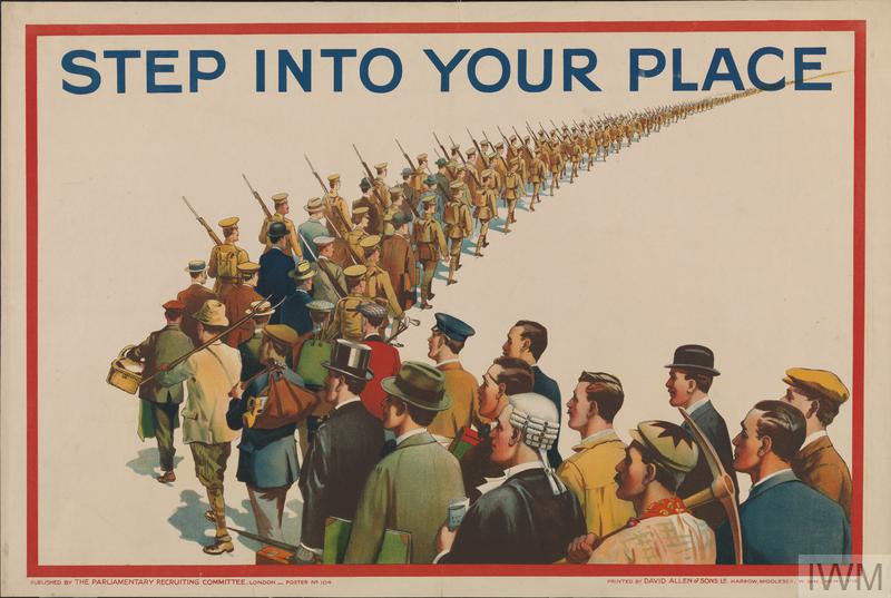
‘Step Into Your place’ is a 1915 first world war propaganda poster that executed the element of scale. The poster calls to action all men of varying occupations and classes to join the fight. As the line-up of men moves farther away, their outfits change, turning to soldiers and shrink in proportion. This showcases depth and physical scale within the poster.
Created by Saul Bass for the movie Vertigo, this poster emphasizes a feeling of unsteadiness or vertigo with its use of curved lines that draws your eyes to the figures. Line is the strongest element as it creates shape, structure, and a mood that ties back to the movie.

Categories
141

Project 1 Yearbook Spread

I started my Yearbook Spread Assignment with too many contradicting ideas. Each thumbnail sketch looked as if it could have been made by a completely different person. To nail down a cohesive theme for the spread I made it in similar fashion to my old high school agendas. A series of books I used like a sketchbook or scrapbook. Every week filling the pages with as much information as possible. I crammed in every doodle, scrap of paper, old candy wrapper, funny story, and occasionally an assignment or two.

I began my process with a green watercolor wash. At first, I only used a regular graphite pencil but later realized I needed to add contrast for clarity. I went back over some lines with a softer darker lead and added some more white highlights. I put emphasis on using the pencils and white jelly pens, as they were often what I would be caught sketching between classes with. This allowed me to limit my tools, only using what would have been in my pencil case. It made my layout more cohesive and truer to the theme. I also implemented doodles of space to tie the spread together as it was recurring imagery I used in the old agendas. It reflects myself as I loved and am still fascinated with astronomy. I can at times also be admittedly a bit spacy.

I had fun revisiting my agendas and paying homage to where I started my art journey. I wished I glued in other elements as it would have stuck to the scrapbook feel, and blocked-in shapes, adding more structure and providing some texture. I only used one color, and while accurate to my agendas the color pallet is boring. The design is cramped, and typography can be sloppy as I had no ruler. I’d give myself a 7/10 for the yearbook spread that took me around four and a half hours to complete.