Categories
131

The Evolving Work of Shantell Martin

Abstract Expressionism & Pop Art Contemporary, Post Modernism

Shantell Martin posing with her work done in a bolder line art style used to decorate floors and walls.

Shantell Martin is an artist known for her stream-of-consciousness drawings. Born in Thamesmead London, she would start her education at St. Martin. After finishing her education she would travel over to Japan to have her work experienced through music in an avant-garde fashion at clubs. Martin would draw digitally live and have her work projected up on the walls of clubs and to singers at concerts. Martin describes her time in Japan as a little isolating, so the way she drew things in her sketchbooks would be more personal like a diary. All her illustrations were done in 0.05 pen, describing this style as more intimate, with just you, the pen, and the paper.

These are some of the sketches done in the 0.05 pens that allow Martin to create more intimate work to express her emotions. Presumably, this was also completed during her time living in Japan.

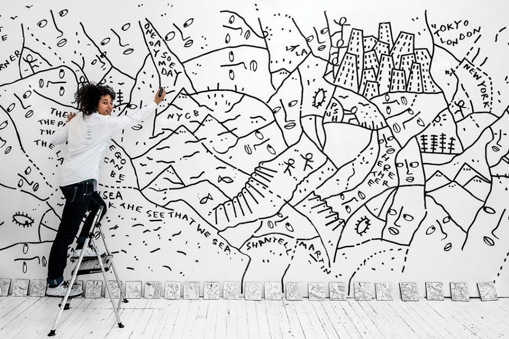
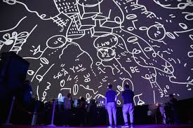
Martin’s work evolves with her environment over time. Like how her work became more intimate, smaller, and refined in Japan, once she moved to America her work once again evolved. She described New York City as “Everything is so big bold and confident.” Martin felt a need to fill this new larger space and her work followed suit.

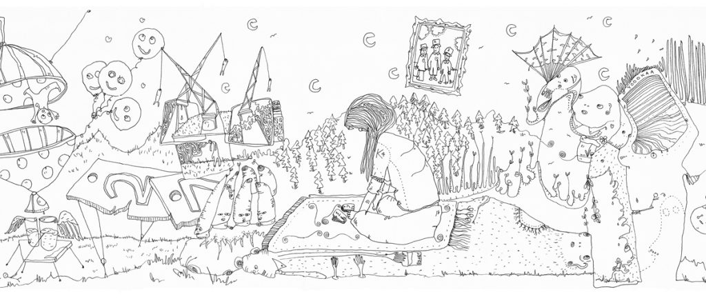
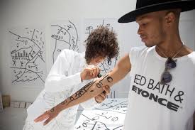
When creating, Martin doesn’t plan out her compositions, her work is a meditative process of thoughts and feelings expressed through lines. “The pen knows where it’s going, and I’ve gotten very good at following” It’s not that Martin doesn’t have an idea what she’s going to draw, her intentions are there to make an artwork that allows her to connect with the world. Many of Martin’s works revolve around exploring themes such as intersectionality, identity, and play. Martin is a cultural facilitator, forging new connections between fine art, education, design, philosophy, and technology with her work. She draws on anything and everything including cars, shoes, planes, tables, walls, and even people.

An example of Martin using different mediums and showing that she does in fact draw on people.

She describes how colour can be used to direct people’s attention around an image. This is why Martin prefers to work in black and white, believing this allows each viewer’s eye to be drawn to a different place.

This is an image of Shantell Martin with her piece done collaborating with the New York Ballet. Done using a thick chisel tip black ink marker in Lincoln Center’s David H. Koch Theater. Here her work is displayed on multiple levels looking down the main lobby of the building.

I choose to study Shantell Martin’s work because it’s not typically the type of work that I would think twice about. Personally, I think her work is interesting and nice to look at, but I wouldn’t feel a need to think deeply about it if I was it on the street. The simple and clean nature of her work makes me think it’s simple altogether; an art piece with no theme, just created to look cool. I wanted to look further into a type of work that I usually wouldn’t, end off the term broadening my horizons hopefully a little. I’m happy I did. Her philosophy about her work holds an interesting and unique perspective. I like how she communicates her own personal story as her work evolves. I also thought it was interesting that her work would adapt to her changing environments. There was a stark difference between the dainty and intimate sketchbook pages done in Japan, and the large bold wall murals completed in America. The lack of colour was what originally attracted me to her art, and I think it works really well for her intentions. Everything she doses feels much more thought out than it appears, even though the process of actually completing the work is described as meditative. After looking into her work more, I found she worked with the company TED a few times, even completing a TEDvTalk on the idea of individuality and the feeling of a blank canvas. It’s interesting to be researching a modern artist on who I can watch YouTube videos to explain their work. It gives me a level of understanding and context for the work that I wouldn’t otherwise get with an older artist like Diego Valazquez. Though, that would be interesting to watch. Overall, I gained a better application for the work, that is more than just aesthetically appealing but touches upon important topics in a unique and modern way with art.

Martin returned to her roots from her days of projecting her art at clubs in Japan. This time she reverses her iconic black-on-white imagery for white lights on a wall for a Kendrick Lamar concert.

Citations:

Martin, Shantell. “How Drawing Can Set You Free | Shantell Martin – YouTube.” YouTube, TED, 21 July 2020, https://www.youtube.com/watch?v=RzBUAY1wuw4.

Martin, Shantell. “No One Else You Could Be | Shantell Martin – Youtube.com.” YouTube, TEDxTalks, 8 Dec. 2017, https://www.youtube.com/watch?v=U0rvNTC_fSM.

Martin, Shantell. “Shantell Martin: Follow the Pen.” Youtube, The New Yorker, 24 Oct. 2013, https://www.youtube.com/watch?v=7ywYnk0-xUY.

“Shantell Martin.” Wikipedia, Wikimedia Foundation, 21 Nov. 2021, https://en.wikipedia.org/wiki/Shantell_Martin.

“Shantell Martin.” Wikipedia, Wikimedia Foundation, 21 Nov. 2021, https://en.wikipedia.org/wiki/Shantell_Martin.

Image Citations:

“Influential Voices: An Interview with Artist Shantell Martin.” BOOOOOOOM!, 18 Jan. 2018, https://www.booooooom.com/2018/01/18/influential-voices-an-interview-with-artist-shantell-martin/.

Martin, Shantell. “Drawing on People.” Flickr, Yahoo!, 17 July 2014, https://www.flickr.com/photos/shantellmartin/14674072534/.

“Newsletter Sign Up.” Empire, http://www.empireentertainment.com/project_detail.php?id=1055596.

“Shantell Martin – Work: X Kendrick Lamar.” Shantell Martin – Work: x Kendrick Lamar, https://shantellmartin.art/work/x-kendrick-lamar/.

Valintine, Victoria L. “Known for Her Free-Form Line Drawings, Shantell Martin Is Collaborating with the New York City Ballet.” Known for Her Free-Form Line Drawings, Shantell Martin Is Collaborating With the New York City Ballet, Culture Type, 26 Jan. 2019, https://www.culturetype.com/2019/01/26/known-for-her-free-form-line-drawings-shantell-martin-is-collaborating-with-the-new-york-city-ballet/.

Categories
141

Leyendecker’s Legacy

A look Into the Real Life Great Gatsby.

Photograph of J.C. Leyendecker
Humble Beginnings

The Leyendecker Family was artistically inclined one way or another, J.C. Leyendecker was no exception from that fact. From the age of eight, Leyendecker would spend all day at school drawing in the margins of his papers and filling textbooks up with what he described as crude drawings. When he returned home he would oil paint on old kitchen rags. Later in his career, he would be influential to America’s Golden Age of Illustration, creating America’s first sex symbol, and inspiring F. Scotts Fitzgerald’s best-selling classic novel, The Great Gatsby. 

Leyendecker’s examples of the Arrow Collar Man in his work.

Born in Germany, the family would immigrate over to America while Leyendecker was still young. They didn’t have much at first but luckily, J.C. Leyendecker would be allowed to study at the Art Institute of Chicago. In his family, his older brother Adolph would go into stained glass art, though he was never close with his family and was pretty much disowned after two very public scandals that tarnished his reputation beyond repair. This caused him to move away and be buried apart from his family. Though the rest of the Lydecker family would remain close. The two younger siblings would be very influential in supporting J.C. Leyendecker’s career working in the same studio and living with him. Frank and Augusta Leyendecker would both join J.C. at the Art Institute of Chicago.

After some time the Leyendecker family came to have more money and felt comfortable sending both J.C. and Frank away to Paris for classical education in painting. J.C. Leyendecker really enjoyed his time in Paris and often spent hours upon hours sketching and painting people in Paris Cafes. Frank was also an excellent illustrator but did not possess the same drive as J.C. and would often get lost in his brother’s shadow. Regardless of that fact, upon returning home the two Lydecker brothers would move to New York and open up an extremely successful studio with their sister Augusta.

Leyendecker working in his studio from a live model.

This new studio is where J.C Leyendecker would rise in popularity for his commercial magazine illustrations. He would create over 322 covers for the Saturday evening post alone. Leyendecker’s other notable series would be posters for Collier’s automobiles and advertising WW2 bonds. His favorite advertisement series would be the Kelloggs Kids. These were illustrations of children with the ceral in magazines. Leyendecker loved painting and working with children as they were more expressive and dynamic in ways adults weren’t.

One of Leyendecker’s many covers for the Saturday Evening Post, for his Saturday Evening Post Babies series.

Leyendecker’s style in his work was notable for many reasons. His use of color, exaggerating proportions and dynamic figures helped to sell ideas for his commercial work. Leyendecker was known for painting these idealized figures of playful happy children, elegant well dressed women, and larger-than-life stoic athletic men to sell a product or idea. He was able to communicate a lot of character within subtle changes to expression and stylized proportion. I really appreciate his ability to tell stories in his work through the smallest of details. Everything he did was to communicate a narrative through his work

When creating an illustration it was clear that Lydecker was a draftsman at heart. Before setting out to paint his final illustration, he made several rough drafts, rehearsing the brushwork of every element until he got it just right. Everything he did was quite intentional in his sketches that he would later use gride method to blow up the painting on a larger scale.

A study done by Leyendecker with the grid-like sketch underneath.

Leyendecker’s most notable contribution in his work would be the Arrow Collar Man. This was America’s first sex symbol and was an extremely influential advertising series to sell the arrow collar in shirts. The Arrow Collar Man was never really the same face being depicted, just a consistently well-dressed stoic man, typical of Leyendecker’s work. This advertising series made the company extremely wealthy. The Arrow Collar factories got more love letters sent to their offices from women who saw Leyendecker’s illustrations and hoped to marry the man in the paintings, than the real and very famous young Louis Vuitton at the time.

Famous example of Leyendecker’s Arrow Collar Man Illustrations.
Extravagant Endeavours

The Arrow Collar Man in the paintings was actually a real person. His name was Charles Beach, a live model who worked for Leyendecker and was extremely good-looking. From the day J.C. Leyendecker and Charles Beach met they would become inseparable. Beach would move in with Leyendecker and share an apartment. From there the two would go on to live with J.C.’s younger siblings Frankie and Agusta Leyendecker in J.C.’s famous large mansion.

Charles Beach fit in well with the other Leyendecker children and their business practices. Charles worked as J.C. Leyendecker’s model and would take up secretary roles in the studio. Agusta Leyendecker took on a matriarchal role in the house as well as working as the two brother’s managers. Frankie Leyendecker took on illustration jobs that J.C. Leyendecker didn’t have time for or couldn’t finish.

One of J.C Leyendecker’s more colourful and expressive illustrations.

Charles, as well as being extremely good-looking was great at talking. He recommended they throw large parties under the guise of networking. This plan ended up working extremely well, Charles Beach’s amazing social skills made up for J.C Lydecker’s utter lack of sociability and they raised Lyndeckers sales immensely.

Illustrators were seen as celebrities, and Leyendecker was the most famous of them all. These extravagant parties attracted the attention of all the rich and famous to attend. Anyone who was anyone would go to Leyendecker’s larger-than-life events. In fact, they were so infamous, the novel ‘The Great Gatsby’ is actually based on Leyendeker and these extravagant parties. F. Scotts Fitsgerald, the writer of The Great Gatsby himself actually attended quite a few of these parties. This is also why literary enthusiasts believe The Great Gatsby to queer a coded novel among other reasons.

This Illustration highlights J.C Lydecker’s consistency in how he depicts men as stoic, as well as other stylistic aspects, light strong brushstrokes, and hatching in the backgrounds.
The Lost legacy

J.C Leyendecker was a gay illustrator in a time where is was dangerous to have been out or outed. His and Charles Beach’s relationship had always been more than platonic and they would live together in that mansion for the rest of their lives. Though, because of this fact, even with the extravagant parties, the two lived a very private life. J.C Leyendecker only took two interviews in his life and Charles Beach even less. This worried Leyendecker as he got older about his legacy since he worked so hard to keep himself personally out of the spotlight. Leyendecker wondered if all that effort would cause him to be forgotten. Which, unfortunately, he was right to be worried, he was nearly forgotten about in history and doesn’t get the proper respect for all he’s done with his influential body of work. Norman Rockwell, a student of J.C Leyendecker and close with the family would give what we know now as a very biased re-telling of J.C Leyendecker’s life. Though, he had great respect for Leyendecker and has kept his legacy somewhat alive in a way. That alone would be some of the only writings on J.C. Leyendecker still around. Before Leyendecker died he asked Charles Beach to take all his writings, letters, sketches, paintings, and unfinished or unpublished pieces and to burn them. Even after his death Leyendecker wanted to protect the name and careers of his friends and family and couldn’t leave anything that could have been seen as incriminating evidence of his homosexuality.

Even though most of his legacy will be lost to history, there are still pieces of his influence felt today. J.C Leyendecker defined classic American culture and paved the way for artists during America’s golden age of Illustration. There are echoes of him found in The Great Gatsby the novel’s movie adaptations. Yet, I believe J.C Leyendecker would have greatly appreciated that his home has turned into a school to teach young children how to paint, mixing his love for art and children into a lasting legacy.

One of my personal favourite pieces from Leyendecker. Showing a golfing trip in a more photographic layout for his painting.

Citations:

“J. C. Leyendecker.” Wikipedia, Wikimedia Foundation, 15 Sept. 2021, https://en.wikipedia.org/wiki/J._C._Leyendecker.

“J.C. Leyendecker.” Haggin Museum, https://hagginmuseum.org/leyendecker-j-c/.

“Joseph Christian Leyendecker : Shades of Colors and Lines.” Bartleby, https://www.bartleby.com/essay/Joseph-Christian-Leyendecker-Shades-Of-Colors-And-FKCUS3VQWQWF.

“Joseph Christian Leyendecker.” Artnet.com, http://www.artnet.com/artists/joseph-christian-leyendecker/.

“Joseph Christian Leyendecker.” The Illustrated Gallery, https://www.illustratedgallery.com/artwork/for-sale/artist/joseph-christian-leyendecker/.

Rowe, Kaz. “JC Leyendecker- The Iconic Gay Artist We ALMOST ForgotJC Leyendecker- the Iconic Gay Artist We … – Youtube.com.” Youtube, TouTube, 21 Mar. 2021, https://www.youtube.com/watch?v=BS7ayV2Ac74.

Image Citations:

“American Advertisement, Arrow Shirt Collars by Joseph Christian Leyendecker.” Fine Art America, https://fineartamerica.com/featured/american-advertisement-arrow-shirt-collars-joseph-christian-leyendecker.html.

Born: March 23, 1874 | Died: July 25. “J.C. Leyendecker.” Illustration History, https://www.illustrationhistory.org/artists/jc-leyendecker.

“J. C. Leyendecker.” Wikiwand, https://www.wikiwand.com/en/J._C._Leyendecker.

“Joseph Christian Leyendecker.” Artnet.com, http://www.artnet.com/artists/joseph-christian-leyendecker/.

Outmagazine. “Rediscovering J.C. Leyendecker & the Creation of the Perfect American Male.” OUT, Out Magazine, 6 Feb. 2015, https://www.out.com/entertainment/art-books/2012/09/04/jc-leyendecker-perfect-american-male-charles-beach.

Tangcay, Jazz. “Director Ryan White on Telling J.C Leyendecker’s Queer History in ‘Coded’.” Variety, Variety, 30 June 2021, https://variety.com/2021/film/markets-festivals/ryan-white-j-c-leyendecker-coded-1234998399/.

Taylor, Jeff. “J.C. Leyendecker: Norman Rockwell, but First and Make It Gay.” LOGO News, 23 Oct. 2019, http://www.newnownext.com/jc-leyendecker-illustrator-gay-lgbtq-history/10/2019/.

Categories
141

Historical Type Identification Poster

Typography Deconstructed

For my Historical Type Identification Poster project, I started with no clear idea and too much research. This left me with too many options and no clear theme besides the idea of breaking down different typography categories as expected from the brief. After doing research I had two ideas for my posters, The ‘Anatomy of Type’, and ‘The Different Faces of Type’. The themes were chosen as I thought they would allow me to best meet the requirements from the brief without making the theme feel forced or out of place. In the end, I like the ‘Anatomy of Type’ idea best and decided to model the design after anatomy sketches and studies from Old Masters like Leonardo da Vinci.

After the class check-in, I decided to modernize my theme based on the feedback I received. I still wanted to center my theme around studies and breaking down the elements of typography. So, I used the idea of using blueprint grids and similar grids found in notebooks of the modern notetaking aesthetics seen on Social Media. I used this theme adding a collage element allowing me to break up the typefaces so that I could show them clearly being studied and broken down. I also needed to re-vamp the name to fit the new them so I choose ‘Typography Deconstructed’. For this poster, I wanted to use high contrast and push myself to try different color combinations that I don’t usually go for. I don’t think I’ve ever used my orange paint marker, so I went with a bright neon orange to grab the viewer’s attention and balance out the piece with pops of color. I also used a more muted complementary blue that I mixed with gauche.

When assembling the poster, I re-drafted some of my designs and picked the elements I liked best before starting construction. I tried to use the type in the poster how it was intended to. Decorative Typeface for the title to grab attention, Blackletter to match the idea of Initials in older scripts and books, and the clear and clean Text Typefaces for smaller and denser areas of type. Overall, I really liked the outcome. I think there was definitely a time crunch near the end and that lead to sloppy mistakes. Some of the typeface names aren’t as straight and aligned as they should be, and I wish some elements were cleaner and clearer to read. Yet, I enjoyed making this poster, even though I was worried about the challenge of neatly fitting eight different typefaces on one poster without looking like a chaotic jumble. This project took me around 7 hours total with research and I’d score myself 8/10.

My Finished Historical Type Identification Poster!