Categories
Uncategorized

Inspired Typography

Canadian Design Today

Image of Carl Dair

Canadian-born Graphic Designer Carl Dair is primarily self-taught in his craft. Dair is a typographer, typographic designer, teacher, and writer. He got his first job at eighteen years old working in advertising layouts for the Stratford Beacon-Herald. In his career, he would become internationally known for integrating design principles innovatively in typography and inspiring many with his design philosophy.

Carl Dair’s book ‘Design with Type’.

During his career, Carl Dair garnered a fair amount of success from his design work. He designed typefaces Cartier, Raleigh, and Cartier Book. He’s also made numerous publications, including books like ‘Design with Type’, ‘A Typographic Quest’; and ‘Gravers and Files a film Dair directed.

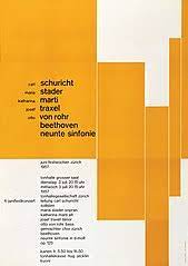
Over three decades of work as a graphic designer, Dair would inspire people with his personal design philosophy where he valued “inspired typography” as the most important factor for any means of visual communication. He would also inspire many as a designer and teacher with his standard of excellence in his craft. Overall, I enjoy his use of white space and creativity in handling typographic elements in his work. I hope to experiment with how I handle typography in the future and will be using him as reference.

Citations:

“Carl Dair, FGDC.” GDC (Graphic Designers of Canada) | Carl Dair, FGDC, https://www.gdc.net/fellows/carl-dair-fgdc.

“Carl Dair.” The Canadian Encyclopedia, https://www.thecanadianencyclopedia.ca/en/article/carl-dair.

“Carl Dair.” Wikipedia, Wikimedia Foundation, 21 Feb. 2022, https://en.wikipedia.org/wiki/Carl_Dair.

Image Citations:

“Carl Dair – Alchetron, the Free Social Encyclopedia.” Alchetron.com, 21 Feb. 2018, https://alchetron.com/Carl-Dair.

“DHIS-310-SU90-2016-Canadian Design History/Theory – Term II.” Week 5 B -Graphics, Typography & Package Design: Canadian Skill, Carl Dair, Henry Eveleigh, Toronto, 1950, https://courses.ecuad.ca/mod/book/view.php?id=64394&chapterid=22757.

Indigo Books & Music, Inc. “Design with Type.” Indigo.ca, https://www.chapters.indigo.ca/en-ca/books/design-with-type/9780802065193-item.html.

Categories
Uncategorized

Mother of the Mac Trash Can

Postmodernism in Europe

Susan Kare

Susan Kare had immersed herself in the arts from a very young age. Whether that was drawing, painting, or various arts and crafts, she had a very early love to create. This passion would lead her to get a Bachelor’s Degree in Art as well as an M.A. and Ph.D. in fine Arts from Mount Holyoke College. She obtained the degree with the intent to be either a fine artist or teacher.

Kare’s solitaire interface designs.

From there, Susan Kare would go on from there to work at the Fine Arts Museums of San Fransisco, opting for a job as a Sculptor. It was during her time spent working at the Museum when she would get a call from a high school friend Andy Hertzfeld to commission her for some hand-drawn icons and front elements for the release of the upcoming Macintosh computer. In exchange for her, work Kare was promised to receive an Apple II computer. Kare agreed but didn’t have any knowledge on how to start or complete a digital project such as this. Kare would draw upon her knowledge in Fine Arts of techniques used in Mosaics, needlepoint, and pointillism and began mocking up designs on graphic paper. These designs were the early stages of some of the most iconic and recognizable digital symbols we see daily.

Some of Susan Kare’s original sketches and designs from her sketchbook.

In just one year she would design the core visual design language for the Macintosh. Icons, typefaces, and even marketing material for the product were designed by her. She would design iconic iconography for Apple like the trash can, paint bucket, dog-ear paper icon, I-beam cursor, and much more. She would truly begin to immerse herself in technology and the design world. She also designed the world’s first proportionally spaced digital font family; Chicago and Geneva. Kare would also design a monospaced type family Monaco. She became Creative Director in Apple Creative Services.

Examples of her Macintosh icon designs.

Susan Kare’s work recolonized the way we use and think about digital design to this day. Her innovations would set the bar for the future of digitals interfaces and iconography. Her work and story go to show that even if you set out a path for your career you can’t predict where life will take you in one’s art journey. I admire how she was able to use her Fine Art background and quickly adapt to digital design.

Susan Kare in her iconic cubical.

Citations:

“The Centre for Computing History.” Centre For Computing History, http://www.computinghistory.org.uk/det/1792/Susan-Kare/.

“Susan Kare.” Wikipedia, Wikimedia Foundation, 28 Mar. 2022, https://en.wikipedia.org/wiki/Susan_Kare.

“Susan Kare: Biography, Designs and Facts.” Famous Graphic Designers, https://www.famousgraphicdesigners.org/susan-kare.

Image Citations:

Cesarato, Alessandra. “Susan Kare: An Iconic Career: Blog.” Domestika, DOMESTIKA, 19 Dec. 2020, https://www.domestika.org/en/blog/3320-susan-kare-an-iconic-career.

Editorial, Canvs. “Susan Kare: An Iconic Graphic Designer.” Medium, Canvs Stories, 22 Jan. 2022, https://medium.com/canvs/susan-kare-an-iconic-graphic-designer-4627cae5c7cf.

Published Jan 12, 2016. “Susan Kare, Designer.” NYMag.com, https://nymag.com/news/features/beginnings/susan-kare/index.html.

“Susan Kare, Gui Icon Design Pioneer (and What the Mac’s Command Key Actually Represents).” Core77, https://www.core77.com/posts/21187/susan-kare-gui-icon-design-pioneer-and-what-the-macs-command-key-actually-represents-21187.

“Susan Kare.” Mount Holyoke College, 24 Aug. 2012, https://www.mtholyoke.edu/175/gallery/susan-kare.

Categories
Uncategorized

The Renaissance Designer

Lisa Strausfeld and Her Work combining Supergraphics Technology and Design

Lisa Strausfeld is an American Designer and professional information architect. Strausfeld studied art history and computer science to get herself a bachelor of arts at Brown University. Then she would go on to study at Harvard University to get a master’s of Architecture. Later she would go on to study media arts at MIT to earn herself a master of Science degree. She seemingly loved to learn, but aside from her education, Strausfeld would also have an extremely successful career utilizing her multiple degrees in her design work. 

An example of Lisa Strausfeld’s work innovating supergraphics.

Strausfeld began her career with two other MIT students and launched the software company Perspecta. She would use her baStrausfeld began her career with two other MIT students and launched the software company Perspecta. She would use her background in technology to push the boundaries of mass communication with supergraphics in new and interesting ways. Later, while a partner at Pentagram, Strausfeld would work with innovative digitally animated supergraphics. She specializes in digital information projects; specifically the design work of large-scale media installations and UI design work.

Lisa Strausfeld’s way to using design to visually show the Billionaire Index of the wealthiest people in the world. This project was completed and updated along side a team of deasigners at pentagram done under the managament of Strausfeld.

I chose to research Lisa Strausfeld as I originally liked her innovative Supergraphic designs and was intrigued by just how many degrees she had… turns out she had quite a few. Other than making me inspired and I chose to research Lisa Strausfeld as I originally liked her innovative Supergraphic designs and was intrigued by just how many degrees she had… turns out she had quite a few. Other than making me inspired and wholly intimidated to get one degree of any sort I appreciated how she was able to draw upon the different education backgrounds she received and combine that knowledge in her design work. She is truly a modern renaissance designer and an early innovator of using technology with design, as seen in her infographics and animated advertisement campaigns.

This is Lisa Strausfeld project taking a look into a new form if data visualization. Described as a google earth for knowledge, it’s a inforraphic network of sorts that prototypes three dimensional data visualization.

Citations:

“Meet Lisa Strausfeld, One of Fast Company’s Most Creative People.” Fast Company, 1 Jan. 2000, https://www.fastcompany.com/person/lisa-strausfeld.

Palladino, Valentina. “The Billionaire Index Gets a Responsive Redesign.” Wired, Conde Nast, 24 Jan. 2013, https://www.wired.com/2013/01/interactive-billionaire-index/.

Schwab, Katharine. “Exclusive: Lisa Strausfeld Is Developing a New Kind of Data Viz.” Fast Company, Fast Company, 19 Oct. 2018, https://www.fastcompany.com/90247240/exclusive-lisa-strausfeld-is-developing-an-entirely-new-kind-of-data-viz.

Image Citations:

“Lisa Strausfeld.” Ideasondesign, http://ideasondesign.net/speakers/speakers/lisa-strausfeld/.

“Pentagram, Lisa Strausfeld, Christian Marc Schmidt, Takaaki Okada, Walter Bender, Eben Eliason, One Laptop per Child, Marco Pesenti Gritti, Christopher Blizzard, Red Hat, Inc.. Sugar Interface for the XO Laptop. 2006-2007: Moma.” The Museum of Modern Art, https://www.moma.org/collection/works/110267.

“VR Prototype for the New Historia.” Information Art, https://informationart.com/.

Categories
Uncategorized

The 60’s Psychedelic Design

A look into Victor Moscoso’s work during the 60’s era of Psychedelic Design

An example of Victor Moscoso’s poster designs that shows off the contrasting colour schemes that he is known for. Here he used saturated pink, blue, and green, so the colours can ‘vibrate’ off one and another.

Victor Moscoso is a Spanish American Artist known for his Psychedelic rock posters, advertisements, and underground comix. Originally from Vilaboa Parish of Culleredo, Galicia, Moscoso would travel with his parents to Brooklyn, America. Moscoso’s father worked as a painter and his mother was a seamstress, growing up in an artistically inclined family is where Moscoso would first learn about colour combinations. Later Moscoso would study art at Cooper Union in New York City then Yale University, finally Moscoso would move to San Fransico to study at San Francisco art institute, where he would later become an instructor there. 

Here Moscoso adds movement through lines to an originally symmetrical layout to remove the stiff and stagnant feel it might have had and encapsulate the psychedelic rock and roll feel in the 60’s.

In his working career, Moscoso would be known for his vibrant vibrating colour schemes in each piece. Moscoso takes inspiration from Josef Albers, his professor from Yale University, drugs, and the re-popularized Art Nouveau movement. His psychedelic rock and roll posters and album covers would shoot him to widespread public success. He would design for musicians like Jerry Garcia, Bob Weir, and David Grisman.

This design highlights the Art Nouveau inspiration in the way the figure is rendered in a style similar to Alphonse Mucha. This poster combined the unreadable warped decorative 60’s font into the naturalistic elements of flowers from Art Nouveau.

I chose to examine Moscoso’s graphic design work as I really appreciate his bold and bright colour combinations. I was already a fan of Art Nouveau, and Alphonse Mucha is one of my favorite artists, so it was interesting to see Designers take inspiration from his work in a different era. Moscoso’s work has great flow and rhythm through each piece that makes them more visually interesting designs. The imagery works perfectly for the type of music that he’s designing for. Moscoso has inspired me to be bolder and more playful with colour combinations and design layouts.

Citations:

Gary Groth | February 9, 2011. “An Interview with Victor Moscoso – Page 5 of 14.” The Comics Journal, FROM THE TCJ ARCHIVES, 1 Oct. 2021, https://www.tcj.com/an-interview-with-victor-moscoso/5/.

Kondolay, Ryan. “The Art of Influence: Victor Moscoso.” Comet Creative, 15 Mar. 2019, https://wearecomet.com/1960s-psychedelic-tribute-calendar-victor-moscoso/.

“Victor Moscoso.” Smithsonian American Art Museum, SAAM, https://americanart.si.edu/artist/victor-moscoso-18206.

Image Citations:

Dukepope. “Victor Moscoso, the Grand Old Master of Psychedelic Art.” DUKEPOPE, 21 June 2013, https://dukepope.wordpress.com/2013/04/01/victor-moscoso-the-grand-old-master-of-psychedelic-rock-posters/.

“Victor Moscoso Master of Psychedelic Posters & Comix.” Victor Moscoso >> Neon Rose Series, http://www.victormoscoso.com/gallery1.htm.

“Victor Moscoso.” Art Blart, https://artblart.com/tag/victor-moscoso/.

Categories
Uncategorized

Working with Minimal Means

An Exploration into Swiss Graphic Design /International Style of Design

Poster by Josef Müller-Brockmann. This poster demonstrates the commonly left-aligned text, hierarchy in size, and strong use of grids.

Swiss Design

Swiss Design, otherwise known as the International Typographic Style was a popular and influential movement that took over the design world in the 1950’s centered around Switzerland. Two art schools in particular, the Kunstgewerbeschule in Zurich, and the Allgemeine Gewerbeschule in Basel would impart design philosophies like ‘form follows function’, and creating rational designs. These ideas, along with having a strong understanding of the design fundamentals, geometric shapes, grids, and sans serif fonts like Helvetica would shape the movement.

A poster by Emil Ruder. This showcases Swiss Design, through the commonly left aligned and sans serif fonts. As well as simple and graphic shapes.

What I Learned and My Opinion

At first, I wasn’t all too impressed with Swiss design. Sure, it looked clean and communicated an idea clearly, but I was under the impression that it was a simple and easy design style, nothing too special. After doing more research and attempting to make a Swiss design poster of my own, I can confidently say; one, it’s not easy, and two, it’s much more important in the history of design than I initially realized.

I understood this especially after researching Armin Hofmann and attempting to understand his design philosophy through his work and the stories from students who worked under him. Armin Hofmann would teach his students a strong set of fundamental skills that they could build off of. He gave them the minimal means of supplies to work with on projects and pushed them to create complex and extraordinary designs.

A Poster by Armin Hofmann showcasing strong contrast and minimal use of colour, as he never wanted to rely on colour in his designs.

Originally, Swiss design felt in some cases too simple to me. The International style of design was built on a strong understanding of how to use the fundamental principles in design to communicate an idea. To remove all the elements deemed unnecessary and convey a message. I realize now that there is a lot of work that goes into making designs seem so simple, yet visually appealing. I think that complex simplicity is something really special that all designers should understand and take into account when creating. Through my research, I’ve come to appreciate Swiss Design and wish to explore the style more. I now really appreciate the fundamentals and wish to practice and implement some of the Swiss design philosophies in my work.

Citations:

Bigman, Alex. “What Exactly Is Swiss Design, Anyway?” 99designs, 99designs, 24 Jan. 2020, https://99designs.ca/blog/design-history-movements/swiss-design/.

Budrick, Callie. “Swiss Style: The Principles, the Typefaces & the Designers.” PRINT Magazine, 11 Oct. 2021, https://www.printmag.com/featured/swiss-style-principles-typefaces-designers/.

Dj. “Heroes – Armin Hofmann.” Designers Journal, 6 Mar. 2012, http://www.designersjournal.net/jottings/designheroes/heroes-armin-hofmann.

“International Typographic Style.” Wikipedia, Wikimedia Foundation, 10 Jan. 2022, https://en.wikipedia.org/wiki/International_Typographic_Style.

Nord, Project. “Everything You Need to Know about the Swiss Style.” PROJECT NORD JOURNAL, PROJECT NORD JOURNAL, 14 Oct. 2019, https://journal.projectnord.com/blog/everything-you-need-to-know-about-the-swiss-style-xbPHo.

Image Citations:

Flask, Dominic. “ARMIN HOFMANN.” Armin Hofmann : Design Is History, http://www.designishistory.com/1940/armin-hofmann/.

GeorgiaFollow this publisher – current follower count:0. “Typography 2 Part B Emil Ruder.” Issuu, 12 Nov. 2017, https://issuu.com/georgiagrace1996/docs/typography_202_20part_20b_20emil_20_c167aafadfd2e1.

“Josef Müller-Brockmann.” Wikipedia, Wikimedia Foundation, 22 Sept. 2021, https://en.wikipedia.org/wiki/Josef_M%C3%BCller-Brockmann.