Categories
121

Tiepolo and the Stories within Stories

Survey 2: Baroque, The Dutch Golden Age, Rococo, Neoclassicism, & Romanticism

“Allegory of the Planets and Continents” is regeared as Tiepolo’s greatest artistic achievement. It is both complex with the multitude of figures in dynamic poses that lead the viewer’s eye smoothly around the composition. The painting is packed with detail to create an allegorical message behind the piece. The figures represent both the four continents and members of the Greco-Roman that were often connected to celestial bodies. The way different characters in the painting interact each tells smaller stories within the larger piece.

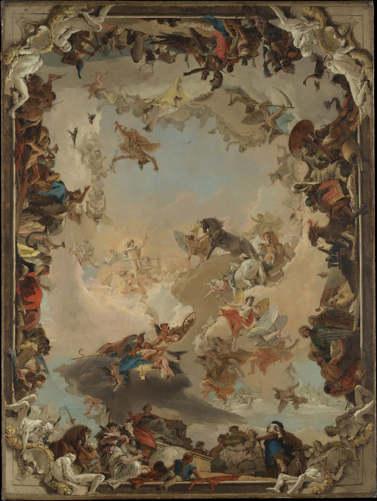
Giambattista Tiepolo is the first name you will find on the list of the Venetian painters’ guild in 1717. He is also known as Giovanni Battista Tiepolo and was a notable Italian painter and printmaker who was often commissioned to create art for Germany and Spain during the Rococo era. His work commonly showcases popular Rococo themes as he often painted allegorical pieces of classical myths or incorporated layers upon layers of symbolism to tell stories within his art.

“An Allegory with Venus and Time” this oil painting represents the passage of time using Greek gods and their associations to illustrate the fable. This painting uses Rococo’s infamous softer pastel color pallet. Tiepolo also has a unique way he frames and crops his paintings. He often uses shapes, whether that’s blocks of flat color or detailed frames like the example above.
This is an example of some of the lesser-known works of his prints. Known as the “Half-dressed Nymph with two children, surrounded by four men”. I thought it would be interesting to dive into some of Tiepolo’s work in other mediums. I was looking to see the possible stylistic crossover between his printing and painting work. It’s possible that the sketches for his paintings could look similar in style to these prints as he uses etching techniques to create fine lines that imitate the look of pencils or ink on paper

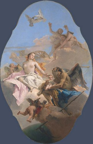
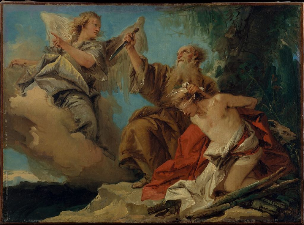
Tiepolo’s paintings carried all the whimsy and decor expected from the Rococo era, even though his style is defined and said to be influenced by the earlier Baroque period. Many of the characteristics in his work can be attributed to incorporating Baroque techniques. This is shown in the sense of drama and movement he brought to each painting. He was almost able to direct his figures among the canvas like actors on stage, conceiving large scenes with genuine emotions and dynamic compositions. All of his work was completed in his signature melancholic style that Tiepolo achieved through the use of strong ‘chiaroscuro’. This can be seen in famous works of his like “Madonna of Carmelo and the “Souls of Purgatory” and especially in “The Sacrifice of Isaac”.

“The Sacrifice of Isaac” is one of Tiepolo’s fewer allegories from the Christain Bible. It’s a story about an angel that keeps Abraham from sacrificing his son Issac in a test of faithfulness. This is a looser painting in terms of brushstrokes, especially in the background. Yet it still uses softer colors and dynamic poses to convey a father’s conviction and faith. This is also the strongest use of chiaroscuro in his work.

I’m an avid lover of storytelling regardless of mediums, so over the process of this blog post, I’ve become a big fan of Giambattista Tiepolo’s work. I love to study the different techniques people use to get these stories across. Tiepolo used symbols to craft his own unique way of illustrating these stories. I love mythology and breaking down symbolism, so I found his work especially interesting research. His style reflected this love for telling stories, as though it’s complex and detailed, he also integrates the use of looser brushstrokes in his works. It seems almost as if he knows the exact quantity of detail and precisely where to put it to get the story of his artwork across in the most succinct way possible. I would like to be able to integrate this quality into my own work to improve my visual compositions and storytelling.

“The Apotheosis of the Spanish Monarch”, was created in 1716 through the use of oil on canvas. This painting was commissioned to be representative of the Spanish Monarchy, attesting to it’s its antiquity, military power, and preeminence among European royal families. This painting is packed with iconography and symbolism, as each figure is either historical, mythological, or allegorical. This is piece is truly a mosaic of stories and symbolism that pushes a larger narrative. It’s a fascinating painting to break down and is probably my favorite as I spent way too much time invested in attempting to understand all the symbolism. If you’re interested the website link below takes you to the MUSEO DEL PRADO’s breakdown of some of the key features in the painting, which I recommend as it adds a level of understanding to help you appreciate the piece further.
https://www.museodelprado.es/en/the-collection/art-work/vault-with-the-apotheosis-of-the-spanish-monarchy/6bd56ee8-029e-4534-ac84-c83292602d0b

Citations:

“The Banquet of Cleopatra – Giambattista Tiepolo – Google Arts & Culture.” Google, Google, https://artsandculture.google.com/asset/the-banquet-of-cleopatra-giambattista-tiepolo/wwFHnS1cmltkFw?hl=en.

Christiansen, Keith. “Giovanni Battista Tiepolo (1696–1770).” Metmuseum.org, Department of European Paintings, The Metropolitan Museum of Art, Oct. 2003, https://www.metmuseum.org/toah/hd/tiep/hd_tiep.htm.

“Giovanni Battista Tiepolo.” Encyclopædia Britannica, Encyclopædia Britannica, Inc., https://www.britannica.com/biography/Giovanni-Battista-Tiepolo.

“Giovanni Battista Tiepolo.” Wikipedia, Wikimedia Foundation, 1 Sept. 2021, https://en.wikipedia.org/wiki/Giovanni_Battista_Tiepolo.

Metmuseum.org, https://www.metmuseum.org/art/collection/search/437792.

Metmuseum.org, https://www.metmuseum.org/art/collection/search/437815.

“Vault with the Apotheosis of the Spanish Monarchy – the Collection.” The Collection – Museo Nacional Del Prado, https://www.museodelprado.es/en/the-collection/art-work/vault-with-the-apotheosis-of-the-spanish-monarchy/6bd56ee8-029e-4534-ac84-c83292602d0b.

Categories
121

Visual Research II

Neville Brody put together this high-contrast poster for the movie Oceans Eleven. The large number Eleven positioned diagonally on the image draws the viewer’s eyes in first. It is bright red and the only color in an otherwise monochrome poster. The number eleven then moves your focus to the black silhouettes at the top. These figures are set apart from the completely white background. The use of contrast in color, tone, and even size allows the poster to pop giving it clear readability.
This 2019 Yale Architecture poster heavily uses the visual design principal alignment. The poster has many columns of texts all seemingly aligned by invisible grids. This creates vertical rectangles from the words making the overall poster quite structured, which is fitting for an architecture program.
This image was created by a user and seller on Pixers by the name of sarplaninac. They created a very high contrast image of a face using only two tones of black and white. The Gestalt principle of Closure is what allows the viewer to distinguish forms from the white highlighted shapes and fill in the mental blanks of the image from the negative space or black background.
The ad ‘Cognac Bisquit’ by Alphonse Mucha is an example of Gestalt’s Principal of Figure/Ground. The lady looking over her shoulder holding the cognac is the figure. She is the focus of the illustration, while the trees and underbrush surrounding her are the background elements. Even though the foliage isn’t the focus of the poster it adds movement, drawing the viewer’s eye around the image in an ‘S’ shape balancing out the composition. This is a great example of figure and ground as even though the figure is the focus of the advertisement to sell the cognac, the ground element is of almost equal importance to make a visually appealing and successful advertisement.

Categories
121

Visual Research I

This poster was created by Illustrator and Graphic Designer Josh Hayes. The poster displays the use of geometric shapes that are differentiated by value and tone. Shape is the strongest element as it adds structure and intrigue to the poster.
‘Step Into Your place’ is a 1915 first world war propaganda poster that executed the element of scale. The poster calls to action all men of varying occupations and classes to join the fight. As the line-up of men moves farther away, their outfits change, turning to soldiers and shrink in proportion. This showcases depth and physical scale within the poster.
Created by Saul Bass for the movie Vertigo, this poster emphasizes a feeling of unsteadiness or vertigo with its use of curved lines that draws your eyes to the figures. Line is the strongest element as it creates shape, structure, and a mood that ties back to the movie.