A look into Victor Moscoso’s work during the 60’s era of Psychedelic Design
Victor Moscoso is a Spanish American Artist known for his Psychedelic rock posters, advertisements, and underground comix. Originally from Vilaboa Parish of Culleredo, Galicia, Moscoso would travel with his parents to Brooklyn, America. Moscoso’s father worked as a painter and his mother was a seamstress, growing up in an artistically inclined family is where Moscoso would first learn about colour combinations. Later Moscoso would study art at Cooper Union in New York City then Yale University, finally Moscoso would move to San Fransico to study at San Francisco art institute, where he would later become an instructor there.
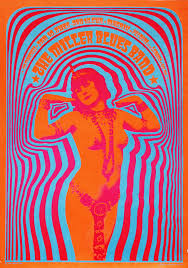
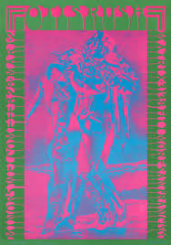
In his working career, Moscoso would be known for his vibrant vibrating colour schemes in each piece. Moscoso takes inspiration from Josef Albers, his professor from Yale University, drugs, and the re-popularized Art Nouveau movement. His psychedelic rock and roll posters and album covers would shoot him to widespread public success. He would design for musicians like Jerry Garcia, Bob Weir, and David Grisman.
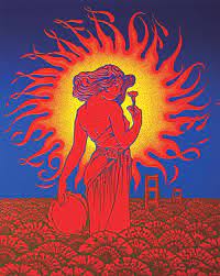
I chose to examine Moscoso’s graphic design work as I really appreciate his bold and bright colour combinations. I was already a fan of Art Nouveau, and Alphonse Mucha is one of my favorite artists, so it was interesting to see Designers take inspiration from his work in a different era. Moscoso’s work has great flow and rhythm through each piece that makes them more visually interesting designs. The imagery works perfectly for the type of music that he’s designing for. Moscoso has inspired me to be bolder and more playful with colour combinations and design layouts.
Citations:
Gary Groth | February 9, 2011. “An Interview with Victor Moscoso – Page 5 of 14.” The Comics Journal, FROM THE TCJ ARCHIVES, 1 Oct. 2021, https://www.tcj.com/an-interview-with-victor-moscoso/5/.
Kondolay, Ryan. “The Art of Influence: Victor Moscoso.” Comet Creative, 15 Mar. 2019, https://wearecomet.com/1960s-psychedelic-tribute-calendar-victor-moscoso/.
“Victor Moscoso.” Smithsonian American Art Museum, SAAM, https://americanart.si.edu/artist/victor-moscoso-18206.
Image Citations:
Dukepope. “Victor Moscoso, the Grand Old Master of Psychedelic Art.” DUKEPOPE, 21 June 2013, https://dukepope.wordpress.com/2013/04/01/victor-moscoso-the-grand-old-master-of-psychedelic-rock-posters/.
“Victor Moscoso Master of Psychedelic Posters & Comix.” Victor Moscoso >> Neon Rose Series, http://www.victormoscoso.com/gallery1.htm.
“Victor Moscoso.” Art Blart, https://artblart.com/tag/victor-moscoso/.