Categories
141

Leyendecker’s Legacy

A look Into the Real Life Great Gatsby.

Photograph of J.C. Leyendecker
Humble Beginnings

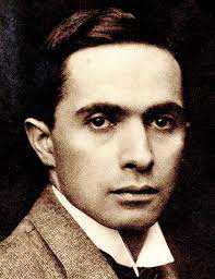
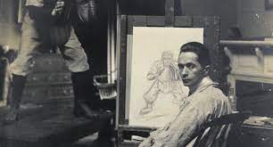
The Leyendecker Family was artistically inclined one way or another, J.C. Leyendecker was no exception from that fact. From the age of eight, Leyendecker would spend all day at school drawing in the margins of his papers and filling textbooks up with what he described as crude drawings. When he returned home he would oil paint on old kitchen rags. Later in his career, he would be influential to America’s Golden Age of Illustration, creating America’s first sex symbol, and inspiring F. Scotts Fitzgerald’s best-selling classic novel, The Great Gatsby. 

Leyendecker’s examples of the Arrow Collar Man in his work.

Born in Germany, the family would immigrate over to America while Leyendecker was still young. They didn’t have much at first but luckily, J.C. Leyendecker would be allowed to study at the Art Institute of Chicago. In his family, his older brother Adolph would go into stained glass art, though he was never close with his family and was pretty much disowned after two very public scandals that tarnished his reputation beyond repair. This caused him to move away and be buried apart from his family. Though the rest of the Lydecker family would remain close. The two younger siblings would be very influential in supporting J.C. Leyendecker’s career working in the same studio and living with him. Frank and Augusta Leyendecker would both join J.C. at the Art Institute of Chicago.

After some time the Leyendecker family came to have more money and felt comfortable sending both J.C. and Frank away to Paris for classical education in painting. J.C. Leyendecker really enjoyed his time in Paris and often spent hours upon hours sketching and painting people in Paris Cafes. Frank was also an excellent illustrator but did not possess the same drive as J.C. and would often get lost in his brother’s shadow. Regardless of that fact, upon returning home the two Lydecker brothers would move to New York and open up an extremely successful studio with their sister Augusta.

Leyendecker working in his studio from a live model.

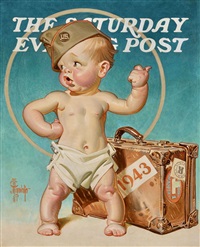
This new studio is where J.C Leyendecker would rise in popularity for his commercial magazine illustrations. He would create over 322 covers for the Saturday evening post alone. Leyendecker’s other notable series would be posters for Collier’s automobiles and advertising WW2 bonds. His favorite advertisement series would be the Kelloggs Kids. These were illustrations of children with the ceral in magazines. Leyendecker loved painting and working with children as they were more expressive and dynamic in ways adults weren’t.

One of Leyendecker’s many covers for the Saturday Evening Post, for his Saturday Evening Post Babies series.

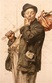
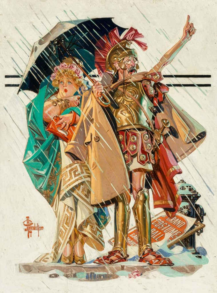
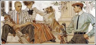
Leyendecker’s style in his work was notable for many reasons. His use of color, exaggerating proportions and dynamic figures helped to sell ideas for his commercial work. Leyendecker was known for painting these idealized figures of playful happy children, elegant well dressed women, and larger-than-life stoic athletic men to sell a product or idea. He was able to communicate a lot of character within subtle changes to expression and stylized proportion. I really appreciate his ability to tell stories in his work through the smallest of details. Everything he did was to communicate a narrative through his work

When creating an illustration it was clear that Lydecker was a draftsman at heart. Before setting out to paint his final illustration, he made several rough drafts, rehearsing the brushwork of every element until he got it just right. Everything he did was quite intentional in his sketches that he would later use gride method to blow up the painting on a larger scale.

A study done by Leyendecker with the grid-like sketch underneath.

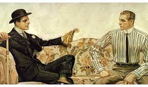
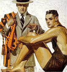
Leyendecker’s most notable contribution in his work would be the Arrow Collar Man. This was America’s first sex symbol and was an extremely influential advertising series to sell the arrow collar in shirts. The Arrow Collar Man was never really the same face being depicted, just a consistently well-dressed stoic man, typical of Leyendecker’s work. This advertising series made the company extremely wealthy. The Arrow Collar factories got more love letters sent to their offices from women who saw Leyendecker’s illustrations and hoped to marry the man in the paintings, than the real and very famous young Louis Vuitton at the time.

Famous example of Leyendecker’s Arrow Collar Man Illustrations.
Extravagant Endeavours

The Arrow Collar Man in the paintings was actually a real person. His name was Charles Beach, a live model who worked for Leyendecker and was extremely good-looking. From the day J.C. Leyendecker and Charles Beach met they would become inseparable. Beach would move in with Leyendecker and share an apartment. From there the two would go on to live with J.C.’s younger siblings Frankie and Agusta Leyendecker in J.C.’s famous large mansion.

Charles Beach fit in well with the other Leyendecker children and their business practices. Charles worked as J.C. Leyendecker’s model and would take up secretary roles in the studio. Agusta Leyendecker took on a matriarchal role in the house as well as working as the two brother’s managers. Frankie Leyendecker took on illustration jobs that J.C. Leyendecker didn’t have time for or couldn’t finish.

One of J.C Leyendecker’s more colourful and expressive illustrations.

Charles, as well as being extremely good-looking was great at talking. He recommended they throw large parties under the guise of networking. This plan ended up working extremely well, Charles Beach’s amazing social skills made up for J.C Lydecker’s utter lack of sociability and they raised Lyndeckers sales immensely.

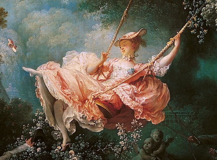
Illustrators were seen as celebrities, and Leyendecker was the most famous of them all. These extravagant parties attracted the attention of all the rich and famous to attend. Anyone who was anyone would go to Leyendecker’s larger-than-life events. In fact, they were so infamous, the novel ‘The Great Gatsby’ is actually based on Leyendeker and these extravagant parties. F. Scotts Fitsgerald, the writer of The Great Gatsby himself actually attended quite a few of these parties. This is also why literary enthusiasts believe The Great Gatsby to queer a coded novel among other reasons.

This Illustration highlights J.C Lydecker’s consistency in how he depicts men as stoic, as well as other stylistic aspects, light strong brushstrokes, and hatching in the backgrounds.
The Lost legacy

J.C Leyendecker was a gay illustrator in a time where is was dangerous to have been out or outed. His and Charles Beach’s relationship had always been more than platonic and they would live together in that mansion for the rest of their lives. Though, because of this fact, even with the extravagant parties, the two lived a very private life. J.C Leyendecker only took two interviews in his life and Charles Beach even less. This worried Leyendecker as he got older about his legacy since he worked so hard to keep himself personally out of the spotlight. Leyendecker wondered if all that effort would cause him to be forgotten. Which, unfortunately, he was right to be worried, he was nearly forgotten about in history and doesn’t get the proper respect for all he’s done with his influential body of work. Norman Rockwell, a student of J.C Leyendecker and close with the family would give what we know now as a very biased re-telling of J.C Leyendecker’s life. Though, he had great respect for Leyendecker and has kept his legacy somewhat alive in a way. That alone would be some of the only writings on J.C. Leyendecker still around. Before Leyendecker died he asked Charles Beach to take all his writings, letters, sketches, paintings, and unfinished or unpublished pieces and to burn them. Even after his death Leyendecker wanted to protect the name and careers of his friends and family and couldn’t leave anything that could have been seen as incriminating evidence of his homosexuality.

Even though most of his legacy will be lost to history, there are still pieces of his influence felt today. J.C Leyendecker defined classic American culture and paved the way for artists during America’s golden age of Illustration. There are echoes of him found in The Great Gatsby the novel’s movie adaptations. Yet, I believe J.C Leyendecker would have greatly appreciated that his home has turned into a school to teach young children how to paint, mixing his love for art and children into a lasting legacy.

One of my personal favourite pieces from Leyendecker. Showing a golfing trip in a more photographic layout for his painting.

Citations:

“J. C. Leyendecker.” Wikipedia, Wikimedia Foundation, 15 Sept. 2021, https://en.wikipedia.org/wiki/J._C._Leyendecker.

“J.C. Leyendecker.” Haggin Museum, https://hagginmuseum.org/leyendecker-j-c/.

“Joseph Christian Leyendecker : Shades of Colors and Lines.” Bartleby, https://www.bartleby.com/essay/Joseph-Christian-Leyendecker-Shades-Of-Colors-And-FKCUS3VQWQWF.

“Joseph Christian Leyendecker.” Artnet.com, http://www.artnet.com/artists/joseph-christian-leyendecker/.

“Joseph Christian Leyendecker.” The Illustrated Gallery, https://www.illustratedgallery.com/artwork/for-sale/artist/joseph-christian-leyendecker/.

Rowe, Kaz. “JC Leyendecker- The Iconic Gay Artist We ALMOST ForgotJC Leyendecker- the Iconic Gay Artist We … – Youtube.com.” Youtube, TouTube, 21 Mar. 2021, https://www.youtube.com/watch?v=BS7ayV2Ac74.

Image Citations:

“American Advertisement, Arrow Shirt Collars by Joseph Christian Leyendecker.” Fine Art America, https://fineartamerica.com/featured/american-advertisement-arrow-shirt-collars-joseph-christian-leyendecker.html.

Born: March 23, 1874 | Died: July 25. “J.C. Leyendecker.” Illustration History, https://www.illustrationhistory.org/artists/jc-leyendecker.

“J. C. Leyendecker.” Wikiwand, https://www.wikiwand.com/en/J._C._Leyendecker.

“Joseph Christian Leyendecker.” Artnet.com, http://www.artnet.com/artists/joseph-christian-leyendecker/.

Outmagazine. “Rediscovering J.C. Leyendecker & the Creation of the Perfect American Male.” OUT, Out Magazine, 6 Feb. 2015, https://www.out.com/entertainment/art-books/2012/09/04/jc-leyendecker-perfect-american-male-charles-beach.

Tangcay, Jazz. “Director Ryan White on Telling J.C Leyendecker’s Queer History in ‘Coded’.” Variety, Variety, 30 June 2021, https://variety.com/2021/film/markets-festivals/ryan-white-j-c-leyendecker-coded-1234998399/.

Taylor, Jeff. “J.C. Leyendecker: Norman Rockwell, but First and Make It Gay.” LOGO News, 23 Oct. 2019, http://www.newnownext.com/jc-leyendecker-illustrator-gay-lgbtq-history/10/2019/.

Categories
141

Historical Type Identification Poster

Typography Deconstructed

For my Historical Type Identification Poster project, I started with no clear idea and too much research. This left me with too many options and no clear theme besides the idea of breaking down different typography categories as expected from the brief. After doing research I had two ideas for my posters, The ‘Anatomy of Type’, and ‘The Different Faces of Type’. The themes were chosen as I thought they would allow me to best meet the requirements from the brief without making the theme feel forced or out of place. In the end, I like the ‘Anatomy of Type’ idea best and decided to model the design after anatomy sketches and studies from Old Masters like Leonardo da Vinci.

After the class check-in, I decided to modernize my theme based on the feedback I received. I still wanted to center my theme around studies and breaking down the elements of typography. So, I used the idea of using blueprint grids and similar grids found in notebooks of the modern notetaking aesthetics seen on Social Media. I used this theme adding a collage element allowing me to break up the typefaces so that I could show them clearly being studied and broken down. I also needed to re-vamp the name to fit the new them so I choose ‘Typography Deconstructed’. For this poster, I wanted to use high contrast and push myself to try different color combinations that I don’t usually go for. I don’t think I’ve ever used my orange paint marker, so I went with a bright neon orange to grab the viewer’s attention and balance out the piece with pops of color. I also used a more muted complementary blue that I mixed with gauche.

When assembling the poster, I re-drafted some of my designs and picked the elements I liked best before starting construction. I tried to use the type in the poster how it was intended to. Decorative Typeface for the title to grab attention, Blackletter to match the idea of Initials in older scripts and books, and the clear and clean Text Typefaces for smaller and denser areas of type. Overall, I really liked the outcome. I think there was definitely a time crunch near the end and that lead to sloppy mistakes. Some of the typeface names aren’t as straight and aligned as they should be, and I wish some elements were cleaner and clearer to read. Yet, I enjoyed making this poster, even though I was worried about the challenge of neatly fitting eight different typefaces on one poster without looking like a chaotic jumble. This project took me around 7 hours total with research and I’d score myself 8/10.

My Finished Historical Type Identification Poster!

Categories
141

Lover’s Eye

Artifact Project Rational

Painting by Fatima Ronquillo commissioned by Gucci for a painting of a Lover’s Eye.

For my Artifact Project, I decided upon a popular trend in the Victorian Era, that started with Queen Victoria herself, called the Lover’s Eye, or a painted miniature. Lover’s Eye’s were typically a painted watercolor eye of one person’s lover that they would wear on a piece of jewelry. The Lover’s Eye would most commonly be a broach in a simple frame that could be surrounded by jewls if you could afford it. The jewelry was used as a discrete way of showing who the person was either dating or courting and often sparked gossip over who was in the miniature. Yet, it was most commaly used as a way to show affection. I used the painting above as a reference for how I would take my photo later.

A simpler Lover’s Eye that I would reference for the design.

Originally I sketched out more intricate designs like the image below. Unfortunately, I have never made jewelry, so I needed to simplify the design so I could complete a broach with the limited materials and knowledge in jewelry making I had. I ended up basing the design off the Lovers Eye above. I knew I wanted to surround the eye in pearls as it was commonly used to symbolize tears, meaning the person whose eye in the portrait had passed away.

This is another example of a Lover’s Eye with a more intricate design surrounding the miniature.

I began by arranging and threading fake pearls on a thin metal wire to surround the eye. I cut out a piece of mixed-media paper and painted a left eye in watercolor. Lover’s eyes are typically paintings of the left eye as it’s said to be connected to the heart. I then hot glued the ring of pearls to the paper and then hot glued the miniature to a backing of an old broach. I thought it looked too simple so I evenly spaced out five fake black gems and created a platform in hot glue so that the gems would stand out from the pearls then glued them down. I went in after with a pencil crayon over the eye to fix some values and then set up the camera shoot to mimic the first Fatima Ronquillo painting of Gucci’s Lover’s Eye. Overall the process went smoothly and took me an estimated 4 hours in total with research to complete the assignment. Other than my failure to understand a hot glue gun at first I’d say the Artifact came out how I hoped it would. If I wanted to improve I might have done more research into jewelry to allow me to better understand how to make a more intricate design. I’d give myself a 9 out of 10.

Here’s the final outcome.

My version of the Artifact ‘Lover’s Eye’, photo based on the Gucci painting.

Citations:

Bewkes, Stacey, et al. “Lover’s Eyes: A History Lesson.” Katie Considers, 5 June 2018, https://katieconsiders.com/2018/06/05/miniature-lovers-eye-jewelry/.

ESMAN, ABIGAIL R. “Lover’s Eye Jewelry: This Romantic (Yet Eerie) Tradition Is Entrancing Artists Right Now.” The Study, 29 Oct. 2020, https://www.1stdibs.com/blogs/the-study/lovers-eye-jewelry/.

Gotthardt, Alexxa. “Why Lovers in 18th-Century England Exchanged Mysterious Painted Eyes.” Artsy, 4 Jan. 2019, https://www.artsy.net/article/artsy-editorial-mysterious-history-lovers-eye-jewelry.

All image Citations came from this site:

Bewkes, Stacey, et al. “Lover’s Eyes: A History Lesson.” Katie Considers, 5 June 2018, https://katieconsiders.com/2018/06/05/miniature-lovers-eye-jewelry/.

Categories
141

The Influential Carl Jung

Carl Jung’s Psychology of the Unconscious published in 1913

Photo of famous Swiss Psychotherapist and Psychiatrist Carl Gustav Jung.
Carl Jung’s Many Intrests

Born in 1875, famous Swiss Psychotherapist and Psychiatrist Carl Gustav Jung would spend his early years developing an interest in religious history and medicine. He would go on to study at the University of Basel pursing and completing a medical degree. Yet, it would be the time spent after his degree where he would begin to create some of his most famous work. Jung joined the Burghoelzli Clinic in Zurich after graduation and would cultivate a keen interest into the complexities of the human unconscious mind.

Image of Sigmund Freud, Stanley Hall, Carl Gustav Jung, Abraham Arden Brill, Ernest Jones and Sándor Ferenczi. All leading Psychotherapist and Psychiatrist of their time.
A Diffrence in Academic Opinion

Jung would go on to travel the world and write books on his new psychoanalytical theories. Along his journeys, Jung would send a copy of one of his books “Studies in World Association” to Sigmound Freud. Impressed with Jung’s work, the equally famous Austrian neurologist Freud would offer to have him visit. Togther they would discuss ideas of the human subconscious. Jung agreed with Freud’s theories but believed there was something more that Freud hadn’t tapped into yet. They would become good friends intill parting ways due to a difference in academic opinion, as Freud would openly criticize Jung’s idea of a collective consciousness and the idea Jung developed categorizing the unconscious into archetypes.

Though this lead to the end of their friendship, this theory on archytypes would be Jung’s most famous and long lasting idea. He would also explore the religious nature behind human psychology, going back to his childhood interest in the psyoclogical impact of religion. Jung founded analytical psychology and would popularized the idea of the two personality types of introversion and extroversion. He would even go on to write many more books like “Archtypes and the Collevtive Unconscious”, “Man and his Symbols”, and “The Relations Between the Ego and the Unconscious”. Carl Jung’s work is one of the most influential and well recognized. He alone would help revolutionize psychoanalytical theories and even influence modern pop-culturte.

Carl Jung’s Book “Psycology of the Unconscious”. This explores some of his most famous theories.
K-pop, Gaming, and Other Psychological Studies

Carl Jung would shape the future for studies done into Psychology. Psychotherapist and Psychiatrist would build off his work in Word Association and Divergent Veiws, Psyche and the Unconscious Mind, Archetypes, Introversion and Extroversion, and the Significance of Dreams. There would also be influence from Jung’s work that he couldn’t have forseen.

Jung would go on to also impact the Abstract and Expressionist Art movements. Painters like Jackson Pollock and Mark Rothko would use the idea on exploring the unconscious mind in their drawings and paintings. More recent pop culture references would be the international K-pop group BTS, as they would be inspired to create three albums further exploring Jung’s work into unconsciousness with their music. They would include albums tracks that are titled after Jung’s famous archtypes, “Map of the Soul: Persona”, “Map of the Soul: Ego”, and “Map of the Soul: Shadow”. Another famous reference to Jung’s work would be the video game titled Persona. Currently there are 5 very popular games in this series with characters and themes that also use the Archtypes from Jung’s work. Jung’s theories have spread to multiple platforms, mediums, and even have been explored in films. Whether it’s splatter paint art, K-pop songs, violent videogames, or Jung’s studies and books; there is a form of media accessible for all to learn from and enjoy.

K-pop group BTS’s album “Map of the soul: Persona” inspired by Jung’s Map of the Soul.
This is the Persona 5 video game inspires by Jung’s Archtypes.
Citations:

“Carl Jung’s 11 Best Books.” Exploring Your Mind, 25 Nov. 2017, https://exploringyourmind.com/carl-jungs-11-best-books/.

Erin, Adrinne. “Carl Jung’s Contributions To Psychology.” Carl Jung’s Contributions to Psychology, 10 Oct. 2019, http://www.dreampositive.info/carl-jungs-contributions-to-psychology/.

Fordham, Frieda. “Carl Jung.” Encyclopædia Britannica, Encyclopædia Britannica, Inc., https://www.britannica.com/biography/Carl-Jung.

Jay, Martin Evan. “Sigmund Freud.” Encyclopædia Britannica, Encyclopædia Britannica, Inc., 1 Oct. 2021, https://www.britannica.com/biography/Sigmund-Freud.

projects, Contributors to Wikimedia. “Carl Jung.” Wikiquote, Wikimedia Foundation, Inc., 14 Oct. 2021, https://en.wikiquote.org/wiki/Carl_Jung.

Team, GoodTherapy Editor. “Carl Jung (1875-1961).” Carl Jung Biography, GoodTherapy, 11 Nov. 2011, https://www.goodtherapy.org/famous-psychologists/carl-jung.html.

Image Citations:

Jung, C.G., and June Singer. “Books-BB Version.” New York Center for Jungian Studies, 7 May 2021, https://nyjungcenter.org/books/.

“Persona 5.” Wikipedia, Wikimedia Foundation, 2 Nov. 2021, https://en.wikipedia.org/wiki/Persona_5.

Peutherer, Jamie. “Carl Jung’s Collective Unconscious Explained: Xnanga.” Psychology, Philosophy & Self-Improvement Articles, 18 Apr. 2017, https://www.xnanga.co.uk/psychology/jungs-collective-unconscious/.

projects, Contributors to Wikimedia. “Carl Jung.” Wikiquote, Wikimedia Foundation, Inc., 14 Oct. 2021, https://en.wikiquote.org/wiki/Carl_Jung.

Ruiz, Susana L. “Analytical Psychology of C.g.jung L Psicoanalista Madrid.” Analytical Psychology of C.G.Jung l Psicoanalista Madrid, 14 Sept. 2019, https://bienestarpsicoanalisis.com/analytical-psychology/.

Categories
141

A Grimm Legacy

Grimm’s Fairy Tales Published: – Survey 4: Steam and the speed of light (1750 – 1850) and Survey 5: Painters and posters (1850 – 1895)
One of the original covers to the Grimm’s Fairy Tales collection.

Once Apon a Time

Grimm’s Fairy Tales is arguably the most influential collection of folklore to this day. There aren’t many people who can say they’ve never heard or seen any modernized iteration of the classic stories. Originally published in 1812 by the Brothers Grimm, Grimm’s Fairy Tales was a two-volume collection of 86 children’s stories. This is where iconic names such as Rapunzel, Snow White, as well as Hansel and Grettel came from. The stories were well received and over the coming years would expand from 86 stories to 210 with their rising popularity. 

“The Goose Girl” Illustrated by Heinrich Vogeler and one of the original 86 stories in the Grimm’s Fairy Tales.

A Change in Violent Tendencies

As time passed more stories were added in, but there were also many that changed due to public opinion. See, even though the stories were marketed towards children, they aren’t the type of stories you’d think of telling a child nowadays. Especially as the original 86 stories were blunter, and more tragic with often brutal and graphic descriptions of violence. The Grimm brother even added some concepts that were too complex and scholarly for kids to understand. This lead to some revisions in the later editions of Grimm’s Fairy Tales.

One of the first changes that happened was the rise in evil stepmothers. Originally, many of the stories simply used a wicked mother as the villain. Though, this wasn’t received well so they later changed any evil mother to an evil stepmother for their lack of “motherhood sacredness”. There was another issue with violence and mature themes being unsuitable for children. In many respects, those aspects were changed, but the violence was never truly toned down. In fact, it seems as if instead of lessening the violence, that brutality became redirected towards punishing villains. Yet, this must have been seen as more respectable for readers as there were no complaints or changes till Disney came along to create their line of animated adaptations. This is also where fairy tales got pushed into mainstream pop culture. Disney was also the force that came along and created the idea of a ‘happily ever after’, as before this there was no guarantee that the protagonist would come out the other side of the story unharmed. Grimm’s Fary Tales pushed the idea of narrating a moral lesson over providing happy endings. Disney didn’t completely remove the idea of a moral lesson from their stories but did significantly childproof them for the silver screens.

Illustrated by Arthur Rackham in the book the Grimm’s Fairytale 1917’s version of the story ‘The True Sweetheart’. One of my personal favorites from the collection of stories.

The Modern Influence and Legacy

Grimm’s Fairy Tales and most of their stories are talked about like common knowledge and referenced to likes of ancient Myths and Legends. Characters in the stories are considered iconic, they are referenced as notable archetypes and are the inspiration for many artists and storytellers to draw upon, sometimes without even knowing. Grimm’s Fairy Tales are deeply saturated in all forms of media and have a strong grip on pop culture. This is especially true, as recently Hollowood pushes the production of as many live-action re-makes of the Disney original cartoons as they can. No matter how good the movies are, or how closely they stick to the source material; they tend to do well as they feed on a strong sense of childhood nostalgia. This speaks volumes of how the stories are to this day able to be enjoyed by a wide audience of children and adults alike. There is a universal appeal to these stories like no other. They have the ability to adapt and evolve with time. They can change genre, and medium and still be well recognized by a wide audience. Whether it’s a painting, play, musical, dance number, movie, or even the one original Grimm’s story, they have and will continue to hold their place in history for people everywhere to enjoy.

Citations:

“Category:François Boucher.” Wikimedia Commons, https://commons.wikimedia.org/wiki/Category:Fran%C3%A7ois_Boucher.

Denecke, Ludwig. “Brothers Grimm.” Encyclopædia Britannica, Encyclopædia Britannica, Inc., https://www.britannica.com/biography/Brothers-Grimm.

Kuiper, Kathleen. “Grimm’s Fairy Tales.” Encyclopædia Britannica, Encyclopædia Britannica, Inc., https://www.britannica.com/topic/Grimms-Fairy-Tales.

Popova, Maria. “Arthur Rackham’s Rare and Revolutionary 1917 Illustrations for the Brothers Grimm Fairy Tales.” The Marginalian, 10 Oct. 2019, https://www.themarginalian.org/2016/02/29/arthur-rackham-brothers-grimm/.

Zipes, Jack, et al. “How the Grimm Brothers Saved the Fairy Tale.” The National Endowment for the Humanities, Apr. 2015, https://www.neh.gov/humanities/2015/marchapril/feature/how-the-grimm-brothers-saved-the-fairy-tale.

Image Citations:

Forgottenbeauty. “The True Sweetheart – Little Brother & Little Sister – Brothers Grimm – Arthur Rackham Art Board Print by Forgottenbeauty.” Redbubble, https://www.redbubble.com/i/art-board-print/The-True-Sweetheart-Little-Brother-and-Little-Sister-Brothers-Grimm-Arthur-Rackham-by-forgottenbeauty/33821322.TR477.

“Grimm’s Fairy Tales by Rackham, Arthur – Jonkers Rare Books.” Jonkers Rare Books – First Edition Books, Signed & Antique – Jonkers Rare Books, https://www.jonkers.co.uk/rare-book/9727/grimm-s-fairy-tales/arthur-rackham.

“The Goose Girl.” Wikipedia, Wikimedia Foundation, 30 Aug. 2021, https://en.wikipedia.org/wiki/The_Goose_Girl.

Categories
141

Arnold Böcklin’s Nouveau Type

Typography Zine Project Rational on the Most Memorable Font from the Art Nouveau Era

In this assignment, I started off with a very strong idea of where I wanted to go with the project. I loved the research and aesthetic I built for the layouts. Unfortunately, I didn’t realize until much later that I picked a font that would not be subtle for the project. This was a major set back and in the future, I will be reading the briefs more carefully. For these setbacks, I will be giving myself a 7 for my personal score. The setback cause a time restriction and I feel I could have done more for this project. I did enjoy it when I eventually got to the font I’d end up using, Arnold Böcklin. The design choices came easy to me, as I love Art Nouveau and Alphonse Mucha, whose work help define the era. Art Nouveau was the theme for this zine so I used naturalistic shapes like arches in the patterns as many of the design choices done in Art Nouveau were inspired by nature. With that came a softer color pallet that I kept very minimal. I spent around 6 hours on the collective research and design portion of the assignment and have left with a better understanding of the intricacies of typography and the Art Nouveau.

My Arnold Böcklin typography design.
Categories
141

Rococo’s Functionless Fashion and Art

Survey 3: Block books and baroque (1450 – 1750)

Arguably the most iconic and well-known art piece that came from the Rococo era. ‘The Swing’ is an 18th-century oil painting by Jean-Honoré Fragonard that perfectly encapsulated the Rococo ideals of light-hearted enjoyment, extravagant clothing, and the commonly used pastel colour pallets.

The Rococo period was defined by its extreme extravagance. The word ‘Rococo’ is derived from ‘rocaille,’ the french word that means a shell-covered rock decorating grottoes. Like many eras, the name was an insult or critique of the times’ main ideas and popular style. Rococo was seen as a movement with no substance. All elaborate ornamentation and no meaning or message. Critics of the movement look past all the glamour to see a plain grotto, except with no shells to decorate the cold exterior; leaving behind what is essentially just a dark and empty cave. 

Oil painting portrait of King Louis XIV in Coronation Robes. His alternate title (The Sun King) had this painting commissioned to the French painter Hyacinthe Rigaud in 1701. Louis XIV was known for his love and endorsement of arts within the Rococo period.

Even though many people didn’t appreciate Rococo, it is still recognizable and has become iconic. The style is commonly used in fashion, art, and media as a reference point to build off or for its romanticized setting. At the time, Rococo’s fashion, art, and architecture was established by its lavish indulgence, yet modeled after popular ideas of love, youth, and playfulness. Subjects of paintings consisted commonly of innocent lovers in soft pastel colour pallets. Artists typically depicted old myths in naturalist settings. The architecture was centered around gold details and intricate embellishments. The building became more theatrical, with high ceilings, curving lines, and an emphasis on asymmetry. Rococo fashion is known for frills and ruffles. Lace and layers were found in both men’s and women’s fashion. Hair was piled higher, and silhouettes stretched larger and more exaggerated in form. In essence, everything became way more fashionable and much less functional. 

Extravagant Rococo architecture, at the Hotel de Soubise in Paris, France. A great example of the detailed gold embellishments that line the ceilings.
An example of the frilly and highly embellished male garment, popular in the Rococo period. The waistcoat and vest encapsulate the dreamy and decadent quality found in the lavish silhouettes and ornamentation.

Overall, it was a very lighthearted and playful period well reflected in its various arts. Jean-Antoine Watteau and Jean-Honore Fragonard capture this well in their artworks. There was an emphasis on fashion as the Rococo period was also the first era where magazines came out. Articles were being designed and published to spread the word of notable fashion designers and artists. Even though like many periods in history, it’s important to recognize this is an era defined, enjoyed, and documented by the wealthy who could afford the iconic extravagance and luxury. Rococo created a lasting impression on arts and culture that can still be admired and enjoyed to this day.

Painted by François Boucher, this work is inspired by the myth, The Birth of Venus. this painting shows the popular fascination with mythology and lighthearted romantic qualities that defined Rococo art.

Citations:

Boundless. “Boundless Art History.” Lumen, https://courses.lumenlearning.com/boundless-arthistory/chapter/rococo/#:~:text=Rococo%20style%20is%20characterized%20by,myths%2C%20youth%2C%20and%20playfulness.

Editorial, Artsy, and Rachel Lebowitz. “10 Rococo Artworks You Should Know.” Artsy, 29 May 2018, https://www.artsy.net/article/artsy-editorial-10-artworks-defined-rococo-style.

“Rococo.” Encyclopædia Britannica, Encyclopædia Britannica, Inc., https://www.britannica.com/art/Rococo.

“Rococo.” History of Costume, https://historyofeuropeanfashion.wordpress.com/tag/rococo/.Trapasso, Erica. “A Brief History of Rococo Art.” Artnet News, Artnet News, 10 Mar. 2015, https://news.artnet.com/market/a-brief-history-of-rococo-art-32790.

Image Citations:

“Category:François Boucher.” Wikimedia Commons, https://commons.wikimedia.org/wiki/Category:Fran%C3%A7ois_Boucher.

David, Georgianna and. “Hôtel De Soubise.” Parisian Moments, Parisian Moments, 23 May 2020, https://parisianmoments.com/blog-1/2018/hotel-de-soubise.

“Portrait of Louis XIV.” Wikipedia, Wikimedia Foundation, 6 June 2021, https://en.wikipedia.org/wiki/Portrait_of_Louis_XIV.

sartistacostume. “1700 Rococo Costume for Men.” Etsy, https://www.etsy.com/listing/613264667/1700-rococo-costume-for-men?ref=shop_home_active_13&epik=dj0yJnU9d0NEcmFqRElXR0dyV19Wc2J2QUU3dXQ2bURZWUVIa1kmcD0wJm49V0VndlBNUkVVVmw3ZjQwSVFmZVdkUSZ0PUFBQUFBR0Y2RE1j.

“The Swing (Fragonard).” Wikipedia, Wikimedia Foundation, 22 July 2021, https://en.wikipedia.org/wiki/The_Swing_(Fragonard).

Categories
141

Mood Board Rational

Review on my Survey 3 Mood Board: Born from Criticism

I really enjoyed the research process within this project. I loved drawing historical connections between different major events. I thought it was fun to create interesting and (hopefully) witty titles, with equally interesting captions that attempt to tell a collective story. I went in with very clear mental depictions of each section on my Mood Board and their overall aesthetics. The most trouble I had on the project was probably the ideation portion of the assignment as I got lost in the research (mainly Rococo art and fashion), and wasted time researching information I knew I wouldn’t use. Aswell as I struggled to adapt to InVision at first, but got the hang of the software soon after. My projects focus was on survey 3, even though it might be the reason I dock myself half a point. I had more unique ideas and connections that I could have explored in other surveys; yet, out of the love for this time period I caved and choose to create my Mood Board on a more generic subject choice. The other half a point would be for the layout of my photos. The way each section is set up isn’t in perfect order to smoothly tell a readable story. My overall personal score is a 9/10. My overall time spent on the project is estimated to be around 6.5 hours.

Click here to view my Survey 3 Mood board Project: Born from Criticism: https://projects.invisionapp.com/boards/5A42YW76HZR/

Categories
141

The King Who Conquered Death

The Epic of Gilgamesh: Survey 1 Blog Post (35,000 BCE – 0 CE)

The First Story 

The Epic of Gilgamesh is, to this date, the earliest surviving written text. Created sometime around 2000 BCE in the Sumerian language of Cuneiform, engraved on clay tablets with a reed stylus. This Epic poem is the foundation for modern-day storytelling and some of the first-ever use of literary tropes. Yet, they aren’t the aspects that make this story so relevant to the modern-day. To understand why you need to understand Gilgamesh’s journey. So a brief spoiler alert for quite literally the oldest story in history.

An example of the Mesopotamian language of Cuneiform on a clay tablet.

A Pretty Epic Poem

It’s hard to summarize this Epic into so few words, but it starts with the King of Uruk, Gilgamesh. Gilgamesh is a terrible person and even worse king. He’s three-fourths god (no, the math doesn’t add up) and cannot come to terms with his mortality. His people hate him and his tyranny, so they pray to the gods for help. In return, the gods crafted Gilgamesh an equal; his name was Enkidu. Enkidu challenged Gilgamesh to a fight. But, being equal in strength, the battle ceased into a stalemate. Gilgamesh was impressed, and with a newfound respect for Enkidu, they became fast friends. Enkidu taught Gilgamesh to be a better person, and eventually, the horrible ruler became a more beloved king. Together they decided to test their strength against the fearsome giant named Humbaba, and together the new friends slew the beast. Upon their return home, Gilgamesh and Enkidu were by with the goddess Ishtar, who proposes herself to Gilgamesh. He refuses her advances, and the infuriated Ishtar sends the Bull of Heaven to rampage the city and kill both the heroes. Once again, with the power of friendship, they both slay the bull. Unfortunately, the gods are outraged that the Bull of Heaven has been killed and decided someone must pay for this. Enkidu falls sick the next day and dies seven days later to repent for the massacre of the bull. Gilgamesh is stricken with grief that his best friend and equal have passed. He contemplates his mortality and, being unable to cope with being one-fourth human, Gilgamesh ventures out searching for a way to cure his mortality and live forever. He searches long and hard and works himself into sickness. When he finds something, it’s the immortal Utnapishtim; he offers Gilgamesh immortality if he can pass one of the trails. Unfortunately, due to his weariness from his desperate search, Gilgamesh isn’t able to complete the first task but eventually is able to obtain the fruit of immortality. On his journey back, Gilgamesh loses the fruit to a snake and gives up, returning to his kingdom empty-handed and mortal.

Gilgamesh slaying the beast Humbaba.

The Hero’s Journey

The Epic of Gilgamesh was the foundation for storytelling and modern literature. It created a variation of what would come to be known as the Hero’s Journey, a storytelling format, and many common story elements that would become modern tropes in entertainment. Yet, it’s still a debate if Gilgamesh was truly even a hero. Gilgamesh was generally disliked for very valid reasons. Throughout Gilgamesh’s story, he is a terrible person. He was a tyrant and committed multiple unforgivable crimes against his people and the gods. He never did anything to help anyone other than himself and got his only friend killed in the process. Not to mention he failed his most important task, the one thing he cared about, gaining immortality. Some might argue for these reasons he’s not a hero at all; and, they’re probably right. Yet, I don’t think that was the point of the story. It is generally known that Mesopotamians had a very negative view of the afterlife; this is reflected in Gilgamesh’s story. He wanted to escape his human faults and weakness; he wanted to escape death. Gilgamesh wants to be immortal, but once he returns to Uruk empty-handed, he is left with nothing but his human mortality. Gilgamesh may have fallen to his hubris and failed most of his tasks: but, in the process, he gained knowledge. He was undeniably very flawed but recognized his mistakes and grew past them to live a better life till his eventual death. He never conquered death, just the idea of it. He conquered the thought process that made death ruin his life. It was his limitations that made him a human, yet it was these same flaws that defined him as a hero. Which is an old lesson that many people could learn.

Carved statue of the Hero Gilgamesh, created in the late 8th century.
Citations:

Agrawal, Pulkit, and Yanping Zhang. “Harvard Wiki.” The Epic of Gilgamesh – Pulkit Agrawal – Literature 114 (Spring 2014-2015) – Harvard Wiki, The President, and Fellows of Harvard College, 10 May 2015, https://wiki.harvard.edu/confluence/display/k104639/The+Epic+of+Gilgamesh+-+Pulkit+Agrawal.

Bryant, Dewayne. “Epic of Gilgamesh.” World History: A Comprehensive Reference Set, edited by Facts on File, Facts On File, 1st edition, 2016. Credo Reference, https://ezproxy.capilanou.ca/login?url=https://search.credoreference.com/content/entry/fofworld/epic_of_gilgamesh/0?institutionId=6884. Accessed 30 Sep. 2021.

Dixon, Kevin H., and Kent H. Dixon . “The Epic of Gilgamesh.” Sevenstories.com, 5 June 2018, https://www.sevenstories.com/books/4052-the-epic-of-gilgamesh. 

O’Neal, Michael J. ““EPIC OF GILGAMESH”: DOCUMENT ANALYSIS ca. 1300 BCE.” Milestone Documents of World Religions, edited by Grey House Publishing, Salem Press, 2nd edition, 2017. Credo Reference, https://ezproxy.capilanou.ca/login?url=https://search.credoreference.com/content/entry/greymdwr/epic_of_gilgamesh_document_analysis_ca_1300_bce/0?institutionId=6884. Accessed 01 Oct. 2021.

Images Citations:

“The Forum, Unlocking the Mysteries of Cuneiform Tablets.” BBC World Service, BBC, 30 Nov. 2020, https://www.bbc.co.uk/programmes/w3cszjwd. 

Escabias, M. “‘The Epic of Gilgamesh’. an Epic Poem from 2.500 BC. Incredibly Current.” Actualidad Literatura, Actualidad Literatura, 25 Sept. 2018, https://www.actualidadliteratura.com/en/the-epic-of-gilgamesh-an-epic-poem-from-2-bc-incredibly-current/.

“Harvard Wiki.” The Epic of Gilgamesh – Pulkit Agrawal – Literature 114 (Spring 2014-2015) – Harvard Wiki, https://wiki.harvard.edu/confluence/display/k104639/The+Epic+of+Gilgamesh+-+Pulkit+Agrawal.

Categories
141

Project 1 Yearbook Spread

I started my Yearbook Spread Assignment with too many contradicting ideas. Each thumbnail sketch looked as if it could have been made by a completely different person. To nail down a cohesive theme for the spread I made it in similar fashion to my old high school agendas. A series of books I used like a sketchbook or scrapbook. Every week filling the pages with as much information as possible. I crammed in every doodle, scrap of paper, old candy wrapper, funny story, and occasionally an assignment or two.

I began my process with a green watercolor wash. At first, I only used a regular graphite pencil but later realized I needed to add contrast for clarity. I went back over some lines with a softer darker lead and added some more white highlights. I put emphasis on using the pencils and white jelly pens, as they were often what I would be caught sketching between classes with. This allowed me to limit my tools, only using what would have been in my pencil case. It made my layout more cohesive and truer to the theme. I also implemented doodles of space to tie the spread together as it was recurring imagery I used in the old agendas. It reflects myself as I loved and am still fascinated with astronomy. I can at times also be admittedly a bit spacy.

I had fun revisiting my agendas and paying homage to where I started my art journey. I wished I glued in other elements as it would have stuck to the scrapbook feel, and blocked-in shapes, adding more structure and providing some texture. I only used one color, and while accurate to my agendas the color pallet is boring. The design is cramped, and typography can be sloppy as I had no ruler. I’d give myself a 7/10 for the yearbook spread that took me around four and a half hours to complete.