Typography Deconstructed
For my Historical Type Identification Poster project, I started with no clear idea and too much research. This left me with too many options and no clear theme besides the idea of breaking down different typography categories as expected from the brief. After doing research I had two ideas for my posters, The ‘Anatomy of Type’, and ‘The Different Faces of Type’. The themes were chosen as I thought they would allow me to best meet the requirements from the brief without making the theme feel forced or out of place. In the end, I like the ‘Anatomy of Type’ idea best and decided to model the design after anatomy sketches and studies from Old Masters like Leonardo da Vinci.
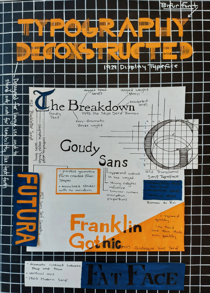
After the class check-in, I decided to modernize my theme based on the feedback I received. I still wanted to center my theme around studies and breaking down the elements of typography. So, I used the idea of using blueprint grids and similar grids found in notebooks of the modern notetaking aesthetics seen on Social Media. I used this theme adding a collage element allowing me to break up the typefaces so that I could show them clearly being studied and broken down. I also needed to re-vamp the name to fit the new them so I choose ‘Typography Deconstructed’. For this poster, I wanted to use high contrast and push myself to try different color combinations that I don’t usually go for. I don’t think I’ve ever used my orange paint marker, so I went with a bright neon orange to grab the viewer’s attention and balance out the piece with pops of color. I also used a more muted complementary blue that I mixed with gauche.
When assembling the poster, I re-drafted some of my designs and picked the elements I liked best before starting construction. I tried to use the type in the poster how it was intended to. Decorative Typeface for the title to grab attention, Blackletter to match the idea of Initials in older scripts and books, and the clear and clean Text Typefaces for smaller and denser areas of type. Overall, I really liked the outcome. I think there was definitely a time crunch near the end and that lead to sloppy mistakes. Some of the typeface names aren’t as straight and aligned as they should be, and I wish some elements were cleaner and clearer to read. Yet, I enjoyed making this poster, even though I was worried about the challenge of neatly fitting eight different typefaces on one poster without looking like a chaotic jumble. This project took me around 7 hours total with research and I’d score myself 8/10.