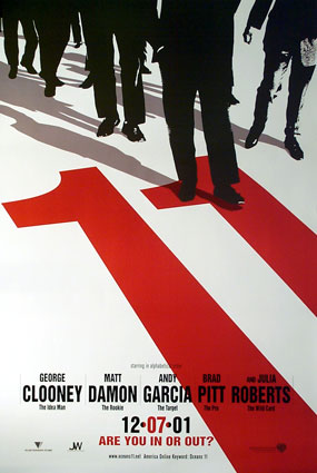
Neville Brody put together this high-contrast poster for the movie Oceans Eleven. The large number Eleven positioned diagonally on the image draws the viewer’s eyes in first. It is bright red and the only color in an otherwise monochrome poster. The number eleven then moves your focus to the black silhouettes at the top. These figures are set apart from the completely white background. The use of contrast in color, tone, and even size allows the poster to pop giving it clear readability.
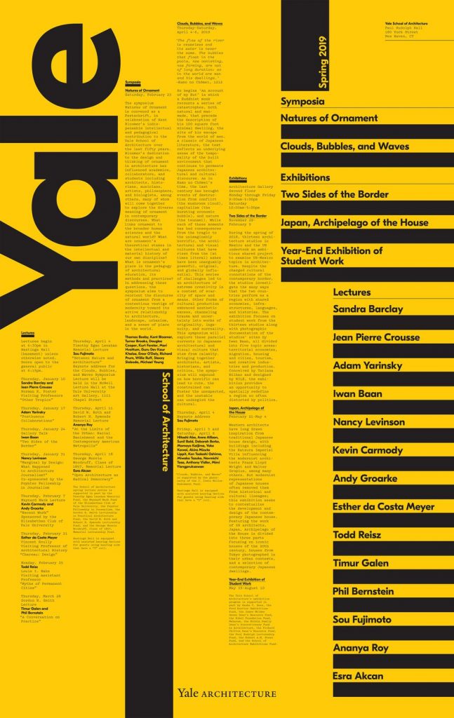
This 2019 Yale Architecture poster heavily uses the visual design principal alignment. The poster has many columns of texts all seemingly aligned by invisible grids. This creates vertical rectangles from the words making the overall poster quite structured, which is fitting for an architecture program.
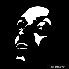
This image was created by a user and seller on Pixers by the name of sarplaninac. They created a very high contrast image of a face using only two tones of black and white. The Gestalt principle of Closure is what allows the viewer to distinguish forms from the white highlighted shapes and fill in the mental blanks of the image from the negative space or black background.
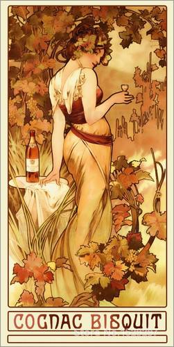
The ad ‘Cognac Bisquit’ by Alphonse Mucha is an example of Gestalt’s Principal of Figure/Ground. The lady looking over her shoulder holding the cognac is the figure. She is the focus of the illustration, while the trees and underbrush surrounding her are the background elements. Even though the foliage isn’t the focus of the poster it adds movement, drawing the viewer’s eye around the image in an ‘S’ shape balancing out the composition. This is a great example of figure and ground as even though the figure is the focus of the advertisement to sell the cognac, the ground element is of almost equal importance to make a visually appealing and successful advertisement.