Self-grading:7/10
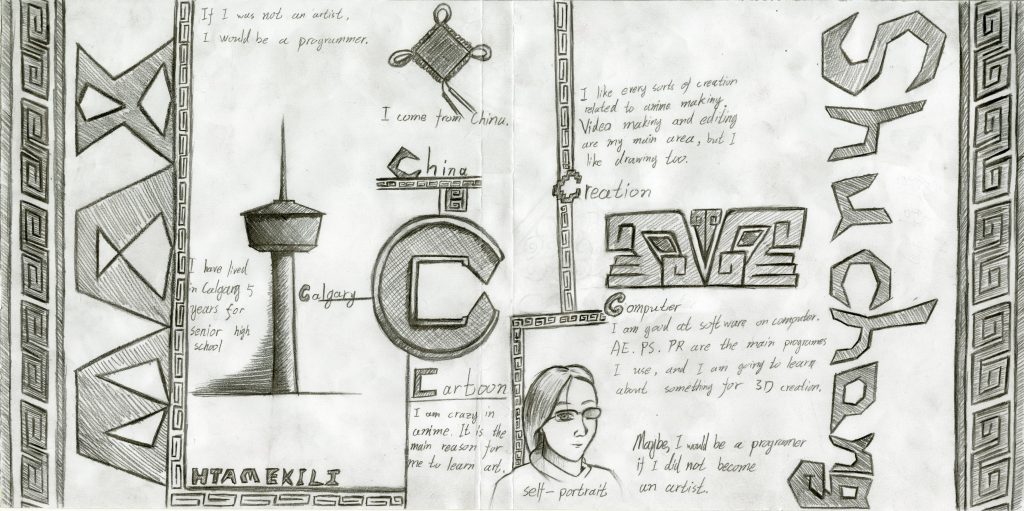
I used C to guide people to read this spread, the inspiration came from the realization that “Calgary” and “China” are both having C as their initial letters. I want to introduce myself to other people as a Chinese international student who has already had enough living experience in Canada. The other C words furthermore described me in detail about my interest and ability. The whole spread was made with a lot of Chinese elements. The central C is a broken Chinese ancient copper coin. The line patterns are the traditional Chinese decoration since the Bronze age. The beast face in the middle of the right page is my own creation referring to the beast face on the Chinese bronze. Those, especially the bronze, are something that people rarely mentioned when they think of Chinese style, thus I want to display this neglected Chinese art. I like to share with others the knowledge that I know can be helpful to gain more understanding about China and to have more different views about art and the world. On the sides, I used my Chinese and English names to make a symmetrical view building a balanced sense in my spread. I think this can help people easier to remember my name.
During making this Yearbook spread, I learned a lot about the overall coordination. In the beginning, I just had the idea of “C”, I thought this can be a good idea as the foundation to start designing this spread and add something else. However, after I had the sketch, I just realize that this spread is limited by its size that cannot contain so much information I want to say. Then the symmetric view came on the top as my main designing goal to help the whole spread having an obvious outline. This change helped me very much in the next step of making the context. I delated a lot of extra information but just kept the idea of “Five C words”. This experience can be helpful in the future when I truly having some creation related to this kind of stuff.
This spread is less in colour because I initially wanted to make the style that focuses more on holistic. It was also the reason for the repeated Chinese “S-like” pattern. However, the final vision looks too monotonous and lesses the power in creating a strong first impression.