
When I first sat down to sketch out logos I didn’t have a clear path of where I wanted to go with it. I started out with my full name, first name, initials of my full name, initials with first 2 names and then working solely on the ‘S’. I definitely gravitated towards a simple ‘S’ mark because I wanted to focus on something typographic so a lot of my first sketches are funky but unrelatable ‘S’s.
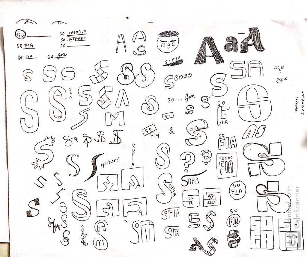
One thing I realized when sketching was that even though I enjoyed how some things looked, shapes make a big difference in the presentation. I naturally gravitate towards designs that are boxier or have straight edges but I don’t feel like they speak to me or my design style. I then shifted my focus on appearances so I began to play with faces and my name combined. Unfortunately, a lot of what I produced looked forced because the name “sofia” has very different letters forms.
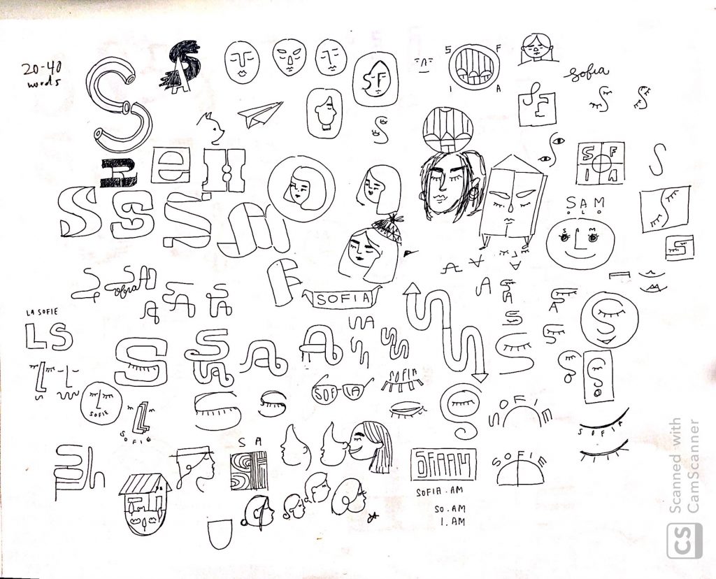
Overall, it was super exciting just spewing out ideas that came up, whether good or bad. What I learned is that it is much more difficult to craft something that is for yourself than it is for someone/something else.