Week 6: Final 3 Concepts

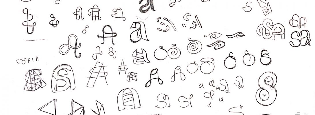
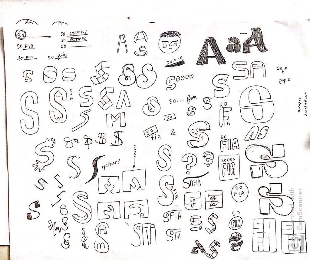
1st Concept: unified initials

Concept 1

This logo plays on my ability to unify ideas and sculpt out from myself. I do like the wat the eye follows the strokes because of their thick and thin nature which I feel portrays the movement of a road or pathway. Originally I had made the whole logo very squared off just because I like edges and sharp corners but I felt it didn’t portray me very well because I’m a more gentle person so I decided to round off the corners.

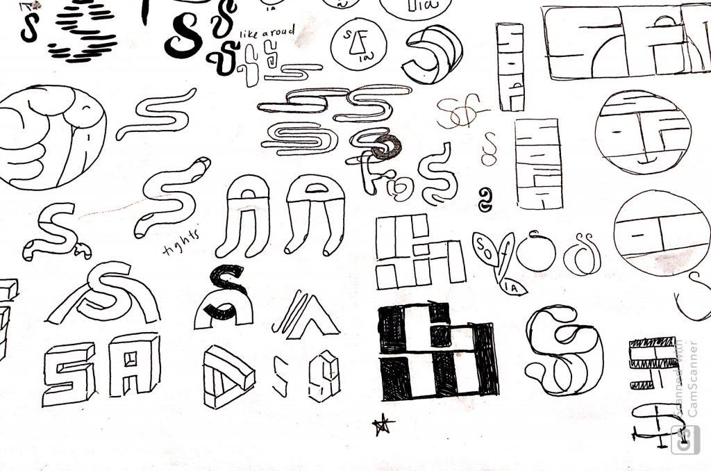
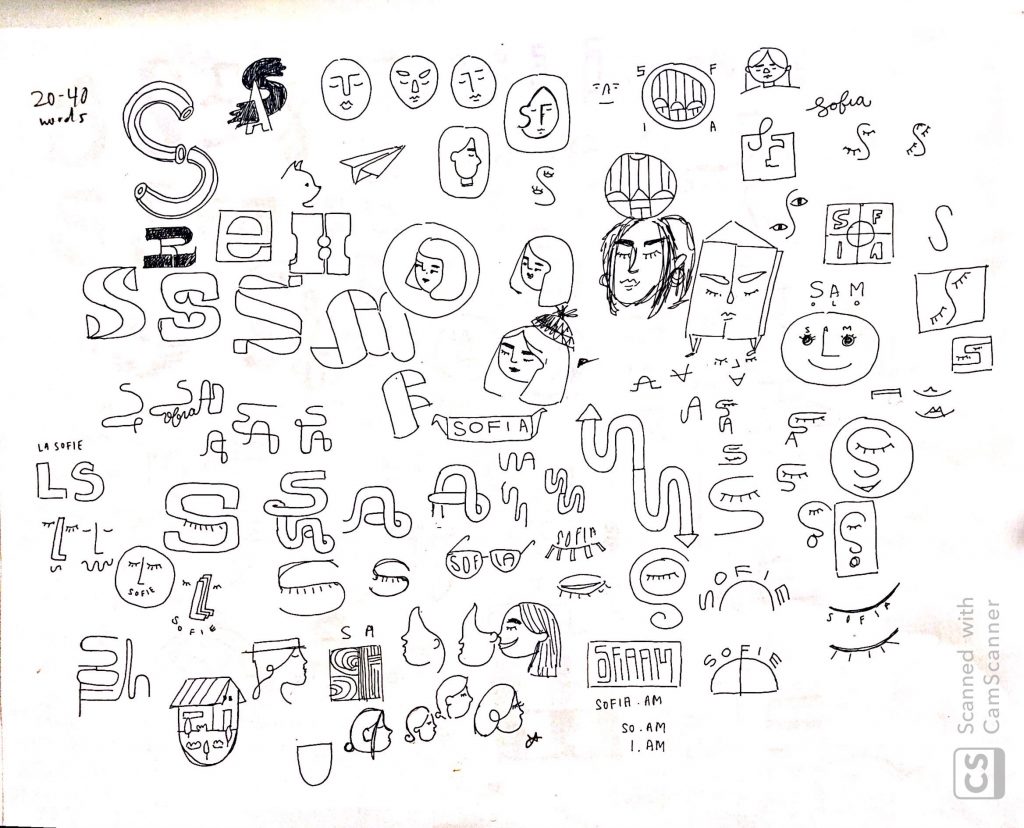
2nd Concept: Side Profile

Concept 2

This idea was based on my appearance. I generally like to wear my shoulder-length hair in a low bun so when I started exploring ways to incorporate my appearance with my letters, I found that the ‘S’ makes the head + bun while the lower-case ‘a’ makes the ear. Together they create a soft and light illustration which is similar to my style of work.

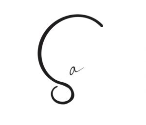
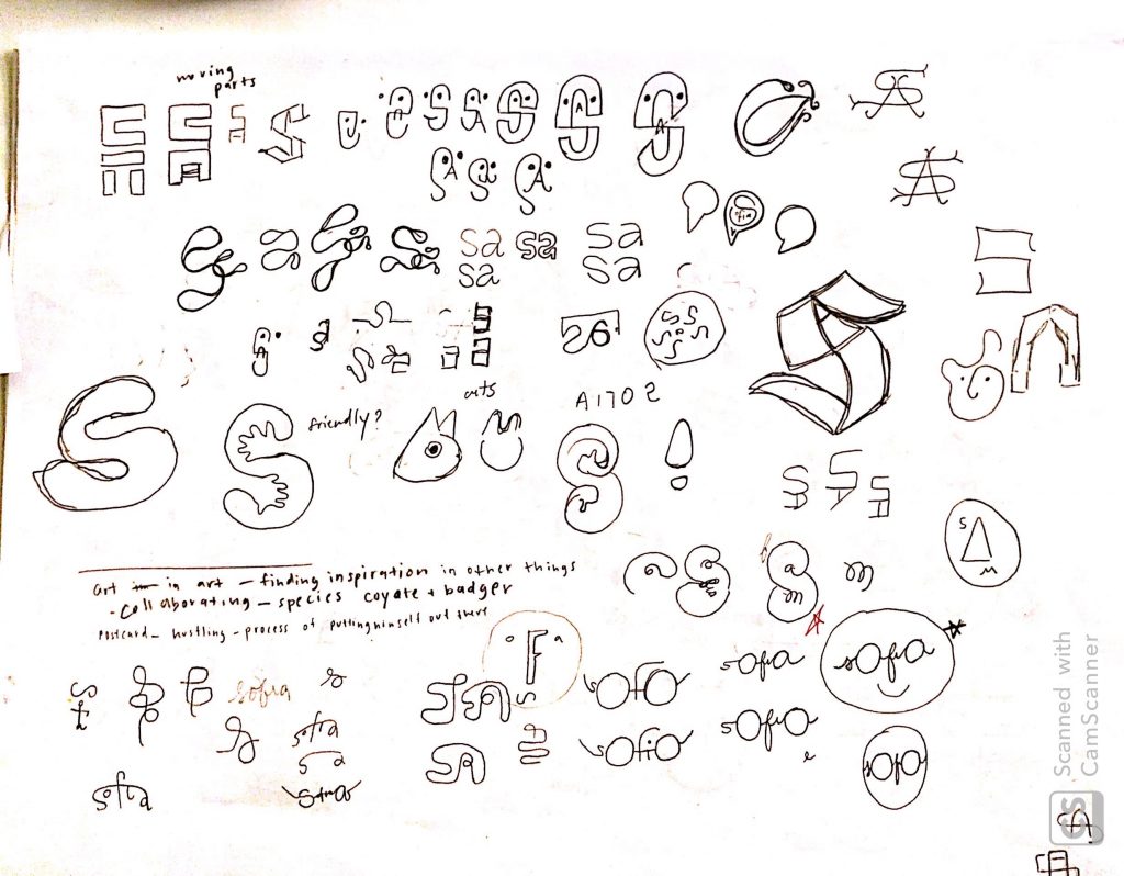
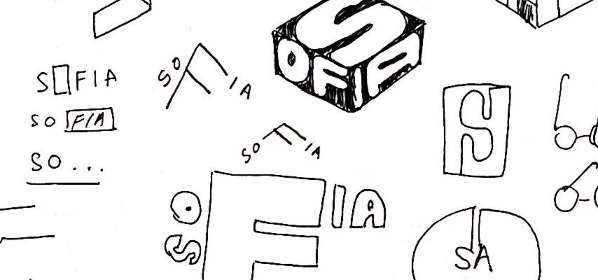
3rd Concept: Abstract face

Concept 3

Off all the logos, this one was my favorite. I was able to create an abstract face from my 5 letter name and I feel like this one speaks very much to my personality. The large “eyes” reflect my attribute word “observant” and “curious” while the cursive typographic spelling of my name reflects “adaptable”. Overall it creates a fun logo that is reflective of my playful side. When exploring more options with this logo, I realized I could also play it up during special events or could be used as a continuous pattern due to the tapering off on the first and last letter.

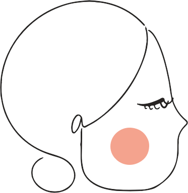
Winner: 3rd Concept “Abstract Face”

Week 5: 200 Logos

Going into the second round of logos was tougher than I had expected. I definitely felt I had more ideas going into the first round of logos but with the second round, it felt like I began to move further away from what was representative of myself. To get more ideas, I went back to my mind map and started exploring other routes such as cultural elements. While it would’ve been interesting to create a logo using Salvadorean artwork or iconography, after a couple of rounds, nothing really stuck.

One page of logos

By this time, however, I knew I wanted to use a shortened version of my name to either S, SA, or Sofia which made it possible to explore more options in a shorter span of time.

A page of logo playing with faces

I was nervous going in for critique for this second round of logos because I didn’t feel strongly for any particular way but fortunately getting feedback really helped the process propel forward.

Week 4: First 100 logos

When I first sat down to sketch out logos I didn’t have a clear path of where I wanted to go with it. I started out with my full name, first name, initials of my full name, initials with first 2 names and then working solely on the ‘S’. I definitely gravitated towards a simple ‘S’ mark because I wanted to focus on something typographic so a lot of my first sketches are funky but unrelatable ‘S’s.

Lots of weird type on the right-hand side

One thing I realized when sketching was that even though I enjoyed how some things looked, shapes make a big difference in the presentation. I naturally gravitate towards designs that are boxier or have straight edges but I don’t feel like they speak to me or my design style. I then shifted my focus on appearances so I began to play with faces and my name combined. Unfortunately, a lot of what I produced looked forced because the name “sofia” has very different letters forms.

Wonky Faces

Overall, it was super exciting just spewing out ideas that came up, whether good or bad. What I learned is that it is much more difficult to craft something that is for yourself than it is for someone/something else.