Practicum Week 4 @ Metalab

me with sports

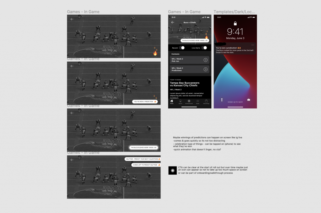
1 month. That’s how long we’ve been with our hosts now and I did not feel it go by AT ALL but it’s been great and I’m really enjoying my placement so far! This week was the busiest of the last 4 weeks. Like mentioned in the last post, I got the chance to work on real segments of an app that streams live sports games. This app also has a bunch of movies and shows but they primarily focus on sports. It’s a pretty cool app I have to say but Metalab’s purpose was not to remake the app or rebrand the company but to include new features to keep existing customers engaged and attract new customers. Since this app focuses on sports they wanted to add in a couple of contests for their users to play while watching sports. These contests are called prediction pool and pick em’s (two things I’ve never heard in my life but had to learn).

not that kind of contest unfortunately

With these contests in mind, we had to ideate on how they could fit onto the homepage so users would first be introduced to them, how they would live in the video detail page, and thinking about how the users can enter these contests right away when they start to watch their game (either in app or casted on their tv’s). These don’t seem like big problems but I learned a lot about problem solving with this project because there were so many factors that came into play in terms of user experience. A challenge we faced was the depth of screens users would have to go through to enter a contest– there can’t have too many layers because that would be a horrible experience but also, how can it live seamlessly with so much content? Another challenge– during the game, how can users be notified if they’ve won a part of the contest and how would that look like if they’re watching directly from their phones or on the big screen? I had a bit of a harder time trying to come up with appropriate solutions but my coworkers are brilliant designers and in a couple of days they already had a whole set of wireframes ready to show the clients. I was blown away by their level of thinking!

My teammates, probably

I got to work on ideation too on how users can possibly be notified if they won and I was so happily surprised to hear that my mentor from this project was really happy with the ideas I put forward. I loved working with her because she always pushed me to go a bit further with my explorations and even got me to present my ideas to the whole internal team! I was nervous but it was really good practice.

Me presenting my ideas to the team

My last day with the team was on Friday so the last couple of days I finally got to work on high fidelity wireframes which was a lot of fun! With their branding in mind, I really got to play with colour schemes, different graphic elements and even tried to animate confetti (which unfortunately didn’t work out at all haha). I had such a great time working on this project and I’m really excited to see what solutions they decide to go forward with– and if any of my ideas make the final cut! 🙂

a bit of my ideation wire-framing in Figma.

Week 6: Final 3 Concepts

1st Concept: unified initials

Concept 1

This logo plays on my ability to unify ideas and sculpt out from myself. I do like the wat the eye follows the strokes because of their thick and thin nature which I feel portrays the movement of a road or pathway. Originally I had made the whole logo very squared off just because I like edges and sharp corners but I felt it didn’t portray me very well because I’m a more gentle person so I decided to round off the corners.

2nd Concept: Side Profile

Concept 2

This idea was based on my appearance. I generally like to wear my shoulder-length hair in a low bun so when I started exploring ways to incorporate my appearance with my letters, I found that the ‘S’ makes the head + bun while the lower-case ‘a’ makes the ear. Together they create a soft and light illustration which is similar to my style of work.

3rd Concept: Abstract face

Concept 3

Off all the logos, this one was my favorite. I was able to create an abstract face from my 5 letter name and I feel like this one speaks very much to my personality. The large “eyes” reflect my attribute word “observant” and “curious” while the cursive typographic spelling of my name reflects “adaptable”. Overall it creates a fun logo that is reflective of my playful side. When exploring more options with this logo, I realized I could also play it up during special events or could be used as a continuous pattern due to the tapering off on the first and last letter.

Winner: 3rd Concept “Abstract Face”

Week 5: 200 Logos

Going into the second round of logos was tougher than I had expected. I definitely felt I had more ideas going into the first round of logos but with the second round, it felt like I began to move further away from what was representative of myself. To get more ideas, I went back to my mind map and started exploring other routes such as cultural elements. While it would’ve been interesting to create a logo using Salvadorean artwork or iconography, after a couple of rounds, nothing really stuck.

One page of logos

By this time, however, I knew I wanted to use a shortened version of my name to either S, SA, or Sofia which made it possible to explore more options in a shorter span of time.

A page of logo playing with faces

I was nervous going in for critique for this second round of logos because I didn’t feel strongly for any particular way but fortunately getting feedback really helped the process propel forward.

Week 4: First 100 logos

When I first sat down to sketch out logos I didn’t have a clear path of where I wanted to go with it. I started out with my full name, first name, initials of my full name, initials with first 2 names and then working solely on the ‘S’. I definitely gravitated towards a simple ‘S’ mark because I wanted to focus on something typographic so a lot of my first sketches are funky but unrelatable ‘S’s.

Lots of weird type on the right-hand side

One thing I realized when sketching was that even though I enjoyed how some things looked, shapes make a big difference in the presentation. I naturally gravitate towards designs that are boxier or have straight edges but I don’t feel like they speak to me or my design style. I then shifted my focus on appearances so I began to play with faces and my name combined. Unfortunately, a lot of what I produced looked forced because the name “sofia” has very different letters forms.

Wonky Faces

Overall, it was super exciting just spewing out ideas that came up, whether good or bad. What I learned is that it is much more difficult to craft something that is for yourself than it is for someone/something else.

Week 3 – Personal Brand Design

Coming to this point in the program, it’s easy to understand why personal branding is critical for the creative field. We’re constantly exposed to a variety of influential material that it really helps to create specific mood boards about where we’d like to go in terms of direction.

Working on our personal mood boards this past week was a pretty exciting task, one that I looked forward to. One thing I found interesting when putting the mood boards together is how tricky it can be to really encapsulate your personality with a handful of photos. I found myself choosing an overwhelming amount of photographs and then having to eliminate one after another in order to create a balanced page.

My favorite mood board to work on was the typography one because I really enjoy studying different forms of type. I’ve always been drawn to big, bold type and so I had no trouble finding typography that speaks to me and finds typographic references. It was surprisingly therapeutic to look for.

My type of therapy

So in conclusion, personal branding is tough to start putting together but super satisfying to work on. Now I’m excited for the next stage: logos!

AHIS 430 – Understanding comics

Panel – Usually surrounded by a border or an outline, panels contain artwork on a page. The shape of the panel can indicate emotion and tension

Gutter – The space in between panels.

Spread – a full image that takes up two pages (or more). Can be seen during an intense or important part of a story.

Splash – (or splash page) an introduction to the story, generally a full page illustration.

Underground comix – was a wave of alternative comics that were popularized beginning in the 1960’s. They were often self-published and contained controversial content.

Alternate Comics – comics following the wave of underground comix.

Encapsulation – The moments chosen by the artist to depict.

The Icon – Any image thaty represents a person, place, thing or idea.

Closure – an agent of time, motion and change.

Monosensery medium– when information is conveyed visually.

Zip Ribbon – the motion lines in comics.

Synaesthetics – Visual cues that are used to bring out senses that are not visible.

Parallel Combo – when words and images go in a certain direction but never intersect.

Montage – when words are used to replace images and treated as equally important as images.

Interdependent – when words and images are used along one another to convey an idea because neither alone has the ability to.

Formalist – the result of composition, framing, etc

Sociocultural – relating to a broader sense of things (culture, society, etc)

Bleeding – when the panels runs off the page. Can set a certain mood.

Project 4: Cross Platform Solutions for GDC

Currently, GDC faces the challenge of getting students involved with their membership. Because of the lack of proper communication, students don’t see the value of GDC which results with the majority of students missing out on the benefits that GDC offers.

With keeping that issue in mind, our goal (for Sara Lilley and I) for this project was to positively change students’ perception of GDC.

A solution Sarah Lilley and I came up with was to create a nation-wide student trivia night competition based on graphic design knowledge and using a game system like kahoot. In urban areas such as Vancouver and Toronto, a local agency would host the event at a local bar/restaurant where students would get the opportunity to meet other students while in rural areas, students would be able to form their own teams and play through the app. Whether students decide to go to the hosted event or play in the comfort of their own space, they would all be connected through the online game. This event would also allow non-GDC members to play (as long they have 1 GDC member on their team) which would open up the opportunity for them to learn about GDC and understand the value of becoming a member.

Local Event Poster

Our collateral pieces were a poster for print, an event page on the GDC website and an Instagram post. We wanted to create something that was fun and eye catching which is why we decided on a photo collage poster. The combination of photography and graphic overlays really pushes the idea of graphic design. We chose to use foxes because they’re known for their wit and we specifically chose an image of them fighting in order to portray a friendly competition.

Instagram post

The event would be beneficial because students would be able to meet and socialize with other design students, keep their design knowledge fresh and make them feel like they’re part of a community.

I would give our work an 8/10 because I believe we created fun and interesting pieces that would encourage students to attend this event. Throughout this project, Sara Lilley and I worked well together to create the moodboard and create a direction for our idea. I was in charge of the poster and Instagram post.

Project 3: Decolonising Idea

Coming into this project, I learned much more than I had previously been taught before. My group and I came up with many different ideas on how to increase visibility on Indigenous people and highlight their rich culture. This is how we came up with Land of Bannock. Our whole idea behind Land of Bannock was to create a space where the public could learn about Indigenous people (Musqueam, Tsleil-Waututh, and Squamish) in an engaging matter and highlighting their connection to the land that we reside on currently.

Instead of having an ordinary food truck, we wanted to create a whole experience. Our solution was to incorporate the 5 senses into Land of Bannock by producing collateral that incorporated it all.

  • See: food truck itself, graphics, sandwich board, microsite
  • Hear: Indigenous music playing
  • Taste: Indigenous cuisine
  • Smell: the smoked food from the truck
  • Touch: packaging, loyalty car, stickers

We wanted the public to walk away learning something new while enjoying their indigenous food made with authentic Indigenous ingredients. To begin with, the food truck itself would have facts written all over it in order to give people something to read while it’s parked. We decided on a food truck as opposed to an actual shop due to the mobility of it. To support this idea, we created a sandwich board that would state a fact about the area we’d be parked (a local leader or the significance of the land). As mentioned before, our menu would consist of authentic Indigenous cuisine and also be land specific. Our packaging would share more facts on the box along with a land acknowledgment statement. We created icons that would be used as stickers and stamps to match our loyalty card which customers would be able to used to eventually get a free meal. Lastly, we created a microsite for the food truck so people would be able to get additional information once they walk away from the truck. Basically, we wanted their experience to continue even after they had left the presence of the truck.

I’m very grateful we got the experience to meet & speak with Michelle and the Indigenous film students as they taught us how easy it is to fall into ignorance, even as well-hearted our intentions might seem.

I would give our project an 8/10 because I felt that we really created a unique experience that has the ability to change people’s perspective towards the Indigenous community. All 4 of us worked very well as we were each responsible for a certain section and we had no problems making time to work on the project as a team although Sharleen, specifically, did an awesome job taking hold of leadership.