1st Concept: unified initials
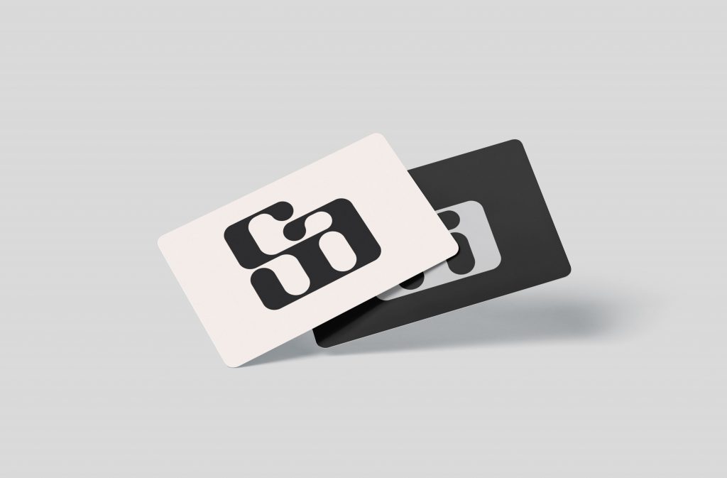
This logo plays on my ability to unify ideas and sculpt out from myself. I do like the wat the eye follows the strokes because of their thick and thin nature which I feel portrays the movement of a road or pathway. Originally I had made the whole logo very squared off just because I like edges and sharp corners but I felt it didn’t portray me very well because I’m a more gentle person so I decided to round off the corners.
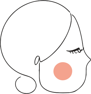
2nd Concept: Side Profile
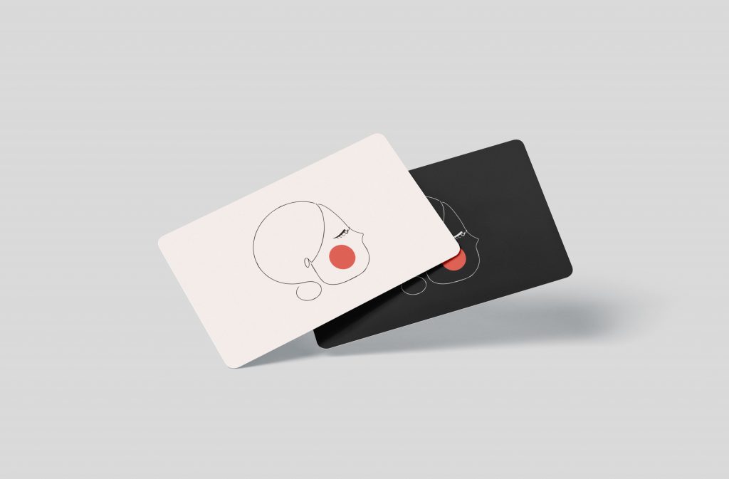
This idea was based on my appearance. I generally like to wear my shoulder-length hair in a low bun so when I started exploring ways to incorporate my appearance with my letters, I found that the ‘S’ makes the head + bun while the lower-case ‘a’ makes the ear. Together they create a soft and light illustration which is similar to my style of work.
3rd Concept: Abstract face

Off all the logos, this one was my favorite. I was able to create an abstract face from my 5 letter name and I feel like this one speaks very much to my personality. The large “eyes” reflect my attribute word “observant” and “curious” while the cursive typographic spelling of my name reflects “adaptable”. Overall it creates a fun logo that is reflective of my playful side. When exploring more options with this logo, I realized I could also play it up during special events or could be used as a continuous pattern due to the tapering off on the first and last letter.
Winner: 3rd Concept “Abstract Face”
