Week 3 – Personal Brand Design

Coming to this point in the program, it’s easy to understand why personal branding is critical for the creative field. We’re constantly exposed to a variety of influential material that it really helps to create specific mood boards about where we’d like to go in terms of direction.

Working on our personal mood boards this past week was a pretty exciting task, one that I looked forward to. One thing I found interesting when putting the mood boards together is how tricky it can be to really encapsulate your personality with a handful of photos. I found myself choosing an overwhelming amount of photographs and then having to eliminate one after another in order to create a balanced page.

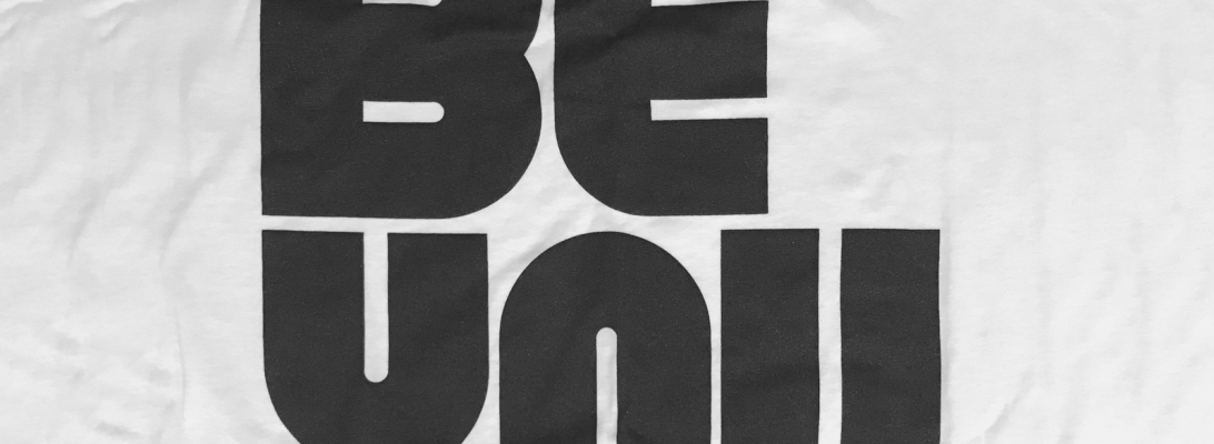
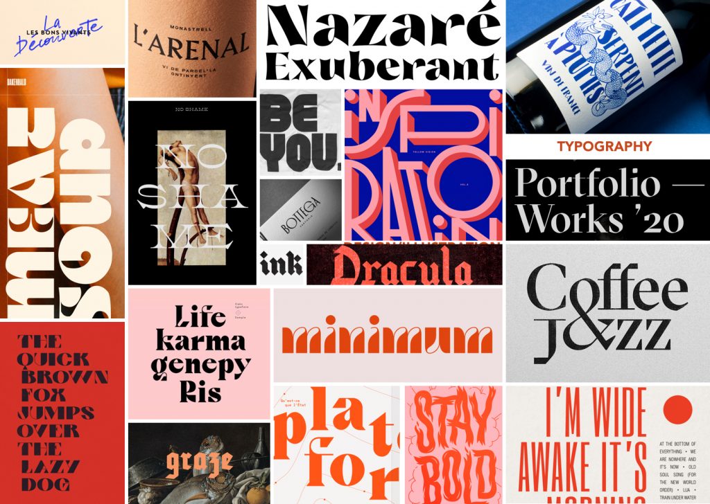
My favorite mood board to work on was the typography one because I really enjoy studying different forms of type. I’ve always been drawn to big, bold type and so I had no trouble finding typography that speaks to me and finds typographic references. It was surprisingly therapeutic to look for.

My type of therapy

So in conclusion, personal branding is tough to start putting together but super satisfying to work on. Now I’m excited for the next stage: logos!

AHIS 430 – Understanding comics

Panel – Usually surrounded by a border or an outline, panels contain artwork on a page. The shape of the panel can indicate emotion and tension

Gutter – The space in between panels.

Spread – a full image that takes up two pages (or more). Can be seen during an intense or important part of a story.

Splash – (or splash page) an introduction to the story, generally a full page illustration.

Underground comix – was a wave of alternative comics that were popularized beginning in the 1960’s. They were often self-published and contained controversial content.

Alternate Comics – comics following the wave of underground comix.

Encapsulation – The moments chosen by the artist to depict.

The Icon – Any image thaty represents a person, place, thing or idea.

Closure – an agent of time, motion and change.

Monosensery medium– when information is conveyed visually.

Zip Ribbon – the motion lines in comics.

Synaesthetics – Visual cues that are used to bring out senses that are not visible.

Parallel Combo – when words and images go in a certain direction but never intersect.

Montage – when words are used to replace images and treated as equally important as images.

Interdependent – when words and images are used along one another to convey an idea because neither alone has the ability to.

Formalist – the result of composition, framing, etc

Sociocultural – relating to a broader sense of things (culture, society, etc)

Bleeding – when the panels runs off the page. Can set a certain mood.

Project 4: Cross Platform Solutions for GDC

Currently, GDC faces the challenge of getting students involved with their membership. Because of the lack of proper communication, students don’t see the value of GDC which results with the majority of students missing out on the benefits that GDC offers.

With keeping that issue in mind, our goal (for Sara Lilley and I) for this project was to positively change students’ perception of GDC.

A solution Sarah Lilley and I came up with was to create a nation-wide student trivia night competition based on graphic design knowledge and using a game system like kahoot. In urban areas such as Vancouver and Toronto, a local agency would host the event at a local bar/restaurant where students would get the opportunity to meet other students while in rural areas, students would be able to form their own teams and play through the app. Whether students decide to go to the hosted event or play in the comfort of their own space, they would all be connected through the online game. This event would also allow non-GDC members to play (as long they have 1 GDC member on their team) which would open up the opportunity for them to learn about GDC and understand the value of becoming a member.

Local Event Poster

Our collateral pieces were a poster for print, an event page on the GDC website and an Instagram post. We wanted to create something that was fun and eye catching which is why we decided on a photo collage poster. The combination of photography and graphic overlays really pushes the idea of graphic design. We chose to use foxes because they’re known for their wit and we specifically chose an image of them fighting in order to portray a friendly competition.

Instagram post

The event would be beneficial because students would be able to meet and socialize with other design students, keep their design knowledge fresh and make them feel like they’re part of a community.

I would give our work an 8/10 because I believe we created fun and interesting pieces that would encourage students to attend this event. Throughout this project, Sara Lilley and I worked well together to create the moodboard and create a direction for our idea. I was in charge of the poster and Instagram post.

Project 3: Decolonising Idea

Coming into this project, I learned much more than I had previously been taught before. My group and I came up with many different ideas on how to increase visibility on Indigenous people and highlight their rich culture. This is how we came up with Land of Bannock. Our whole idea behind Land of Bannock was to create a space where the public could learn about Indigenous people (Musqueam, Tsleil-Waututh, and Squamish) in an engaging matter and highlighting their connection to the land that we reside on currently.

Instead of having an ordinary food truck, we wanted to create a whole experience. Our solution was to incorporate the 5 senses into Land of Bannock by producing collateral that incorporated it all.

  • See: food truck itself, graphics, sandwich board, microsite
  • Hear: Indigenous music playing
  • Taste: Indigenous cuisine
  • Smell: the smoked food from the truck
  • Touch: packaging, loyalty car, stickers

We wanted the public to walk away learning something new while enjoying their indigenous food made with authentic Indigenous ingredients. To begin with, the food truck itself would have facts written all over it in order to give people something to read while it’s parked. We decided on a food truck as opposed to an actual shop due to the mobility of it. To support this idea, we created a sandwich board that would state a fact about the area we’d be parked (a local leader or the significance of the land). As mentioned before, our menu would consist of authentic Indigenous cuisine and also be land specific. Our packaging would share more facts on the box along with a land acknowledgment statement. We created icons that would be used as stickers and stamps to match our loyalty card which customers would be able to used to eventually get a free meal. Lastly, we created a microsite for the food truck so people would be able to get additional information once they walk away from the truck. Basically, we wanted their experience to continue even after they had left the presence of the truck.

I’m very grateful we got the experience to meet & speak with Michelle and the Indigenous film students as they taught us how easy it is to fall into ignorance, even as well-hearted our intentions might seem.

I would give our project an 8/10 because I felt that we really created a unique experience that has the ability to change people’s perspective towards the Indigenous community. All 4 of us worked very well as we were each responsible for a certain section and we had no problems making time to work on the project as a team although Sharleen, specifically, did an awesome job taking hold of leadership.