Storyboard

by Sisy Wong

Here’s our group’s process of story board. We chose Colin for the main character and developed 4 stories for the project.

Story 1

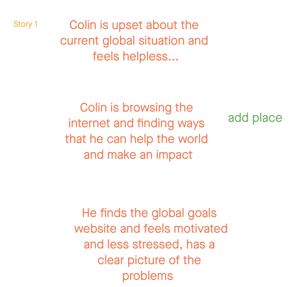
For our first story, we tried to make a concept of Colin noticed the severity of global goals, but after the discussion with Christina, we found out that we missed the place of this situation and started to look into the next story.

Story 2

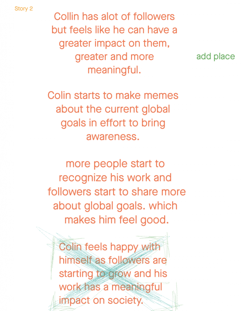
The second story is about Colin’s social media, we saw his profolio and it mentioned he has lots of followers in Instagram and we used this point to create this story. However, we don’t think this story is the uniquest one, so we kept looking to other one.

Story 3

This is our best story idea, it’s unique and have emotions on each sections.

Story 4

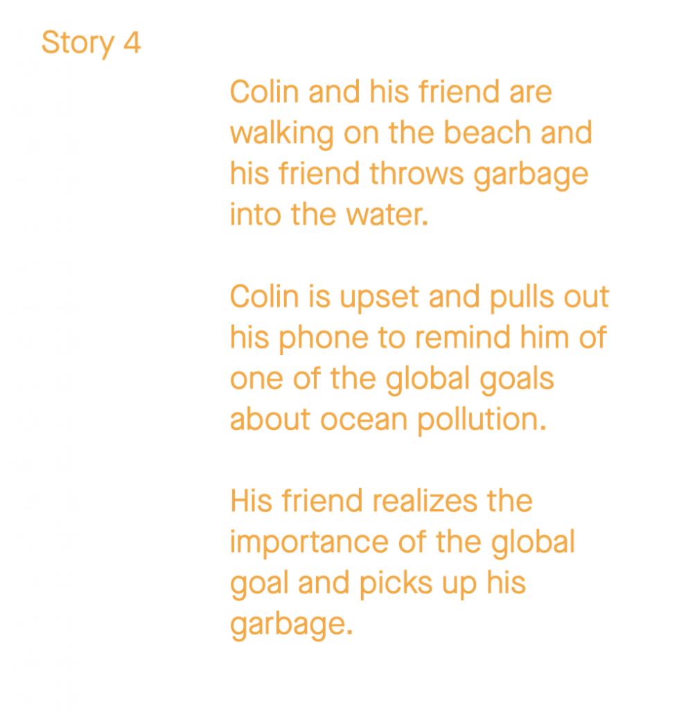
This is our last story and it has the same problem with story 2, we think story 3 is the best one and we used that story to complete our storyboards independently.

Storyboard

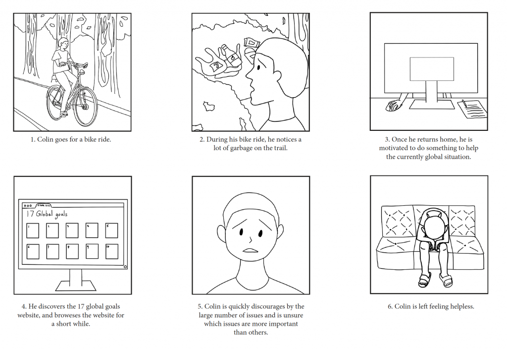
This is my storyboard, I’d like to make it simple and easy to get it, so I just draw the outline of figures and tried on different angles to show the character ‘s expressions.

Blog 5: Canadian Design Today

Sisy Wong

In week 13, we discussed the Canadian designers. Theo Dimson is the one who I inspired. He was born in London, Ontario and passed away in 2012. He was a Toronto graphic designer. Art Deco-Style movie and theatre posters were his well-known pieces. He studied at Ontario College of Art and Design with a scholarship and graduated in 1950.

Theo Dimson

I think his art style is very special which mostly using lines and shapes with colours. Also, I found that in some of his art works he included spiral shapes.

Source: https://gdc.design/fellows/theo-dimson-fgdc

He was the author of Great Canadian Posters and commissioned by Canada Post to create stamps.

I think the images in his stamps design are cute and I like his colour palettes, they are always related to the art work topics.

POSTERS FOR FALCON BRIDGE

This is one of my favourite Theo Dimson’s work. This is a series of posters for Falcon Bridge. I really like design of the bird’s eye, it looks funny and cool.

Blog 4: Postmodernism in Europe

Sisy Wong

During week 9, we discussed the postmodernism artist in Europe.

Gerard Unger is the one who impressed me the most. He was a Dutch typographer and graphic designer. He was born in Arnhem, Netherlands in 1942. Unfortunately, he passed away in 2018 which five months after his wife’s death. He studied at Gerrit Rietveld Academie. Also, he took lots of guest lectures at the University of Reading which he taught lots of young modern typeface designers.

He created lot of typefaces in his life. Most of them are available from Linotype and the Dutch Type Library.

Alverata 2013

This is my favorite Unger’s design typeface, it’s called the Alverata. It was created in 2013. It’s a twenty-first-century typeface whose design is inspired by capitals in inscriptions from the Romanesque period. It also reflects developments in design and arts of twentieth century.

I think he is such a genius, he created tons of typefaces in his lifetime. I appreciated the perseverance that he has as I can never create typefaces. In all his works, I especially love this book cover, I like the pin and thread style of typeface and I think it looks cool.

Sources: https://en.wikipedia.org/wiki/Gerard_Unger#Work

Blog 3: Supergraphics Innovator

Sisy Wong

In week 7, we discussed the difference between modern and postmodern. Paula Scher is one of my favourite designers in this topic. She is an American graphic designer, painter and art educator. Also, she joined the Pentagram in 1991 and became the first female principal. She studied at the Tyler School of Art in Elkins Park, Pennsylvania. She was born in Washington then moved to New York City for her layout artist for Random House;s children’s book division job.

The map is one of my favourite. I can’t believe how well she organized those colourful, different size and the streamline of types together. She is really good at playing types in different angles.

Lots of her art works included types and she always join the types with two lines together which make the types pop out.

I like the way she combine the types and images together so well.

Sources: https://en.wikipedia.org/wiki/Paula_Scher

Blog 2: Psychedelic Design Hero

Sisy Wong

In week 5, we discussed the design of dissent. The most interesting part in the 1960s is the bold, special type style which most of the designers used it in their art works. One one them is Stanley Mouse.

Stanley Mouse

Stanley Mouse is an American Artist. He was well-known for his psychedelic rock concert designs for the Grateful Dead and Journey albums cover. Mouse completed his formal education at Detroit’s Society of Arts and Crafts. He developed the skill of using airbrush and began painting T-shirts at custom car shows. In 1964, people invited him for designing the Monogram automobile model kits, he then created his famous monster cartoon characters.

I really like his art style which I think it looks like a poker card and I love he used bright and bold colours especially the red really captures my eyes. Besides, most of his arts give me a sense of misery which led me to think the meaning behinds the designs.

Resource: https://en.wikipedia.org/wiki/Stanley_Mouse

Blog 1: Advertising Art Director

Sisy Wong

In week 3, we discovered the New York school. Leo Lionni was the one who inspired me. He was an author and illustrator of children’s book. He was an art director for advertising agencies, then for the “Fortune” magazine.

Press the Button, from the Early Series

This is a photo montage with gouache on paperboard piece. Also, this is one of my favourite piece of Leo Lionni. I like the way he organized and combine multiple photos which gave a strong message of stopping the war.

Fortune Magazine cover

One of Leo Lionni’s biggest clients was Fortune magazine. He loved using bauhaus style which gave lots of geometry shapes, texture and bold colours.

“A Color of His Own” was one of his famous children’s book illustrations. His illustrations were colourful and the subject always catches my eye. It’s a children’s book about chameleon distressed that he doesn’t have a color of his own like other animals. He cannot move around without changing colour. Then he finds another chameleon, they travel together and set off on a new life of adventure.

I really like his illustrations on children’s book as they are all simple, full of color with joy and energy.

Sources: https://www.penguinrandomhouse.ca/books/101927/its-mine-by-leo-lionni/9780679880844

Rationale IV

Sisy Wong

Fai Chun

For survey 10, I’m doing a free-wheeling spread. I am doing research on comparing Traditional Chinese characters and Simplified Chinese characters. They are both Chinese characters that people are using right now but used in different provinces. Traditional Chinese characters are used in Hong Kong, Macau, and Taiwan. Besides, they appear in most of the Chinatown. Simplified Chinese characters are used in mainland China. For what I’m doing is Fai Chun. It’s a traditional decoration that is frequently used during Chinese New Year. People put Fai Chun in the doorways to create a jubilant festive atmosphere since the phrases are written on it mean good luck and prosperity. I used acrylic paints to paint it all red and used a black marker to draw to characters on the paper. Then I put the introduction in the separate picture as if I put it with the Fai Chun, the words will be unclear. I would give myself a Grade B as I think most of it is working except the left Fai Chun can be bolder more.

Introduction

Contemporary, Post Modernism, and Women in Art

Sisy Wong

Everything 2003
The Mythic being: Sol’s Drawing 1974
Adrian Piper

Adrian Piper is a American conceptual and performance artist. She was born on September 20, 1948, New York. She is known for her provocative works that treat race, gender, class, and identity. She studied sculpture and painting at the School of Visual Arts in New York City with an associate’s degree in New York in 1969. She then studied philosophy in the City College of New York in 1974 and Harvard university in 1981. Her early art style was conceptual art tradition. Her art work contains both art and philosophy. I like her art works as I think they are very new concept and I like most of her art works are in black and white which made the tone serious for us to really think about.

Self Portrait as My Negroid Features
Self Portrait as Nice White Lady 1995

Resources: https://www.britannica.com/biography/Adrian-Piper

Rationale III

Sisy Wong

Japanese camera

For Survey 9 I am doing research on tools and technology, so I came up with an idea of researching Japanese cameras. The Japanese Camera industry began to take off in 1936 with the Canon 35mm rangefinder, an improved version of the 1933 Kwanon prototype. The Precision Optical Instruments Laboratory that established its reputation for developing the ‘Hansa Canon’ was transformed into the Precision Optical Industry, Co., Ltd. to start the full-scale production and sales of cameras. The company specialized in manufacturing high-quality 35mm cameras and developed the unique ‘Serena’ lens with the motto that it would produce world-class cameras.

For the camera part, I used toilet paper rolls and wrapped them with tinfoil. Then, used a transparent film for the lens part. For the background, I hanged up some photos that I took in Japan tried to make it related to the topic. The outcome is good but not the clarity of the picture. I tried to retake the pictures with my camera but the spread still looks blur. I would like to give myself a grade B+.

Draft

Abstract Expressionism and Pop Art

Sisy Wong

Yayoi Kusama

Yayoi Kusama is a Japanese artist who was a self-described “obsessional artist,” known for her extensive use of polka dots. She was born on March 22, 1929, in Matsumoto, Japan. She employed painting, sculpture, performance art, and installations in a variety of styles, including Pop art and Minimalism. She studied at the Kyoto City Specialist School of Arts between 1948 and 1949. She then moved to New York. Kusama’s artworks are all polka dots in different shapes. One of her famous pieces is the polka dots pumpkin. Kusama also has a cross over with Louis Vuitton in 2012, which made her become well known than before.

Polka dots plants
Kusama cross over with LV