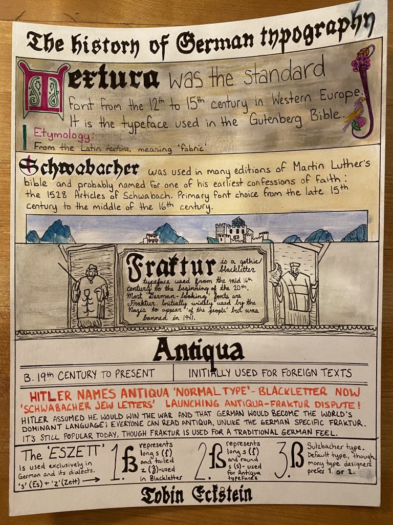
I love taking the opportunity to delve further into my German heritage and so this project was more than just an assignment; it was a personal passion project. Germany has been the centre for many turning points in both the design and engineering world-think Bauhaus and the Gutenberg press-and their innovations with typography marry both of those elements together. I had many ways I could approach this infographic, but I decided to take the most important document from each pivotal typeface and stick them together as one. For Textura, we have the Gutenberg Bible, Schwabacher is a page from the Nuremberg Chronicle, Fraktur from Durer’s Triumphal Arch, and Antiqua from a German newspaper in 1941. The Eszett is just a bonus! I tried my best to match the style of each document, even bringing a lighter to my page (scary!), and I think it turned out pretty good. If I had created it over a longer period of time rather than in two sittings, I may have come out with something even better though. I definitely had to cover a couple of ink smears with white acrylic…That being said, I am still proud of the project and would give it a solid 9/10.